 our blog
mobx, the big bang
30 November 2011, 19:47
And now for part two of my MobX lecture. In part one we saw how old mobile was becoming bloated, more complex and slower. And then…
boom!
January 9th, 2007 the iPhone was introduced. It was the big bang of mobile. Looking at that first version hard‐ and soft‐ware today, it looks quite humble:
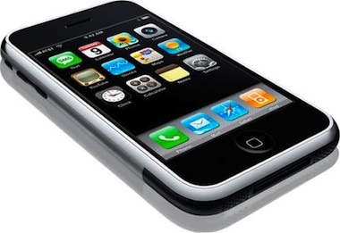
During a year or so after the introduction I caught up with my contacts at mobile manufacturers and networks. I found out that the response had been universal across the industry: ‘oh shit.’ This was followed by an investigation, ordered by the highest company level, into ‘why did we not invent this?’
culture club
That is a question of culture. All these companies have many very bright researchers. The question is what is being done with their work. That is a management problem. As is excellence in execution. Good enough is simply not good enough, today.
We also know that Apple had to keep the mobile networks out of the loop to make sure that the iPhone would not be any old mobile. At the end they found AT&T prepared to sign up, sight‐unseen, for the iPhone. After the introduction the genie was out of the bottle and no mobile network could put it back.
touch rules
Mid‐2007 I was for a couple of weeks in the US to work on the interaction fundamentals of an ‘iPhone killer.’ It was my first chance to get my hands on an iPhone, introduction in Europe was in November of that year. It took only a few days to figure out the rules of touch (apart from the obvious changes):
- The user interaction is more within a given screen, instead of being defined by transitions, as it was for old mobile.
- Use the whole screen. Whatever you do, make it as big and gorgeous as possible.
- Pixels are no longer the unit of measurement; it is the finger grid in centimetres.
- Touch interaction is addictive. Especially sliding, swiping or flicking things is the stuff that joy of use is made of: satisfaction guaranteed.
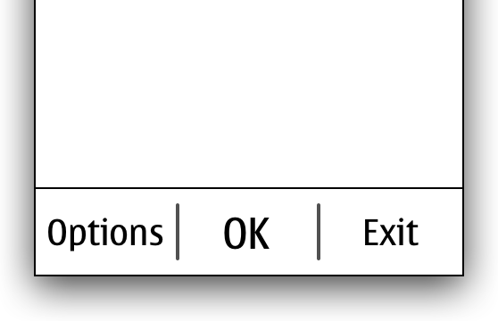
- No Options menus anymore. They are virtually gone.
- Back‐stepping (pressing the Back softkey) was such a natural part of old mobile that it was not even shown on the chart. With touch it is mostly avoided.
- This is not a phone. It is a handheld computer that happens to make calls.
In the two years that followed, I led the interaction design work on more than one ‘iPhone killer,’ for corporations that were simply not getting it. They were still insisting that their devices should have green and red hardware keys, as if they were making a telephone. Usability folks at these corporations were not exactly helping the innovation, playing it safe by insisting that everything should be operated by means of simple tapping. What was that about swiping?
like a robot
Now that we know the rules of touch, can someone tell me what is going on with android? April last year I was at a conference—nothing to do with mobile—and Google gave away a nexus one to every participant. It took only a few days to figure out that something was really wrong. They’re back:
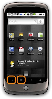
The return of the Options menu and Back hardware keys is not just a case of old‑think. It is a serious problem. This is because the bright and shiny display is where the interaction is, and these two buttons are not part of it. And that is how users are perceiving it, they always pause when their next step can only be performed with either key. They get torn out of their interaction flow, press the key, then re‑enter the flow.
It is the law of the platform and android is stuck with it. But those of us who design user interaction for android apps can help. Why not put all the interaction on the screen? Refuse to depend on these two keys. And when the guidelines of android still prescribe to make use of the Options menu and Back keys, then treat them as a backup solution.
This is analogous to the situation on the desktop, where for instance in iPhoto most of the interaction can be performed in the main window, and the menubar is there as a slow, but safe, interaction element prescribed by the guidelines.
glass half full
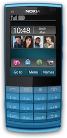
What about hybrid touch, aka touch and type? Is it half‐baked? Looking at the image below it is obvious that the bottom half of this devicee cannot be used to watch a film, read a webpage or play a game. But, you can type like it’s 1999.
When I first had a prototype for this device in my hands, I thought: ‘wow, finally something is not trying to be an iPhone.’ This one is doing its own thang and deserves some love. The UI however is a direct adaptation of old mobile, adjusted for the obvious changes: direct touch input; no soft‑ and scroll‐keys. This must have really helped in the feasibility department, but it does the device no justice.
but there is hope
Early last year I led the interaction design for a software project for these devices. Without going into the project, I would like to show you that there are opportunities to push the envelope. Ignoring what is on the screen, let’s concentrate on the softkey line:
That softkey line is a touch area, of course. And because it is on the bright and shiny display, it is usable, unlike the android keys. Being touch, you can do whatever you want, which I did:
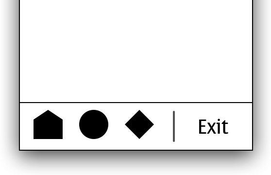
I put three icons (placeholders shown here), giving users direct‐access navigation between three sections of the application, as seen on touch devices. Together with the remaining right softkey, it is a truly hybrid solution. I kept the boss of this UI platform in the loop and she was very encouraging. She was eager to see innovation on the platform.
So do not despair when you have to work as an interaction designer on a hybrid touch project. It is a grey zone which means lots of opportunity to define it yourself. Go on and break the rules, and innovate.
the future of old
Looking at the graphs below, from the incredibly useful asymco blog, we see both for the US (left) and globally (right) smartphones—today most of them touch devices—are definitely on the rise towards dominating the market. Note that in our context both symbian and RIM are good old mobile—and were never that smart—but they follow the trend and are in decline.
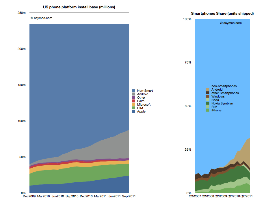 source: asymco.com
Before you now predict the death of old mobile, let me point out that something as simple as component costs will keep proper touch out of the hands of most of the world population. Serving the worldwide middle classes: yes; everyone: as soon as the total parts cost is $10 or less.
So old mobile is here to stay, for a while. Let’s not forget outside the western world there is a lot of service innovation going on that puts the western world to shame. All of that is on old mobile. And no, working on old mobile does not need to be nagging legacy support.
dual strategy
I have blogged before about working on Nokia’s first dual‑SIM phones. I can talk about this project for hours, but what you need to know is how the fundamental equation of mobile phone was changed from one user, one SIM to one user, two SIMs. This triggers a massive engineering effort, every software component in the phone is affected. And if you don’t watch out, then for the UI you are up for redesigning hundreds of screen layouts, implementing these and re‑specifying all software that use them.
Because of this massive effort it was not that sure at the beginning of the project that we were going to make it. I was the interaction lead for the whole phone. I created the solution strategy and accompanying design patterns. Then I worked with Nokia designers and mentored them while implementing these patterns. And we made it:
And that was in part thanks to the solution I designed. My top priority had been good user interaction, but a happy side‐effect was a great reduction in UI design effort and overall engineering work. In May this year the first Nokia dual‑SIM model appeared on the market; today there are five models.
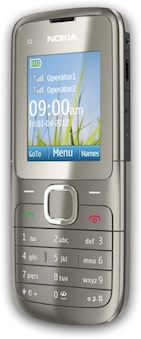
When you look at the phone above you see it is good old mobile. The solution could have been made in 1997: it is all just lists and Options menus. And the fist device we designed it for is low spec mobile, with just about the smallest screen size Nokia ships.
the future is bright
The dual‑SIM project turned out to be one of the most satisfying projects I ever worked on. And it was not just because of the challenge, the mind‐boggling complexities; not for the travel involved or the rewarding cooperation with my colleagues. It was so satisfying because all the time we worked on it, we knew how much it mattered.
How much it mattered for Nokia’s business was proven a couple of weeks ago when its third quarter results were released. In between the gloom and doom there was some light. They had shipped 18 million dual‑SIM devices that quarter. Through this they had gained market share in India. Even though with dual‑SIM we are talking about cheap devices, that is around a billion dollar in turnover.
In the financial statement and all marketing material, Nokia proudly communicates that their dual‑SIM solution ‘enables users to personalize up to five SIM cards.’ Cool, I designed that. The personalisation: instead of calling the SIMs just A and B, let users name the SIMs for what they mean to them, like ‘cheap calls’ or ‘free SMS.’ And that number five, I set that as the minimum to remember. It is quite normal for users in these markets to juggle three SIMs every day, and to change one or two of them, every month. 3 + 2 = 5.
Just the other week Nokia CEO Stephen Elop spoke at a press conference of the ‘halo effect’ that dual‑SIM has in the market. All sorts of Nokia devices are selling better because dual‑SIM is now shipping.
users + nerds
Also on the user side we knew how much the dual‑SIM project mattered. There was a pent‑up demand for this and now it is safe to say that out of those 18 million people that bought these devices, 100% did it for the dual‑SIM. And 100% of them are using it every day. Compared to the one percent I mentioned in part one, that matters.
Reviewing all this, I am thinking: maybe this touch UI vs. old mobile is all relative. Maybe it is just designer nerd‐talk? It reminds me so much of discussions developers have about the coolness and merits of doing a project in C, C++, Java or something new, like lua. Just maybe, it does not matter that much.
So for us designers, it might be more rewarding to be excited about how relevant the project before you is for your users and the business of your client. And at the end, you will know you have worked hard enough only if you are excited about how elegant you made the interaction, and about how much innovation you put in.
postscript
That’s it for my lecture. I could only share 5% of what I had lined up in my mind, but there was only half an hour on stage for each speaker and time goes fast. I am looking forward to the next opportunity to share some more.
Labels: design stage, lecture, mentoring, mobile, practical

mobx, mobile before January 9th, 2007
28 November 2011, 22:22
Hot on the heels of the WUD there was the MobX conference. Very cool to be invited for this one, the speaker lineup was promising and delivered. The feedback of the conference audience was enthusiastic, both on the day itself and via all the familiar networks. As usual, here is the write‑up of my lecture.
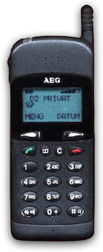
mobile before and after January 9th, 2007
. At that time, mobile looked like this:
 source:
handy-sammler.de,
thanks for the memory!
source:
handy-sammler.de,
thanks for the memory!
The pixels on this mobile’s screen were not square, they were rectangular; more high than wide. This was to save on screen cost and on memory needed to drive it.
More fun trivia: I did not own or use a mobile in those days. Only two years later I got my first mobile. I had seen mobiles before, more of them in the UK in ’95, less in Holland in ’96. But I had never made a call with one.
spec work
Work on mobiles was in those days driven by the GSM specification, which regulates how mobile networks work and type‐approval of mobiles. These specs are written by a committee of manufacturers, but I learned that they did this in order to please the network operators, to create new revenue streams for them.
The SIM toolkit, which I worked on in ’97, is an example of that. It lets networks add menus and UI to mobiles, for proprietary services. Speaking of services, in those days SMS was used by virtually no one, it was simply too expensive.
touch and go
Looking back it is quite amazing that we were working in ’98 on a touch UI model, for production. OK, it looked more like the model above than an iPhone, but still it had handwriting text input. Alas, that work stopped in the mid‑1998 when AEG got out of the mobile business. Nokia had invented segmentation—different mobiles for different people—and were solidly beating companies like AEG who were making only one model at any given time. Segmentation seemed to be the way of the future…
a cup of joe
We now fast‐forward to 2001, when a long stretch of mobile work started for me. Nokia was about to start working on their first java‐equipped phone, the 6310i:
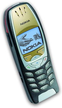
This model still had a 1‑bit, black and white screen; two softkeys and 2‑way scroll keys. I still see the 6310i in use today, nine years after its introduction. They were built to last.
Mobile models were at that time differentiated by ‘extras’ which had taken over from the GSM spec as driver of development. I was asked by Nokia to design the first java mobile applications (MIDlets) to ship with the phone, together with a Nokia colleague. From this phase of ‘old mobile’ I would like to discuss three things I learned that are still valid in today’s touch‐dominated world.
1. work on a chart
This is the UI chart of the first MIDlet I designed, the converter. It converts units, like pounds to kilos and gallons to litres:
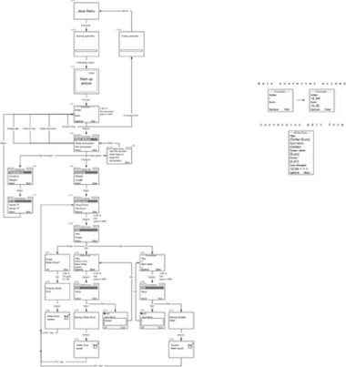
The point is that this is the complete user interaction. It is accompanied by an error chart—derived from the UI chart, it shows what happens when things go wrong, e.g. memory full—and a short document, less than ten pages, that specifies details. This is all you need to develop and ship the MIDlet.
Case in point. A couple of years later I worked on version two and three of Nokia’s java email client. Version one reached me in the form of a 189‑page document. Text‐only: a section for each screen, with gotos at the end for the transitions. It had taken nine months to write and was unusable. I spent a week decoding the document and made this chart:
Now Nokia knew what they had been developing. The chart was my first deliverable and it was a revelation to them. Worth every penny, they thought. In a much shorter timeframe, nine weeks, I did a redesign for version two, which had a lot of new stuff included. The result had to be put on two charts, though.
incomplete story
Every once in a while, I see storyboards being used to communicate an interaction design. You know, a row of screens showing what happens in sequence:
This may work—even well—to present work to people who are not in on the project. But it is not a working tool for interaction designers. It is not fit for communicating the design to development. That is because it cannot show a complete and coherent picture of the interaction.
seeing is believing
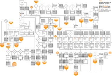
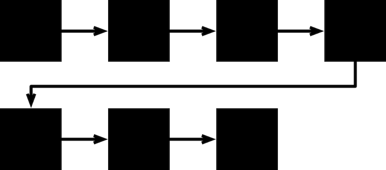
What I learned after a while is to read the chart. To see the quality of the user interaction from the patterns. This works because in old mobile, a lot of the interaction is not determined by what is on the screens, but by the flow between the screens. Here is the basic flow of old mobile, there is not much more to it than this:
- Without even looking at what is on the screens, you just know that this is the Options menu.
- Under it are the task flows, each completing a task.
- The return point for the flows. After a while I sensed that this is a point in the UI where users feel calmer, more secure.
- The flows themselves are more uncomfortable for users, they do not like to hang out there.
- Longer flows spell trouble; one screen more and I would be alarmed and investigate. Note that this is about feeling (see 4) and not about number of clicks (a most useless metric).
If a chart has arrows flying all over the place, then either you have not drawn it very well (try again) or the user interaction needs a redesign. This is why I like to have the complete and coherent picture. To see how everything is connected and relates to everything else. That’s why I say: work on a chart.
2. there is no such thing as cross‑platform
I learned this one the hard way. So there we were at Nokia. There was a java team that had to make a toolkit that would run any MIDlet in the world. And there was me asked to design real Nokia applications using this toolkit. This was a constant struggle.
I do not blame the java team. They had to adhere to a common‐denominator specification and do the best they could. But the loss of control on my side meant too many cases of close but no cigar. The make‑or‐break details of user interaction could not be put in order.
difference engine
After a while I was also designing for multiple devices. All Nokia devices, but the differences started to bite. It is easy to see the big impact of changing the number of buttons on a device. From two to three softkeys; introducing 4‑way scroll.
Remarkably more buttons was not always better: I had optimised the converter so much for two softkeys, that when the third came along, the problem was what action to assign to it. At the end I put the conversion selection, but it was clear that the converter had not been aching for three softkeys to come along.
size matters
More subtle were the differences in screen sizes of the devices. This meant changes in how much text or how many items one could fit on a screen. This situation is quite elastic, but sometimes there would be a catastrophe because something would not fit anymore or an opportunity because an extra thing would fit.
This would trigger a redesign, and I do not mean just of some screens. Whole flows had to be changed because of the catastrophe/opportunity. I think today with touch UI this screen size factor is even bigger than with old mobile. Pixels sizes do not count anymore, it is the finger grid, measured in centimetres. That means less elasticity.
So when somebody says ‘we are going to do this cross‐platform from one codebase’ or someone else says ‘I got a cross‐platform UI toolkit,’ then I say: no you don’t. You have no idea what user interaction is really about.
3. be obsessed with elegance
So there I was, designing these small MIDlets that really only did one thing. And I started to be obsessed with how elegant the interaction could get. An example is the Nokia translator, which translates a couple of thousand words between five languages.
This looked easy, but there was one thing that bugged me: should users constantly be telling the translator what they are translating (German–English or English–German?). Language is a two‑way thing, so this directionality had to go. I was obsessed with this for more than a week, day and night. But then I had it.
Language is the answer. Just look up the input word in all five dictionaries. Spelling will sort out in which language it was. We ran some tests that confirmed the plan. The result was a leap in elegance. And a small, very satisfying UI chart.
complex issues
I used to have a complex, designing these small MIDlets that really only did one thing. Other people were working on bigger things like call, phonebook or SMS that were also used by a lot more users. I have always estimated that one percent of users used these small MIDlets that I designed. With an installed base of half a billion that still gives five million users, which is not bad.
These days, small programs that really only do one thing, and are used by only a fraction of users, are called apps. They are perceived as beautiful and people have no hang‑ups about working on them. And elegance rules this domain.
grinding halt
With hindsight it is easy to say that being small is beautiful. This is because I can now see that around 2005 something was clearly going wrong:
Meet sensor, today you would call it a social network, in this case a short‐range one: it worked via bluetooth only. It is so large it needed four UI charts; you can feel my pain. I redesigned this from the original symbian version. It was quite a bit of work, because there is no such thing as cross‑platform.
This is really exemplary of what was happening at the time. Mobile was getting bloated and more complex. Users were noticing it. Everything just felt slower. Straightforward things were no longer straightforward.
That is, until January 9th, 2007. Read about it in part two.
Labels: design stage, lecture, mobile, practical, top story
the wud, on social networks
15 November 2011, 18:10
I have just just wrapped up another world usability day (WUD). The theme was Social Networks and we had a full house—workshops and lecture hall—all day. As mentioned before, I had hands‑on interaction design experience with a sprouting social network to share in my lecture. A video registration (in German) of the full lecture can be seen online and, as usual, here is also my write‑up.
structured visualisation or simply being social, the design work at unusuals.net
We agreed on a ten man‑day consulting project, which was then implemented over a two month period.
With a modest project like this one cannot expect interaction architects to make and document detailed designs (wireframes) of a whole social network website. There is simply not enough time; practical consulting is the most effective way to shape the project. Fortunately, the unusuals were up to the task of wireframing themselves.
just getting started
The work before the work that I do at the start of a project is structuring. At unusuals I implemented the following sequence of methods and phases:
- product vision
- Define of what is it that we are creating; what is the end‑goal.
- functionality
- Create a complete overview of ‘what’s inside the box.’
- user scenarios
- Further work out the vision with scenarios showing typical and essential use. These are then used for…
- expert evaluation
- Evaluate any existing stuff: ideas; plans; designs; software; websites; competing offerings.
- brainstorming
- Time for creativity and generate new ideas. Starting with real life; take it through a couple of loops of fantasy; then back to earth.
- design sessions
- Sit down and solve the design problem at hand. From fundamental stuff like browser sizing and flexible layouts; to mid and detailed design of components like a film gallery.
This may look like a long‐winded process, only getting results at the end (the design sessions). Let’s see whether this was really the case.
panavision
We started—as is my custom—with the product vision phase: defining what the product is, its identity, what the target user groups are and where the value is. This took a couple of hours with unusuals, especially because they had to explain to me the advertising film world.
How many people does it take to make a tv commercial? Easily more than 50. All these people work in a pyramid, in a strict hierarchical system. It is also a world full of freelancers and the name of the game is getting that next job; then recruit the people who work directly below you in the pyramid, within one or two days.
keep on rolling
Two weeks before the WUD, the unusuals kindly agreed to help me prepare by spending two hours recounting the project. During that, they admitted that they did roll their eyes (a bit) when they realised they had to explain the film world to me, an outsider. They themselves have 10–20 years of experience in the business as either producer or director.
But then they also quickly realised, while explaining, that this was helping them, formulating this simplified version to an external. Also my questions helped, always pointing in the same direction: how does this film world tick. Because how it ticks is how the unusuals network should work. And it is the interaction design that defines how it works.
this header has been intentionally left blank
Now I would like to show the unusuals’ product vision to you, but it is simply too strategic. User interaction, being so directly connected to it, is that strategic. But I can share some of the keywords of the vision. unusuals is:
- international
- There are a hundred thousand, or two, people in this industry, worldwide.
- transparent
- The whole point of the network.
- exclusive
- For insiders only.
- a ‘kitchen party’
- Thinking about identity, the unusuals wanted the opposite of industry (awards) events, with its cynical networking. They wanted to have that vibe of a private party at someone’s home, full of film industry mates of course. And the best place to be at a party is… the kitchen.
just can’t get enough
Where it came to functionality, there was already a wall full of post‑its; the proverbial wish list of everything other social networks do, plus some more on top. But luckily there were some moderating factors. There was a fixed (re‑)launch date of mid‑June (real artist ship) and there was also a planning, so they knew they had to do a feature freeze way before June. Apart from that I also encouraged them to focus on the essential, because squeezing it all in would be in direct conflict with achieving great user experience.
And here I must make the unusuals a big compliment. Unlike many other companies, they were able to prioritise functionality, to decide what really mattered. And ensure that that would be designed and implemented to a high standard. They were able to draw on their experience as film makers and translate that to the software maker world.
But also they had a new basis for their decisions upon. They had their product vision. So instead of individuals fighting for their feature, they were a team checking if features were essential for reaching their common goal. The unusuals completed this method as ‘homework.’
internet‐free zone
More homework for the unusuals was writing their user scenarios. I say: six is the magic number for user scenarios. I also had an extra assignment for the unusuals: keep the technology out. No mention of social stuff like poking, liking, following; do not even mention the internet. The focus should be on users and what they are trying to achieve.
Being natural storytellers, the unusuals gave the main character of each scenario a name. Here is a swift impression of a scenario: Pablo searches for information on film‐making companies; Pablo asks his friends for some tips; Pablo looks at films to get inspired; Pablo checks the details of a film company; et cetera. Usually around ten steps like that per scenario. Only human tasks and needs.
fun fun
The unusuals said they had fun boiling an initial fifteen scenarios down to the magic number. Seeing the commonalities between two of them and merging them into one. And they learned about what mattered to users while doing this.
This method overview shows that designing good user interaction did not have to wait until the design session. It started right away, from the first step, discussing the product vision. Let’s now take a look at how those four vision keywords drove the interaction design.
up and away
Starting with international, yes it is a worldwide industry. But it is also very local. That professional is needed here and tomorrow. In real life everybody maintains a local network of contacts for that. And there is a third factor in this paradox: this industry has a penchant for exotic locations. And with that a couple of questions rise:
- What network do you tap while filming on location, far from home?
- When a professional wants to base himself in a new town, how to get started there?
- Even simpler: what do you do when all the usual suspects who can fill a position are busy next week?
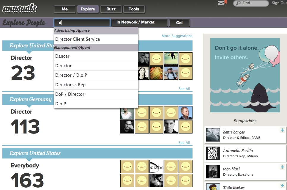
The unusuals network is of course the answer. We combined the transparency that it needs to deliver with the local‐but‐international paradox to arrive at a design where one page handles many tasks:
- organic exploring, starting from this user’s own network;
- organic exploring, starting from anybody else’s network;
- organic exploring of the filmmaking market of a city, country or the world;
- recruit people, starting from this user’s own network;
- recruit people, starting from anybody else’s network;
- recruit people within a filmmaking market of a city or country.
Conventionally this would lead to up to six different web pages, each designed differently and fragmenting the experience. Shown below is how we designed it: in a natural, unified—if at first sight maybe even unspectacular—way. Starting with exploring:
Adding filtering for a certain role:
Or take as starting point the network of people one trusts, or a certain market:
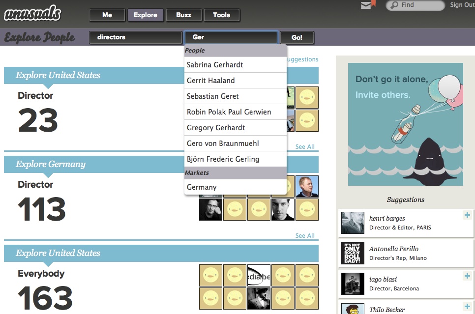
What we see is user interaction shaped by working methodically; combining the product vision, user scenarios and the understanding of how users tick.
splendid isolation
unusuals being an exclusive network is a great thing. It really helps to focus while designing, creating a place where this user group will feel right at home. Which can only help to build the network. But it will also help the network to survive.
What is it that destroys social networks? It is that cool innovators—who are the gravitational force that builds a network—do not want to be seen in the company of people who they consider ‘clowns, jerks and definitely uncool.’ So they leave networks when they feel overrun by these types, adopting a new, hip hangout for themselves. As usual, this is followed by an exponentially rising tide of invites that builds this next network.
lean and mean
My conclusion is that all general networks must die. By which I mean that these networks have the same life cycle as boy bands: every couple of years there is another bunch that dominate the charts. It is just a fashion/trend cycle, driven by these cool innovators.
I believe specialised, exclusive networks have much greater staying power. By keeping out people who are definitely not insiders, reasons to leave can be kept below the threshold of the cool. This why I am happy that the unusuals followed through with keeping it exclusive:
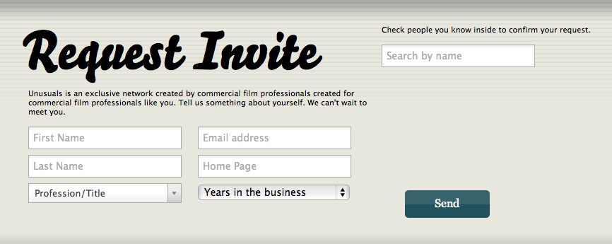
To join unusuals you have to be invited. And to be invited you have prove your credentials. Modelled on real‐life strategies of getting past the doorman of an exclusive club, there is two ways to do it. Either ‘do you know who I am?’ or ‘people are waiting for me inside.’
you can’t touch this
What became of the kitchen party? There is no part of the unusuals site that can be identified as its tangible representation. But as the unusuals pointed out in their feedback, it is everywhere. It certainly got mentioned a hell of a lot throughout the project. That helped with finding the right form while designing and also helped with important decisions.
Having you own offbeat concept like the kitchen party really works like a conspiracy within the design and development team. It does keep everyone pushing in the right direction.
paper + clip
With the kitchen party comes the curious host, who keeps the party going by discreetly asking a question or two to participants and using that to establish new connections and interactions. Again, this is not directly tangible. Do not expect Clippy, the curious host.
Instead, it resulted in a policy: no form‐filling, beyond the bare minimum, like on the request for an invite. There is no duty for users to reveal information about themselves, only opportunities. ‘See that cool sneaker spot? Yeah, I edited that.’ You can then count on the vision of a exclusive, professional network; that users will take the opportunity to profile themselves.
talk talk
And now for some social interaction. Among all that initial functionality on post‑its there was all sorts of communication. Private messaging, group discussions, comments, following, feeds, tweeds, et cetera. Each of these looks ‘easy’ to add. In reality we underestimate the effort because they are ubiquitous, infrastructure type of functionality. We tend to forget about all the details that need to be designed and implemented for each.
Part of my job is to exactly point out these implications. And to show how much work it would be to integrate these with each other, as well as having to explain to users why all these have to exist within unusuals. For example, private messaging is covered well by good old email. No need to duplicate it. It was time for me to say: ‘Pick one. Which form of communication is the most important for your vision?’
crashing the party
Fast forward to a round of brainstorming, where the vision of transparency was combined with a look at how people communicate at a real‐life kitchen parties: two or more people conversing with each other anyone standing close enough can listen in. And anyone who has something to contribute can join the conversation.
That is how conversations were designed at unusuals. Starting with a comment to a film, or person A starting talking to person B. When someone answers it is a conversation, anyone can join to broaden it. Nice detail that there is no ownership of any given conversation, they are simply attached to all persons and content involved.
the right stuff
The best part of this is that the unusuals own this stuff. No, not like in software patents. I mean they worked it out themselves. The worst you can do when developing user interaction is blind copying: ‘facebook has a wall; so must we. They are quite successful.’ Not really much better is the ‘not invented here’ attitude. ‘facebook has a wall; that will not happen to us. We must invent something unique.’
The correct way to develop user interaction is to work through the methods outlined above, beginning with that you’ve got to have a vision. If then your design is quite similar to something already existing, then that is OK. You arrived at it independently, from your own strength.
During the unusuals development period this year, facebook changed the behaviour of its ‘wall.’ Two weeks ago I asked the unusuals what they thought when that happened. They said that they could not care less. They have their own thing, which is right for them and their users. They have their independence.
red carpet day
Further brainstorming produced premieres, of course based on the film business. It solves the problem of how a crew that worked on a film can be kept up to date of the release of said commercial. unusuals lets members schedule a premiere of a new commercial. Those closely involved with its release will do so, out of pride and/or as part of customer service. Via invitations and organic networking the crew gets to hear about the upcoming premiere.
And here the curious host principle pays off. Any member checking out the premiere has to opportunity to put himself with a simple action on the crew list of the film (yes, there is peer review to fight abuse). This action (soft‐)connects the crew: they have worked together. We see again how important content is for starting social interaction and building the network.
quattroporte
The unusuals had a dream. They asked me if the site could feel really simple. Like only needing four departments to structure the whole site. Problem was that at that time their straightforward classification of their functionality called for nine departments. So I thought about it for a short while and the answer is: yes, you can.
There is no standard recipe for achieving this simplification. Solving it is quite an intuitive design process. Full understanding of the product vision and how users tick goes into it and suddenly, it gels. The understanding that exploring the network, keeping up with social activity and users presenting themselves were the most promising categories to put top‑level. Then the functionality overview is used as a work list to check and place everything:
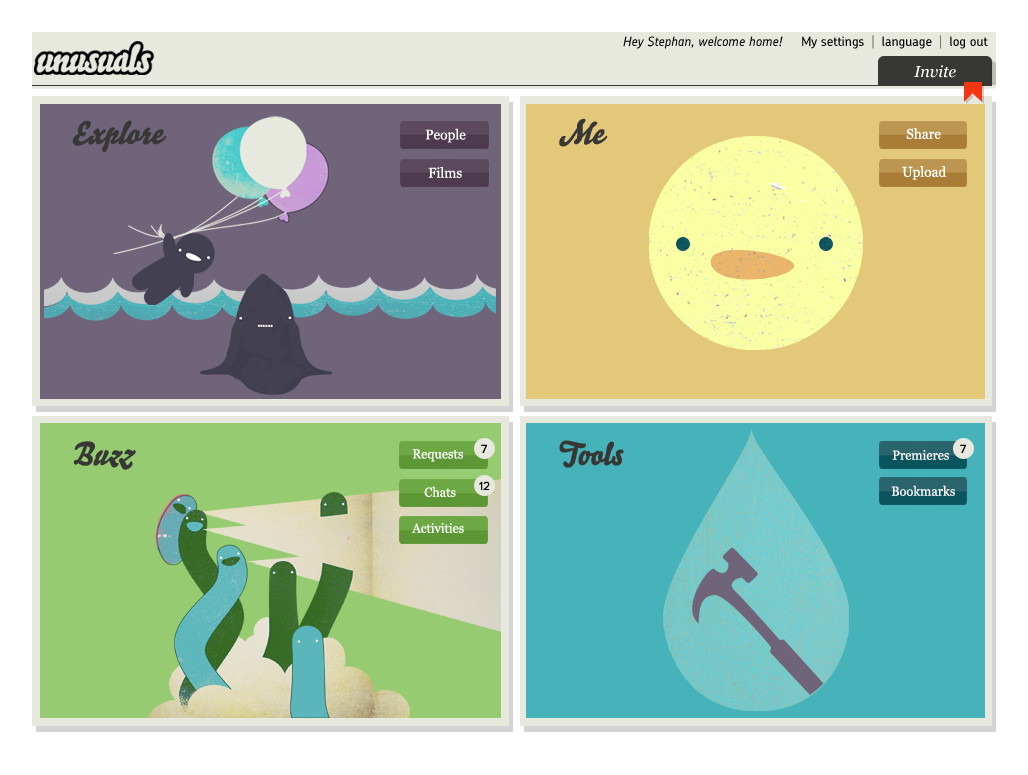
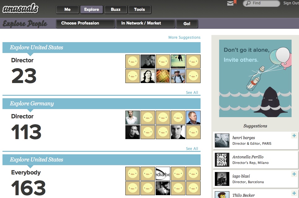
Top‑left is the Explore section we saw before. The Me section is all about this particular user (profile, settings, media uploaded and associated with) and the Buzz covers anything social and dynamic in time. Finally the Tools section offers room to expand. For instance managing premieres belongs there.
get the most out of it
Phew, already a long haul and it still only covers part of what we were able to achieve during this modest, ten man‑day project. So I asked myself: how come the unusuals got so much out of this? I think it is because:
- The unusuals were fully open to process change. Introducing proper interaction design means that things cannot stay as they were before. Because unusuals is a startup it was more a case of process shaping, but still they got it without a need for heavy discussion.
- The unusuals reached out to get a professional on board to work on their user interaction. And they were determined not to go it alone. They kept looking until they found a partner that fitted their needs; then without further ado started our project.
And here we have the acid test. Without these two, really nothing is going to happen. You cannot bolt on some usability or interaction design consulting to the side of you regular development process and expect results. For that they have to become the core of your process. Similarly, doing serious work takes experienced professionals that you trust. When both of these points are not in place, then all that is left is talk, about improving usability and having a great user experience. Read more about process integration—from last year’s WUD.
What also really helped is that at unusuals I was working directly with deciders. People who, without distractions, put their 100% in making the best product they can.
live and learn
A nice aspect of my job is that you always learn something new, it keeps things interesting. What I learned from the unusuals is that especially for startups, structuring is more than half the work—I explored that deeper in a previous blog post. They stressed that they really valued the methodical approach to the project.
The second thing I learned takes that to the next level. The unusuals insisted that the early methods—product vision, functionality, user scenarios—liberated them. They could stop talking about unusuals on other peoples terms, start with a clean sheet and express what and how they wanted to create themselves.
This really bowled me over, I had never looked at it in this way. I use the methods for information transfer and as a solid foundation of the interaction design. That these methods can work emancipating for my clients, well, I keep that in mind from now on.
the ins and outs
The final lesson learned is that a social network like this is a living thing. The growth and dynamic of the network definitely forms another channel of feedback that goes into the evolving interaction design.
Working with the unusuals was a blast. I am proud of what we achieved in such a short time. Normally this would be the point where I say: check it out, unusuals.net. But the chance is high that you are not in the advertising film business. So you won’t get in. But that is actually a good thing.
Labels: lecture, practical, process, product vision, startups
If you like to ask Peter one burning question and talk about it for ten minutes, then check out his available officehours.
 Peter Sikking is an
experienced
Peter Sikking is an
experienced
interaction architect. He unabashedly puts
shipping great products at the centre of his design practice. He is known for
his work for Google, Nokia, the
Metapolator &
GIMP
open source projects,
and startups.
What is Peter up to? See his /now page.
- info@mmiworks.net
- +49 (0)30 345 06 197
- imprint