 our blog
economic outlook
16 June 2007, 01:02
two interesting articles in this week’s The Economist. First one is the leader article that accompanies the cover:
Some of my favourite snippets:
‘…Apple illustrates the importance of designing new products around the needs of the user, not the demands of the technology. Too many technology firms think that clever innards are enough to sell their products, resulting in gizmos designed by engineers for engineers.’
‘But too few technology firms see “ease of use” as an end in itself.’
‘Listening to customers is generally a good idea, but it is not the whole story. For all the talk of “user‐centric innovation” and allowing feedback from customers to dictate new product designs, a third lesson from Apple is that smart companies should sometimes ignore what the market says it wants today.’The Economist, Lessons from Apple, June 7th, 2007
economic brain scan
Second, there is the portrait of Mark Shuttleworth of ubuntu. More snippets:
‘A successful South African entrepreneur during the dotcom era, he wants open‐source zealots to lose their religion and concentrate on ease‐of‐use instead.’
‘…open‐source software lags behind in many areas too, Mr Shuttleworth admits. “The community tends to build for functionality, not for comfort,” he complains. “We have to inspire the free‐software world to make the user environment attractive. This takes an order of magnitude more work.”’The Economist, Bringing free software down to earth, June 7th, 2007
business 101
The Economist sets the agenda for business leaders and other decision makers. The more remarkable then that innovation in user experience is in effect their front‐page story. The snippets above resonate with my everyday business.
‘by engineers for engineers’
This is the norm in software today. Remarkable are the few—and I mean just a few—pieces of software in the world that actually have a functioning user interface. I say it is remarkable that the world puts up with this situation.
One of the things I have to accomplish in each of my projects is to get accepted that UI decisions can no longer be based on the technical structure of the code, nor on the personal user preferences of the developers. They can only be based on solid interaction architecture.
‘an end in itself’
A decent UI is seen as a ‘nice enhancement,’ something we can work on ‘after we have shipped this important version.’ Somehow unusable, off‑putting or productivity‐wasting interfaces are not a serious bug.
The companies I work with are the ones who have realised that in any piece of software that has a UI, the value is created by users, and user interaction can make or break this.
‘ignore what the market says’
Software innovation is not born by listening to markets, and UI improvement does not result from listening to users. Both follow from a keen understanding of what markets or users need.
It is exactly this keen understanding of what users need that companies seek when they approach m+mi works. It is the essence of what we deliver.
‘concentrate on ease‐of‐use’
Usability of open‐source software is generally bad, but that of commercial software is only a fraction better. I see the factors of literally being made ‘by engineers for engineers’ and too much development at the whim of users contributing to the worse position of open‐source software.
The methods that I introduce in the projects that I work on have the same effect in the commercial and the open‐source world: a new awareness that we are not making the software for us, and that value and innovation is created within the project team, if we underpin the UI with a solid concept.
‘an order of magnitude more work’
Yes, it takes work to replace the unusable user interfaces of today with something that actually functions. We are not talking a slight tweak here. But that does not mean doubling the number of GUI developers, and therewith quadrupling the amount of discussion in the project team.
The companies I work with get the specialist in, to do the heavy UI concept work. This stops the discussions in the project team, and lets the developers concentrate on what they do best: engineering of user interfaces.
Labels: fundamental

linuxTag, printingTag
10 June 2007, 19:32
Last week the linuxTag expo and conference was held here in berlin. It was also the site for the openPrinting in‑between UI summit. I had set for this occasion the goals of showing mock‑ups of what we thus far had only been talking about and to start getting the linux UI platforms (KDE, gnome) involved.
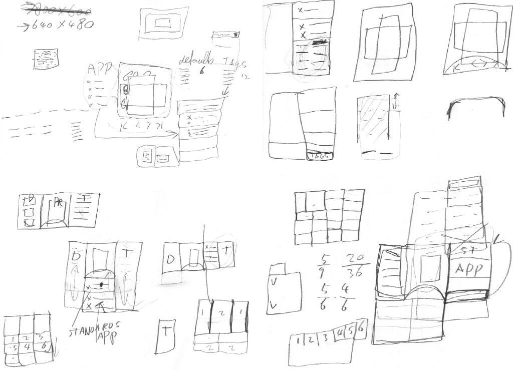
from thoughts to paper
To prepare, I spent a day sketching the printing dialog, together with Andrea Alessandrini—my associate on this project. We had set ourselves the target of ‘fits on a 640×480 screen.’ Dialogs need a modest size, and this way it can still be used on mini‐sub‑notebooks.
In this dialog we have to show the sections that form the core of our solution:
- quick presets
- aka printing defaults; with one click, the printer is set up for what one wants to do: print a high‐quality photo, a document, some internet images; these presets ship with the printer for instant success, and users can make their own; quick presets need to be directly clickable, not in a pop‑up menu, else they are not ‘quick’ enough.
- preview
- a square area (shows portrait + landscape) where one can preview if the print is correctly transformed to paper; shows also staples, punched holes, duplex, watermark; includes controls for flipping through the pages; the preview needs to be big enough to be reliable, but no need to be able to read text on the page either.
- tags
- these stand for the aspects of printing that can interest users; by selecting one or more tags users configure their own dialog; using the tags should be effortless, users should not even notice that they are configuring their dialog.
- printing parameters
- these really control the printing in detail; the number of parameters that need to be displayed varies and depends on the tags selected.
Most of the day saw us probing where to put the tags, and how to cope with this seriously varying number of printing parameters:
from paper to screen
The weekend before the linuxTag was spent making mock‑ups of the dialog for general inkjet printers. Yes, they are in windows look + feel, but that happens to be a neutral position in the great KDE vs. gnome stand‑off. Andrea used visio, which comes with a windows l+f template, so we did not need to reinvent the wheel. But first:
- disclaimer
- this is a quick‐and‐dirty lash‑up to show you what we mean; there are for sure some things missing and lots of small issues to solve; enjoy nonetheless…
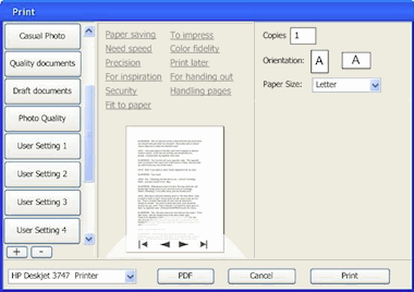
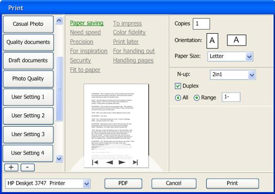
Keeping that in mind, here is the dialog in default appearance: no tag selected:

The quick presets are in the left column, with two buttons to add and delete presets. Tags are shown in the centre column, with the preview below them. The preview has a semi‐transparent heads‑up display for page navigation. In the right column are the printing parameters, showing here only the absolutely essential.
many–to–many
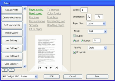
The tags shown are just examples to demonstrate that they do not only cover technical aspects of printing, but also user experience aspects. Here is the relationship between three of the tags (left) and their seven parameters:
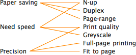
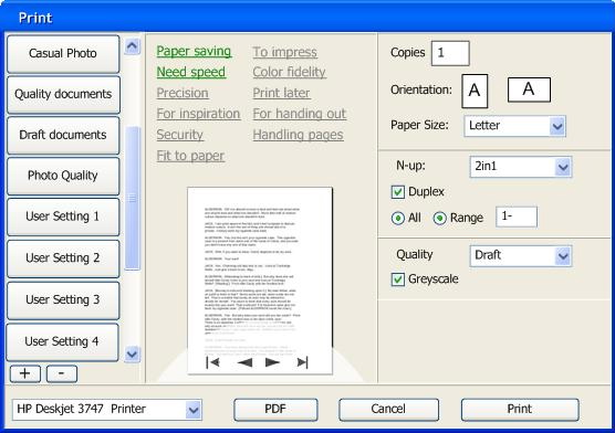
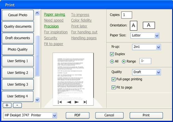
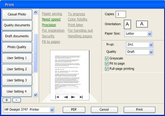
Note how each tag is connected to a low number of parameters. And how two of the parameters (N‑up, Print quality) each belong to two tags. The parameter section builds up according to the tags selected:
Full size dialogs: 1 tag, 2 tags, 3 tags. Which tags were selected will be persisted on a user + printer + application basis. This means that users optimise the dialog for each application they print from.
When even more tags are selected, The dialog will grow vertically to accommodate the extra printing parameters. The centre and right column have the same width, so parameters can be placed in both.
design decisions
The actual tags, parameters and their mapping come straight ‘from the printer,’ e.g. the driver or the PPD. It is ultimately the interaction designer that works for the printer manufacturer who decides what makes sense for a particular printer model.
Our team will set the standard here by designing tags and mappings for the seven printer clusters that we are working on. Usability surveys and test will be used to fundamentally answer the question ‘what aspects of printing do actually interest users?’
think different
For manufacturers, the tags are an excellent way of differentiating themselves. Not by introducing a tag ‘manufacturer xyz’ and associating some proprietary parameters with it. Instead, by representing unique benefits with a tag:
Say a manufacturer has a line of office printers of which the unique selling point is that these make your meetings 33% shorter (cool). Then introducing the tag ‘Shorter meetings’ and associating the parameters that enable that is the way to go.
expert evaluation
At the linuxTag, the openPrinting interaction architecture and usability team met, together with project organiser Till Kamppeter. The usability and interaction experts present (Celeste Lyn Paul, Jan Mühlig and me) discussed the dialog mock‑ups.
We found the concept in general really promising. It can be a definite improvement over the current printing dialogs of any desktop platform. But:
- printer selection pop‑up at the bottom? from looking at the task logic it needs to be at the top of the dialog;
- there can be confusion over what a quick preset does (change the printer settings, not any dialog parameter display) and what a tag does (change the parameter display in the dialog, not any printer settings); the dialog could do more to avoid this confusion;
- there needs to be a stronger relationship between the tags and the the parameters shown; a stronger showing of cause and effect.
These combined would probably cause this dialog to fail a usability test. The good news is that for us it is straightforward to sit down and solve these points. We are working on it.
automatic for the people
I was anxious to hear what Josef Spillner, our resident guru on auto‐configuring dialogs, had to say about the feasibility of our concept. The fact that parameters can belong to multiple tags makes for tricky grouping of parameters. This is not your fathers’ dialog with tabs:
Full size dialogs: first, second, third
Josef thinks that he and his team can crack this puzzle. We discussed the additional challenges of keeping parameters grouped in a logical way and giving the interaction designer that works for the printer manufacturer the means to override the auto‐configuration in exceptional cases.
all aboard
The first contact with folks from KDE and gnome and their respective UI toolkits, Qt and gtk, was very encouraging. My demo with the mock‑ups created a lot of enthusiasm, and the tag system was perceived uniformly as ‘very cool.’
LinuxTag was the first step on the road to cooperation. In the next weeks more steps will be taken, together with both the gtk community and Trolltech.
Labels: design stage, openPrinting, practical
teaching interaction
6 June 2007, 00:43
Mid‐May I was for a week at the FH Vorarlberg, Austria, to teach interaction design. I had arranged for the students to work in project teams: to create a concept for real‐world software, under real time pressure, with a real presentation at the end of the week.
I had asked the students to prepare by reading specific articles about activity based design and my own methods. However, they not know what software they would be designing for. Let’s jump in like they did.
monday morning, 9:00
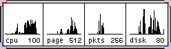
After getting acquainted, I introduced the software we would be working for: ksysguard, performance monitoring for KDE. Showing processor; memory; network or disk usage, et cetera.
design brief
When I first put my eyes on ksysguard, I thought ‘this application needs an overview,’ a summary that shows the essential. So I set the goal to design a cool object for the desktop, that at a glance informs about the performance and stability of the local or a remote machine.
Oh, and anything that looked like the same old graphs that have been around for twenty years was forbidden.
first things first
While preparing for the course, I had interviewed our customer, the developer of ksysguard, for several hours via irc. It was a typical interview to find out the product vision of the software: what it is; who should be using it and what value does it deliver.
I went with the students through the complete interview, then we discussed and wrote down a product vision:
ksysguard allows to monitor different soft‐ and hardware parameters that influence the performance and stability of a local or remote computer system.
It allows tech‐knowledgeable users, or admins of a few computers, to detect and go to the bottom of (rising) problems, and do something about them.product vision of ksysguard
The product vision was then approved by the developer.
User scenarios could be skipped for this project. I realised that there is not a wide variety of use that needs to be reduced to the essential. We spent the rest of the day sorting out the functionality that should go into our desktop overview, according to the product vision.
tuesday…
…concept day. I divided the students into two teams and sent them on their explorations. They had to solve the problem of mapping these machine parameters (processor, memory, et cetera) to different display dimensions.
The display dimensions include space, 2‑D or 3‑D; color; transparency; time; texture and animation.
vision driven
Being the part‐time team leader of both teams, I maintained the overview for both teams and ensured that they were solving the right problems. I encouraged the good concepts they came up with, and steered them towards alternatives for the not‐so‑good.
Time and time again, I made a team check the product vision, to focus on the ultimate goal. Aspects like ‘monitor’; ‘performance’; ‘stability’; ‘detect and go to the bottom’ had to be realised by us.
wednesday
The concepts where gelling, we moved from pencil + paper to mouse + screen to prepare for the presentation. An A0 poster and a short animation film had to be produced.
I focussed both teams on producing the minimum of concept visualisation that would have a maximum of impact. One should not have too much blood, sweat and tears invested in a concept, to be able to ditch it when a better solution crystallises.
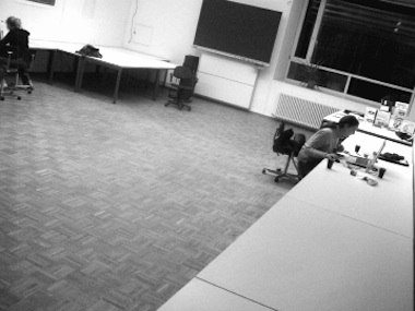
The teams moved out of our classroom. Christian and Andrea (team 2) worked in parallel at the mac‑pool…
…while in their atelier, Katharina and Verena (team 1) worked on opposite ends of the project:
thursday
Crunch time. In the morning I had both teams sketch out a quick script/storyboard for their film. This way they could keep track of what they really needed to produce and I knew they would not lose the plot.
I showed the teams how to structure their poster. Instead of just showing all the cool stuff, it is better to show first that it was not divine intervention that produced the design, but methodical work.
friday
Usability day at the FH Vorarlberg. Theme: ‘inform with computer animation.’ It was no coincidence that my course was tacked before the uDay, it gave us a real deadline and a real venue for presentation.
I had selected ksysguard from the list of projects at openusability.org because of the animation angle. Animation comes natural when handling real‐time data.
showtime
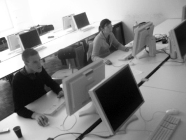
Bleary‐eyed from finishing the film and poster the night before, we exhibited throughout the uDay to usability and animation professionals:
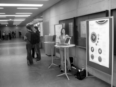
I made that into a crash course in engaging people at exhibitions or trade fairs. And an introduction to the number of interesting conversations one can expect during such a day.
Visible in the photo above are the posters:
Watch out, those pdfs (1, 2) are 3.3 MB large. Now, let’s have a look at the individual concepts.
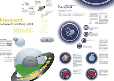
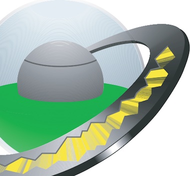
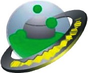
team 1
Disco mirror ball; Saturn ring; lava lamp; the meatball in the pea soup. It was fun discussing concepts with Verena and Katharina. But as usual, these far‑out discussions delivered results.
See the film on youTube.
I am impressed with how they use two dimensions of the ring to display on. On the side of the ring is the instantaneous value of load and cpu usage, and on the top of the ring is the five‐minute history of both:
They did have to take the hard choice to not go into multi‐processor details here, but that choice paid off handily.
I also like a lot how they used animation to display a parameter. When a disk partition starts running out of space, the green fluid starts bubbling, lava lamp style:
The more critical the free space situation gets, the more hectic the animation becomes: cool metaphor.
For more details, check out the poster.
 The work of team 1 is licensed under a
Creative Commons Attribution‐Share Alike 3.0 License.
The authors are: Verena Mayer, Katharina Seidowski and peter sikking.
The work of team 1 is licensed under a
Creative Commons Attribution‐Share Alike 3.0 License.
The authors are: Verena Mayer, Katharina Seidowski and peter sikking.
team 2
‘Circles must be in fashion this year’ I thought when I saw the lyrical sketches from Andrea and Christian. On that Tuesday team 1 was also ‘going in circles,’ and I feared we were going to end up with very similar concepts.
See the film on youTube.
I am impressed with how they worked hard to keep the ‘nothing to worry about,’ everyday look of the desktop object very clean by employing several strategies:

First, they introduced a level of drill‐down in the desktop object, displaying details in ‘pods’ around the central ring. This way details for up to 16 processors cores; disk partitions or memory hogging applications can be shown:

I like how this enables users to monitor details of one parameter for a while.
Second, when an certain parameter needs user attention, then the ring that represents it not only gets an opaque centre, it also grows in size:

This is a clever use of screen space. Whenever users’ attention is needed or users focus on details, most of the overall circle is used for that.
For more details, check out the poster.
The work of team 2 is licensed under a
Creative Commons Attribution‐Share Alike 3.0 License.
The authors are: Andrea Thum, Christian Haudum and peter sikking.
looking back…
I had a great time teaching at the FH. I would like to thank Philipp von Hellberg for cooking this up with me, and the FH staff for making everything run smoothly.
And thanks to Katharina, Christian, Verena and Andrea for working so hard with me on this project.
Labels: practical, product vision, teaching
If you like to ask Peter one burning question and talk about it for ten minutes, then check out his available officehours.
 Peter Sikking is an
experienced
Peter Sikking is an
experienced
interaction architect. He unabashedly puts
shipping great products at the centre of his design practice. He is known for
his work for Google, Nokia, the
Metapolator &
GIMP
open source projects,
and startups.
What is Peter up to? See his /now page.
- info@mmiworks.net
- +49 (0)30 345 06 197
- imprint
