 our blog
bicycle, node, network, design
14 September 2016, 10:25
For a full transcript, read on.
ring ring
There are two things that you need to know about me. The first is that I am dutch and the second is that I am becoming a sentimental old fool. I combine the two when I do cycling holidays in Holland:
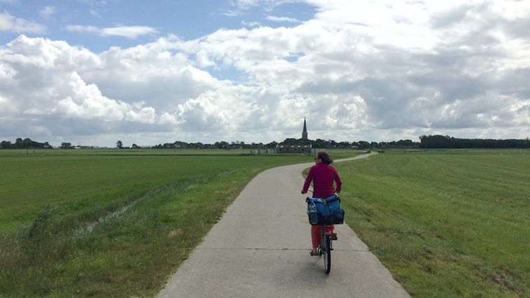 my partner Carmen leads the way
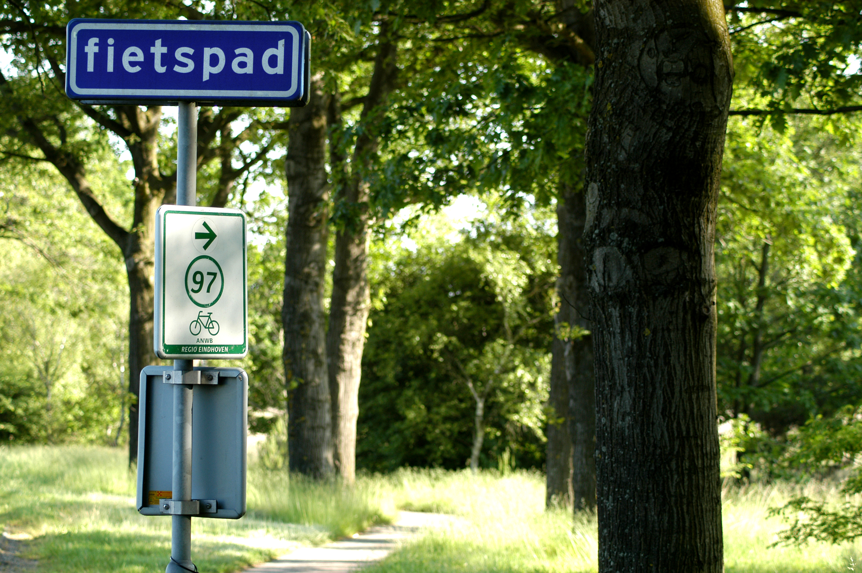
For this we use the fietsroutenetwerk, the bicycle route network of the Netherlands. This was designed for recreational cycling in the countryside. It was rolled out between 2003 and 2012. The network is point‐to‑point:
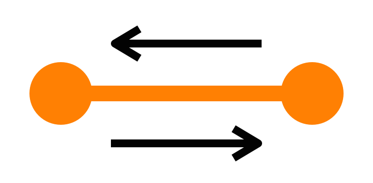
Between two neighbouring nodes there is complete signage—with no gaps—to get you from one to the other. And this in both directions. Here are some of these signs:
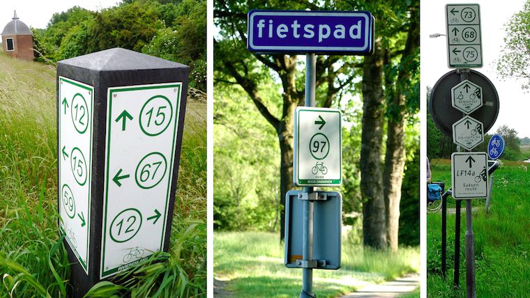 sources: fietsen op de fiets,
het groene woud,
gps.nl
sources: fietsen op de fiets,
het groene woud,
gps.nl
The implicit promise is that these are nice routes. That means: away from cars as much as possible. And scenic—through fields, heath and forrest.
Using the nodes, local networks have been designed and built:
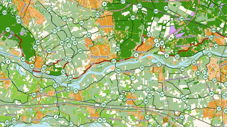
These networks are purely infrastructural; there is no preconception of what is ‘proper’ or ‘typical’ usage. They accommodate routes of any shape and any length.
At every node, one finds a local map, with the network:
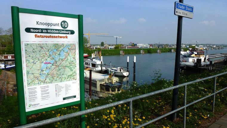 source: wikimedia commons
It can be used for planning, reference and simply reassurance. Besides that, there are old‑fashioned maps and plenty of apps and websites for planning and sharing of routes.
The local networks were knitted together to form a national network:
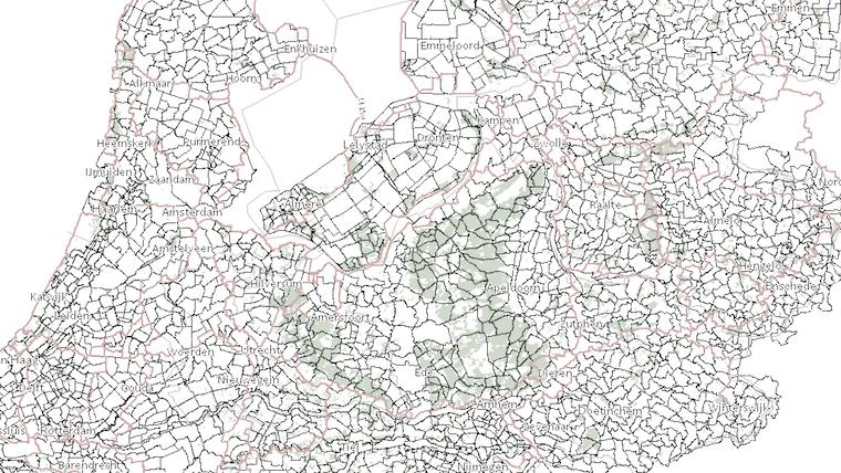
Looking at this map I see interesting differences in patterns and densities. I don’t think this only reflects the geography, but also the character of the locals; what they consider proper cycling infrastructure and scenic routes.
The network was not always nation-wide. It was rolled out over a period of nine years, one local network at the time. I still remember crossing a province border and (screech!) there was no more network. It was back to old‑fashioned map reading and finding the third street on the left.
not invented here
I was shocked to find out that the Dutch did not invent this network system. We have to go back to the 1980s, north‐east Belgium: all the coal mines are closing. Mining engineer Hugo Bollen proposes to create a recreational cycling network, in order to initiate economic regeneration of the region. Here’s Hugo:
 source: toerisme limburg
He designed the network rules explained in this blog post. The Belgians actually had to build(!) all of the cycling infrastructure, so it took them to 1995 to open the first local network. It now brings in 16.5 million Euro a year to the region.
how many?
I got curious about the total number of network nodes in Holland. I could not find this number on the internet. The net is really quite short on stats and data of the cycling network. So I needed to find out by myself. What I did was take one of my maps—
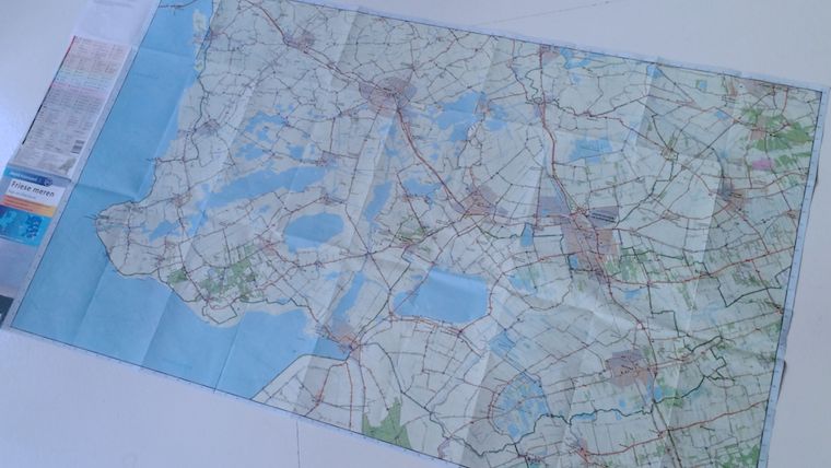
And I counted all the nodes—there were 309. I multiplied this with the number of maps that cover all of Holland. Then I took 75% of that number to deal with map overlaps and my own over‐enthusiasm. The result: I estimate that the dutch network consists of 9270 nodes.
in awe
The reason I got curious about that number is that every time I use the network, I am impressed by a real‐genius design decision (and I don’t get to say that very often). It makes all the difference, when using the network in anger.
All these nearly‐ten thousand nodes are identified by a two‑digit number. Not the four (or more future‐proof, five) one would expect. All the nodes are simply numbered 1 through 99, and then they start at one again. And shorter is much better:
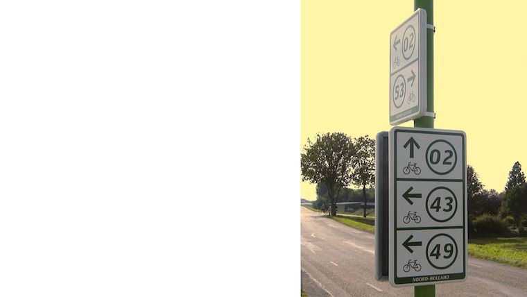 source: recreatieschap westfriesland
Two digits is much faster to read and write down. It is easier to memorise, short‐term. It is instant to compare and confirm. Remember, most of these actions are performed while riding a bike at a nice cruising speed.
but…
Pushing through this two‑digit design must have been asking for trouble. Most of us can just imagine the bike‐shedding: ‘what if cyclists really need to be able to uniquely identify a node in the whole nation?’ Or: ‘will cyclists get confused by these repeating numbers?’
This older cycling signpost system has a five‑digit identification number:
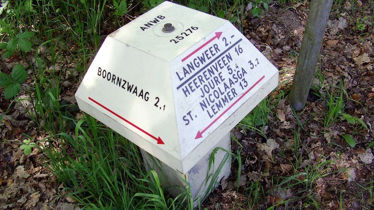 source: dirk de baan
This number takes several steps to process. Two‑digit numbers are humane numbers. They exploit that way‐finding is a very local activity—although one can cover 130km a day on a bike.
whatchamacallit?
Wrapping up, the cycling network is a distributed network:
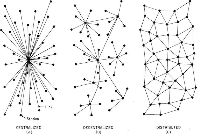 source: j4n
All nodes are equal and so are all routes. Cyclist route themselves. In that way the network works quite like… the internet.
We could call it the democratic network, because it treats everyone as equals. Or we could call it the liberal network (that would be very dutch). Or—in a post‐modern way—we could call it the atomised network.
I simply call it the bicycle route network of the Netherlands.
Labels: infrastructure, lecture, practical, top story



designing interaction for creative pros /4
30 May 2016, 20:08
Part one urged to make a clear choice: is the software you’re making is for creative professionals, or not? Part two was all about the rally car and the need for speed. Part three showed the need to support the free and measured working modes of masters.
We start by revisiting the cars of part two.
party like it’s…
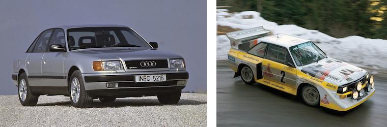
It is no coincidence that I showed you a 1991 family car and a 1991 rally car:
 source: netcarshow.com
and imgbuddy.com
source: netcarshow.com
and imgbuddy.com
I did that because our world—that of software for creative pros—is largely stuck in that era. And just like 1991 king‐of‑the‑hill cars (even factory‐mint examples found in a time capsule), this software is no longer competitive.
 yes, it’s pants! source:
charliepants.com
yes, it’s pants! source:
charliepants.com
It is my observation that in this field there is an abundance of opportunities to do better. If one just starts scratching the surface, on a product, workflow, or interaction level, then today’s software simply starts to crumble.
testing, testing, one two
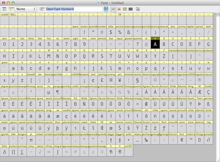
For instance, while doing research for the Metapolator project, I asked some users to show me how they work with the font design tools of today. They showed me the glyph range, the central place to organise their work and get started:
They also showed me the curve editor, where the detailed work on each glyph is done:
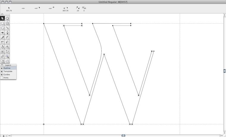
Both of them need the whole screen. In a short amount of time I saw a lot of switching between the both of them. I sensed wasted time and broken flows. I also saw tiny, slow handles in the editor. And I thought: this cannot be it.
They also showed me, in another program, designing in context:
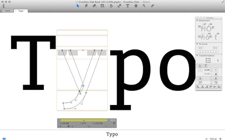
I immediately sensed this was a big deal. I saw that they had pushed the envelope—however, not broken through to the other side.
Besides that, I observed that editing was done in outline mode (see the ‘y’, above), but evaluation is of solid black glyphs. Again I sensed broken flows, because of switching between making and evaluating. And I thought: this cannot be it.
Frank sez…
Enough of that; let’s zoom out from my field report, to the big issue at hand. To paraphrase Zappa:
‘How it has always been’ may not be quite dead, but it sure smells funny.
The question is: how did we get to this situation? Let me dig through my experience to find some of the causes.
First of all we can observe that each piece of creative‐pro software is a vertical market product; i.e. it is not used by the general population; only by certain masters. That means we are in armpit of usability territory. Rereading that blog post, I see I was already knee‐deep into this topic: ‘its development is driven by reacting to what users ask for (features!) and fear of changing “like it has always been” through innovation.’
go on, have another cake
The mechanism is clear: users and software makers, living in very different worlds, have a real hard time communicating. Where they manage, they are having the wrong conversation: ‘gimme more features!’ —‘OK, if that makes you happy.’
What is happening today is that users are discussing software made yesterday. They are not able to communicate that their needs are so lousily addressed. Instead, they want some more cherries on top and this cements the position of this outdated software.
Constantly, users are telling software makers, implicitly and explicitly, ‘add plenty of candy, but don’t change a thing.’
This has been going on for decades—lost decades.
bond of pain
A second cause that I want to highlight is that both users and software makers have worked for years to get on the inside and it has been a really painful experience for all of them. This unites them against change.
Thus users have been fighting several frustrating years to get ‘into’ software that was not designed (for them; armpit of usability, remember), but instead made on terms favourable to the software makers.
Software makers spent year after year trying to make something useful. Lacking any form of user research, the whole process has been an exasperating stab‐in‐the‐dark marathon.
Thus a variant of the Stockholm syndrome spooks both parties. They are scarred‐for‐life victims of the general dynamic of the pro‑software industry. But now that they have gotten this far, their instinct is to sustain it.
the point
Two decades of experience shows that there is a way out of this misery; to become competitive (again). There is no incremental way to get there; you’ll have to snap out of it. What is called for is innovation—of your product, workflow, your interaction. A way that unlocks results is:
- user research
Experienced researchers cut straight past the wants and get the user needs on the table. (Obligatory health & safety notice: market research has nothing to do with user research; it is not even a little bit useful in this context.) - design‐driven innovation
When user needs are clear (see point 1), then a designer can tell you any minute of the project—first to last—what part of ‘how it has always been’ is begging to be replaced, and which part is the solid foundation to build upon. Designer careers are built on getting this right, every time.
Skip either point—or doing it only in a superficial, or non-consequential, way—and I’ll guarantee you’ll stay stuck in 1991. Making it happen requires action:
Software‐makers: enthusiastically seek out user researchers and designers and start to sail by them. Stop considering adding features a good thing, stop being a captive of ‘how it has always been’ and trust the accomplished.
picture show
To illustrate all this, let’s look at some of my designs for Metapolator. To be able to solve these problems of contemporary font design tools that I mentioned above, I had to snap out of the old way.
First of all, I pushed designing in context a lot further, by introducing in‑specimen editing:
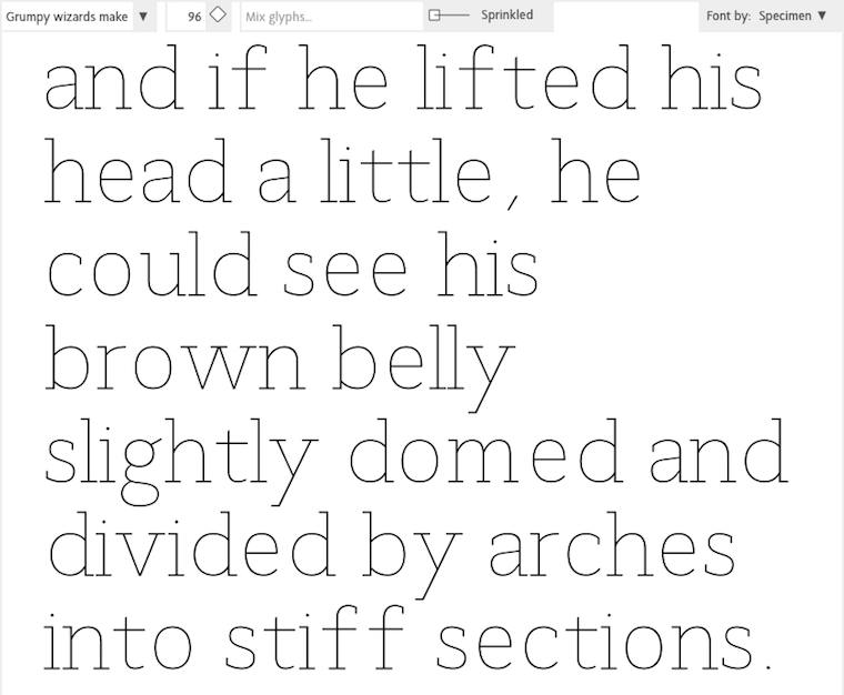
Every glyph you see above is directly editable, eliminating switching between overview and editing. The size that the glyphs are displayed in can be adjusted any given moment, whatever suits the evaluate/edit balance.
‘OK, that’s great’ you say, ‘but every once in a while one needs a glyph range to do some gardening.’ To address that, I used a handy trick: the glyph range is just another specimen:
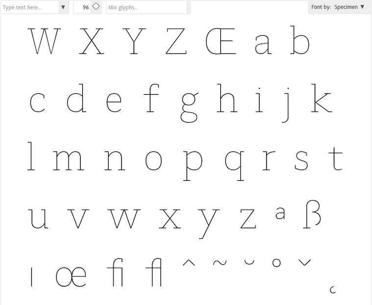
Everybody in the Metapolator team thought I was crazy, but I was dead set on eliminating outline mode. I sensed there was chance to do that here, because the focus moves from working at the edge of the glyph—the high‐contrast black–white transition—to the center line within:
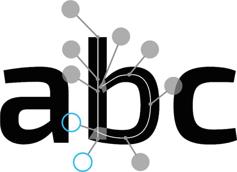
Then there was the matter of offering users generous handles that are fast to grab and use. After brainstorming with Simon Egli, the design shown above was born: put them ‘on sticks’ outside, so that they do not impede visual evaluation of the glyph.
pep talk
In closing: to be good in creative‐pro interaction, I encourage you to—
Do not ask how the past can guide you. Ask yourself what you can do to guide your software for creative pros into the 21st century.
Labels: design stage, lecture, metapolator, practical, product phase, top story
designing interaction for creative pros /3
4 June 2015, 10:13
two‐way street
There are two ways for masters to get the job done. The first way is to start somewhere and to keep chipping away at it until it is right:
 heads up: animated gif
So let’s throw in some material, move and size it (bam, bam, bam)—right, done. That was quick and the result is perfect.
like putty
This is called free working; squeeze it until it feels right. It is always hands‑on and I always move both my hands in a moulding motion when I think of it, to remind me what it feels like.
Although done by feeling, it is still fast and furious. Don’t mistake this for ‘trying out’, ‘fiddling’ or ‘let’s see where we end up’; that is for dilettantes. When masters pick up their tools, it is with great confidence that the result they have in mind will be achieved in a predictable, and short, amount of time.
on the other hand…
The second way for masters to get the job done is to plan a bit and then create a precise, parametric, set‑up:
This is called a jig. Now the master only has to ‘cut’ once and a perfect result is achieved:
 another animated gif
measure twice, cut once
This is called measured working. It is an analytical approach and involves planning ahead. It delivers precise results, to the limits of the medium. You will find it in many places; everywhere where the hands‑on factor is zero, parameters are entered and—bam—the result is achieved in one stroke.
It might be tempting to think that setting up the jig always involves punching in numbers. However also making choices from discrete sets, e.g. picking a color from a set of swatches, is part of it. Thus it is better to talk in general of entering parameters.
old‐skool
I did not make up all this by myself. I am indebted to this very cool book that goes deep into the matter of free and measured working, as practiced for centuries by masters. Luckily it is back in print:

Once familiar with this duality in how masters work, it can be used to analyse their workflows. For instance while reading this article about Brian Eno working with the band James.
In the sidebar (Eno’s Gear) it says ‘I don’t think he even saves the sounds that he gets. He just knocks them up from scratch every time’ about using one piece of gear, and ‘It’s stuffed full of his own presets’ about another. Reading that, I thought: that has, respectively, the vibe of free and measured working.
I have looped that insight back into my designs of creative‐pro software from then on. That is, giving equal importance to users building a collection of presets and knocking‑it‑up‐from‐scratch for tool set‑ups, configuring the work environment and assets (brush shapes, patterns, gradients, et cetera).
(There are more nuggets of that’s‐how‐masters‐work in the Eno article; see if you can spot them.)
the point
And with that I have arrived at rule numero one of this blog post:
All masters work free and measured; the only thing predictable about it is that it occurs 50–50, with no patterns.
We cannot rely on a given master taking the same route—free or measured—for all the different tasks they perform. It’s a mix, and a different mix for every master. Thus design strategies based on ‘remember if this user tends to do things free or measured’ are flawed.
We cannot rely on a given task being predominantly performed via either route—free or measured—by masters. It’s a mix, a 50–50 mix. Thus design strategies based on ‘analyse the task; is it free or measured?’ are flawed.
same, not same
The same master doing the same task will pick a different route—free or measured—at different times, based on the context they are in. For instance how difficult the overall project is. And for sure their own mood plays a role; are they under stress, are they tired (that night shift meeting that deadline)?
Masters will guesstimate the shortest route to success under the circumstances—and then take it.
dig it
With this 50–50 mix and no patterns, software for creative pros has only one choice:
Equal opportunity: offer every operation that users can perform in—at least—two ways: one free, one measured.
If you now say either ‘man, this will double my software in size’, or ‘yeah, my software already does that’, then my reply is: experience says that once we really start checking, you will see that current creative‐pro software achieves 60–80% equal opportunity.
how low can you go?
The question is not how do we prevent this list of operations from ballooning. It is: are there any more innocent, boring, easy to overlook operations to go on our list? For instance: setting the document size. Yeah boring, but often enough key to the creative result. A crop tool is the free way to do that operation.
From the Brian Eno episode above we have seen that it is not enough to filter the operations list by ‘does it change the creative end result?’ There we saw that meta‐operations (set up tools, configuring the work environment and assets) are also fully in scope.
picture show
To illustrate all this, let’s look at some of my designs for Metapolator.
 a final animated gif
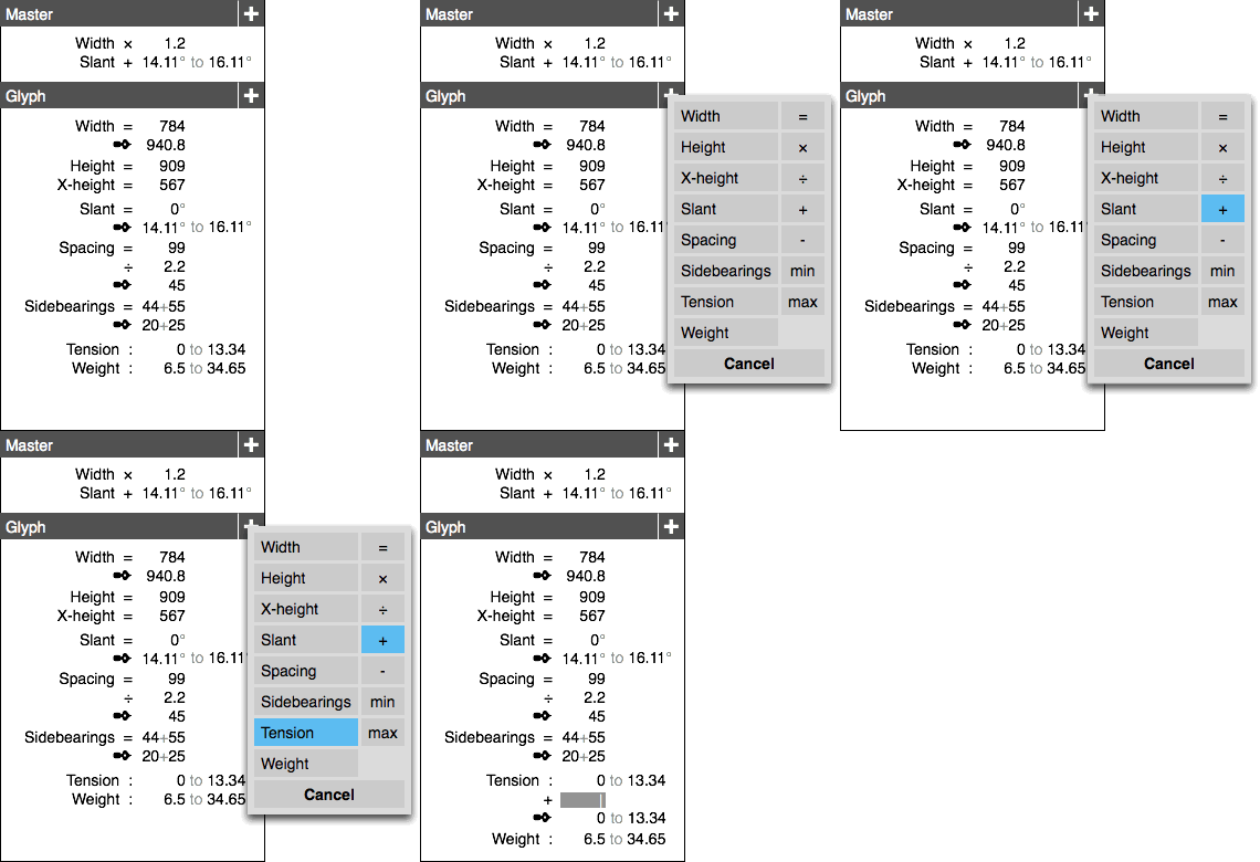
This is measured central: the parameters panel. Literally here parameters are entered and—bam—applied. With the popup action shown the system is taken to the next level. Preferably for wide‐ranging selections, expressions of change (e.g. new value = A × old + B) can be built.
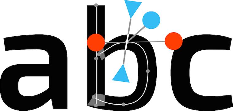
Most on‑canvas interaction is by nature of the free variety. The hands‑on factor is simply up for grabs. In Metapolator this interaction complements the parameter panel shown above to achieve equal opportunity.
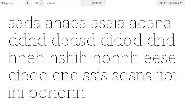
Specimens are a huge factor in the Metapolator design. It is the place to evaluate if the typefaces are right. That makes it also the logical place to squeeze it until it is right: free working.
All on‑canvas interaction is performed directly in the specimens for this reason. If that looks natural and normal to you, I say ‘you’re welcome.’ This is completely novel in the field of font design software.
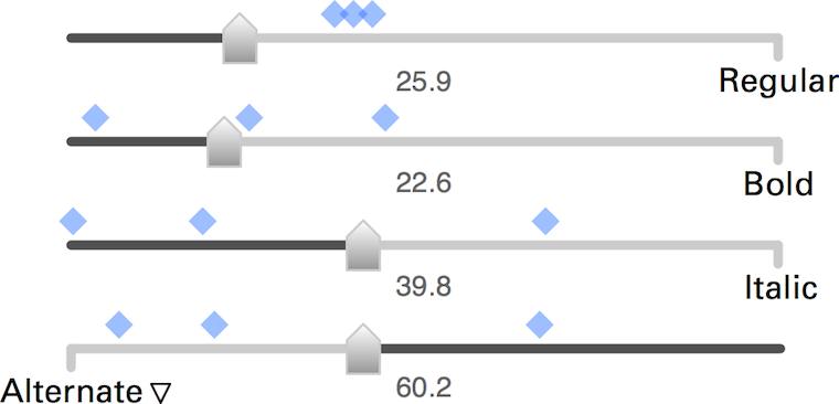
Here are these fellows again, the slider set for freely mixing master fonts to make new fonts. These new fonts are shown by the blue markers, so that users can feel the clustering and spread of these new fonts—clearly a component of free working.
The numbers you see are all editable, also quickly in a row. This supports measured working. That number input is straightforward and gives predictable and repeatable results was a big factor for me to choose the algorithm of these sliders over alternatives.
boom, boom
In short: software for creative pros has to offer every operation that users can perform in two ways: one free—squeeze it until it feels right—one measured—involving planning ahead, entering parameters and ‘cutting’ once.
That’s it for part three. Stay tuned for part four: how to be good.
Labels: design stage, lecture, metapolator, practical, top story
designing interaction for creative pros /2
12 May 2015, 19:29
(here is part one). Let’s check them out.
freude am fahren
First up is the family car:
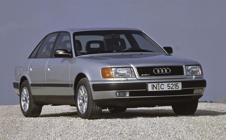 source: netcarshow.com
It stands for general software. It is comfortable, safe and general‐purpose. All you need to use it is a minimum of skills, familiarity and practice—in the case of cars this is covered by qualifying for a driving licence.
In the case of software, we are talking casual and enthusiast use. A good
example is web browsers. One can start using them with a minimum of skills and
practice. After gaining some experience one can comfortably
drive use a browser on a daily basis. If a pro web browser
exists, then it has escaped my radar.
(It would make a very interesting project, a pro web browser. But first a product maker would have to stand up with a solid vision of pro web browsing; its user groups; and some big innovation that is valuable for these users.
vroooom
When I think of creative pro interfaces, I think of this:
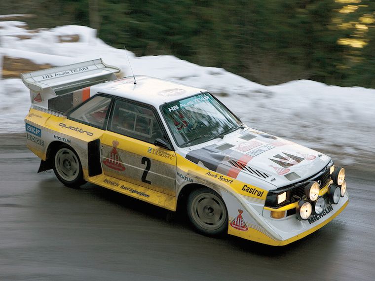 source: imgbuddy.com
The rally car. It is still a car, but… different. It is defined by performance. And from that, we can learn a couple of things.
speed, baby
First, creative pros work fast. They ‘wield the knife’ without doubt. A telltale sign of mastery is the speed of execution. I have this in mind all the time when designing for creative pros.
I vividly remember one of the earliest LGMs, Andy Fitzsimon went on stage and demonstrated combining pixel and vector in one image. The pace was impressive, Andy was performing nearly two operations per second.
Bam bam bam bam. At a tempo of 120 beats per minute; the solid tempo of marching bands and disco. That is the rhythm I aim to support, when designing for creative pros.
command and control
Second, creative pros really know their material, the medium they work with. They can, and need to, work with this material as direct and intimate as possible, in order to fulfil creative or commecial goals. This all can be technology‐assisted, as it is with software, but the technology has to stay out of the way, so that it does not break the bond between master and material.
The material I am talking about is that of film, graphics, music, animation, garments, et cetera. These can be digital, yes. However data and code of the software‐in‐use are not part of a creative pro’s material. Developers are always shocked, angry, then sad to learn this.
Thus Metapolator, has been designed for font designers and typographers who know what makes a font and what makes it tick. They know the role of the strokes, curves, points, the black and the white, and of the spacing. They are experienced in shaping these to get results. It is this material that—by design—Metapolator users access, just that it is organised such that they can work ten times faster.
dog eat dog
Third, it’s a competitive world. Creatives pros are not just in business. Also in zero‐budget circles there are real fun and/or prestigious projects where exactly those with proven creative performance, and ability to deliver, get asked.
Tools and software are in constant competition, also in the world of F/LOSS. It is a constant tussle: which ones provide next‐generation workflows with more speed and/or more room for creativity? Only competitive tools make masters competitive.
the point
Now that we got the picture, here is the conflict. The rules—the law and industry mores—that make good family cars may be a bad idea to apply to rally cars. And what makes rally cars competitive, may simply be illegal for family cars.
Every serious software platform has its HIG (human interface guidelines). It is the law, a spiritual guide and a huge source of security for developers. That is, for general software. It is only partly authoritative for software for creative pros. Because truly sticking to the HIG, while done all in good faith, will render creative pro software non‐competitive.
vorsprung durch technik
Rally cars contain custom parts, handmade from high performance materials like aluminium, titanium, carbon, etc. This is expensive and done because nothing off‐the‐shelf is sufficient.
Similarly creative pro software contains custom widgets, handmade at great expense—in design and development. For a decade I have witnessed that it is a force of nature to end up in that situation. Not for the sake of being cool or different, but all in the name of performance.
tough cookie
So, with loose laws and a natural tendency for custom widgets, can you do just what you like when you make creative pro software? Well no. It is tough, you still have to do the right thing. If this situation makes you feel rather lost, without guidance, then reach out and find yourself an interaction designer who really knows this type of material. Make them your compass.
picture show
To illustrate all this, let’s look at some of my designs for Metapolator.
Speed, baby! Big handles to select and move individual points on the skeleton of a glyph (i.e. direct control of the material). During a brainstorm session with Metapolator product visionary Simon Egli, he noticed how the points could be connected by rigid sticks to big handles.
I worked out the design with big (fast) handles available for furious working, but out of the way of the glyph, so it can be continuously evaluated (unbroken workflow).
This is a custom slider set for freely mixing master fonts—metapolation—to make new fonts. In this case four fonts, but it has been designed to easily scale up to nine or more; a Metapolator strength (vis‑à‐vis the competition).
One of the sliders—‘Alternate’—is in an “illegal” configuration; it is reversed. This is done to implement the rule that the mix of fonts has to always add up to 100%. There is special coupled behaviour between the sliders to ensure that.
The design of this part included a generous amount of exploration and several major revisions. Standard widgets and following the HIG would not deliver that every sliders setting maps to one unique font mix. Apart from a consistency goal, that is also about maximising input resolution. So I broke some rules and went custom.
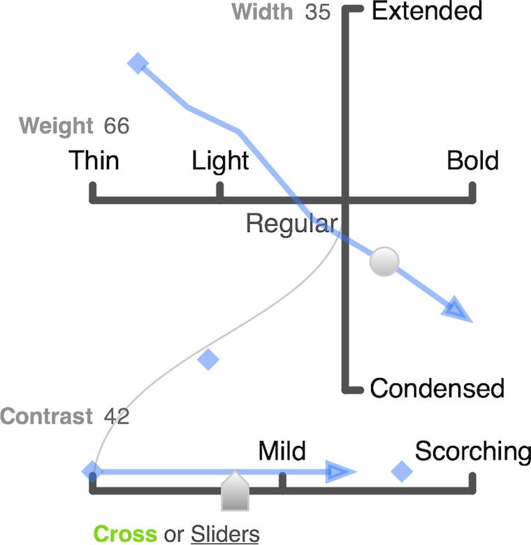
This is also a metapolation control. In this case a three‐dimensional one involving eight master fonts. Working with that many fonts is really a pro thing; you have to know what you are doing and have the experience to set up, identify and pick the ‘good font’ results.
The long blue arrow is a font family, with nine or so fonts as members. The whole family can be manipulated as one entity (i.e. placed and spanned in this 3‑D space) as can each member font individually.
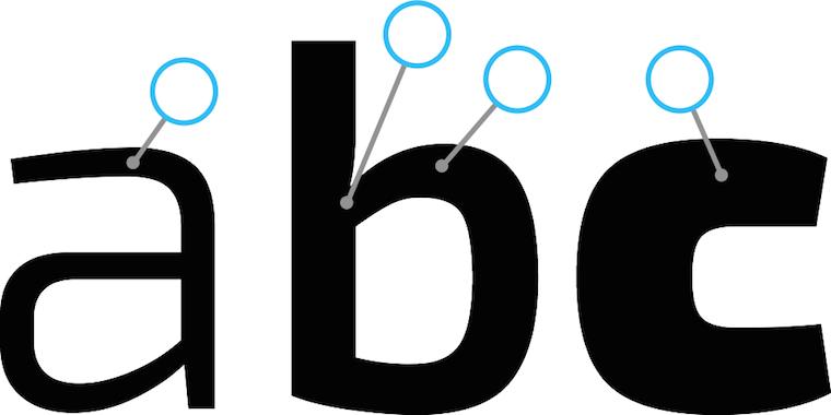
Final example: complex selections. Across three different fonts and three different glyphs, several points have been selected. Now they can be manipulated at the same time. That is definitely not consumer‑grade.
If that looks easy, I say ‘you’re welcome.’ It takes serious planning ahead in the design to allow this interaction; for the three fonts to appear, editable, at the same time; for deep selections within several glyphs to be possible and manageable—the big handles‑on‐sticks help also here.
vroom, vroom
In short: if there is one thing that I want you to take away from this blog post, then it is that image of the rally car. How different its construction, deployment and handling are. Making software for creative pros means making a product that is definitely not consumer‑grade.
That’s it for part two. Go straight to part three: 50–50, equal opportunities.
Labels: design stage, lecture, metapolator, practical
designing interaction for creative pros /1
7 May 2015, 19:23
The lecture coincided with the launch of the demo of Metapolator, a project I have been working on since LGM 2014. All the practical examples will be from that project and my designs for it.
see what I mean?
‘So what’s Metapolator?’ you might ask. Well, there is a definition for that:
‘Metapolator is an open web tool for making many fonts. It supports working in a font design space, instead of one glyph, one face, at a time.
‘With Metapolator, “pro” font designers are able to create and edit fonts and font families much faster, with inherent consistency. They gain unique exploration possibilities and the tools to quickly adapt typefaces to different media and domains of use.
‘With Metapolator, typographers gain the possibility to change existing fonts—or even create new ones—to their needs.
‘Metapolator is extendible through plugins and custom specimens. It contains all the tools and fine control that designers need to finish a font.’
theme time
That is the product vision of Metapolator, which I helped to define the moment I got involved with the project. You can read all about that in the making‑of.
One of the key questions answered in a product vision is: who is this for? And with that, I have arrived at what this blog post is about:
Products need a clear, narrow definition of their target users groups. Software for creatives needs a clear definition whether it is for professionals, or not.
Checking the vision, we see that Metapolator user groups are well defined. They are ‘“pro” font designers’ and ‘typographers.’ The former are pro by definition and the latter come with their own full set of baggage; they are pro by implication.
define it like a pro
But what does pro actually mean? And why is it in quotes in the Metapolator vision? Well, the rather down‐to‐earth definition of professional—earning money with an occupation—is not helping us here. There are many making‐the‐rent professionals who are terrible hacks at what they do.
Instead it is useful to think of pros as those who have mastered a craft—a creative craft in our case. Examples of these are drawing, painting; photographing, filming, writing, animating, and editing these; sewing, the list goes on and on.
Making software for creative pros means making it for those who have worked at least 10.000 hours in that field, honing their craft. And also making it for for the apprentices and journeymen who are working to get there. These two groups do not need special ‘training wheels’ modes; they just need to get their hands dirty with the real thing.
the point
The real world just called and left a message:
making it for pros comes at a price.
First of all, it is very demanding—I will cover this in the follow‑up posts. Second, it puts some real limits on who else you can make it for. Making it for…
- pros
- is perfectly focussed, to meet those demanding needs.
- pros + enthusiasts
- (the latter also known as prosumers.) This compromises how good one can make it for pros; better keep in check how sprawling that enthusiast faction is allowed to be.
pros + enthusiasts + casual users- forget it, because pros and casual have diametrically opposite needs. There is no room in the UI for both, and with room I mean screen real estate and communication bandwidth.
pros + casual users- for the same reasons one can royally forget about this one too. Enough said.
the fall‐out
You might think: ‘duh, that speaks for itself, just make the right choice and roll with it.’ If it was only that easy. My experience has been that projects really do not like to commit here, especially when they know the consequences outlined above. And when they did make a choice, I have seen the natural tendency to worm out of it later.
I guess that having clear goals is scary for quite a few folks. Having focussed user groups means saying ‘we don’t care about you’ to vast groups of people. Only the visionary think of that as positive.
Furthermore, clear goals are a fast and effective tool to weed out bad ideas, on an industrial scale. That’s good for the product, but upsets the people who came up with these ideas. So they renegotiate on the clear goals, attacking the root of the rejection.
no fudging!
In short: define it; is your software for creatives made for pros, or not? Then compile a set of coherent user groups. In the case of Metapolator the ‘pro’ font designers and typographers fit together beautifully. Once defined, stick with it.
That’s it for part one. Here is part two: a tale of cars.
[editor’s note: Gee Peter, this post contains a lot of talk about pros, but where is the creative angle?] True, the gist this post is valid for all professionals. The upcoming parts will feature more ‘creative’ content, more Metapolator, and illustrations.
Labels: lecture, metapolator, practical, process, product phase, product vision
collisions in software projects… and a Volkswagen bus
26 April 2013, 11:37
A week or two ago I was the guest of Volkswagen, in their hometown of Wolfsburg. They had asked me to lecture on in‑house software projects, friction and usability. Great question, could fill many an hour answering it. With one hour at my disposal, I picked one main aspect. Here we go.
the fashion trade
Usually I design interaction for software products; off‐the‐peg software so to say: desktop applications, in browsers, and since 1997 also mobile. A recent twist are services, for instance social networks or B2B websites.
A quite different world is that of software projects; bespoke software, made to measure for clients and—hopefully—its users too. Comparing software products and projects, there is remarkable effect that I want to address in this blog post.
slidin’ down
Below we see from left to right a continuum of software specialisation: from general (email, web surfing), via specialised (software for doctors, or engineers) to bespoke projects. Plotted against that is their usability, in general:
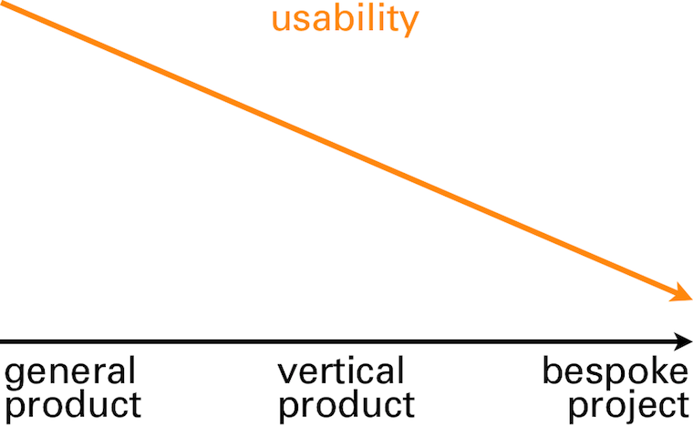
its cause and effect.
clients
The first world we will take a look at is that of clients. This is logical because it is clients who instigate software projects (there are also illogical ways to start a software project—e.g. have to spend the budget before year’s end, ask supplier how—but I will disregard these).
A first client need in software projects is to get ‘it’ built; ‘finished and working.’ This alone is already a cause of many a conflict in software projects. I will show later how to get a much better handle on this issue.
people, get moving
Another client need in software projects is to save money. At least, it used to be in the past decades, when software automated a lot of mechanical, brain‐dead labour, especially in office environments. Additionally, looking at a software project in this way is very spreadsheet‐friendly. The temptation of this should not be underestimated.
But time has moved on and just about all mechanical jobs have been rationalised away. What remains is creating value. This is exactly what people do: deal with situations with flexibility, provide a human touch to communication, solve issues and create new ways to do things. Machines and software do not stand a chance there. Over the years I have made this value creation the core of my design praxis.
intermezzo: what about value?
Let’s take a short detour and see some examples of value creation. We start with a plain project description:
‘We need a new order‐taking system.’
Then we ask where the value is:
‘We need a new order‐taking system, tightly integrated with manufacturing and warehouse operations.’
No, that is not it. That is still a very mechanical description of what needs to be achieved. Try again:
‘We need a new order‐taking system that allows users to unbureaucratically engage with any customer wish.’
There we have it: value. Feels really different than the previous two, doesn’t it? Introducing software that realises this will be of clear competitive advantage to this client.
‘We need a new order‐taking system that allows users to be order makers, instead of order takers.’
Another statement with value; not better, not worse, just different. This demonstrates that defining value is a strategic choice for clients.
Flesh out the two statements above to three paragraphs, answering ‘what is it we are making, who is it for and where is the value?’ and you have what I call a vision. And vision is exactly what I expect from management and leadership in a software project.
back on track
Where were we? Ah, value is definitely a client need in a software project. And by formulating that in a vision statement we have moved to the first thing clients have to offer.
We did already see that clients offer that software projects exists at all. And therefore they have to offer funding, because projects without funding turn out to be sad affairs, in my experience.
tech
The second world that we will take a look at is that of technology, i.e. the in‑house IT department or the external suppliers. All engineers, developers, technical architects, DBAs and functional analysts are part of this world.
Cut to the bone, the sole reason these in‑house IT departments and external suppliers exist is to hoover up those software projects and budgets that clients have to offer. It is their first, and prime, need. This is a marked difference with the world of software products, where technology departments are achievement‐focussed.
XOR
The second need the tech world has is that of clarity. From the zero/one definition of a bit upwards, in black and white terms. What needs to be built and when can we call it finished? This is compounded by the need of the tech world to frame and communicate everything in technical terms.
As such, the tech world is completely at ease working from the statement we have seen before:
‘We need a new order‐taking system, tightly integrated with manufacturing and warehouse operations.’
Given enough time and budget, they can bring this to a good end by themselves. But they are completely lost with the value part in this statement:
‘We need a new order‐taking system that allows users to unbureaucratically engage with any customer wish.’
Yes, the sales types of the tech world will nod understandingly when clients express the value they need. But when the actual work starts, their colleagues will hem and haw until the statement is reduced to something like the first one, i.e. technically precise, but without value.
truly, always
What the tech world has to offer is the engineering and building of software. Everyone knows that in order to get software, it needs to get built, i.e. code developed. The brutal reality of software making is that everything else I describe in this blog post is perceived by clients as optional, even down to the proper engineering part: ‘just bang some code together.’
The tech world expertly plays this ‘you need to get it built’ card. They play it to get (just about) all of the available budget, and to bury deep under the ground anything they don’t ‘feel’ like doing.
users
The last world that we will take a look at is that of users. And here the circle closes, because what users have to offer is value creation. We can now see what software is:

It is a means of value transport, provided by the client and built by technology. The software is there to meet its users, pick up the value they create and bring it back to the client:

But to pick up that value, the users will have to get on the bus. Paying them is not enough, neither is a direct order. These will make them endure the software, but they will not even consider getting on the value bus.
How do you entice users to get on the bus? You do it by observing the needs of these users and addressing them in the software. What are these user needs? Well, that is exactly the question the IT industry has been struggling with for the last 50 years.
Morse code
What happens traditionally in software projects is that (indirectly) the three worlds—client, tech and users—sit down to discuss what users need. It is literally three different worlds meeting, three different cultures, speaking three different languages:
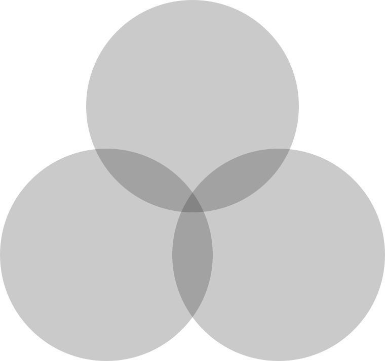
You can see that the intersection of all three is very small. It has a name: discussing features. Features, features, ever more features. A very human phenomenon is feature hoarding. Just like kids and toys, there can never be less features. No, that is a regression.
Everything gets phrased as a feature request—the only means of communication available. Often users are asking that an existing feature gets improved (e.g. finally made findable, or usable), but it gets phrased as an additional feature.
gimme some dough
Features are a commodity, think staple foods like rice, corn and wheat. Sure, not enough and users will starve. But increase supply beyond enough and you have glut. In real life, people’s attention turns to better food when they have enough. In the software world, the need for a better meal is answered by a huge buffet of mediocre food.
The biggest mistake the software industry makes is listening to these feature requests and supply what users want. This is the prime reason supposedly tailor‐made project software ends up being the armpit of usability. Remember, the goal was to find out what users need. There is a solution for this, it is called usability.
intermezzo: what about usability?
Another detour. There are two definitions for the word usability that you have to know:
- Measure of how usable, i.e. fit for use, something is. It is qualitative; this makes the tech world nervous because there is no hard numbers.
- A group of empirical professionals who measure usability and survey user needs. Their general background is psychology. Tech‐splanation: they are specialised in this type of hardware called humans.
This is incredibly useful. Usability professionals can be engaged to deliver an exact map of a software project users’ needs and measure whether software is actually fit for use. The effort and cost of this scales with the size of the project. In general it is peanuts compared to what development hoovers up.
back on track
Where were we? Ah, knowing users’ needs is fully within reach, a question of just do it. Now we need one more thing. We need to connect the world of clients, technology and users; to translate between them and hook up the needs and offers. There is a solution for that, it is called interaction design.
That is what I do as interaction architect. It involves making the plan for the bus. For clients I realise the value transfer; for tech I make clear what needs to be built; for users I ensure their needs are met.
To show how this works I will now present my recommendations for software projects, in nine easy steps:
1. you got to have a vision
Before kicking off a project, even getting that budget, why not make it crystal clear what value is going to be created and formulate a project vision? I help my customers all the time to discuss, clarify, reach consensus and formulate one; this fits nicely in a one‐day workshop.
It serves as a first feasibility check, getting a convincing vision together. And it can be immediately used to ‘sell’ the project internally and get a modest budget for the next steps. Costs involved? One–two man‐days for the workshop.
2. start with user needs
Right here, at the very beginning of the project, is the right moment to get the user needs mapped out. These are already a useful foundation for strategic platform—desktop, browser, tablet and/or smartphone?—and architectural decisions. Why take these without knowing what is needed?
Usability specialists survey and observe your project’s users and bring back the facts. As mentioned, you are still not spending any serious money at this point.
3. integrate usability + interaction
Now is the time to integrate usability and interaction design with your project. This does not happen by itself. The software industry has the tendency to bolt on interaction design somewhere at the bottom of the development pyramid and stick usability research in a drawer. Sorry, but that is not going to help you.
Usability professionals are the only objective partners a client has for knowing what users need and if the software is really working. The interaction architect is the partner for realising your project vision of value creation. Processes will have to change too; you cannot make software like you did ‘last time’ when the results should really not be like last time.
4. design it first
With your vision, user needs and platform choices known, the largest open question of the project—what do we need to build?—can be answered. A first, rough design of the user interaction can be made by an interaction architect (‑team for larger projects).
This will include a solutions model: a large‐scale solution for realising that value creation, plus a design strategy for working out the complete software in detail. This will take the whole project out of the dark, into the light.
It is a good idea to have your prospective tech partners on board during this design stage as discussion partners. Technical feasibility has a profound impact on interaction design. And vice versa: interaction design has the same profound impact on the architecture and design of back‑ends.
5. test it first
Yes, not a line of code needs to be written to find out if the interaction design is meeting your users’ needs—and by extension, if the goals you set for value creation are fulfilled. A usability test with your users can be performed with a paper prototype. I have seen many of these and they simply work.
These tests are practical, quick and lightweight, involving six users, maybe up to twelve if your user group is very heterogeneous. Anything beyond that is project bloat, making it less agile. If you do insist on having it tested on a real computer/tablet/mobile screen, then a prototype can be made. This should take three days, not weeks or longer.
6. refine + test again
The reason we made a rough design in step 4 and performed practical, lightweight testing in step 5 is that we are going to iterate. From the analysis of the tests the interaction architect keeps the parts of the design that work well and redesigns the parts that performed badly.
These changes can be sweeping, because up to now relatively little time, budget and commitment have been invested.
Then it is time for another round of usability testing and it will show that giant step have been taken towards a fully working interaction design. If still any big issues are found, then repeat this step of refinement and test.
7. make interaction spec part of the contract
You still have not spent any serious money up to now. You do have a refined interaction design specification that shows what has to be built. It has been tested to fulfil your users’ needs and to realise your vision of value creation.
Now is the time to take this specification to your tech partners, the in‑house IT department or the external suppliers, and ask for a quote. It will be much easier to provide an estimate on this basis and it will be more accurate. You will also be able to define much better contractually what ‘finished and working’ means.
8. test + test
That’s two different tests. The first one is the usual, functional testing of what is being built. Doing this against the interaction design specification ensures that you get exactly what you expected. Passing these test gives the tech partners an exact moment to call it finished.
The second type of testing is usability testing of alpha versions of the built software. It checks for more subtle usability issues and validates the overall interaction design. Again the interaction architect resolves the issues and refines the design. The project impact of this is low, because all the bigger issues were dealt with before development started.
9. agile? interaction architect is co‑owner
Agile development was invented in + for the world of software projects. Working agile does not change much of the eight steps above. In step 4 one certainly needs to get to a solutions model, to knock the project into shape.
More detailed interaction design can be postponed, to be delivered just‐in‐time for the start of an implementation sprint. Usability tests are performed on the evolving software, as described in step 8.
In the piecemeal work that agile entails, it is very easy to lose track of a coherent user experience, one that meets your users’ needs. Making the interaction architect software co‑owner in the agile process, highly involved in planning of the next sprint and further sprints, solves that.
postscript
And that’s it. I have shown that it is fully possible to set up software projects where the needs of all the parties involved are met. The clients’ need to get it built and for value creation; the tech worlds’ need for clarity on what needs to be built and of when it can be called finished.
Last, it is straightforward to find out what software users’ needs are and to meet them through interaction design. At that point you can build the value bus, one that users are pleased to take, to bring their value home:
 bus symbol from
openclipart.org
bus symbol from
openclipart.org
Labels: architects, design stage, lecture, practical, process, product vision, top story
a survival guide for designing in a service context
10 November 2012, 00:26
The world usability day came early to Berlin this year. Apart from a special date, we also had a special location; the location scouts of the organisation team had worked hard to secure the iconic kalkscheune to receive a record number of visitors.
This year our theme was digital payments & service design. I contributed with a lecture titled simply designing in a service context—a survival guide. You can see the video online (in German), or read it below.
cliffhanger
Thinking about the theme of this world usability day, I asked myself: can I show some complete service design projects? The answer: positively maybe.
Let me explain.
What happens a lot in practice is that we get asked to design the user interaction for a piece of software—an app, website, portal, application, or even for a whole device—and in no time we find out that it is part of a whole service. , i.e. fixed:
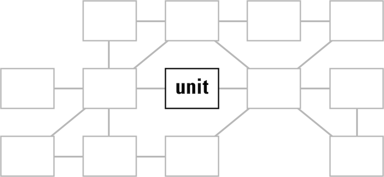
This is of course a rather unfortunate situation and basically a dilemma for interaction architects who are used to seeing the whole picture and shaping it.
rationalisation
There are plain, practical reasons for concentrating on one unit instead of designing the whole service. The first one is hardcore: time = money. In every project I have been involved in in the last two decades, effort—as counted in man‐months—was the bottleneck. Either time or budget was limited, or both. This does not mix easily with shifting the focus to the whole service, which does make a project automatically grow in size.
Besides that, every person has the need to divide a daunting task into ever‐smaller chunks, until these subtasks become small enough to be grasped and worked on in a secure way. Software development is full of this: modules–source files–functions so that developers can do their job, securely. The problem is that once a daunting task—say, a service—has been broken into pieces and grasped, it is hard for most to step back and look at the big picture.
Similarly, every organisation or firm gets divided into ever‐smaller chunks, divisions–departments–teams, so that people actually function. But it also creates fiefs and bureaucracy, with nobody willing or able to take responsibility for a whole service.
‘life is not meant to be easy’
What we can learn from this is that for service design to happen one needs time, stamina and budget; big‐picture thinkers in charge and the will to break departmental borders and bureaucracy. And one needs all of the above, or service design is not going to happen and the work will concentrate on a single software unit, aka catch‑22.
looking in my rear‐view mirror…
Now that we are completely rational, I would like to point out that it does not happen very often that customers say ‘hey, here is a project that is actually part of a whole service.’ Usually interaction architects have to figure that out by themselves. In my experience, that happens pretty fast. Below I will review some of my recent projects to give a glimpse of how that works.
But before we jump in, let me mention that I found the economic definition of service quite helpful to get a grip on the theme. Of the five characteristics, variability is the one that gave me most pause for thought; the fact that a service cannot be cookie‐cutter by definition.
Now on to the examples.
an e‑care portal for a mobile network
This portal is used by customers to configure and renew their contracts, among other things. A mobile network clearly delivers a service, check for instance the intangible and perishable characteristics of it. Another boost to the service design vibe is that multiple platforms/media are part of the mix: websites, call centres, SIMs being delivered in the post, brick‑and‐mortar stores.
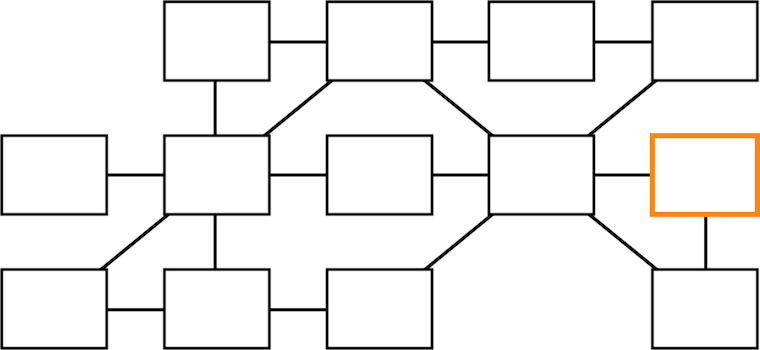
As the highly‐abstracted service view above shows, the e‑care portal in question lives at the far end of the service flow. It is vital to understand its role of regenerating customers in the system, by enabling them to engage with their subscriptions and renew them.
The clear service factor and the multiple platforms/media involved make me say with confidence that we worked here in a service design context.
a startup that will take the pain out of printing
We were asked to have a look at their desktop + mobile printing clients. When we started working with them it became clear that they were delivering a service: keep printing running in companies. Also the multiple platforms/media factor is there, with software and online components, toner delivery and even printers themselves in the mix.
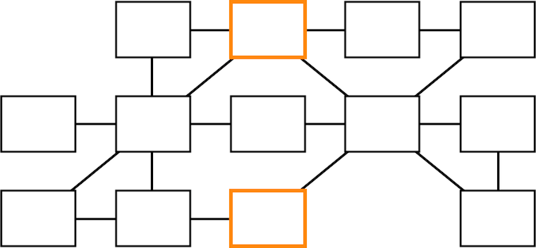
Thus we took the service view and put the printing clients in their proper place, on the sidelines of the service.
an image editor for professionals
One can also take this service thinking too far. This image editing application is tightly integrated with its online manual; there is a registry for plugins, to extend its capabilities with one‐click installation; there is a whole community in online forums around it:
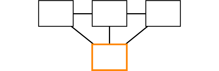
However, the service vibe is not there. This application is not perishable, once you have downloaded it, you’ve got it. It is a tool, you can almost touch it.
Service design is not a cure‑all, not a universal approach to tackle the whole digital world.
a social network for the ad film world
We had already a good look at this one last year. A social network is certainly a service, you may recall how outspoken I am about their perishability and indeed after they decline their is nothing tangible left (also kidding there, folks).

There is an email component in addition to the website, but as is shown above, the overall service is just not complicated enough for me to warrant a service design approach. It is just not worth the effort.
a multi‑SIM mobile phone
This project we have also discussed before, twice. I reviewed it for the heck of it and found something interesting. I was trying to construct some kind of service argument around that this mobile, with its hot‐swap SIM slot, keeps tabs on five different mobile services at the time:
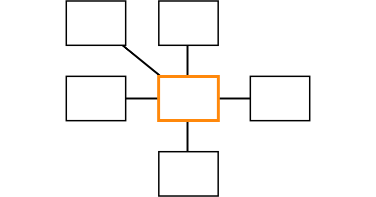
But then realised something else: this is not service design, this is contra‐service design. In a counter move, this product breaks the service tie between mobile network and mobile phone, reducing networks to commodities. It is literally a case of ‘power to the people.’ This is exactly what my team had in mind when we designed its user interaction.
walks like a duck, quacks like a duck
What I conclude from these project reviews is that in order to get in the service mood, I need to encounter a project that has serious service characteristics and has a nice complex structure, which preferably spreads over multiple platforms/media (desktop, online, devices, the real world—the one with humans and buildings).
At the end it is a judgement call—yep, gut feeling—whether the service context is present or not. This reflects the current start of the art, with publications lamenting that there is no such thing as a commonly accepted definition of ‘service, as used in service design.’
This situation reminds me of today’s confusion surrounding the term UX. That has the positive effect of creating the freedom to ‘simply do the right thing’—a source of many an innovation. But this situation is also cynically exploited at the moment and that discredits the movement to get UX at the top of the agenda.
elementary
And now, as promised, the survival guide. To recap, it is about dealing with the catch‑22 situation of concentrating on the user interaction design of a single unit (app, website, portal, application or device) that lives in a service context.
I will now go through the design project phases that I normally use and explain how to scope the design work so that the best is made of the situation—but without ballooning the effort involved.
product phase
The product phase lays the foundation of the project. With compact methods the goals and context are defined, and the whole as‑is situation is evaluated. Here we go:
- product vision
- There is no project without defining what needs to be achieved. A product
vision is a short, sharp statement of the identity of the product; its user
groups (narrowly defined) and the value it should deliver, as defined in a
moderated session by the persons leading the product creation.
- To cut to the chase, the vision we should work against in our catch‑22 project has to be that of the whole service: a service vision. Exactly, this is the moment where the ‘whole service view’ can be locked into the goals of the project, without any extra effort.
- This is also our last chance in the project to find out that a service context is present; if we find out later then we will have to start again from this step, or ignore it and plod on. Luckily the vision session method is 100% made for finding out what it is that we are designing. In the printing startup project that is what happened. As soon as we saw signs of a service context in the vision session, we switched gears and focussed on the service for their vision.
- functionality
- A functionality overview is compiled for two reasons:
- to get to know the project;
- to have checklist of everything that is ‘in the box,’ every point of functionality that has to be given a place in the interaction; the checklist is literally used as such during the design phase.
- For the first point mentioned, it is best to focus on the unit under design, but also go—in a more fleeting manner—through the service context:
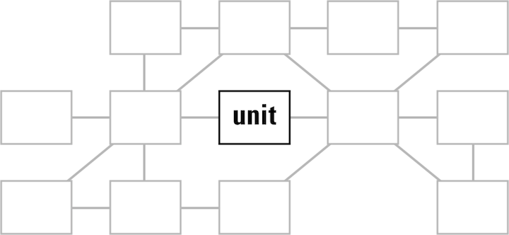
- There is an opportunity here to discuss the relationship of the functionality in our unit and that of the rest of the service, and maybe move some of it around. It is good service design to distribute functionality thoughtfully across the service; i.e. when one platform (web, desktop, devices) covers a functionality point, it may be omitted elsewhere.
- Point number two: when compiling the functionality checklist, simply concentrate on the unit only, in accordance with the project brief.
- user scenarios
- These capture typical and essential use of the product. Imagine a playing
field, with the different ways to use the product spread over its two dimensions.
User scenarios are journeys over the field that show how big and diverse the
field is:
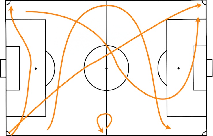
- You can see it doesn’t take many scenarios to cover the whole field. Three is minimal, six is fine and twelve is a good limit for huge, complex products. In our service context it translates like this:
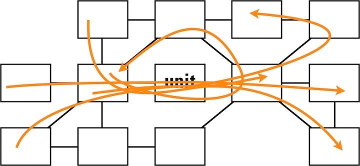
- Every scenario goes through our unit, but they also exercise the typical and essential parts of the service.
- expert evaluation
- The user scenarios are our guide during evaluation. Anything related to
the project—existing software, plans, designs, prototypes, competitors—can
be evaluated: does it fulfil the service vision?
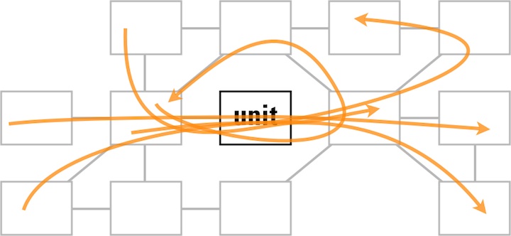
- As shown above, the scenarios make us focus on the unit under design, but also make us evaluate the typical and essential parts of the service.
design stage
The design stage is where we stop looking backwards and start moving forward, to solve the problems found and create the design. Since the bulk of the effort of an interaction design project is found here, there is not so much room anymore to take the whole service into account.
However, the first part of this phase is analysis, which is fully based on the expert evaluation, which in turn is shaped by the user scenarios. These made us focus on the unit, but still guided us through the whole service. Also the service vision was used as a tool during all evaluation and this takes the ‘whole service view.’ Thus the service plays a leading role in our analysis.
the party is over
But when we move on with all further design work we will have to focus on the unit we are designing, exclusively. Remember ‘time = money’? Here is where interaction architects have to be rational and work according to plans and budgets.

All we can do during the whole design stage is to highlight in all communication, with our collaborators and partners, how everything is connected in the service; how choices elsewhere in the service impact our design; how our design decisions create requirements elsewhere in the service.
implementation support
The last component of a design project is implementation support; collaboration with developers and media designers. The point of this is getting the product shipped, while keeping the interaction design together; ensuring that it does not crumble to dust one step at the time during implementation.
Since this is a follow‐through on the design work, we will again have to focus on the unit we are working on, exclusively.
the heartbeat
You can see the steps I just described in the animation below. Notice how the scope of the work pulses throughout the design project (animated gif):
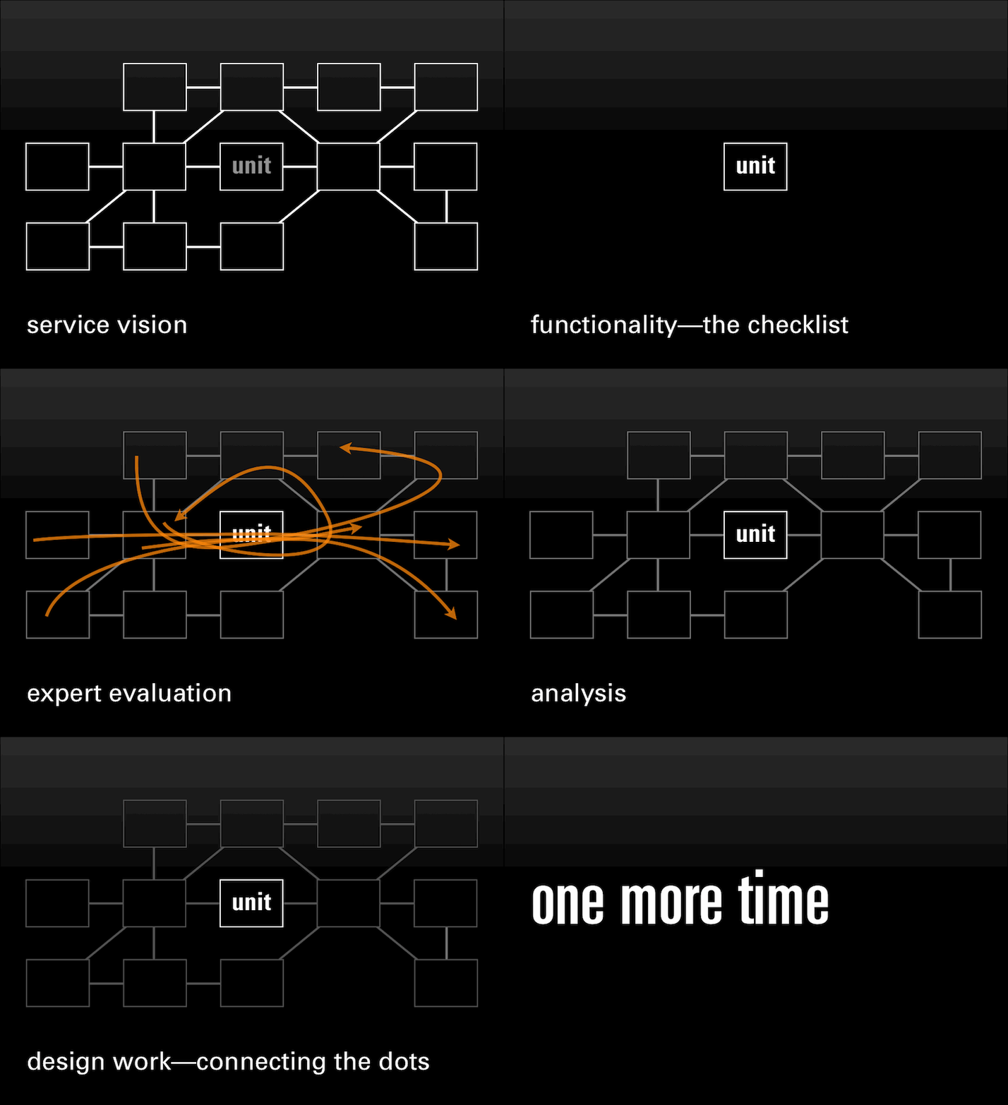
introspection
Now is the time to stop and look back. Did I just present a way to fake a service design project? A way for managers to avoid having to think at the ‘whole service’ level and let interaction architects sort it out, one unit at the time?
Can a project set‑up like this produce OK results? Well, as long as there is an interaction architect on the job who can implement the described steps methodically, that is guaranteed.
Can a project set‑up like this produce good results? That mainly depends on how good the interaction architect is.
Ah, you are looking for great results? Then you need time, stamina and budget; big‐picture thinkers in charge and the will to break departmental borders and bureaucracy. Then a multi‐disciplinary team needs to design the whole service as if it was shaped by a single hand.
Then, you need service design.
Labels: lecture, practical, process, product vision, top story
If you like to ask Peter one burning question and talk about it for ten minutes, then check out his available officehours.
 Peter Sikking is an
experienced
Peter Sikking is an
experienced
interaction architect. He unabashedly puts
shipping great products at the centre of his design practice. He is known for
his work for Google, Nokia, the
Metapolator &
GIMP
open source projects,
and startups.
What is Peter up to? See his /now page.
- info@mmiworks.net
- +49 (0)30 345 06 197
- imprint

_knooppunt_10_fietsroutenetwerk.JPG)