the wud, on social networks
15 November 2011, 18:10
I have just just wrapped up another world usability day (WUD). The theme was Social Networks and we had a full house—workshops and lecture hall—all day. As mentioned before, I had hands‑on interaction design experience with a sprouting social network to share in my lecture. A video registration (in German) of the full lecture can be seen online and, as usual, here is also my write‑up.
structured visualisation or simply being social, the design work at unusuals.net
We agreed on a ten man‑day consulting project, which was then implemented over a two month period.
With a modest project like this one cannot expect interaction architects to make and document detailed designs (wireframes) of a whole social network website. There is simply not enough time; practical consulting is the most effective way to shape the project. Fortunately, the unusuals were up to the task of wireframing themselves.
just getting started
The work before the work that I do at the start of a project is structuring. At unusuals I implemented the following sequence of methods and phases:
- product vision
- Define of what is it that we are creating; what is the end‑goal.
- functionality
- Create a complete overview of ‘what’s inside the box.’
- user scenarios
- Further work out the vision with scenarios showing typical and essential use. These are then used for…
- expert evaluation
- Evaluate any existing stuff: ideas; plans; designs; software; websites; competing offerings.
- brainstorming
- Time for creativity and generate new ideas. Starting with real life; take it through a couple of loops of fantasy; then back to earth.
- design sessions
- Sit down and solve the design problem at hand. From fundamental stuff like browser sizing and flexible layouts; to mid and detailed design of components like a film gallery.
This may look like a long‐winded process, only getting results at the end (the design sessions). Let’s see whether this was really the case.
panavision
We started—as is my custom—with the product vision phase: defining what the product is, its identity, what the target user groups are and where the value is. This took a couple of hours with unusuals, especially because they had to explain to me the advertising film world.
How many people does it take to make a tv commercial? Easily more than 50. All these people work in a pyramid, in a strict hierarchical system. It is also a world full of freelancers and the name of the game is getting that next job; then recruit the people who work directly below you in the pyramid, within one or two days.
keep on rolling
Two weeks before the WUD, the unusuals kindly agreed to help me prepare by spending two hours recounting the project. During that, they admitted that they did roll their eyes (a bit) when they realised they had to explain the film world to me, an outsider. They themselves have 10–20 years of experience in the business as either producer or director.
But then they also quickly realised, while explaining, that this was helping them, formulating this simplified version to an external. Also my questions helped, always pointing in the same direction: how does this film world tick. Because how it ticks is how the unusuals network should work. And it is the interaction design that defines how it works.
this header has been intentionally left blank
Now I would like to show the unusuals’ product vision to you, but it is simply too strategic. User interaction, being so directly connected to it, is that strategic. But I can share some of the keywords of the vision. unusuals is:
- international
- There are a hundred thousand, or two, people in this industry, worldwide.
- transparent
- The whole point of the network.
- exclusive
- For insiders only.
- a ‘kitchen party’
- Thinking about identity, the unusuals wanted the opposite of industry (awards) events, with its cynical networking. They wanted to have that vibe of a private party at someone’s home, full of film industry mates of course. And the best place to be at a party is… the kitchen.
just can’t get enough
Where it came to functionality, there was already a wall full of post‑its; the proverbial wish list of everything other social networks do, plus some more on top. But luckily there were some moderating factors. There was a fixed (re‑)launch date of mid‑June (real artist ship) and there was also a planning, so they knew they had to do a feature freeze way before June. Apart from that I also encouraged them to focus on the essential, because squeezing it all in would be in direct conflict with achieving great user experience.
And here I must make the unusuals a big compliment. Unlike many other companies, they were able to prioritise functionality, to decide what really mattered. And ensure that that would be designed and implemented to a high standard. They were able to draw on their experience as film makers and translate that to the software maker world.
But also they had a new basis for their decisions upon. They had their product vision. So instead of individuals fighting for their feature, they were a team checking if features were essential for reaching their common goal. The unusuals completed this method as ‘homework.’
internet‐free zone
More homework for the unusuals was writing their user scenarios. I say: six is the magic number for user scenarios. I also had an extra assignment for the unusuals: keep the technology out. No mention of social stuff like poking, liking, following; do not even mention the internet. The focus should be on users and what they are trying to achieve.
Being natural storytellers, the unusuals gave the main character of each scenario a name. Here is a swift impression of a scenario: Pablo searches for information on film‐making companies; Pablo asks his friends for some tips; Pablo looks at films to get inspired; Pablo checks the details of a film company; et cetera. Usually around ten steps like that per scenario. Only human tasks and needs.
fun fun
The unusuals said they had fun boiling an initial fifteen scenarios down to the magic number. Seeing the commonalities between two of them and merging them into one. And they learned about what mattered to users while doing this.
This method overview shows that designing good user interaction did not have to wait until the design session. It started right away, from the first step, discussing the product vision. Let’s now take a look at how those four vision keywords drove the interaction design.
up and away
Starting with international, yes it is a worldwide industry. But it is also very local. That professional is needed here and tomorrow. In real life everybody maintains a local network of contacts for that. And there is a third factor in this paradox: this industry has a penchant for exotic locations. And with that a couple of questions rise:
- What network do you tap while filming on location, far from home?
- When a professional wants to base himself in a new town, how to get started there?
- Even simpler: what do you do when all the usual suspects who can fill a position are busy next week?
The unusuals network is of course the answer. We combined the transparency that it needs to deliver with the local‐but‐international paradox to arrive at a design where one page handles many tasks:
- organic exploring, starting from this user’s own network;
- organic exploring, starting from anybody else’s network;
- organic exploring of the filmmaking market of a city, country or the world;
- recruit people, starting from this user’s own network;
- recruit people, starting from anybody else’s network;
- recruit people within a filmmaking market of a city or country.
Conventionally this would lead to up to six different web pages, each designed differently and fragmenting the experience. Shown below is how we designed it: in a natural, unified—if at first sight maybe even unspectacular—way. Starting with exploring:
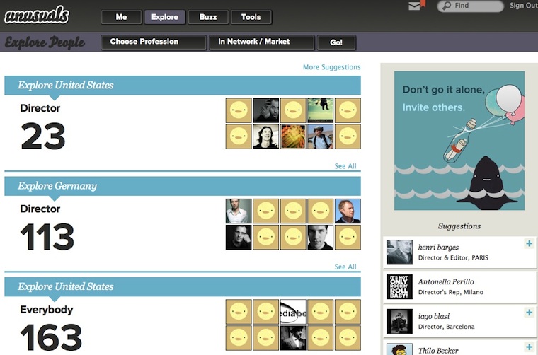
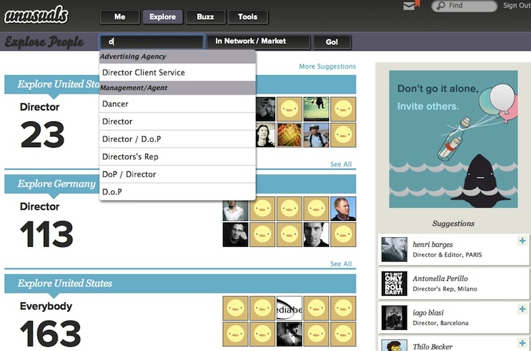
Adding filtering for a certain role:
Or take as starting point the network of people one trusts, or a certain market:
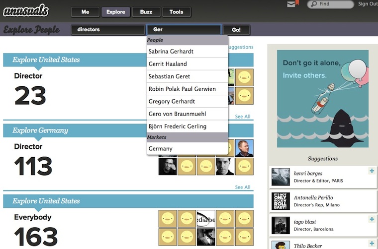
What we see is user interaction shaped by working methodically; combining the product vision, user scenarios and the understanding of how users tick.
splendid isolation
unusuals being an exclusive network is a great thing. It really helps to focus while designing, creating a place where this user group will feel right at home. Which can only help to build the network. But it will also help the network to survive.
What is it that destroys social networks? It is that cool innovators—who are the gravitational force that builds a network—do not want to be seen in the company of people who they consider ‘clowns, jerks and definitely uncool.’ So they leave networks when they feel overrun by these types, adopting a new, hip hangout for themselves. As usual, this is followed by an exponentially rising tide of invites that builds this next network.
lean and mean
My conclusion is that all general networks must die. By which I mean that these networks have the same life cycle as boy bands: every couple of years there is another bunch that dominate the charts. It is just a fashion/trend cycle, driven by these cool innovators.
I believe specialised, exclusive networks have much greater staying power. By keeping out people who are definitely not insiders, reasons to leave can be kept below the threshold of the cool. This why I am happy that the unusuals followed through with keeping it exclusive:
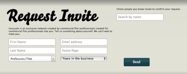
To join unusuals you have to be invited. And to be invited you have prove your credentials. Modelled on real‐life strategies of getting past the doorman of an exclusive club, there is two ways to do it. Either ‘do you know who I am?’ or ‘people are waiting for me inside.’
you can’t touch this
What became of the kitchen party? There is no part of the unusuals site that can be identified as its tangible representation. But as the unusuals pointed out in their feedback, it is everywhere. It certainly got mentioned a hell of a lot throughout the project. That helped with finding the right form while designing and also helped with important decisions.
Having you own offbeat concept like the kitchen party really works like a conspiracy within the design and development team. It does keep everyone pushing in the right direction.
paper + clip
With the kitchen party comes the curious host, who keeps the party going by discreetly asking a question or two to participants and using that to establish new connections and interactions. Again, this is not directly tangible. Do not expect Clippy, the curious host.
Instead, it resulted in a policy: no form‐filling, beyond the bare minimum, like on the request for an invite. There is no duty for users to reveal information about themselves, only opportunities. ‘See that cool sneaker spot? Yeah, I edited that.’ You can then count on the vision of a exclusive, professional network; that users will take the opportunity to profile themselves.
talk talk
And now for some social interaction. Among all that initial functionality on post‑its there was all sorts of communication. Private messaging, group discussions, comments, following, feeds, tweeds, et cetera. Each of these looks ‘easy’ to add. In reality we underestimate the effort because they are ubiquitous, infrastructure type of functionality. We tend to forget about all the details that need to be designed and implemented for each.
Part of my job is to exactly point out these implications. And to show how much work it would be to integrate these with each other, as well as having to explain to users why all these have to exist within unusuals. For example, private messaging is covered well by good old email. No need to duplicate it. It was time for me to say: ‘Pick one. Which form of communication is the most important for your vision?’
crashing the party
Fast forward to a round of brainstorming, where the vision of transparency was combined with a look at how people communicate at a real‐life kitchen parties: two or more people conversing with each other anyone standing close enough can listen in. And anyone who has something to contribute can join the conversation.
That is how conversations were designed at unusuals. Starting with a comment to a film, or person A starting talking to person B. When someone answers it is a conversation, anyone can join to broaden it. Nice detail that there is no ownership of any given conversation, they are simply attached to all persons and content involved.
the right stuff
The best part of this is that the unusuals own this stuff. No, not like in software patents. I mean they worked it out themselves. The worst you can do when developing user interaction is blind copying: ‘facebook has a wall; so must we. They are quite successful.’ Not really much better is the ‘not invented here’ attitude. ‘facebook has a wall; that will not happen to us. We must invent something unique.’
The correct way to develop user interaction is to work through the methods outlined above, beginning with that you’ve got to have a vision. If then your design is quite similar to something already existing, then that is OK. You arrived at it independently, from your own strength.
During the unusuals development period this year, facebook changed the behaviour of its ‘wall.’ Two weeks ago I asked the unusuals what they thought when that happened. They said that they could not care less. They have their own thing, which is right for them and their users. They have their independence.
red carpet day
Further brainstorming produced premieres, of course based on the film business. It solves the problem of how a crew that worked on a film can be kept up to date of the release of said commercial. unusuals lets members schedule a premiere of a new commercial. Those closely involved with its release will do so, out of pride and/or as part of customer service. Via invitations and organic networking the crew gets to hear about the upcoming premiere.
And here the curious host principle pays off. Any member checking out the premiere has to opportunity to put himself with a simple action on the crew list of the film (yes, there is peer review to fight abuse). This action (soft‐)connects the crew: they have worked together. We see again how important content is for starting social interaction and building the network.
quattroporte
The unusuals had a dream. They asked me if the site could feel really simple. Like only needing four departments to structure the whole site. Problem was that at that time their straightforward classification of their functionality called for nine departments. So I thought about it for a short while and the answer is: yes, you can.
There is no standard recipe for achieving this simplification. Solving it is quite an intuitive design process. Full understanding of the product vision and how users tick goes into it and suddenly, it gels. The understanding that exploring the network, keeping up with social activity and users presenting themselves were the most promising categories to put top‑level. Then the functionality overview is used as a work list to check and place everything:
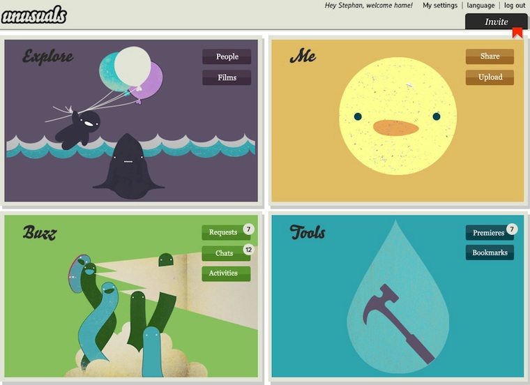
Top‑left is the Explore section we saw before. The Me section is all about this particular user (profile, settings, media uploaded and associated with) and the Buzz covers anything social and dynamic in time. Finally the Tools section offers room to expand. For instance managing premieres belongs there.
get the most out of it
Phew, already a long haul and it still only covers part of what we were able to achieve during this modest, ten man‑day project. So I asked myself: how come the unusuals got so much out of this? I think it is because:
- The unusuals were fully open to process change. Introducing proper interaction design means that things cannot stay as they were before. Because unusuals is a startup it was more a case of process shaping, but still they got it without a need for heavy discussion.
- The unusuals reached out to get a professional on board to work on their user interaction. And they were determined not to go it alone. They kept looking until they found a partner that fitted their needs; then without further ado started our project.
And here we have the acid test. Without these two, really nothing is going to happen. You cannot bolt on some usability or interaction design consulting to the side of you regular development process and expect results. For that they have to become the core of your process. Similarly, doing serious work takes experienced professionals that you trust. When both of these points are not in place, then all that is left is talk, about improving usability and having a great user experience. Read more about process integration—from last year’s WUD.
What also really helped is that at unusuals I was working directly with deciders. People who, without distractions, put their 100% in making the best product they can.
live and learn
A nice aspect of my job is that you always learn something new, it keeps things interesting. What I learned from the unusuals is that especially for startups, structuring is more than half the work—I explored that deeper in a previous blog post. They stressed that they really valued the methodical approach to the project.
The second thing I learned takes that to the next level. The unusuals insisted that the early methods—product vision, functionality, user scenarios—liberated them. They could stop talking about unusuals on other peoples terms, start with a clean sheet and express what and how they wanted to create themselves.
This really bowled me over, I had never looked at it in this way. I use the methods for information transfer and as a solid foundation of the interaction design. That these methods can work emancipating for my clients, well, I keep that in mind from now on.
the ins and outs
The final lesson learned is that a social network like this is a living thing. The growth and dynamic of the network definitely forms another channel of feedback that goes into the evolving interaction design.
Working with the unusuals was a blast. I am proud of what we achieved in such a short time. Normally this would be the point where I say: check it out, unusuals.net. But the chance is high that you are not in the advertising film business. So you won’t get in. But that is actually a good thing.
Labels: lecture, practical, process, product vision, startups
0 comments · post a comment
If you like to ask Peter one burning question and talk about it for ten minutes, then check out his available officehours.
What is Peter up to? See his /now page.
- info@mmiworks.net
- +49 (0)30 345 06 197
- imprint
 Peter Sikking