mobx, the big bang
30 November 2011, 19:47
And now for part two of my MobX lecture. In part one we saw how old mobile was becoming bloated, more complex and slower. And then…
boom!
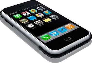
January 9th, 2007 the iPhone was introduced. It was the big bang of mobile. Looking at that first version hard‐ and soft‐ware today, it looks quite humble:
During a year or so after the introduction I caught up with my contacts at mobile manufacturers and networks. I found out that the response had been universal across the industry: ‘oh shit.’ This was followed by an investigation, ordered by the highest company level, into ‘why did we not invent this?’
culture club
That is a question of culture. All these companies have many very bright researchers. The question is what is being done with their work. That is a management problem. As is excellence in execution. Good enough is simply not good enough, today.
We also know that Apple had to keep the mobile networks out of the loop to make sure that the iPhone would not be any old mobile. At the end they found AT&T prepared to sign up, sight‐unseen, for the iPhone. After the introduction the genie was out of the bottle and no mobile network could put it back.
touch rules
Mid‐2007 I was for a couple of weeks in the US to work on the interaction fundamentals of an ‘iPhone killer.’ It was my first chance to get my hands on an iPhone, introduction in Europe was in November of that year. It took only a few days to figure out the rules of touch (apart from the obvious changes):
- The user interaction is more within a given screen, instead of being defined by transitions, as it was for old mobile.
- Use the whole screen. Whatever you do, make it as big and gorgeous as possible.
- Pixels are no longer the unit of measurement; it is the finger grid in centimetres.
- Touch interaction is addictive. Especially sliding, swiping or flicking things is the stuff that joy of use is made of: satisfaction guaranteed.
- No Options menus anymore. They are virtually gone.
- Back‐stepping (pressing the Back softkey) was such a natural part of old mobile that it was not even shown on the chart. With touch it is mostly avoided.
- This is not a phone. It is a handheld computer that happens to make calls.
In the two years that followed, I led the interaction design work on more than one ‘iPhone killer,’ for corporations that were simply not getting it. They were still insisting that their devices should have green and red hardware keys, as if they were making a telephone. Usability folks at these corporations were not exactly helping the innovation, playing it safe by insisting that everything should be operated by means of simple tapping. What was that about swiping?
like a robot
Now that we know the rules of touch, can someone tell me what is going on with android? April last year I was at a conference—nothing to do with mobile—and Google gave away a nexus one to every participant. It took only a few days to figure out that something was really wrong. They’re back:
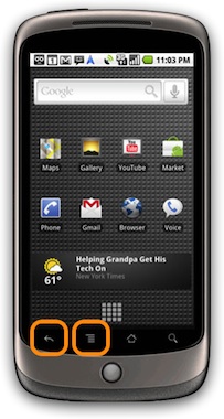
The return of the Options menu and Back hardware keys is not just a case of old‑think. It is a serious problem. This is because the bright and shiny display is where the interaction is, and these two buttons are not part of it. And that is how users are perceiving it, they always pause when their next step can only be performed with either key. They get torn out of their interaction flow, press the key, then re‑enter the flow.
It is the law of the platform and android is stuck with it. But those of us who design user interaction for android apps can help. Why not put all the interaction on the screen? Refuse to depend on these two keys. And when the guidelines of android still prescribe to make use of the Options menu and Back keys, then treat them as a backup solution.
This is analogous to the situation on the desktop, where for instance in iPhoto most of the interaction can be performed in the main window, and the menubar is there as a slow, but safe, interaction element prescribed by the guidelines.
glass half full
What about hybrid touch, aka touch and type? Is it half‐baked? Looking at the image below it is obvious that the bottom half of this devicee cannot be used to watch a film, read a webpage or play a game. But, you can type like it’s 1999.
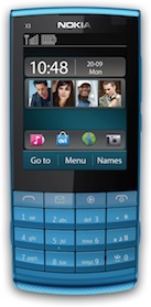
When I first had a prototype for this device in my hands, I thought: ‘wow, finally something is not trying to be an iPhone.’ This one is doing its own thang and deserves some love. The UI however is a direct adaptation of old mobile, adjusted for the obvious changes: direct touch input; no soft‑ and scroll‐keys. This must have really helped in the feasibility department, but it does the device no justice.
but there is hope
Early last year I led the interaction design for a software project for these devices. Without going into the project, I would like to show you that there are opportunities to push the envelope. Ignoring what is on the screen, let’s concentrate on the softkey line:
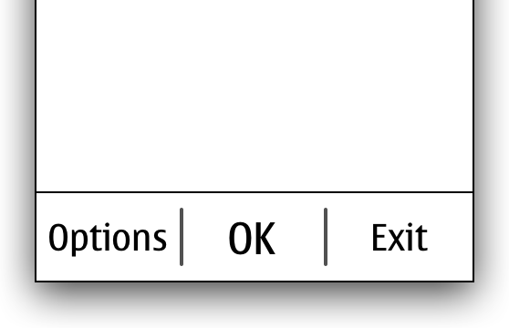
That softkey line is a touch area, of course. And because it is on the bright and shiny display, it is usable, unlike the android keys. Being touch, you can do whatever you want, which I did:
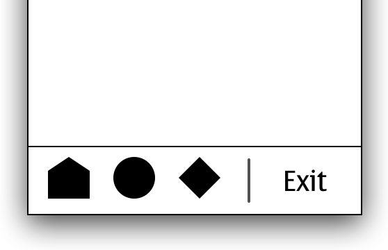
I put three icons (placeholders shown here), giving users direct‐access navigation between three sections of the application, as seen on touch devices. Together with the remaining right softkey, it is a truly hybrid solution. I kept the boss of this UI platform in the loop and she was very encouraging. She was eager to see innovation on the platform.
So do not despair when you have to work as an interaction designer on a hybrid touch project. It is a grey zone which means lots of opportunity to define it yourself. Go on and break the rules, and innovate.
the future of old
Looking at the graphs below, from the incredibly useful asymco blog, we see both for the US (left) and globally (right) smartphones—today most of them touch devices—are definitely on the rise towards dominating the market. Note that in our context both symbian and RIM are good old mobile—and were never that smart—but they follow the trend and are in decline.
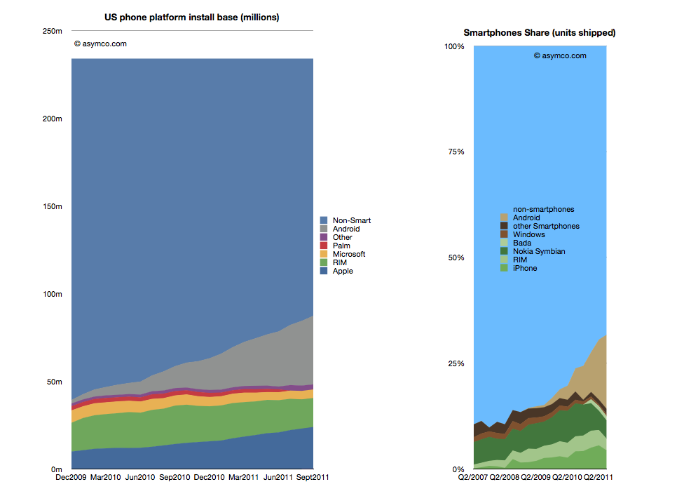 source: asymco.com
Before you now predict the death of old mobile, let me point out that something as simple as component costs will keep proper touch out of the hands of most of the world population. Serving the worldwide middle classes: yes; everyone: as soon as the total parts cost is $10 or less.
So old mobile is here to stay, for a while. Let’s not forget outside the western world there is a lot of service innovation going on that puts the western world to shame. All of that is on old mobile. And no, working on old mobile does not need to be nagging legacy support.
dual strategy
I have blogged before about working on Nokia’s first dual‑SIM phones. I can talk about this project for hours, but what you need to know is how the fundamental equation of mobile phone was changed from one user, one SIM to one user, two SIMs. This triggers a massive engineering effort, every software component in the phone is affected. And if you don’t watch out, then for the UI you are up for redesigning hundreds of screen layouts, implementing these and re‑specifying all software that use them.
Because of this massive effort it was not that sure at the beginning of the project that we were going to make it. I was the interaction lead for the whole phone. I created the solution strategy and accompanying design patterns. Then I worked with Nokia designers and mentored them while implementing these patterns. And we made it:
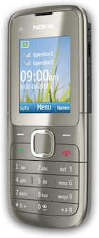
And that was in part thanks to the solution I designed. My top priority had been good user interaction, but a happy side‐effect was a great reduction in UI design effort and overall engineering work. In May this year the first Nokia dual‑SIM model appeared on the market; today there are five models.
When you look at the phone above you see it is good old mobile. The solution could have been made in 1997: it is all just lists and Options menus. And the fist device we designed it for is low spec mobile, with just about the smallest screen size Nokia ships.
the future is bright
The dual‑SIM project turned out to be one of the most satisfying projects I ever worked on. And it was not just because of the challenge, the mind‐boggling complexities; not for the travel involved or the rewarding cooperation with my colleagues. It was so satisfying because all the time we worked on it, we knew how much it mattered.
How much it mattered for Nokia’s business was proven a couple of weeks ago when its third quarter results were released. In between the gloom and doom there was some light. They had shipped 18 million dual‑SIM devices that quarter. Through this they had gained market share in India. Even though with dual‑SIM we are talking about cheap devices, that is around a billion dollar in turnover.
In the financial statement and all marketing material, Nokia proudly communicates that their dual‑SIM solution ‘enables users to personalize up to five SIM cards.’ Cool, I designed that. The personalisation: instead of calling the SIMs just A and B, let users name the SIMs for what they mean to them, like ‘cheap calls’ or ‘free SMS.’ And that number five, I set that as the minimum to remember. It is quite normal for users in these markets to juggle three SIMs every day, and to change one or two of them, every month. 3 + 2 = 5.
Just the other week Nokia CEO Stephen Elop spoke at a press conference of the ‘halo effect’ that dual‑SIM has in the market. All sorts of Nokia devices are selling better because dual‑SIM is now shipping.
users + nerds
Also on the user side we knew how much the dual‑SIM project mattered. There was a pent‑up demand for this and now it is safe to say that out of those 18 million people that bought these devices, 100% did it for the dual‑SIM. And 100% of them are using it every day. Compared to the one percent I mentioned in part one, that matters.
Reviewing all this, I am thinking: maybe this touch UI vs. old mobile is all relative. Maybe it is just designer nerd‐talk? It reminds me so much of discussions developers have about the coolness and merits of doing a project in C, C++, Java or something new, like lua. Just maybe, it does not matter that much.
So for us designers, it might be more rewarding to be excited about how relevant the project before you is for your users and the business of your client. And at the end, you will know you have worked hard enough only if you are excited about how elegant you made the interaction, and about how much innovation you put in.
postscript
That’s it for my lecture. I could only share 5% of what I had lined up in my mind, but there was only half an hour on stage for each speaker and time goes fast. I am looking forward to the next opportunity to share some more.
Labels: design stage, lecture, mentoring, mobile, practical

![]()
![]()
1 comments · post a comment
- at 13 January, 2012 15:28,
 commented
 - hi peter,
thanks for your interesting article! I have to object though about the android "back"-button. I find it incredibly useful to have this option always in a consistent location in the bottom area of the phone easily reachable with the thumb of the hand that holds the phone. In theory I would have said and thought the same as you did, but once I was using it I liked it instantly.
Ever since I used an android phone for a while at work I miss the back button on my iPhone :)
Cheers, Kat
If you like to ask Peter one burning question and talk about it for ten minutes, then check out his available officehours.
 Peter Sikking is an
experienced
Peter Sikking is an
experienced
interaction architect. He unabashedly puts
shipping great products at the centre of his design practice. He is known for
his work for Google, Nokia, the
Metapolator &
GIMP
open source projects,
and startups.
What is Peter up to? See his /now page.
- info@mmiworks.net
- +49 (0)30 345 06 197
- imprint
