 our blog
the world needs more fonts, honestly
24 June 2017, 18:30
It appeared in a thread that started off with some saucy quotes: ‘the problems have already been solved’ and ‘the function of new typefaces is largely aesthetic.’
It piqued my interest because I have worked on the interaction design of a couple of font design applications. Besides that I have spent a lot of time investigating the general nature of design.
making a splash
So I jumped in and joined the twitter discussion. After a false start (oh, the joys of social media) the heart of the matter came to light: ‘It is about problems that typefaces solve, not about the problems of typeface design practice, i.e. the categories of reasons why to draw.’ So I addressed it there, have been thinking about it quite a bit more since then, and now I am going to address it better.
Let’s start with a smooth aikido move to get this discussion positioned where it belongs. When a font is to be used by many (i.e. more than 100) people, then it is a product. The type designer is the product designer; the design process is the act of product realisation. The process starts with a product definition; methodical research and design follows. Eventually a set of design drawings is created, to be engineered into shippable fonts.
This insight rebases the discussion. It is a product issue, not a design issue. Asking what problems type design can solve today, is asking: are there any product definitions left that aim to bring useful, valuable font solutions to users?
Well, allow me to make some suggestions.
think big, really big
If you write using Latin script, then it seems that you have 100.000 fonts to choose from. If you write in another script, you are suddenly scraping the barrel; 100 usable fonts is then super luxurious. Does this impact just some tiny minorities? Well, here is a handy list: writing scripts sorted by usage. If I skip Latin and add up the populations that actively use the next ten scripts, then I end up with 3.41 billion people.
The ten scripts are: Chinese, Arabic, Devanagari, Bengali‐Assamese, Cyrillic, Kana, Javanese, Hangul, Telugu and Tamil. Right after these on the list there is a group of six modestly used scripts (Gujarati, Kannada, Burmese, Malayalam, Thai and Sundanese) that nonetheless serve another 205 million people.
Here is my suggestion: Want to do something useful? Pick a popular Latin font (family), say from the top‐1000 in use, and pick one of the big‑10/modest‑6 scripts listed above. Your product definition is to design a font in that script that goes together seamlessly with the Latin font. That does not mean that your new font has to play second fiddle to the Latin one; just that they get along famously.
I can tell you from experience that it is very rewarding to design something this relevant; with the knowledge that tens, if not hundreds, of million of people are waiting out there for the results. Of the 3.615 billion people mentioned above, a good chunk owns a smartphone or will own one soon—you cannot stop commodity Android. It’s their access to the internet. They inform and express themselves using text. They need fonts.
fit for purpose
Read a book on typography and one discovers that non‐philistine typesetting starts with using proper numbers (oldstyle vs. lining, &c.), small caps, and so on. Now check 10 random fonts on the device you use to read this post. Do they contain a full set of numbers and small caps? It is going to be hit and miss. Personally, I am still waiting for oldstyle numbers for my favourite Swiss sans.
While typesetting got more efficient (hot lead, to photo, to digital), typography support got thrown overboard. Today, typography is banned to the graveyard called OpenType features. Yes I know, OT features UI is a world of hurt, but someday someone is going to do something about it (if that is you, ping me). Meanwhile, it is 2017 and fonts that just support the skimpiest of Latin glyph set feel very ‘ms‑dos’ to me; primitive, with a touch of nostalgia, but surely past due date.
So my second suggestion is to start doubling down on OpenType features. Go through the top‐1000 list of fonts and start extending them to make them useful, and valuable, for typographers. I realise there are some barriers of entry, like intellectual property and access to source files (so that they can be extended). Maybe you can pitch the company that owns them and get the gig. A straightforward case is open source fonts, you can get started right now.
fit for authors
Bold and italic are not just a good idea, they are (by default) the way to express certain conventions in text, e.g. emphasis, or denote publication titles. The defaults of html & css are an example of how enshrined this is. A week ago I was trying to select some typefaces for a new website, and it was an uphill struggle, littered with missing italic and/or bold font variants.
My third suggestion: there are plenty of holes in the top‐1000 fonts where it comes to bold and italics. Your product definition is to fill some of these, where you think it matters most. Designing a bold for someone else’s regular can be a drag. But italics can be worthwhile design work, because they start with a clean sheet and a different skeleton than the regulars. I suspect the amount of true‐design work involved is the reason italics got skipped in the first place.
Speaking of, here is a bonus product definition: real italics to be used seamlessly with that famous Swiss sans—to replace them obliques. Again a clean‐sheet project which solves a typographer’s problem. And an ambitious, high‐profile one too. You can call it Helvetalics, if you like.
fit for a new medium
Last year I was involved in an internet‐of‐things project. After a methodical start, it became immediately clear that for our combination of display (size, resolution), use (viewing distance, information density) and goals (not end up being cheap junk slapped together by engineers) we needed a font to make it work. Yes work; life or death.
New media to display text, with new properties—and new contexts for old ones—pop up regularly. These events naturally trigger product definitions for fonts to make new media work.
aesthetics, schm’sthetics
In this blog post I have not gone into aesthetics, because I didn’t need to. All I have done is look beyond the glyph shapes and spot ocean‐sized holes in the font product landscape. Just following up on my first suggestion will keep the global type designing community busy for decades with work that is 100% non‐frivolous. Suddenly today’s ‘glut’ of type designers looks like it could use some serious reinforcement troops.
A business coach once told me: ‘this design work you do is political, isn’t it?’ She meant that my design clearly impacts society and that my design decision make the world better, or worse. That starts with the decision ‘what project do I work on?’
If you get to decide the product definitions at your font shack, then your work is political.
- Your choice of scripts is political; how many of 3.615+ billion people are you gonna throw under the bus?
- Your choice of OT features is political; a font for typographers, or only for simple business administration?
- Your choice of including a bold and italic is political; is your font going to be a drop‐in solution for those who just want to communicate?
- Your choice of targeting new display media is political; are you going to leave their new users out in the cold?
If you scour the font landscape, looking for pockets of user‐felt hurt (‘what, XYZ simply doesn’t exist?’) and then do something about it by creating, or updating, a font product, then your work is political, useful and valuable. And I salute you.
Labels: openType, practical, product phase, product vision, top story

bicycle, node, network, design
14 September 2016, 10:25
For a full transcript, read on.
ring ring
There are two things that you need to know about me. The first is that I am dutch and the second is that I am becoming a sentimental old fool. I combine the two when I do cycling holidays in Holland:
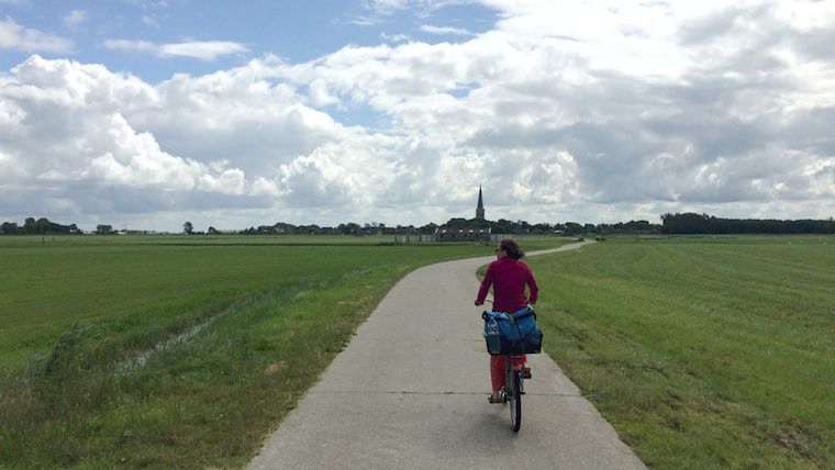 my partner Carmen leads the way
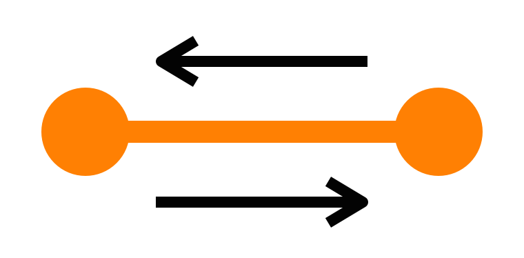
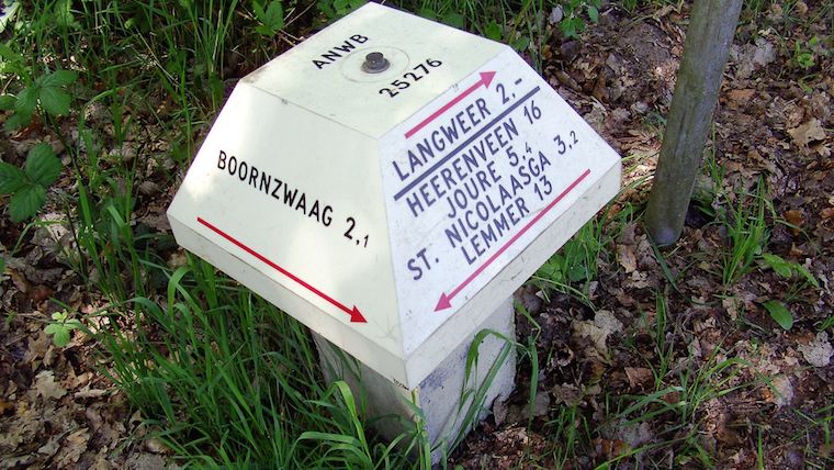
For this we use the fietsroutenetwerk, the bicycle route network of the Netherlands. This was designed for recreational cycling in the countryside. It was rolled out between 2003 and 2012. The network is point‐to‑point:
Between two neighbouring nodes there is complete signage—with no gaps—to get you from one to the other. And this in both directions. Here are some of these signs:
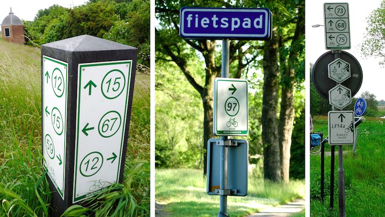 sources: fietsen op de fiets,
het groene woud,
gps.nl
sources: fietsen op de fiets,
het groene woud,
gps.nl
The implicit promise is that these are nice routes. That means: away from cars as much as possible. And scenic—through fields, heath and forrest.
Using the nodes, local networks have been designed and built:
These networks are purely infrastructural; there is no preconception of what is ‘proper’ or ‘typical’ usage. They accommodate routes of any shape and any length.
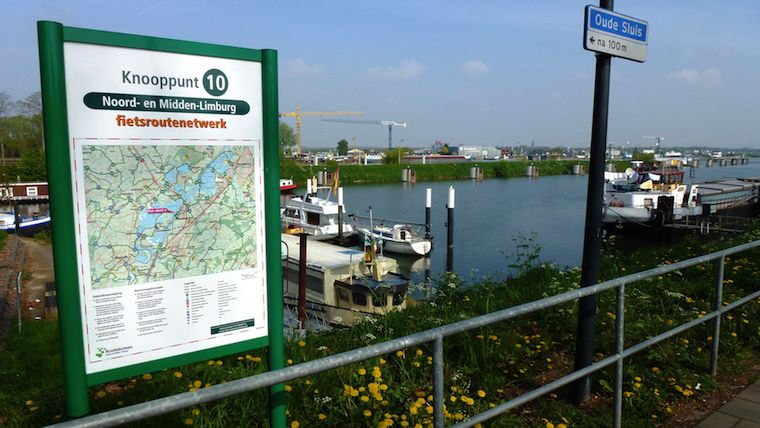
At every node, one finds a local map, with the network:
 source: wikimedia commons
It can be used for planning, reference and simply reassurance. Besides that, there are old‑fashioned maps and plenty of apps and websites for planning and sharing of routes.
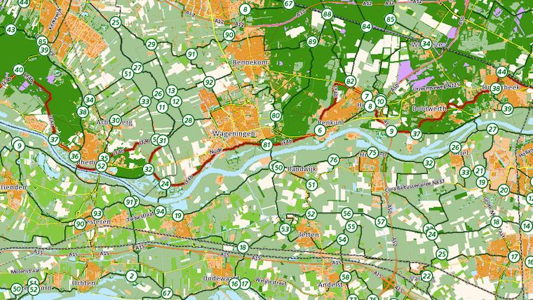
The local networks were knitted together to form a national network:
Looking at this map I see interesting differences in patterns and densities. I don’t think this only reflects the geography, but also the character of the locals; what they consider proper cycling infrastructure and scenic routes.
The network was not always nation-wide. It was rolled out over a period of nine years, one local network at the time. I still remember crossing a province border and (screech!) there was no more network. It was back to old‑fashioned map reading and finding the third street on the left.
not invented here
I was shocked to find out that the Dutch did not invent this network system. We have to go back to the 1980s, north‐east Belgium: all the coal mines are closing. Mining engineer Hugo Bollen proposes to create a recreational cycling network, in order to initiate economic regeneration of the region. Here’s Hugo:
 source: toerisme limburg
He designed the network rules explained in this blog post. The Belgians actually had to build(!) all of the cycling infrastructure, so it took them to 1995 to open the first local network. It now brings in 16.5 million Euro a year to the region.
how many?
I got curious about the total number of network nodes in Holland. I could not find this number on the internet. The net is really quite short on stats and data of the cycling network. So I needed to find out by myself. What I did was take one of my maps—
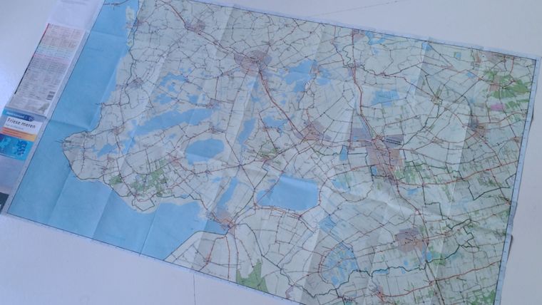
And I counted all the nodes—there were 309. I multiplied this with the number of maps that cover all of Holland. Then I took 75% of that number to deal with map overlaps and my own over‐enthusiasm. The result: I estimate that the dutch network consists of 9270 nodes.
in awe
The reason I got curious about that number is that every time I use the network, I am impressed by a real‐genius design decision (and I don’t get to say that very often). It makes all the difference, when using the network in anger.
All these nearly‐ten thousand nodes are identified by a two‑digit number. Not the four (or more future‐proof, five) one would expect. All the nodes are simply numbered 1 through 99, and then they start at one again. And shorter is much better:
 source: recreatieschap westfriesland
Two digits is much faster to read and write down. It is easier to memorise, short‐term. It is instant to compare and confirm. Remember, most of these actions are performed while riding a bike at a nice cruising speed.
but…
Pushing through this two‑digit design must have been asking for trouble. Most of us can just imagine the bike‐shedding: ‘what if cyclists really need to be able to uniquely identify a node in the whole nation?’ Or: ‘will cyclists get confused by these repeating numbers?’
This older cycling signpost system has a five‑digit identification number:
 source: dirk de baan
This number takes several steps to process. Two‑digit numbers are humane numbers. They exploit that way‐finding is a very local activity—although one can cover 130km a day on a bike.
whatchamacallit?
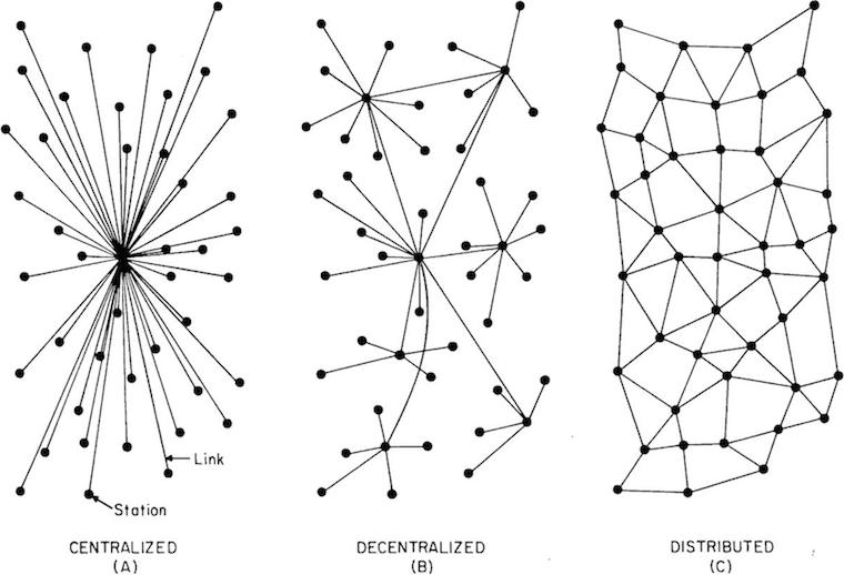
Wrapping up, the cycling network is a distributed network:
 source: j4n
All nodes are equal and so are all routes. Cyclist route themselves. In that way the network works quite like… the internet.
We could call it the democratic network, because it treats everyone as equals. Or we could call it the liberal network (that would be very dutch). Or—in a post‐modern way—we could call it the atomised network.
I simply call it the bicycle route network of the Netherlands.
Labels: infrastructure, lecture, practical, top story
designing interaction for creative pros /4
30 May 2016, 20:08
Part one urged to make a clear choice: is the software you’re making is for creative professionals, or not? Part two was all about the rally car and the need for speed. Part three showed the need to support the free and measured working modes of masters.
We start by revisiting the cars of part two.
party like it’s…
It is no coincidence that I showed you a 1991 family car and a 1991 rally car:
 source: netcarshow.com
and imgbuddy.com
source: netcarshow.com
and imgbuddy.com
I did that because our world—that of software for creative pros—is largely stuck in that era. And just like 1991 king‐of‑the‑hill cars (even factory‐mint examples found in a time capsule), this software is no longer competitive.
 yes, it’s pants! source:
charliepants.com
yes, it’s pants! source:
charliepants.com
It is my observation that in this field there is an abundance of opportunities to do better. If one just starts scratching the surface, on a product, workflow, or interaction level, then today’s software simply starts to crumble.
testing, testing, one two
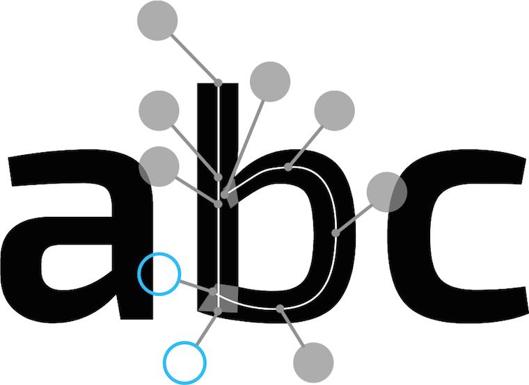
For instance, while doing research for the Metapolator project, I asked some users to show me how they work with the font design tools of today. They showed me the glyph range, the central place to organise their work and get started:
They also showed me the curve editor, where the detailed work on each glyph is done:
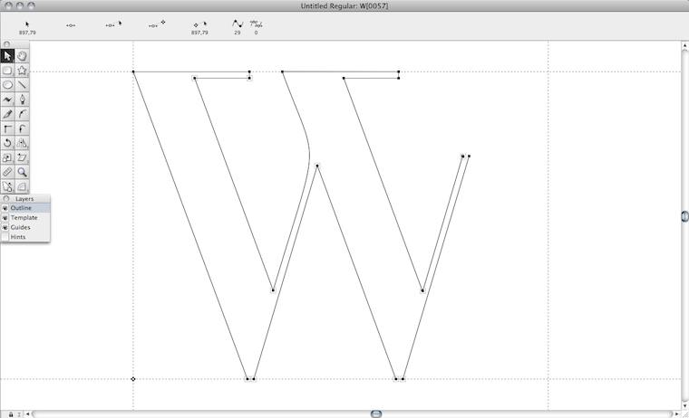
Both of them need the whole screen. In a short amount of time I saw a lot of switching between the both of them. I sensed wasted time and broken flows. I also saw tiny, slow handles in the editor. And I thought: this cannot be it.
They also showed me, in another program, designing in context:
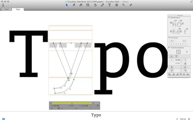
I immediately sensed this was a big deal. I saw that they had pushed the envelope—however, not broken through to the other side.
Besides that, I observed that editing was done in outline mode (see the ‘y’, above), but evaluation is of solid black glyphs. Again I sensed broken flows, because of switching between making and evaluating. And I thought: this cannot be it.
Frank sez…
Enough of that; let’s zoom out from my field report, to the big issue at hand. To paraphrase Zappa:
‘How it has always been’ may not be quite dead, but it sure smells funny.
The question is: how did we get to this situation? Let me dig through my experience to find some of the causes.
First of all we can observe that each piece of creative‐pro software is a vertical market product; i.e. it is not used by the general population; only by certain masters. That means we are in armpit of usability territory. Rereading that blog post, I see I was already knee‐deep into this topic: ‘its development is driven by reacting to what users ask for (features!) and fear of changing “like it has always been” through innovation.’
go on, have another cake
The mechanism is clear: users and software makers, living in very different worlds, have a real hard time communicating. Where they manage, they are having the wrong conversation: ‘gimme more features!’ —‘OK, if that makes you happy.’
What is happening today is that users are discussing software made yesterday. They are not able to communicate that their needs are so lousily addressed. Instead, they want some more cherries on top and this cements the position of this outdated software.
Constantly, users are telling software makers, implicitly and explicitly, ‘add plenty of candy, but don’t change a thing.’
This has been going on for decades—lost decades.
bond of pain
A second cause that I want to highlight is that both users and software makers have worked for years to get on the inside and it has been a really painful experience for all of them. This unites them against change.
Thus users have been fighting several frustrating years to get ‘into’ software that was not designed (for them; armpit of usability, remember), but instead made on terms favourable to the software makers.
Software makers spent year after year trying to make something useful. Lacking any form of user research, the whole process has been an exasperating stab‐in‐the‐dark marathon.
Thus a variant of the Stockholm syndrome spooks both parties. They are scarred‐for‐life victims of the general dynamic of the pro‑software industry. But now that they have gotten this far, their instinct is to sustain it.
the point
Two decades of experience shows that there is a way out of this misery; to become competitive (again). There is no incremental way to get there; you’ll have to snap out of it. What is called for is innovation—of your product, workflow, your interaction. A way that unlocks results is:
- user research
Experienced researchers cut straight past the wants and get the user needs on the table. (Obligatory health & safety notice: market research has nothing to do with user research; it is not even a little bit useful in this context.) - design‐driven innovation
When user needs are clear (see point 1), then a designer can tell you any minute of the project—first to last—what part of ‘how it has always been’ is begging to be replaced, and which part is the solid foundation to build upon. Designer careers are built on getting this right, every time.
Skip either point—or doing it only in a superficial, or non-consequential, way—and I’ll guarantee you’ll stay stuck in 1991. Making it happen requires action:
Software‐makers: enthusiastically seek out user researchers and designers and start to sail by them. Stop considering adding features a good thing, stop being a captive of ‘how it has always been’ and trust the accomplished.
picture show
To illustrate all this, let’s look at some of my designs for Metapolator. To be able to solve these problems of contemporary font design tools that I mentioned above, I had to snap out of the old way.
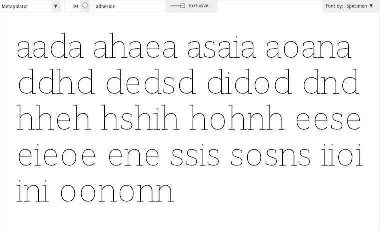
First of all, I pushed designing in context a lot further, by introducing in‑specimen editing:
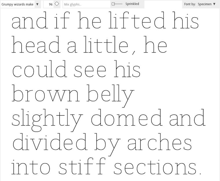
Every glyph you see above is directly editable, eliminating switching between overview and editing. The size that the glyphs are displayed in can be adjusted any given moment, whatever suits the evaluate/edit balance.
‘OK, that’s great’ you say, ‘but every once in a while one needs a glyph range to do some gardening.’ To address that, I used a handy trick: the glyph range is just another specimen:
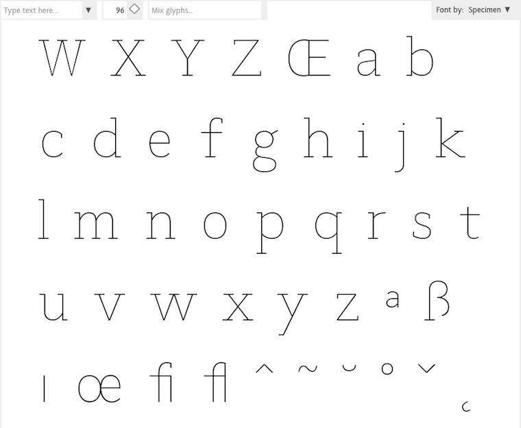
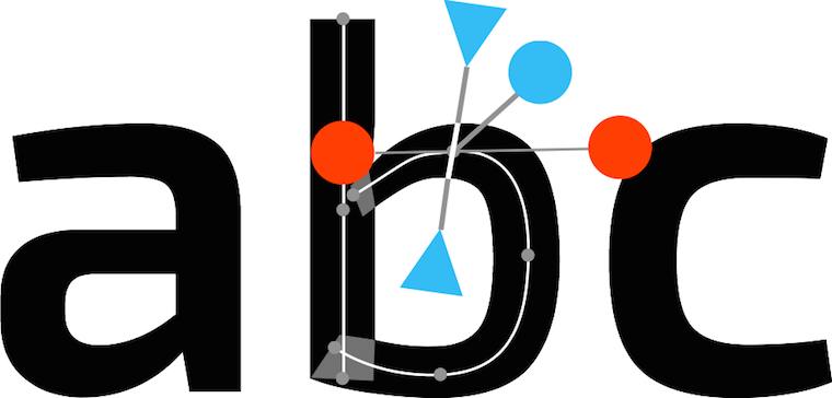
Everybody in the Metapolator team thought I was crazy, but I was dead set on eliminating outline mode. I sensed there was chance to do that here, because the focus moves from working at the edge of the glyph—the high‐contrast black–white transition—to the center line within:
Then there was the matter of offering users generous handles that are fast to grab and use. After brainstorming with Simon Egli, the design shown above was born: put them ‘on sticks’ outside, so that they do not impede visual evaluation of the glyph.
pep talk
In closing: to be good in creative‐pro interaction, I encourage you to—
Do not ask how the past can guide you. Ask yourself what you can do to guide your software for creative pros into the 21st century.
Labels: design stage, lecture, metapolator, practical, product phase, top story
punters vs. society, an illustrated guide
15 February 2016, 12:01
brownie snaps
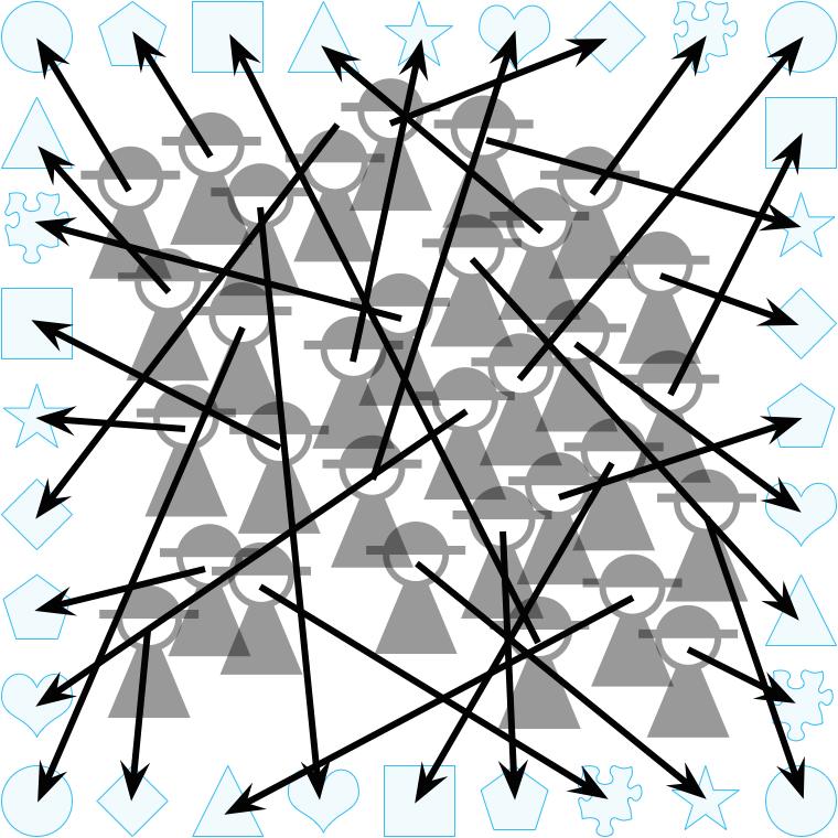
Below, we see the users of a product—e.g. a piece of software, an (internet) service, a device:

All users are different. Above we see the diversity of this user society depicted in two dimensions; no two are in the same spot. In reality this spread happens in dozens of dimensions. Even for very specialised user groups like ‘font designers for indochinese languages,’ there is plenty of diversity in many dimensions.
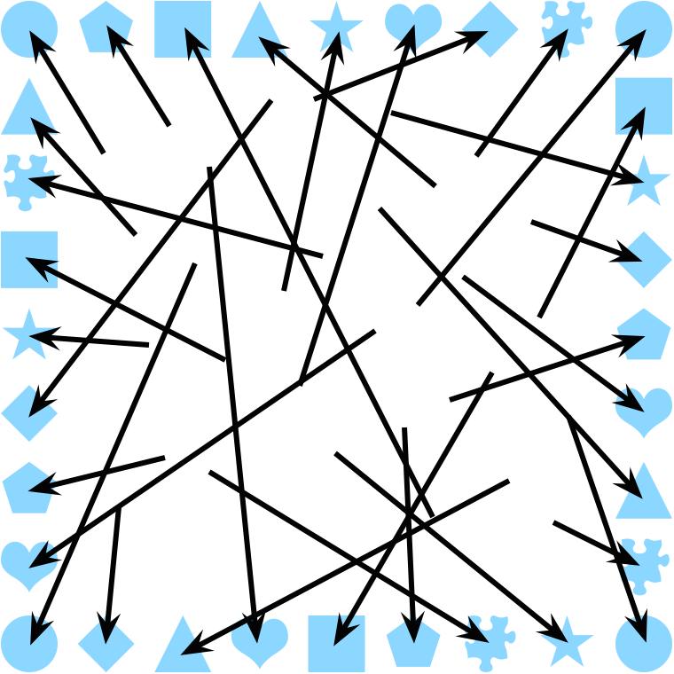
We all act like selfish punters; you, me, everyone. And when we are individually engaged in talk about a product, we will offer self‐centred opinions on what matters most and self-serving feature requests, i.e. our wants:
The dynamic we see illustrated above is very common in the software industry. You will find it in 99% of—
- custom software projects for companies, NGOs or the government, during requirements gathering;
- small and medium‐sized software companies where the boss, sales, support and/or consultants talk to customers and users;
- any kind of user forum, online or otherwise;
- take (a variant of) the second point above and combine it with the third, that’s F/LOSS, all of it;
- anywhere where market research is deployed.
write write, scribble scribble
It is also very common in the software industry to earnestly administrate user wants:
Common forms of this are—
- lists of use cases;
- use cases in sheep’s clothing: user stories;
- bug trackers; not necessarily as an enhancement or a feature request, it may be dressed up as a bug, or a usability problem;
- feature roadmaps;
- a lingering pressure, guilt, or fear in the minds of those in charge—boss, product manager, or maintainer;
- a consensus among (part of) the crew: ‘people keep asking for XYZ, we could hack something basic in a couple of days’ (yeah sure).
Now we can compare this administration of wants to the user society:

We see that at best, wants are good at describing the fringe of the society, but 80% of them are downright far‑out and esoteric.
Since wants are so overwhelmingly used in the industry to drive products and projects, there is overwhelming evidence that this leads to awful results. It is completely normal that a majority of time and talent is spent on adding far‑out and esoteric features that are instant bloat.
And thus everybody loses: makers, users and financial backers.
doing it right
Now we are going to stop flirting with disaster.
User research avoids all what has been described up to now in this post. The focus is on—
- finding out what users need;
- quality and depth of these findings;
- understanding the mechanisms at play.
Instead of listening to everbody and their dog, researchers accompany a selection of representative participants on a ‘journey‘ through the pertaining activity, while constantly picking their brain:
Above, we see depicted that when users still insist on pushing their wants (i.e. go far out), researchers reel them in by questioning; peeling away layers of rationalisation in order to understand the underlying needs.
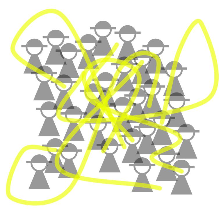
These needs are not exotic, they are basic human needs (e.g. control, overview, feedback, organisation, a stable environment, a simple rule book) that form the center of the picture—and are central to making it work for users.
Researchers and designers collaborate on constructing a model—an understanding—of the user society. The centre of the picture is where one finds the commonalities in the (analysed) research material:
This is the heart of the matter. It is surrounded by the diversity in needs as found by the research. Note that there is a hard edge to this model: what is outside is certainly out of scope.
The qualitative aspect of research (e.g. taking into account the tone of voice or facial expression when something is stated) makes a world of difference. It is this richness of information that makes user research so effective. We see above that some outliers have been ignored in the user model. This is done with full confidence, based on the research.
core, non‑core
Now we can compare the needs‐based user model to the user society:

The coverage of the model works out so well, that it is difficult to see the actual users. This is especially true for the heart of the matter. Note that some users at the very fringe of society may feel left out; they are covered a little bit or not at all.
In a design‐driven approach, the needs‐based user model is used to decide which features to add (cover the diversity, but nothing beyond the edge) and where to focus design and development effort (on the heart of the matter).
A/B testing
Zooming out, we now can compare the two approaches:

When compared to the results of user research, the bog standard, wildly popular method of listening to users and their wants—
- fails to record the heart of the matter;
- fails to record the diversity of user needs;
- is a list of disparate wishes, instead of a coherent, nuanced insight;
- highlights the fringe, the far‑out, the esoteric;
- gets you completely the wrong picture.
postscript
This past semester I discussed all this with my students at the BTK design school. To get the point across about the dangers of talking to users, I asked them ‘do you remember these creatures in mythology that always give you the wrong answer, so that you get lost?’
‘Yeah’, they said, ‘they are called trolls.’
Labels: fundamental, product phase, top story, war and peace
war and peace—the 5th column
21 August 2015, 10:22
cuckoo
Last week my friend Jan‑C. Borchardt tweeted:
‘Stop saying »the user« and referring to them as »he«. Thanks!’
To which I replied:
‘“They”; it is always a group, a diverse group.
‘But I agree, someone talking about “the user” is a tell‐tale sign that they are part of the problem, not the solution.’
All that points at a dichotomy that I meant to blog about for a long time. You see, part one of the war and peace series looked at all four parties involved—product makers, users, developers and designers—as separate silos. The logical follow‑up is to look at hybrid actors: the user‐developer, the product maker‐developer, et cetera.
While working to provide a theoretical underpinning to 20+ years of observation of performance in practice of these hybrid actors, I noticed that for all user‐XYZ hybrids, the user component has not much in common with the users of said product. In general, individual users are in conflict with the user group they are part of.
That merits its own blog post, and here we are.
spy vs. spy
First we got to get away from calling this ‘user versus users.’ The naming of the two needs to be much more dissimilar, both to get the point across and so that you don’t have to read the rest of this post with a magnifying glass, just to be sure which one I am talking about.
During the last months I have been working with the concept of inhabitants vs. their city. The inhabitants stand for individual users, each pursuing their personal interests. All of them are united in the city they have chosen to live in—think photoshop city, gmail city, etc. Each city stands for a bustling, diverse user group.
inner city blues
With this inhabitants & city model, it becomes easier to illustrate the mechanisms of conflict. Let’s start off with a real‐life example.
Over the next years, Berlin needs to build tens of thousands units of affordable housing to alleviate a rising shortage. Because the tens of thousands that annually move to Berlin are (predominantly) looking for its bubbly, relaxed, urban lifestyle, building tower blocks on the edge of town (the modernist dream), or rows of cookie‐cutter houses in suburbia (the anglo‐saxon dream) won’t solve anything.
What is needed is development of affordable housing in the large urban area of Berlin. A solid majority of the population of Berlin agrees with this. Under one condition: no new buildings in their backyard. And thus almost nothing affordable gets built.
What can we learn from this? Naturally reactionary inhabitants take angry action to hinder the development that their city really needs. I am sure this rings a bell for many a product maker.
yee‑haw!
The second example is completely fictional. A small posse of inhabitants forms and petitions the city to build something for their (quite) special interest: a line‐dancing facility. At first they demand that the city pays for everything and performs all the work. When this falls on deaf ears, the posse organises a kickstarter where about 150 backers chip in to secure the financing of the building work.
Being petitioned again, the city asks where this line‐dancing facility could be located. The posse responds that in one of the nicest neighbourhoods there is a empty piece of grassland. The most accessible part of it would be a good location for the facility and its parking lot.
The city responds that this empty grassland host events and community activities on about 100 days a year, many of which are visited by folks from all over the city. And all other days of the year the grassland serves the neighbourhood, simply by being empty and semi‐wild nature; providing a breather between all the dense and busy urbanisation, and a playground for kids.
repeat after me: yee‑haw!
This angers the line‐dancing posse. They belittle the events and activities, and don’t know anyone who partakes in them. The events can be moved elsewhere. The land just sits there, being empty, and is up for grabs. Here they are with a sack of money and a great idea, so let’s get a move on.
The city then mentions one of its satellite towns, reachable by an expressway. At its edge, there is plenty of open space for expansion. It would be good to talk to the mayor of that town. The posse is now furious. Their line‐dancing facility, which would make such a fine feature for the heart of the city, being relegated to being an appendix of a peripheral module? Impossible!
What can we learn from this? Inhabitants will loudly push their special‐interest ideas, oblivious to the negative impact on their city. Again this must also ring a bell for many product makers.
leaving the city
Now that the inhabitants & city model has helped us to find these mechanisms, I must admit there are also some disadvantages to it. First, cities do not scale up or down like user groups do. I have worked on projects ranging from a handful of users (hamlet) to 100 million (large country). And yes, the mechanisms hold over this range.
Second, I suspect that many, especially those of a technological persuasion, will take the difference between inhabitants and their city to be that the former are the people, and the latter the physical manifestation, especially buildings and infrastructure.
no escape
Thus we move on for a second time, picking a more generic route, but one with attitude. For individual users I have picked the term punter. If that smacks to you as clientèle that is highly opinionated, with a rather parochial view of their environs, then you got my point.
Now you may think ‘is he picking on certain people?’ No, on the contrary: we all are punters, for everything we use: software, devices, websites, services—hell, all products. You, me, everyone. We are all just waffling in a self‐centred way.
There is no single exception to the punter principle, even for people whose job is centred on getting beyond the punter talk and to the heart of the matter. It is simply a force of nature. The moment we touch, or talk about, a product we use, we are a punter.
greater good
For the user group I have picked the term society. This works both as a bustling, diverse populace and as a club of people with common interests (the photoshop society, gmail society, product‑XYZ society). Some of you, especially when active in F/LOSS, will say ‘is not community the perfect term here?’ It would be, if it wasn’t already squatted.
After almost a decade in F/LOSS I can say that in practice, ‘community’ boils down to a pub full of punters (i.e. chats, mailing lists and forums). In those pubs you will hear punters yapping about their pet feature (line dancing) and loudly resisting structural change in their backyard. What you won’t hear is a civilised, big‐picture discourse about how to advance their society.
it differs
One thing that last week’s exchange with Jan‑C., and also a follow up elsewhere, brought me is the focus on the diversity of a (product) society. This word wonderfully captures how in dozens and dozens of dimensions people of a society are different, have different needs and different approaches to get stuff done.
I can now review my work over the last decade and see that diversity is a big factor in making designing for users so demanding. The challenge is to create a compact system that is flexible enough to serve a diverse society (hint: use the common interests to avoid creating a sprawling mess).
I can also think of the hundreds of collaborators I worked with and now see what they saw: diversity was either ‘invisible,’ in their mono‐cultural environment, or it was such an overwhelming problem that they did not dare tackle it (‘let’s see what the user asks for’). Talking about ‘the user’ is the tell‐tale sign of a diversity problem.
The big picture emerges—
If you want to know why technology serves society so badly, look no further than the tech industry’s problem to acknowledge, and adapt to, the diversity of society.
Yes, I can see how the tendency of the tech sector to make products that
only its engineers understand has the same roots as the now widely publicised
problem that this sector has a hard time being inclusive to anyone who is not
a male,
but why?
Back to the punters. That we all act like one was described ages ago by the tragedy of the commons. This is—
‘[…] individuals acting independently and rationally according to each’s self‐interest behave contrary to the best interests of the whole group by depleting some common resource.’
If you think about it for a minute, you can come up with many, many examples individuals acting like that, at the cost of society. The media are filled with it, every day.
what a waste
What common resources do punters strive to deplete in (software) products? From my position that is easy to answer—
- makers’ time; both in proprietary and F/LOSS, the available time of the product maker, the designer and developers is scarce; it is not a question of money, nor can you simply throw more people at it—larger teams simply take longer to deliver more mediocre results. To make better products, all makers need to be focussed on what can advance their society; any time spent on punter talk, or acts (e.g. a punter’s pull request), is wasted time.
- interaction bandwidth; this is, loosely, a combination of UI output (screen space, sound and tactile output over time) and input (events from buttons, wheels, gestures), throttled by the limit what humans can process at any given time. Features need interaction and this eats the available bandwidth, fast. In good products, the interaction bandwidth is allocated to serve its whole society, instead of a smattering of punters.
The tragedy of (software) products is that it’s completely normal that in reaction to punters’ disinformation and acts of sabotage, a majority of maker’s time and a majority of interaction bandwidth gets wasted.
Acts of sabotage? SME software makers of specialised tools know all about fat contracts coming with a list of punter wishes. Even in F/LOSS, adoption by a large organisation can come with strings attached. Modern methods are trojan horses of punter‐initiated bounties, crowdfunding or code contributions of their wishes.
the point
This makes punters the fifth column in the UI version of war and peace. Up to now we had four players in our saga—product maker, users (i.e. the society), developers and the designer—and here is a fifth: a trait in all of us within society to say and do exactly that what makes (software) products bloated, useless, collapse under their own weight and burn to the ground.
It is easy to see that punters are the enemy of society and of product makers (i.e. those who aim to make something really valuable for society). Punters have an ally in developers, who love listening to punters and then build their wishes. It makes the both of them feel real warm and fuzzy. (I am still not decided on whether this is deliberate on the part of developers, or that they are expertly duped by punters offering warmth and fuzziness.)
That leaves designers; do they fight punters like dragon slayers? No, not at all. Read on.
the dragon whisperer
Remember that punters and society are one and the same thing. The trick is to attenuate the influence of punters to zero; and to tune into the diversity and needs of society and act upon them. Problem is, you only get to talk to punters. Every member of society acts like a punter when they open their mouth.
There is a craft that delivers insight into a society, from working with punters. It is called user research. There are specialist practitioners (user researchers) and furthermore any designer worth their salt practices this. There is a variety of user research methods, starting with interviewing and surveying, followed up by continuous analysis by the designer of all punter/society input (e.g. of all that ‘community’ pub talk).
the billion‐neuron connection
What designers do is maintain a model of the diversity and needs of the society they are designing for, from the first to the last minute they are on a project. They use this model while solving the product‐users‐tech puzzle, i.e. while designing.
When the designer is separated from the project (tech folks tend towards that, it’s a diversity thing) then the model is lost. And so is the project.
(Obligatory health & safety notice: market research has nothing to do with user research, it is not even a little bit useful in this context.)
brake, brake
At this point I would like to review the conflicts and relationships that we saw in part one of war and peace, using the insights we won today. But this blog post is already long enough, so that will have to wait for another day.
Instead, here is the short, sharp summary of this post:
- Users groups can be looked at in two ways: as a congregation of punters and as a society.
- We all are punters, talking in a in a self‐centred way and acting in our self‐interest.
- We are also all members of (product) societies; bustling, diverse populaces and clubs of people with common interests (the photoshop society, gmail society, product‑XYZ society).
- Naturally reactionary punters take angry action to hinder structural product development.
- Punters will loudly push their special‐interest ideas, oblivious to the negative impact on their society.
- The diversity of societies poses one of the main challenges in designing for users.
- The inability of the tech sector to acknowledge, and adapt to, the diversity of society explains why it tends to produce horrible, tech‐centric products.
- In a fine example of ‘the tragedy of the commons,’ punters behave contrary to the best interests of their society by depleting makers’ time and interaction bandwidth.
- Punters act like a fifth column in the tri‑party conflict between product makers, society and developers.
- You only get to talk to punters, but pros use user research methods to gain insight into the diversity and needs of a society.
- Everyone gets bamboozled by punters, but not designers. They use user research and maintain a model of diversity and needs, to design for society.
Interested, or irritated? Then (re)read the whole post before commenting. Meanwhile you can look forward to part three of war and peace, the UI version.
Labels: design stage, fundamental, top story, war and peace
wishful thinking; ignite the shirts
7 August 2015, 13:31
kaboom!
The Ignite format is pretty demanding. I better let them explain it themselves:
‘Each speaker gets 5 minutes on stage. 20 slides, which auto‐forward every 15 seconds, no going back. So it’s pretty brutal, although nothing that a rehearsal can’t fix.’the Ignite format, from their about page
Yes, this is really different than presenting 20 to 45 minutes at your own rhythm, which is what I am used to. A strategy, careful planning of the 20 slides and a generous helping of rehearsal are asked for. What I regularly see at conferences—some (recycled) slides banged together the night before and winging it during showtime—is bound to have a 99.99% fail rate at Ignite.
bang, you win
The upside is that the audience wins. All the speakers are an order of magnitude more prepared than they normally would be. There is no time for waffling and even single‐issue talks are engaging for five minutes.
At this event there were fourteen talks, two runs of seven each, which sounds like a looong marathon to sit through. In praxis, one run of seven talks takes 35 minutes of pure talk time, plus some for applaus and changeover (everything is pre‐sequenced on a single laptop). Thus in 38–40 minutes, seven engaging topics have passed and then it is time for a break, to digest and discuss.
Since my talk was scheduled almost at the end of the event, I expected to be too preoccupied to enjoy all these talks before mine. On the night, all of the talks engaged and entertained me, which put me in a good mood for mine. (When is the last time you could say that about a conference?)
show and tell
In my Ignite talk I showed a selection of wishful‐thinking issues,
together with the positive action
that can must be taken to remedy them. Meanwhile, I told
the back‐story, for instance, that—
- I have seen all of this wishful thinking in practice;
- I wanted to expose a destructive streak that runs through the IT industry;
- it was more work to make issues and remedies fit a single tweet, than to come up with them;
- I felt that I could go on ‘forever’, but called it quits at fifty;
- being in interaction design—which is essentially product realisation and involves seeing all dimensions (product, users, tech)—makes it easy to see the damage from wishful thinking;
- it is a real shame to see the right people, with the right intentions, run projects into the ground through wishful thinking;
- this is not valid only in IT, but in any industry;
- please, it is difficult, but resist the wishful thinking when you believe in what you are working on;
- what is needed is process change, which is also difficult, introducing a design process that from the first to the last minute of the project shapes and runs all product realisation, including manufacturing or fixing that final bug.
aftermath
I had plenty of interesting discussions after the talks were through, but one really took me by surprise: fellow speaker Onika Simon of Spokehub said something along the lines of ‘why don’t you put this wishful thinking on t‑shirts? There are plenty of people who deserve to get one.’
During my talk I had admitted that I am not a product maker and that never in my life I’ve had a good product idea. Thus it did not surprise me that I never had thought of wishful‐thinking t‑shirts. But now that the genie was out of the bottle, how difficult could it be?
snakes and ladders
Some parts were really straightforward. The content was already there. Deciding what should go on front and back, and picking some free‐as‐in‐speech fonts (right, no pirated components in my products) was no big deal. Neither was typesetting the texts.
Making EPS files already involved jumping through one hoop (why not accept pdf? It is just about the same tech). Dealing with spreadshirt was a three‐ring circus. Spreadshirt is suppose to make it easy to open your own merchandising outlet, but forget about the easy part.
I could go on and on, about requiring flash <spit>, crashes, usability disasters, the pervasive ‘how do I get that done?’ and ‘how do I know it did it?’ anxiety, and only finding out what you will get when you get there. But let’s say that unless you are a spreadshirt executive, I won’t bother (you with it).
lift‑off
Against these odds, I did manage to put up a t‑shirt shop in less than a week. There is one MVP: a limited‐edition t‑shirt (available one month only) in female and male cuts, and two variants, dark and bright:
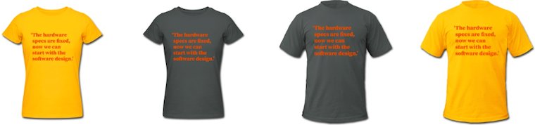
I found out at the very end, when I got to check it out (typical, eh), that you can change the shirt colour in the shop. Suits me fine; a simple ‘menu’ to choose from and then freedom to customise, a bit.
When I checked the wishful thinking topic page, I noticed how hard‐hitting these are by themselves, so it was clear that these go, solo, on the front:
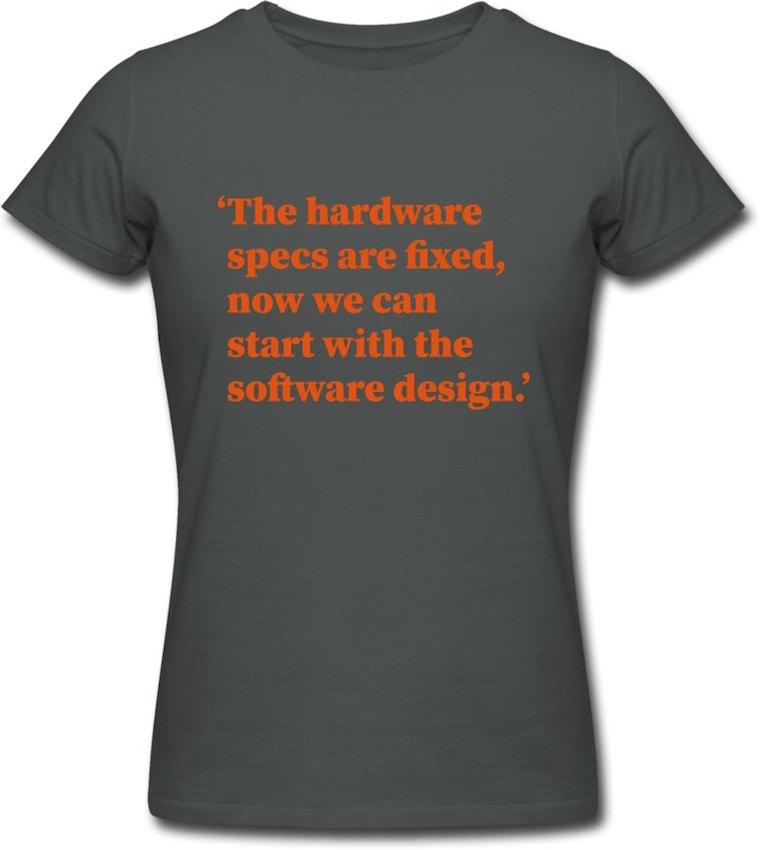
This is the wishful thought for August ’15 and you can see that I plunged for the first one I saw. Each month I will pick a different one (no, not in the order on that page) and change the ‘bright’ colour scheme.
On the back we ensure that everyone gets the point…
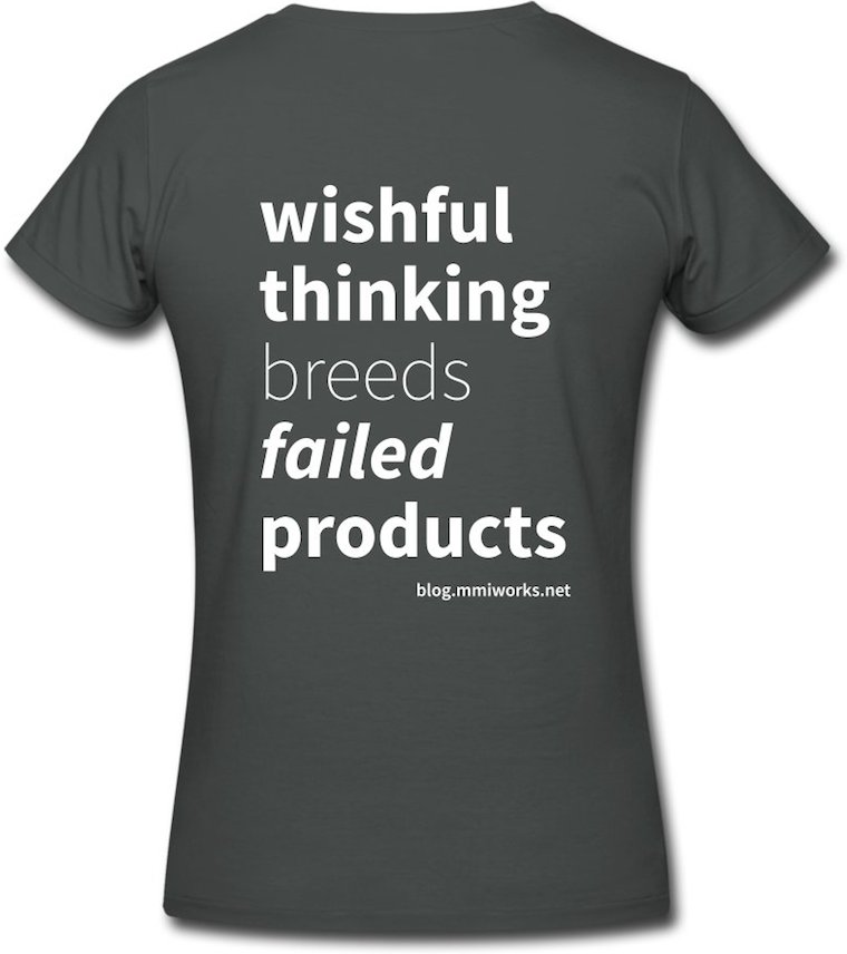
…just in case the beholder wishfully thinks the statement on the front is best‐practice.
postscript
And out of the blue m+mi works offers a hardware product. It will be fun offering these and I hope spreadshirt cooperates a bit more to keep it that way. I look forward to seeing one of these t‑shirts being worn in the wild.
Labels: act to succeed, top story, why products fail
designing openType‐features UI /intro
23 June 2015, 09:24
a bit of a situation
First things first. It is quite likely that when you are reading this, you know what openType features in fonts are. But just in case you don’t, here is a friendly, illustrated explanation of some of the features, without putting you straight into corporate specification hell. The reason I said ‘some’ will become clear below.
What is interesting is that there is a riot going on. The 800‑pound gorillas of (typo‐)graphical software—the adobe creative suite applications—have such bad and disparate UI for handling openType features that a grass‐roots protest movement started among typographers and font designers to do something about it. What followed was a a petition and a hasty promise by adobe to do better—in the future.
meanwhile in Toronto…
These events prodded Nathan Willis into action, because ‘open‐source applications aren’t any better in this regard.’ He organised a openType workshop at this year’s LGM to get a process started to change that. I went there because this is smack in the middle of one of my fields of specialisation: interaction for creatives. As you can read in Nathan’s report, I got immediately drawn into the UI discussion and now we have a loose‐knit project.
The contents and vibe of the questions, and my answers, in the UI discussion all pointed in a certain direction, that I was only able to name a day later: harmonised openType features for all F/LOSS (typo‐)graphical applications definitely has an infrastructure component.
the untouchables
Pure infrastructure—e.g. tap water, electricity, telecoms—offers its designers some unique challenges:
- everybody uses it
- and everybody’s needs are equally important; there is no opportunity to optimise the design for the specific needs of user groups.
- nobody cares
- usage is ubiquitous, i.e. we all do not even register that we are using this stuff all the time—until it stops working, then we miss it a hundred times a day. This makes it very hard to research; no recollection, feelings or values are connected to infrastructure, just entitlement.
- anyplace, anywhere, anytime
- there is no specific contextual information to work with: why is it used; what is the goal; what does it mean in the overall scheme of things; how much is a little, and a lot; it is used sparsely, all the time, at regular intervals, in bursts? It all depends and it all happens. Just deal with it, all of it.
- millions of use cases
- (not that I consider use cases a method that contributes positively to any software project, but‐) in the case of infrastructure something funny and instructive happens: after a week or two of exploration and mapping, the number of use cases grows exponentially towards a million and… keeps on growing. I have seen this happen, it is like peeling an onion and for every layer you peel off, the number goes up by an order of magnitude. These millions of use cases are an expression of everybody using it anyplace, anywhere, anytime.
- heterogeneous capabilities
- this is not always the case, but what is available can vary, a lot. For instance public transport: how many connections (incl. zero) are available for a given trip—and how fast, frequent and comfortable these are—is set by the network routes and timetables. An asked‑for capability is on offer, or not. It all depends and it all happens. Just deal with it, all of it.
I have worked as design lead on two infrastructure projects. One was Nokia dual‑SIM, the other openPrinting, where we designed printing dialogs for all linux users (everyone), as used in 10.000 applications (anyplace, anywhere, anytime), connected to 10.000 different printer models (heterogeneous capabilities). I dubbed it the project with five million use cases.
Ah, and since both application and printer configure the available options of the print dialog, there are potentially 100 million configurations. Even if in reality the variability is far less (say, just 1% on both application and printer side; i.e. 100 significantly different printer models and 100 apps that add serious, vital printing options), then it is still an overwhelming 10.000 configurations.
drowning, not waving
In my experience, designing infrastructure is very demanding. All the time one switches between making the big, abstract plan for everything, and designing, minutely, one of many details in complete isolation. Mid‑level interaction design, the journeyman, run‑of‐the‑mill, lay‑out‐a‑screen level, is completely missing.
It is like landscaping a featureless dessert, where every grain of sand is a detail that has to be dealt with. With no focus on particular users, no basis for research, no context, no just‑design‐the‐example, millions of use cases and highly variable capabilities, I have seen very capable design colleagues lose their bearings and give up.
back at the ranch
Enough war stories. How large is this infrastructure component of openType features in (typo‐)graphical software? Let’s check the list:
- everybody uses it—nope. Whether the user groups turn out to be defined real narrow or quite wide—a matter of vision—they will have in common that all of them know their typesetting. That is a craft, not common knowledge.
- nobody cares—well, soon they won’t. Right now there is upheaval because nothing is working. As soon as users get a working solution in the programs they use, it will become as interesting as the streetlights in your street.
- anyplace, anywhere, anytime—right on! This has to work in (typo‐)graphical software; all of it—even the kind I have never heard of, or that will be invented in five years from now. All we know, is that serious typesetting is performed there by users, on any length of text selection.
- millions of use cases—not quite. The limited user group provides the breaks here. But there is no such limit from the application side; on the contrary: most of these are (open‐ended) tools for creatives. Just thinking about how flexible a medium text is, for information or shapes, gives me the confidence to say that 10.000 use cases could be compiled, if someone would sit down and do it.
- heterogeneous capabilities—hell yeah! OpenType‐features support in fonts is all over the place and not just because of negligence. First there is the kaleidoscopic diversity of scripts used around the world, most of which you and I have never heard of. Latin script is just the tip of the iceberg. Furthermore, what is supported, and how each supported feature is actually realised, is completely up to the font designer. The openType‐features standard is open‐ended and creates opportunities for adding sophistication. This is only limited by the combined imagination of the font design community.
Adding that up, we get a score of 3½ out of 5. By doing this exercise I have just found out that openType features in (typo‐)graphical software is 70% infrastructural. This is what I meant with that it is a special, complicated project.
structure—the future
In projects like these structuring the design work is make‑or‐break; either we set off in the right direction, or never get to any destination—not even a wrong one. The structure I use is no secret. Here is my adaptation for this project:
A product vision is not that easy to formulate for pure infrastructure; it tends to shrink towards ‘because it’s there.’ For instance at openPrinting the vision was ‘printing that just works.’ I still regret not having twisted some arms to get a value statement added to that. There were times that this value void was keeping us from creating true next‐generation solutions.
Apart from ‘what’s the value?’ also ‘who is this for?’ needs to be clarified; as we saw earlier, openType features is not for everyone. The identity question, ‘what is it we are making?’ may be a lot less spectacular, but it needs to be agreed. I will take this to the Create mailing list first, mainly to find out who are the ‘fish that swim upfront’, i.e. the people with vision and drive. Step two is an online vision session, resulting in a defined vision.
The deliverable is a to‑the‐point vision statement. If you want to get a good picture of what that entails, then I recommend you read this super‐informative blog post. Bonus: it is completely font‐related.
we want the funk, the whole funk, nothing but the funk
A deep understanding of the functionality is the key to success in this project. I already got burned once with openType features in the Metapolator project. Several font designers told me: ‘it is only a bunch of substitution rules.’ Until it turned out it isn’t. Then at the LGM meeting another surprise complication surfaced. Later I briefly check the specification and there is yet another.
This is what I meant before with that friendly page explaining some of the features. I do not trust it to be complete (and it is only Latin‐centric, anyway). As interaction architect I will have to be completely on top of the functionality, never having to rely on someone else to explain me what ‘is in the box.’ This means knowing the openType standards.
Central to it is the feature tags specification and the feature definition syntax. This contains both the material for understanding of how complicated it all can get and the structures that I can use to formulate UI solutions. It is one of the few aspects that are firm and finite in this project.
The deliverable is a functionality overview, written up in the project wiki.
talking heads
I will do user research, say interview half a dozen users, to gain insight into the act of typesetting, the other aspect that is firm and finite in this project. Which users to recruit depends on what is defined in the product vision. Note that the focus is on the essence of typesetting, while ignoring its specific role in the different (typo‐)graphical applications, and not get swamped by the latter’s diversity.
The deliverable is notes of interest from the interviews, written up in the wiki.
I look forward to an exchange with F/LOSS (typo‐)graphical applications via the Create list. This is not intended to get some kind of inventory of all the apps and how different they are. In this project that is taken as abstract and infinite—the good old infrastructural way.
What I want to find out is in how many different ways openType features must, or can, be integrated in the UIs of (typo‐)graphical applications. In blunt terms: how much space is there available for this stuff, what shape does it have and what is the duty cycle (permanently displayed, or a pop‑up, or…)? These diverse application needs are clustered into just enough UI models (say, six) and used below.
The deliverable is the UI models, written up in the wiki.
getting an eyeful
Then it is time to do an expert evaluation of existing openType‐features UI and all these UI ideas offered by users when the petition did its rounds. All of these get evaluated against—
- the product vision: does it realise the goals? Is it appropriate for the defined user groups?
- the functionality: can it cope with the heterogeneous capabilities?
- the user research: how tuned is it for the essence of typesetting?
- the UI models: how well does it fit with each model?
All of it gets analysed, then sorted into the good, the bad and the ugly. There will be a tiny amount of gold, mostly in the form ideas and intentions—not really what one would call a design—and a large catalog of what exactly not to do.
The deliverable is notes of interest from the evaluation, written up in the wiki.
warp drive
Then comes the moment to stop looking backwards and start working forwards; to start creating the future. First a solutions model is made. This is a combination of a broad‐strokes solution that cuts the project down to manageable proportions and a defined approach how to deal with the rest, the more detailed design work.
The next stage is to design a generic solution, one that already deals with all of it, all the hairy stuff: text selections of any length, all the heterogeneous capabilities, the typesetting workflow, clear representation of all openType features available and their current state. This will be specified in a wiki, in the form of UI patterns.
With the generic solution in place it will be real clear for the central software library in this small universe, HarfBuzz, which new capabilities it will need to offer to F/LOSS (typo‐)graphical software.
home straight
The final design phase is to work out the generic solution for each UI model. These will still be toolkit agnostic (not specific for KDE or gnome) and, btw, for desktop UI‐only (touch is a whole ’nother kettle of fish). This will also be specified in the wiki.
With this, every (typo‐)graphical software project can go to the wiki, pick a UI model that most matches their own UI structure and see a concrete UI design that, with a minimum of adaptations, they can implement in their own application. They will find that HarfBuzz fully supports their implementation.
While working on Metapolator in the last year I had good experience with sharing what I was doing almost every day I was working on it, through its community. There were encouragement, ideas, discussions, petitions and corrections—all useful. I think this can be replicated on the Create list.
Labels: design stage, fundamental, infrastructure, openType, practical, process, product phase, product vision, top story
a half‑century of success
11 June 2015, 12:48
To complete the round number of fifty, I present the final dozen + two of these for your reference. If you are a product maker, or manage a product‐shipping organisation, then you can initiate at least one of these today:
Make the lead designers of your hard‐ and software work as a pair; make them inseparable.cf. ‘The hardware specs are fixed, now we can start with the software design.’
Define your focus so tightly, it hurts (a bit); deploy it so you ship, instead of discuss.cf. ‘We spent ages discussing this, trying to find a solution that pleased everyone.’
Make interaction design the backbone of your product realisation; or compete on low, low price.cf. ‘We thought we could spend a couple of man‐days on the low‐hanging usability fruit.’
Deploy lightweight design and engineering documentation to keep everyone with the programme.cf. ‘The source is the ultimate documentation.’
Ban hacks, at least from those who are supposed to shape your product for the long term.cf. ‘There is no need to go for the gold‐taps solution.’
Set a ‘feature budget’ and set it way below bloat; be frugal, spend it on user value.cf. ‘It does not hurt to have those features as well.’
Set the goal to be competitive on each platform you support—that starts with your interaction.cf. ‘One code base; fully cross‐platform.’
Root out boilerplate thinking for any product aspect; your design process is your QA.cf. ‘You have to pick your battles.’
Set up your designers for big impact on the internals of your software, instead of vice versa.cf. ‘Once you get familiar with the internal workings of our software, it becomes easy to use.’
Define your target user group(s) so tightly, it hurts; focus on their needs, exclusively.cf. ‘Our specific target user group is: everyone.’
Introduce this KPI: the more your developers think the UI is ‘on the wrong track,’ the better.cf. ‘Our developers are very experienced; they make the UI of their modules as they see fit.’
Hire those who are able to take your interaction beyond the HIG, once you achieve compliance.cf. ‘We religiously adhere to the HIG.’
Regularly analyse workarounds adopted by your users; distill from them additional user needs.’cf. ‘You can do that by [writing, running] a script.’
Make the connection: product–users–tech. Design is the process, the solution and realisation.cf. ‘What do you mean “it’s all connected”? we just don’t have the time for those bits and pieces.’
ask not what this blog can do for you…
Now, what else can you do? First of all, you can spread the word; share this blog post. Second, I invite you to connect via twitter, g+, linkedin, or xing.
And third, if you able and willing to take some positive action, then email or call us. We will happy to help you ship successful products.
ps: you can check out part three if you missed it.
Labels: act to succeed, practical, top story
designing interaction for creative pros /3
4 June 2015, 10:13
two‐way street
There are two ways for masters to get the job done. The first way is to start somewhere and to keep chipping away at it until it is right:
 heads up: animated gif
So let’s throw in some material, move and size it (bam, bam, bam)—right, done. That was quick and the result is perfect.
like putty
This is called free working; squeeze it until it feels right. It is always hands‑on and I always move both my hands in a moulding motion when I think of it, to remind me what it feels like.
Although done by feeling, it is still fast and furious. Don’t mistake this for ‘trying out’, ‘fiddling’ or ‘let’s see where we end up’; that is for dilettantes. When masters pick up their tools, it is with great confidence that the result they have in mind will be achieved in a predictable, and short, amount of time.
on the other hand…
The second way for masters to get the job done is to plan a bit and then create a precise, parametric, set‑up:
This is called a jig. Now the master only has to ‘cut’ once and a perfect result is achieved:
 another animated gif
measure twice, cut once
This is called measured working. It is an analytical approach and involves planning ahead. It delivers precise results, to the limits of the medium. You will find it in many places; everywhere where the hands‑on factor is zero, parameters are entered and—bam—the result is achieved in one stroke.
It might be tempting to think that setting up the jig always involves punching in numbers. However also making choices from discrete sets, e.g. picking a color from a set of swatches, is part of it. Thus it is better to talk in general of entering parameters.
old‐skool
I did not make up all this by myself. I am indebted to this very cool book that goes deep into the matter of free and measured working, as practiced for centuries by masters. Luckily it is back in print:

Once familiar with this duality in how masters work, it can be used to analyse their workflows. For instance while reading this article about Brian Eno working with the band James.
In the sidebar (Eno’s Gear) it says ‘I don’t think he even saves the sounds that he gets. He just knocks them up from scratch every time’ about using one piece of gear, and ‘It’s stuffed full of his own presets’ about another. Reading that, I thought: that has, respectively, the vibe of free and measured working.
I have looped that insight back into my designs of creative‐pro software from then on. That is, giving equal importance to users building a collection of presets and knocking‑it‑up‐from‐scratch for tool set‑ups, configuring the work environment and assets (brush shapes, patterns, gradients, et cetera).
(There are more nuggets of that’s‐how‐masters‐work in the Eno article; see if you can spot them.)
the point
And with that I have arrived at rule numero one of this blog post:
All masters work free and measured; the only thing predictable about it is that it occurs 50–50, with no patterns.
We cannot rely on a given master taking the same route—free or measured—for all the different tasks they perform. It’s a mix, and a different mix for every master. Thus design strategies based on ‘remember if this user tends to do things free or measured’ are flawed.
We cannot rely on a given task being predominantly performed via either route—free or measured—by masters. It’s a mix, a 50–50 mix. Thus design strategies based on ‘analyse the task; is it free or measured?’ are flawed.
same, not same
The same master doing the same task will pick a different route—free or measured—at different times, based on the context they are in. For instance how difficult the overall project is. And for sure their own mood plays a role; are they under stress, are they tired (that night shift meeting that deadline)?
Masters will guesstimate the shortest route to success under the circumstances—and then take it.
dig it
With this 50–50 mix and no patterns, software for creative pros has only one choice:
Equal opportunity: offer every operation that users can perform in—at least—two ways: one free, one measured.
If you now say either ‘man, this will double my software in size’, or ‘yeah, my software already does that’, then my reply is: experience says that once we really start checking, you will see that current creative‐pro software achieves 60–80% equal opportunity.
how low can you go?
The question is not how do we prevent this list of operations from ballooning. It is: are there any more innocent, boring, easy to overlook operations to go on our list? For instance: setting the document size. Yeah boring, but often enough key to the creative result. A crop tool is the free way to do that operation.
From the Brian Eno episode above we have seen that it is not enough to filter the operations list by ‘does it change the creative end result?’ There we saw that meta‐operations (set up tools, configuring the work environment and assets) are also fully in scope.
picture show
To illustrate all this, let’s look at some of my designs for Metapolator.
 a final animated gif
This is measured central: the parameters panel. Literally here parameters are entered and—bam—applied. With the popup action shown the system is taken to the next level. Preferably for wide‐ranging selections, expressions of change (e.g. new value = A × old + B) can be built.
Most on‑canvas interaction is by nature of the free variety. The hands‑on factor is simply up for grabs. In Metapolator this interaction complements the parameter panel shown above to achieve equal opportunity.
Specimens are a huge factor in the Metapolator design. It is the place to evaluate if the typefaces are right. That makes it also the logical place to squeeze it until it is right: free working.
All on‑canvas interaction is performed directly in the specimens for this reason. If that looks natural and normal to you, I say ‘you’re welcome.’ This is completely novel in the field of font design software.
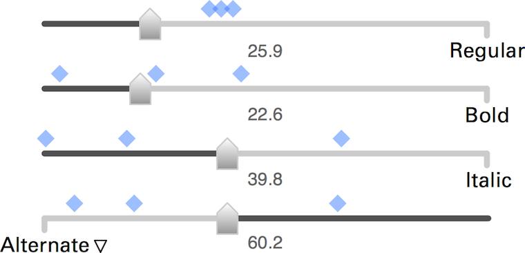
Here are these fellows again, the slider set for freely mixing master fonts to make new fonts. These new fonts are shown by the blue markers, so that users can feel the clustering and spread of these new fonts—clearly a component of free working.
The numbers you see are all editable, also quickly in a row. This supports measured working. That number input is straightforward and gives predictable and repeatable results was a big factor for me to choose the algorithm of these sliders over alternatives.
boom, boom
In short: software for creative pros has to offer every operation that users can perform in two ways: one free—squeeze it until it feels right—one measured—involving planning ahead, entering parameters and ‘cutting’ once.
That’s it for part three. Stay tuned for part four: how to be good.
Labels: design stage, lecture, metapolator, practical, top story
If you like to ask Peter one burning question and talk about it for ten minutes, then check out his available officehours.
 Peter Sikking is an
experienced
Peter Sikking is an
experienced
interaction architect. He unabashedly puts
shipping great products at the centre of his design practice. He is known for
his work for Google, Nokia, the
Metapolator &
GIMP
open source projects,
and startups.
What is Peter up to? See his /now page.
- info@mmiworks.net
- +49 (0)30 345 06 197
- imprint

_knooppunt_10_fietsroutenetwerk.JPG)