 our blog
bicycle, node, network, design
14 September 2016, 10:25
For a full transcript, read on.
ring ring
There are two things that you need to know about me. The first is that I am dutch and the second is that I am becoming a sentimental old fool. I combine the two when I do cycling holidays in Holland:
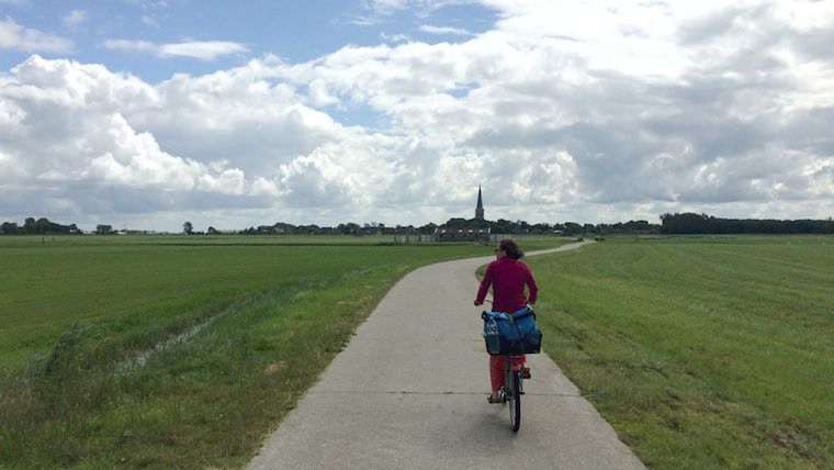 my partner Carmen leads the way
For this we use the fietsroutenetwerk, the bicycle route network of the Netherlands. This was designed for recreational cycling in the countryside. It was rolled out between 2003 and 2012. The network is point‐to‑point:
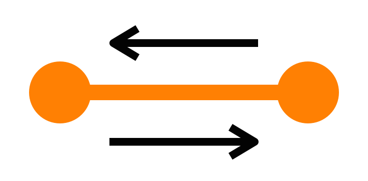
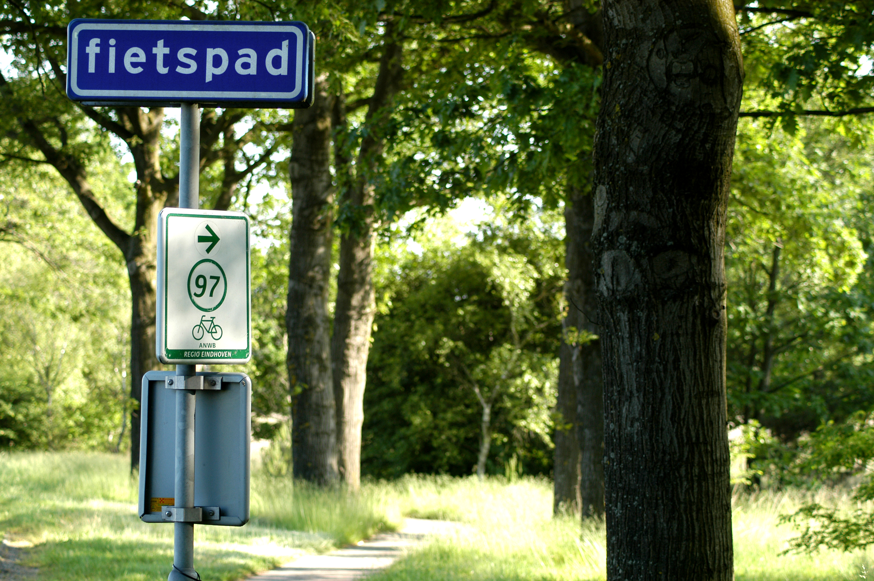
Between two neighbouring nodes there is complete signage—with no gaps—to get you from one to the other. And this in both directions. Here are some of these signs:
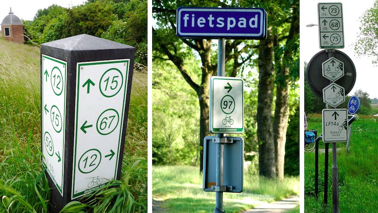 sources: fietsen op de fiets,
het groene woud,
gps.nl
sources: fietsen op de fiets,
het groene woud,
gps.nl
The implicit promise is that these are nice routes. That means: away from cars as much as possible. And scenic—through fields, heath and forrest.
Using the nodes, local networks have been designed and built:
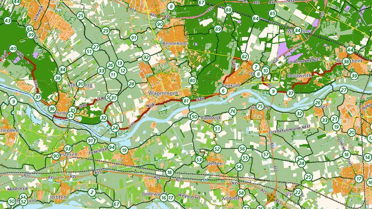
These networks are purely infrastructural; there is no preconception of what is ‘proper’ or ‘typical’ usage. They accommodate routes of any shape and any length.
At every node, one finds a local map, with the network:
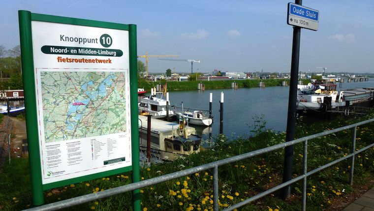 source: wikimedia commons
It can be used for planning, reference and simply reassurance. Besides that, there are old‑fashioned maps and plenty of apps and websites for planning and sharing of routes.
The local networks were knitted together to form a national network:
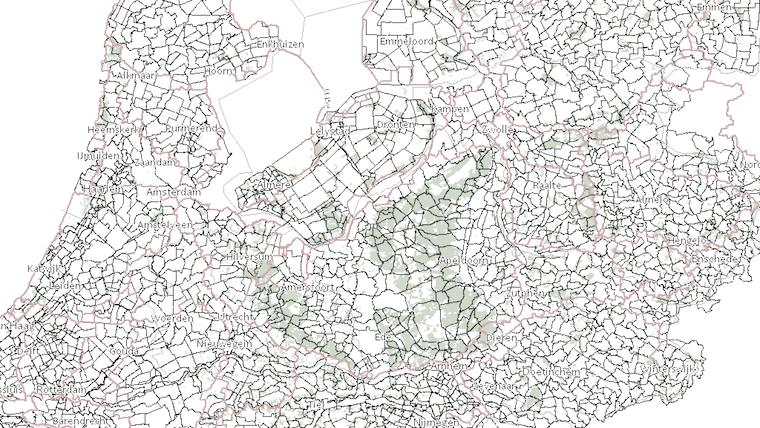
Looking at this map I see interesting differences in patterns and densities. I don’t think this only reflects the geography, but also the character of the locals; what they consider proper cycling infrastructure and scenic routes.
The network was not always nation-wide. It was rolled out over a period of nine years, one local network at the time. I still remember crossing a province border and (screech!) there was no more network. It was back to old‑fashioned map reading and finding the third street on the left.
not invented here
I was shocked to find out that the Dutch did not invent this network system. We have to go back to the 1980s, north‐east Belgium: all the coal mines are closing. Mining engineer Hugo Bollen proposes to create a recreational cycling network, in order to initiate economic regeneration of the region. Here’s Hugo:
 source: toerisme limburg
He designed the network rules explained in this blog post. The Belgians actually had to build(!) all of the cycling infrastructure, so it took them to 1995 to open the first local network. It now brings in 16.5 million Euro a year to the region.
how many?
I got curious about the total number of network nodes in Holland. I could not find this number on the internet. The net is really quite short on stats and data of the cycling network. So I needed to find out by myself. What I did was take one of my maps—
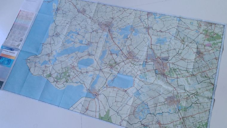
And I counted all the nodes—there were 309. I multiplied this with the number of maps that cover all of Holland. Then I took 75% of that number to deal with map overlaps and my own over‐enthusiasm. The result: I estimate that the dutch network consists of 9270 nodes.
in awe
The reason I got curious about that number is that every time I use the network, I am impressed by a real‐genius design decision (and I don’t get to say that very often). It makes all the difference, when using the network in anger.
All these nearly‐ten thousand nodes are identified by a two‑digit number. Not the four (or more future‐proof, five) one would expect. All the nodes are simply numbered 1 through 99, and then they start at one again. And shorter is much better:
 source: recreatieschap westfriesland
Two digits is much faster to read and write down. It is easier to memorise, short‐term. It is instant to compare and confirm. Remember, most of these actions are performed while riding a bike at a nice cruising speed.
but…
Pushing through this two‑digit design must have been asking for trouble. Most of us can just imagine the bike‐shedding: ‘what if cyclists really need to be able to uniquely identify a node in the whole nation?’ Or: ‘will cyclists get confused by these repeating numbers?’
This older cycling signpost system has a five‑digit identification number:
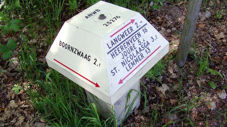 source: dirk de baan
This number takes several steps to process. Two‑digit numbers are humane numbers. They exploit that way‐finding is a very local activity—although one can cover 130km a day on a bike.
whatchamacallit?
Wrapping up, the cycling network is a distributed network:
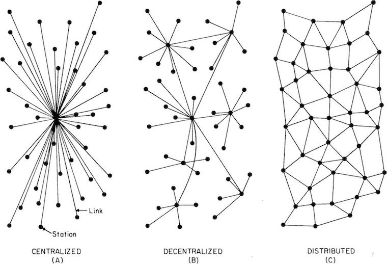 source: j4n
All nodes are equal and so are all routes. Cyclist route themselves. In that way the network works quite like… the internet.
We could call it the democratic network, because it treats everyone as equals. Or we could call it the liberal network (that would be very dutch). Or—in a post‐modern way—we could call it the atomised network.
I simply call it the bicycle route network of the Netherlands.

Labels: infrastructure, lecture, practical, top story



designing openType‐features UI /intro
23 June 2015, 09:24
a bit of a situation
First things first. It is quite likely that when you are reading this, you know what openType features in fonts are. But just in case you don’t, here is a friendly, illustrated explanation of some of the features, without putting you straight into corporate specification hell. The reason I said ‘some’ will become clear below.
What is interesting is that there is a riot going on. The 800‑pound gorillas of (typo‐)graphical software—the adobe creative suite applications—have such bad and disparate UI for handling openType features that a grass‐roots protest movement started among typographers and font designers to do something about it. What followed was a a petition and a hasty promise by adobe to do better—in the future.
meanwhile in Toronto…
These events prodded Nathan Willis into action, because ‘open‐source applications aren’t any better in this regard.’ He organised a openType workshop at this year’s LGM to get a process started to change that. I went there because this is smack in the middle of one of my fields of specialisation: interaction for creatives. As you can read in Nathan’s report, I got immediately drawn into the UI discussion and now we have a loose‐knit project.
The contents and vibe of the questions, and my answers, in the UI discussion all pointed in a certain direction, that I was only able to name a day later: harmonised openType features for all F/LOSS (typo‐)graphical applications definitely has an infrastructure component.
the untouchables
Pure infrastructure—e.g. tap water, electricity, telecoms—offers its designers some unique challenges:
- everybody uses it
- and everybody’s needs are equally important; there is no opportunity to optimise the design for the specific needs of user groups.
- nobody cares
- usage is ubiquitous, i.e. we all do not even register that we are using this stuff all the time—until it stops working, then we miss it a hundred times a day. This makes it very hard to research; no recollection, feelings or values are connected to infrastructure, just entitlement.
- anyplace, anywhere, anytime
- there is no specific contextual information to work with: why is it used; what is the goal; what does it mean in the overall scheme of things; how much is a little, and a lot; it is used sparsely, all the time, at regular intervals, in bursts? It all depends and it all happens. Just deal with it, all of it.
- millions of use cases
- (not that I consider use cases a method that contributes positively to any software project, but‐) in the case of infrastructure something funny and instructive happens: after a week or two of exploration and mapping, the number of use cases grows exponentially towards a million and… keeps on growing. I have seen this happen, it is like peeling an onion and for every layer you peel off, the number goes up by an order of magnitude. These millions of use cases are an expression of everybody using it anyplace, anywhere, anytime.
- heterogeneous capabilities
- this is not always the case, but what is available can vary, a lot. For instance public transport: how many connections (incl. zero) are available for a given trip—and how fast, frequent and comfortable these are—is set by the network routes and timetables. An asked‑for capability is on offer, or not. It all depends and it all happens. Just deal with it, all of it.
I have worked as design lead on two infrastructure projects. One was Nokia dual‑SIM, the other openPrinting, where we designed printing dialogs for all linux users (everyone), as used in 10.000 applications (anyplace, anywhere, anytime), connected to 10.000 different printer models (heterogeneous capabilities). I dubbed it the project with five million use cases.
Ah, and since both application and printer configure the available options of the print dialog, there are potentially 100 million configurations. Even if in reality the variability is far less (say, just 1% on both application and printer side; i.e. 100 significantly different printer models and 100 apps that add serious, vital printing options), then it is still an overwhelming 10.000 configurations.
drowning, not waving
In my experience, designing infrastructure is very demanding. All the time one switches between making the big, abstract plan for everything, and designing, minutely, one of many details in complete isolation. Mid‑level interaction design, the journeyman, run‑of‐the‑mill, lay‑out‐a‑screen level, is completely missing.
It is like landscaping a featureless dessert, where every grain of sand is a detail that has to be dealt with. With no focus on particular users, no basis for research, no context, no just‑design‐the‐example, millions of use cases and highly variable capabilities, I have seen very capable design colleagues lose their bearings and give up.
back at the ranch
Enough war stories. How large is this infrastructure component of openType features in (typo‐)graphical software? Let’s check the list:
- everybody uses it—nope. Whether the user groups turn out to be defined real narrow or quite wide—a matter of vision—they will have in common that all of them know their typesetting. That is a craft, not common knowledge.
- nobody cares—well, soon they won’t. Right now there is upheaval because nothing is working. As soon as users get a working solution in the programs they use, it will become as interesting as the streetlights in your street.
- anyplace, anywhere, anytime—right on! This has to work in (typo‐)graphical software; all of it—even the kind I have never heard of, or that will be invented in five years from now. All we know, is that serious typesetting is performed there by users, on any length of text selection.
- millions of use cases—not quite. The limited user group provides the breaks here. But there is no such limit from the application side; on the contrary: most of these are (open‐ended) tools for creatives. Just thinking about how flexible a medium text is, for information or shapes, gives me the confidence to say that 10.000 use cases could be compiled, if someone would sit down and do it.
- heterogeneous capabilities—hell yeah! OpenType‐features support in fonts is all over the place and not just because of negligence. First there is the kaleidoscopic diversity of scripts used around the world, most of which you and I have never heard of. Latin script is just the tip of the iceberg. Furthermore, what is supported, and how each supported feature is actually realised, is completely up to the font designer. The openType‐features standard is open‐ended and creates opportunities for adding sophistication. This is only limited by the combined imagination of the font design community.
Adding that up, we get a score of 3½ out of 5. By doing this exercise I have just found out that openType features in (typo‐)graphical software is 70% infrastructural. This is what I meant with that it is a special, complicated project.
structure—the future
In projects like these structuring the design work is make‑or‐break; either we set off in the right direction, or never get to any destination—not even a wrong one. The structure I use is no secret. Here is my adaptation for this project:
A product vision is not that easy to formulate for pure infrastructure; it tends to shrink towards ‘because it’s there.’ For instance at openPrinting the vision was ‘printing that just works.’ I still regret not having twisted some arms to get a value statement added to that. There were times that this value void was keeping us from creating true next‐generation solutions.
Apart from ‘what’s the value?’ also ‘who is this for?’ needs to be clarified; as we saw earlier, openType features is not for everyone. The identity question, ‘what is it we are making?’ may be a lot less spectacular, but it needs to be agreed. I will take this to the Create mailing list first, mainly to find out who are the ‘fish that swim upfront’, i.e. the people with vision and drive. Step two is an online vision session, resulting in a defined vision.
The deliverable is a to‑the‐point vision statement. If you want to get a good picture of what that entails, then I recommend you read this super‐informative blog post. Bonus: it is completely font‐related.
we want the funk, the whole funk, nothing but the funk
A deep understanding of the functionality is the key to success in this project. I already got burned once with openType features in the Metapolator project. Several font designers told me: ‘it is only a bunch of substitution rules.’ Until it turned out it isn’t. Then at the LGM meeting another surprise complication surfaced. Later I briefly check the specification and there is yet another.
This is what I meant before with that friendly page explaining some of the features. I do not trust it to be complete (and it is only Latin‐centric, anyway). As interaction architect I will have to be completely on top of the functionality, never having to rely on someone else to explain me what ‘is in the box.’ This means knowing the openType standards.
Central to it is the feature tags specification and the feature definition syntax. This contains both the material for understanding of how complicated it all can get and the structures that I can use to formulate UI solutions. It is one of the few aspects that are firm and finite in this project.
The deliverable is a functionality overview, written up in the project wiki.
talking heads
I will do user research, say interview half a dozen users, to gain insight into the act of typesetting, the other aspect that is firm and finite in this project. Which users to recruit depends on what is defined in the product vision. Note that the focus is on the essence of typesetting, while ignoring its specific role in the different (typo‐)graphical applications, and not get swamped by the latter’s diversity.
The deliverable is notes of interest from the interviews, written up in the wiki.
I look forward to an exchange with F/LOSS (typo‐)graphical applications via the Create list. This is not intended to get some kind of inventory of all the apps and how different they are. In this project that is taken as abstract and infinite—the good old infrastructural way.
What I want to find out is in how many different ways openType features must, or can, be integrated in the UIs of (typo‐)graphical applications. In blunt terms: how much space is there available for this stuff, what shape does it have and what is the duty cycle (permanently displayed, or a pop‑up, or…)? These diverse application needs are clustered into just enough UI models (say, six) and used below.
The deliverable is the UI models, written up in the wiki.
getting an eyeful
Then it is time to do an expert evaluation of existing openType‐features UI and all these UI ideas offered by users when the petition did its rounds. All of these get evaluated against—
- the product vision: does it realise the goals? Is it appropriate for the defined user groups?
- the functionality: can it cope with the heterogeneous capabilities?
- the user research: how tuned is it for the essence of typesetting?
- the UI models: how well does it fit with each model?
All of it gets analysed, then sorted into the good, the bad and the ugly. There will be a tiny amount of gold, mostly in the form ideas and intentions—not really what one would call a design—and a large catalog of what exactly not to do.
The deliverable is notes of interest from the evaluation, written up in the wiki.
warp drive
Then comes the moment to stop looking backwards and start working forwards; to start creating the future. First a solutions model is made. This is a combination of a broad‐strokes solution that cuts the project down to manageable proportions and a defined approach how to deal with the rest, the more detailed design work.
The next stage is to design a generic solution, one that already deals with all of it, all the hairy stuff: text selections of any length, all the heterogeneous capabilities, the typesetting workflow, clear representation of all openType features available and their current state. This will be specified in a wiki, in the form of UI patterns.
With the generic solution in place it will be real clear for the central software library in this small universe, HarfBuzz, which new capabilities it will need to offer to F/LOSS (typo‐)graphical software.
home straight
The final design phase is to work out the generic solution for each UI model. These will still be toolkit agnostic (not specific for KDE or gnome) and, btw, for desktop UI‐only (touch is a whole ’nother kettle of fish). This will also be specified in the wiki.
With this, every (typo‐)graphical software project can go to the wiki, pick a UI model that most matches their own UI structure and see a concrete UI design that, with a minimum of adaptations, they can implement in their own application. They will find that HarfBuzz fully supports their implementation.
While working on Metapolator in the last year I had good experience with sharing what I was doing almost every day I was working on it, through its community. There were encouragement, ideas, discussions, petitions and corrections—all useful. I think this can be replicated on the Create list.
Labels: design stage, fundamental, infrastructure, openType, practical, process, product phase, product vision, top story
working on Nokia’s first dual‑SIM phones
3 July 2011, 18:47
I am really proud to see the shipping of the first Nokia dual‑SIM phone: the C2‑00. Additionally a second product on the same basis, the hybrid‐touch C2‑03 (aka C2‑06) has been announced. Having been deeply involved with creating these, I would like to share some of my experiences with you.
revolution!
Although folks on the net write ‘gee, why did it take so long?’, the truth is that developing a dual‑SIM phone is huge undertaking. This is because the software codebase that you start from has been developed—over years, if not ten or more—with the casual, implicit assumption of one user, one SIM.
All of a sudden that fundamental equation is changed to one user, two SIMs. This impacts any software module that deal with voice, messaging or data going over the antenna: i.e. nearly all modules present on a mobile phone, hundreds in total.
a pair is two, no?
And when I say ‘two SIMs,’ I really mean two or more. Dual‑SIM phones do not invent a new way of using phones. They are a response to how single‑SIM phones are used by a large number of users, world‐wide. It is quite normal that these people are using three different SIM cards on any given day. And despite the burden of removing the battery and rebooting the mobile, these SIMs are swapped more times than you would think.
Now imagine what happens to that frequency when one takes that burden away. It was a smart move by Nokia to make one of the SIM slots hot‐swappable.
keeping it personal
When one talks to people about mobile phones for emerging countries, immediately they start speaking of groups, families and villages sharing a single mobile phone. Actually we know what that should be called: a mobile phone booth. Let it be clear that the products I worked on, the C2‑00/03/06, are not designed for that, they are single‐user devices.
Designing the user interaction of a mobile phone booth would be a groundbreaking undertaking. What should Contacts, Messaging or Call logs be like for such a mobile phone booth? I do not know, but certainly not what they are today on all our single‐user phones. If asked, I wouldn’t be afraid to take on the mobile phone booth project, but on the condition that we start from scratch and are supported by a boatload of research to ascertain users’ needs.
structure equals change
Let’s go back to the beginning of the project. ‘One user, two SIMs.’ Changes for dual‑SIM not only uproot the software of a whole phone, but also all user interaction. Same principle: if it has to do—even indirectly—with voice, messaging or data going in or out over the antenna, it is impacted. Yep, just about the whole phone. My job? Making it all work for users.
First thing I did was structure the interaction design part of the project. Having been asked to work as principal designer with a Nokia team of interaction designers, it looked only natural to me that I would design the general solution for dual‑SIM user interaction for the whole phone, and to deliver it in the form of interaction patterns.
The other part of this plan was that I immediately empowered my team of Nokia designers. Each of them was to take charge of a key part of the phone and redesign it, based on the general patterns that I designed. This straightforward plan addressed the questions of how to deal with a project on this grand scale and how to do it with consistency.
nowhere to hide
Also clear on day one was that existing competitor dual‑SIM phones were doing a dreadful job of supporting users with their two, or more, SIM use. To avoid the traps that these had fallen into—identifying SIMs with just a character (A|B or 1|2); always giving up screen space to show/set what SIM to use next—I started with the following principles:
- the solution has to be based on the three factors why users bother to use multiple SIMs: saving money; ensuring network coverage; projecting multiple personalities (life/work, etc.);
- these three factors are not independent—e.g. cost is always an issue; having no network reception spoils the best laid plans;
- these three factors fluctuate over a given day (mobile tariffs, reception depending on location, switching personalities);
- only users can decide on the spot, based on the circumstances and their priorities: is it urgent; can I call later; can I afford to pay more; is this marginal reception sufficient; can I give up my privacy?
- dual‑SIM is not an issue in phone use, most of the time;
- except, when voice, messaging or data is about to go out over the antenna, then users need full control over which SIM is used for that, every time;
- also, when voice, messaging or data starts coming in over the antenna, then users need to identify which SIM is involved, every time;
- make users freely name their SIMs, to express the role each one plays; use these names everywhere;
- design for three‑SIM use, not just the two that are in the hardware slots; also handle if there is just one SIM present;
- keep things nimble; do not lock users into using only one SIM; however, support repetitive use of the same SIM.
the right stuff
The solution I designed ticks all the boxes. In it, dual‑SIM is invisible unless there is a user need to interact with it. Then plenty of screen space is given to display the names given to the SIM cards; to show the network reception for both SIMs, at the moment decisions are taken; for direct control by users, with fast click‐through when everything checks out as expected.
Making it work for users is only half my job. Making it buildable is the other half. My solution avoided that hundreds of screens had to be redesigned. Or that hundreds of UI states had to have new input handling added. This saved a massive amount of effort and cost in design, specification, engineering and testing. Those existing competitor dual‑SIM phones did do all this effort, with sub‑standard interaction to show for it.
The overall architecture of my solution had, of course, a make‐or‐break impact on the feasibility of the whole dual‑SIM project. It is professionally satisfying to see how I was able to align the need for minimal disruption from users, technical architects, developers and interaction designers, enabling the success of the project.
the journey is the reward
After nailing the general solution and interaction patterns, a second phase of working with the Nokia designers started. I mentored, consulted with them and reviewed their detailed designs. Particularly fun was the phase where every week I was in a different country, spending two days on‑site with one of the Nokia designers.
We solved all of the tough interaction design questions during those days. This for instance involved going through all the user settings that relate to messaging and deciding for each if it was impacted by dual‑SIM. There is a surprising number of them and about half require detailed knowledge of messaging protocol or GSM legacy.
Normally nobody bothers with these settings, on either the mobile making or mobile using side. But we had to understand and check all of them. To see, if either for a technical reason—does it stop working?—or to enable any of the three factors, a setting had to be differentiated by SIM. This is the infrastructure aspect of going dual‑SIM: it permeates everything and the team of interaction designers has to think through the whole experience.
more fun
One thing I really want to share is how fulfilling it is to work on a useful product like this for emerging markets. During the project there was a sense, of urgency; of the real impact mobile has on the lives of people in these markets; of how much essential value our designs would deliver to end‑users.
In the same period as I worked on dual‑SIM, the Economist ran a special report on telecoms in emerging markets (make sure you read all six parts). First of all, it is humbling to read that the backwards mobile networks… are the ones in the western world. Second, it is uplifting to read that mobile phones in emerging markets are truly improving customers’ lives—their first phone line, first internet, first means of transferring money—and enable customers to raise their income, which lifts a significant part of them out of poverty.
one more for the road
So that is what it was like. A huge and complex undertaking; fundamental change to the whole mobile phone experience; make‐or‐break responsibility for user interaction and project feasibility; avoiding the traps the competition fell into; structuring, mentoring, travelling, consulting; designing the big picture and the obscure details; and in the end, very fulfilling work.
This is why I am really proud to see the shipping of the first Nokia dual‑SIM phone.
Labels: infrastructure, mentoring, mobile, practical
public, mobile, transport
30 April 2010, 18:27
This week I was at a mobile applications workshop, organised by a customer of ours, the VBB. The VBB is the umbrella organisation for public transport here in Berlin and the surrounding federal state, Brandenburg.
Present at the workshop were public transport authorities and information services from across Europe. The buzz was solidly about iPhone apps, android apps, any mobile apps for—you guessed it—public transport information. Justus Brown from Nokia maps was there to show their latest effort in walking routing and to evangelise the integration of public transport information.
The VBB had asked me to deliver a talk ‘related to usability’ within the context of the day. So I shared some insights from my 13 years in mobile user interaction.
this is not a big pipe
Guesstimating that most of my audience was working on mobile apps coming from a desktop (web) background, I kicked off my talk by explaining that mobile is not a shrunk desktop. Let’s investigate the reasons:
- UI output
- Yep, small screens. But beyond how little one can fit at any given moment, it is about low bandwidth: how little communication can be passed over a given amount of time. Besides that, scrolling mobile screens is simply no fun.
- UI input
- Rigid cursor movement with the cursor keys, a cramped experience. Text input is of variable quality, from the simple dial pad to too‐generous‐by‐half qwerty keyboards. Again, low bandwidth.
- on the move
- But much more of a game changer is the mobile factor. The fact that a mobile can be used anytime, anyplace makes the current location (when available to the mobile software) and the moment of now! the right default for tens of percent of use for, say, a public transport routing query.
And now we have moved from trivial nuts and bolts to the totally different vibe in which mobile app interaction design should be performed: a sense of urgency, of life on the move.
you can’t touch this
Shifting up a gear, I moved on to the topic of touch devices, iPhone + co. As I argued years ago, when the iPhone was just a green sprout, touch is not mobile. I can add today: neither is it a shrunk desktop. Again, the reasons:
- UI output
- Compared to mobiles, there are quite a bit more pixels on touch devices. But watch that resolution: the display is not that much bigger when measured in centimetres. Scrolling is not only more fun, it is a pleasure. This has to do with how stroking a touchscreen is so much more satisfying than poking at it. Still, that pleasure has its limits. Immediate visibility without the need to scroll rules.
- UI input
- Touch sports random input access, so the cramp of mobiles is gone. Also the hallmark of true touch interfaces is the absence of Options menus: everything is done on the screen, making for an immersive experience. But there are inputs limits: the ‘average’ fingertip size dictates the minimum sizes of touchable items on the screen. And that, and the ups and downs of touchscreen text typing, set it apart again from desktop experiences.
- the urgency, of life on the move
- Yes, touch devices have the full mobile factor. But just as you think that tips the balance solidly towards being a mobile device, you have to factor in that touch devices are pocket computers that happen to be making cellular calls.
And with that we are straight back in limbo. The solution is to stop talking about mobile or desktop and respect the touch platform for what it is. Just as mobile application interaction has to be designed from ground up, touch applications have to be—by forgetting about everything one knows about desktop or mobile.
really real‐time?
I continued my talk with some general guidelines for interaction design, e.g. you are not ‘the user’ or nice data, but what about solutions? In this blog post I want to focus on one of them: be transparent.
A good portion of the mobile workshop was spent on real‐time updates—busses being late, interruption of rail service, etc.—being shown at stations, stops, on websites, mobiles and touch devices. An example of this was discussed and it boasts a pretty impressive response time, from measurement on a vehicle to consumers being informed.
But then it turned out that the system still depends on humans passing messages. This exactly breaks down when the stress starts, as delays get serious. Also some transport services report much faster than others. And when last winter a massive amount of snow shut down the rail service, the ‘real‐time updates’ kept showing trains arriving at stations. Final nail in the coffin: users on twitter inform faster about delays then the public transport system itself.
really transparent
Here is where the ‘be transparent’ guideline comes in. Because users of this service sense that the information is ‘real‐time,’ they expect it always to reflect the situation of now! and we have seen above that this is not the case. This discrepancy between representation (promise) and delivered service cannot be.
‘Be transparent’ demands that either the real‐time updates are made to be as instant, correct and free of human failing as promised by their representation (i.e. a serious redesign of the chain of the systems delivering the info) or the representation at stations, stops, on websites, mobiles and touch devices gets redesigned to reflect that the service is not really always ‘real‑time.’
You have to go all the way. There is no compromised middle ground in this.
private vision
I closed off my talk with a vision for the (near) future. It involves travelling with a mobile device on public transport. The route you are taking is known and on what exact bus/tram/train you are right now (that takes a small beacon). The public transport service has good real‐time data and sees that your bus connection is going haywire.
At this moment the public transport service could re‑route you and send your mobile updated instructions: at what stop to change and to which line. This could be really cool for commuters who get to know every little hiccup of their daily service after a while.
meanwhile…
The vision above can also be seen as one big privacy nightmare. The solution for this conundrum is control. By putting users fully in control, they get empowered to deal with it as they perceive it: as a great benefit or a privacy issue. This means in practice that users have to opt in first before a service is available to them. So no google buzz fiasco: shoot first and let them opt out later.
Labels: infrastructure, lecture, mobile, practical
If you like to ask Peter one burning question and talk about it for ten minutes, then check out his available officehours.
 Peter Sikking is an
experienced
Peter Sikking is an
experienced
interaction architect. He unabashedly puts
shipping great products at the centre of his design practice. He is known for
his work for Google, Nokia, the
Metapolator &
GIMP
open source projects,
and startups.
What is Peter up to? See his /now page.
- info@mmiworks.net
- +49 (0)30 345 06 197
- imprint

_knooppunt_10_fietsroutenetwerk.JPG)