the rise of proper integration
23 November 2010, 00:51
This year’s world usability day in Berlin marks my return to blogging. The hiatus was triggered by google’s deprecation of my publishing method, which had some knock‑on effects, both organisational and in publishing discipline.
Our usability day was bigger and better visited than ever. As a long‐time co‑organiser, sponsor and speaker, I think that’s cool. My lecture built a bridge between the theme of the day—mobile communication—and the new meet the expert sessions. The latter offered executives a chance to meet senior usability or interaction design experts to discuss about strategic, big‐picture issues.
My lecture was titled ‘the proper integration of interaction design and usability, or, the rise and fall of mobile empires’ and this is how it went.
first things first
To anchor the meaning of my lecture, I started off with my definitions of both usability and interaction design.
- usability
- both the measure of how usable something is and the profession where experts approach user interaction in an empirical way: surveying, observing, performing exercises with users. I always say: usability means getting the facts on the table.
- Asking users what they prefer is not usability. That is market research territory. Usability is about measuring how users tick and if interaction works.
- interaction design
- both the complete plan of how the interaction works and the profession where experts create user interaction by shaping it in broad strokes; by innovating; integrating every single detail into the overall plan. Interaction design is about creating the future by making innovation jumps forward.
- My complex relationship with the word design is known. It is not about making it pretty, design is solving the problem. It is about structure and how the interaction ticks. Elegance is defined in the mathematical sense, of how a solution covers all with a minimum of complexity.
Also note my old acid test for when we have slipped out of interaction design and into visual design. The baggage that comes with the word ‘design’ makes that I rather call myself an interaction architect. That also reflects much better the role of being the one who integrates the overall interaction plan.
separated at birth
Interaction design and usability are two distinctly different professions. Now you may think that I am painting this too much as a black and white issue. Is there not a huge grey‐zone between the extremes, where usability experts also design and designers also avidly test? Well, I only found out about the dichotomy because it is so pronounced. The grey‐zone, where professionals seriously combine both, is much smaller than one would expect.
trouble in paradise
With these definitions out of the way, I moved on to state how troubled I am by the way usability is deployed today. If companies want to get a serious return on investment in usability, they should understand that:
- It is not enough to commission some usability tests, when they are performed late in the project and there is no chance anymore to sort out the UI. I have too many frustrated usability colleagues who perform tests for the same clients, same products, version after version, only to find the same usability errors.
- It is not enough to employ usability specialists, when they are kept at bay by the rest of the software development organisation, who label their recommendations as ‘optional enhancements.’ I have experienced enough developers who were wildly enthusiastic about usability help, only to start overruling when it came to taking action on the results.
- It is not enough to have a usability department, when it is undersized for the development capacity of the company; when other departments manoeuvre to keep it catching up with the situation; when there is no interaction design competence in the whole company to solve the problems at hand.
The same can be said for interaction design:
- It is not enough to commission a UI redesign, when it is received as a collection of nice and flashy ‘ideas,’ when there is no follow‐through by designers during implementation. Which means with every next step, every decision, the design further crumbles to dust.
- It is not enough to employ interaction designers, when they have to work in fireman mode: to review and correct whatever happens to be already developed at the moment; when technical architectures and hardware are ‘already fixed’ from the start; when developers reserve the right to decide which corners can be cut in the design.
- It is not enough to have a design department, when their designs end up in drawers; when they do not lead the development of the UI; when there is no usability competence in the whole company to provide a foundation for the design work.
So there we were, at the end of a successful world usability day, and I had to spread this doom and gloom. Could I maybe offer any hope, instead? Yes I could, in the form of a three‐point plan for the proper integration of interaction design and usability into development projects.
1. work with a vision
Interaction design and usability work is not performed in a vacuum. It is not implementing, and testing against, some kind of general list of guidelines. Actually, interaction design and usability start where the UI guidelines end.
When designing interaction, we are creating the (generally) sole tangible incarnation of a piece of software with a certain identity, for a certain target group, delivering the reason why one actually would invest in using the software: value. In parallel, usability recruits participants from the target group, for instance to test if the software reflects the identity and if the value is delivered or hampered by the interaction.
It comes as no surprise (to those who know me) that identity + target group + value make a product vision. In order to put a bit more practice—mobile practice—into my talk, I then showed how a product vision is made for a fictive example.
everywhere you go, you always take…
Starting from the situation where a product manager comes in and says ‘we are going to build a weather widget,’ I demonstrated how by interviewing the persons who are driving the innovation, they can be coaxed to deliver something much clearer:
‘The weather widget is an always‐available, quick forecast of the weather for one location. It allows hi‑tech seekers and lifestyle junkies to plan ahead for the next 4–8 hours, while on the move.’
There is plenty in there for identity and value, what’s in it and what not, to design from. The user segments—‘hi‑tech seekers and lifestyle junkies,’ mobile is full of that—are used for usability recruiting and come with a lot of defined market data, like the use of mobile data.
everybody is scarce
While demonstrating this I hit the point where for target group you get the standard answer: ‘everybody.’ In my experience, there is one type of software that really is for ‘everybody,’ and that is infrastructure.
Software that provides infrastructure is easy to spot: it is so boring, that nobody is interested in talking about it or working on it. Literally, I have seen it make people run away. My own main experience here is the openPrinting project my firm is working on: pure infrastructure. So is call handling on a mobile phone. Duh, no? Should just work, no? My point exactly.
As soon as software is not coma‐inducing boring, it is no longer for ‘everybody.’ Yes, even the weather. In this mobile example the user segments of the phones that the widget is made for set a much narrower target group, which means the interaction design can be much more optimised.
all together
Working with a product vision is a form of insurance against moving targets and endless discussions. It is also a form of integration, where the goals of the project are firmly implanted as the root of the whole interaction design process.
2. process integration
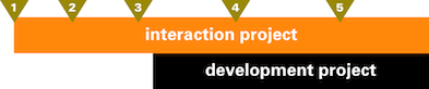
Let us look at the timeline of a development project, it starts at the left and ends at the right:
Now let us say that the project decides to involve interaction design at the point where the orange marker is:
I say: sure you can do that at that point, as long as you understand the following two points:
- Up to this point, you haven’t done nothing for your user interaction. Sure, also in my experience developers—and if you got them, visual designers—can come up with exiting nuggets of interaction innovation, but it has to be clear that the job of making the whole interaction work starts at this point.
- Having started at his point, it cannot be that things—like technical architectures and visual layouts—that heavily impact interaction design are ‘done.’ These are significantly formed in symbiosis with the interaction design.
Yes, you are right: that orange marker is better placed a lot earlier in the project.
Now, let us take the same project and instead of interaction design, involve usability at the point where the green marker is:
Par for the course, I say. But there are two more points:
- Yes, ‘you haven’t done nothing’ until this late in the project.
- The test will get the facts on the table. Knowing the industry standard for chances of surviving a usability test, I have to ask you: what did you think you were going to do now, in so little time?
Practically speaking, creating interaction starts a lot earlier than building it and it only ends when the last bug is fixed and the software ships:

As you can see from the color coding the overall interaction project is interaction design territory. Following through, keeping the interaction concept together as time pressure and compromises start eating into it is a prerequisite for success.
A serious deployment of usability looks like this:
Detailing each wave by number:
- Initial research of how the target group users tick. This provides a grounding for the interaction design.
- Test of initial, rough interaction design. The most important thing about this test is that one is fully prepared and capable to throw everything away and start anew, when the results tell one to do so. Testing on paper is good for that.
- Test of the much more solid interaction design. Medium level stuff can still be turned around when the test says so. Still testing on paper.
- Interaction design has been working with development for a while, a software prototype can be tested in a more high‐fidelity test.
- This is just as ‘late’ as in the single test example. In this case, we are really just testing last niggly issues; icons and graphics that have been produced by now; final wording of texts in the UI.
At the end of each wave, usability and interaction design work together to analyse the results and splice the outcome into the foundation of any further interaction design work.
all change
Introducing usability and interaction design means process change. It is the only way to morph a technical software code producing machine into one that delivers products.
3. organisational integration
This process change must be accompanied by a redistribution of authority. And here lies the rub:
- Product managers know exactly that the interaction of the software is the one and only embodiment of the product. With mobiles, it is the remaining one once the product has been bought and the spell of hardware design dissipates. Product managers don’t find it funny to lose control over this embodiment.
- The development manager simply has to get it done. So (s)he does not find it funny that the definition of done has become so clear and explicit, e.g. in a UI specification. The room to fudge, to declare it done no matter how primitive the implementation, is gone.
- My experience with developers is all over the place. A good deal of them find it a pleasure to work on UI at a whole new level, to have exactly clear what needs to be build and to get on with the engineering. Others don’t find it funny that playtime is over. That—although there is room to do proof‐of‐concepts and contribute nuggets of innovation—as soon as it comes to production of user interaction, there is no more improvisation involved.
- Visual designers don’t find it funny that ‘design’ gets extended into dimensions that they are really not comfortable with, that layouts come pre‐structured and that text has to be in un‑cool, readable sizes.
This triggers standard tactics from all of the above in order to keep their fun going just a little longer:
- ‘these folks work subordinate to me in this organisation’
- ‘well, it is only advice’
- ‘we decide on that together’
- ‘I am doing the development, so who is going to stop me?’
But I say you cannot have it both ways. You cannot ask usability and interaction design people to deliver what is unreachable for you—make the user interaction work—and in the meantime sideline them so everything stays as in the ‘good old days.’
irresponsibility
Being made responsible for something, like usability, is almost a poisoned chalice. Responsibility comes with all of the workload and none of the freedom to execute. What is missing in today’s practice of usability and interaction design is the complementary pair of accountability and authority.
The accountability—one’s neck being on the line—comes naturally to interaction designers. To make that user interaction represent the product and that it all works for users and that it is feasible to build: who else is going to do the job? It is about time that the authority—the final say in what is being built—gets respected, as part of the deal for taking on that accountability.
And let’s not chicken out on usability, although it is empirical in nature. Usability folks should be accountable for getting the relevant and correct facts on the table. By doing this they earn the authority to report the fact that software is working or not, for users. Let’s stop calling it advice and consulting.
great balls of fire
Nobody is going to give up their slice of fun just like that. It takes organisational reform to make this work. This diagram shows how accountability and authority should be implemented. The ‘boss’ stands for the person who has the authority to sign off all the funds that pay for the software production:
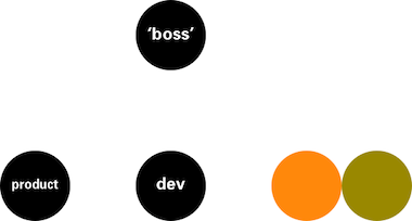
Below the ‘boss’ we find, left–to–right, product management; development; interaction design and usability, all at the same level. Each of these can be a single person or a hierarchy that culminates at this point. Each of these can be in‑house or outsourced. All four are accountable to the ‘boss’ and the ‘boss’ lends each the authority to get their job done.
The only variant of this structure that I can think off, is when there is no ‘boss.’ This is the case with open source: the maintainers are the top of the development tree. It is also the case with start‑ups and other partnership situations. What we then have is a flat‐top hierarchy, with clear accountability and authority as before:

It also shows what kind of partners you need in this type of set‑up. ‘Boss‐type’ decisions will have to be made a consensus or committee type of way, in open source that will involve even more persons as shown here. The worst that can happen here is that one of these four gets elevated to the ‘boss’ position, but still keeps her/his original role. Conflict of interest is then pre‐programmed.
capital punishment
So am I here on a prima donna ‘designer’ power trip? No. I think that ‘having your head chopped off’ when the design cannot reasonably be built, when it does not embody the product or when it is unusable really focusses the mind and stops ego trips.
Over the last years I have come to the conclusion that interaction design thrives with tension, i.e. when the conditions are tough. When for product, development and usability heads—even better, for the ‘boss’—only the best is good enough. I once was leading a top‐secret project to design the ‘easy, intuitive phone of the future.’ My team thought immediately of paring back the ungodly number of features of mobile phones by a factor of three. But that would have been too easy. I saw there and then that greatness would come from designing for (almost) the whole feature set and deliver on ‘easy and intuitive.’
So yeah, challenges, tough requirements, great tension are fine with me, as long as I have the authority to solve all of that as I see fit, to create and roll out the best user interaction I can.
So what happens when push comes to shove? When someone insists the interaction design has to be changed and the interaction designer has reconsidered everything and knows this is the best solution. I say only three things can happen:
- the ‘boss’ supports the interaction designer and it gets built and rolled out exactly as designed;
- the ‘boss’ fires the interaction designer;
- the interaction designer resigns.
Anything else, e.g. a horrible compromise to keep the peace, is unacceptable and should trigger scenario number 3.
1 + 2 + 3 = ∞
So there we have it, the three‐point plan for the proper integration of interaction design and usability into development projects:
- work with a vision;
- process integration;
- organisational integration.
Can interaction design and usability experts in any way encourage the reform needed to achieve this proper integration? Yes we can, by stopping being happy with just any kind of work that comes our way. By saying no to:
- working on a project that cannot be coaxed into formulating a product vision;
- a late, first usability test and suggest instead that the same money be spent for testing at the beginning of the next project;
- designing interaction as a layer over a ‘done’ piece of software;
- working in situations where the ‘boss’ thinks interaction design and usability are ‘nice to have’;
- jobs at companies where interaction design and usability are down on the org chart;
- being just responsible.
We better spend our energy and our capital—the stuff it takes to create great user interaction—at places where we can see that one, two or even three steps can be taken in the direction of proper integration. And deliver there, to enable the next step.
And on that note I end part one of my wud lecture coverage. Read on for the rise and fall of mobile empires.
Labels: fundamental, lecture, mobile, process, product vision

![]()
![]()
0 comments · post a comment
If you like to ask Peter one burning question and talk about it for ten minutes, then check out his available officehours.
 Peter Sikking is an
experienced
Peter Sikking is an
experienced
interaction architect. He unabashedly puts
shipping great products at the centre of his design practice. He is known for
his work for Google, Nokia, the
Metapolator &
GIMP
open source projects,
and startups.
What is Peter up to? See his /now page.
- info@mmiworks.net
- +49 (0)30 345 06 197
- imprint
