users, vision + architects /2
29 July 2006, 00:33
Let’s move on with the next two sections in the article by Don Norman, starting at ‘human‐centred versus activity‐centred…’
‘Successful devices are those that fit gracefully into the requirements of the underlying activity, supporting them in a manner understandable by people.’Don Norman
‘Does this UI optimally support the activity’ is one of my key criteria when I perform an expert evaluation, or when selecting from different interaction design variants for my clients.
Supporting the activity is the difference between UI that ostensibly makes the functionality available to the user and UI that makes the activity a piece of cake, and the software a true joy to use.
‘only software that supports the activity adds user value, and is worth using’ps
Hitting the sweet spot where the UI optimally supports the activity is a great development team motivator. On every project I work on, the eyes of all involved start glowing when we have that Zen experience: we got it. You can see the developers calculating how with a little bit of effort they can put together this really cool piece of software.
‘only software that supports the activity adds company value, and is worth developing’ps
users will adapt
Actually, users suffer in silence, when using software. This leads to the ‘we did not get any complaints’ phenomenon. There is a backlash from this when it is time to innovate.
Remembering the last time they had to learn how to ‘work around’ the current UI, which does not support their activities, users fight change hand and tooth. Many parts of the software industry are stuck in the dark ages because of this.
The only way to break this loop is to hit the sweet spot. Show people UI that optimally supports their activity and they’ll want it, right now. They will have their Zen moment: this is the best thing since sliced bread.
highly efficient machines
It is the interaction architect who takes the responsibility to lead the development team to the sweet spot. To focus on the activity, take a collection of features, functions and technology and to shape them into a nifty, highly efficient machine that supports the activity.
next…
…stay tuned for the third article, dealing with user testing and ease of use.
Labels: architects, fundamental, ucd, users-vision-architects

users, vision + architects /1
18 July 2006, 17:52
So let’s get started with the article by Don Norman at the top‐left corner, and work our way through the introduction, up to the musical instruments.
the paradox
Norman starts off by observing a paradox:
- there is quite a bit of software in this world that, while produced according to human‐centred principles, is complex and confusing;
- there are lots of tools and objects (not software), that have been made without any human‐centred design methods, but that are used successfully across the globe.
Norman goes on to explain that the latter may be the result from a deep understanding of the activity performed. He then defines activity as the big picture of what people do.
In the final part of this introduction, Don shows—with examples—that it is quite normal for people to adapt to rather artificial systems, simply in order to get things done.
living with the paradox
The 99.9% of functional analysts, GUI developers and multi‐media/web designers out there, who work on projects that involve no human‐centred design at all, may feel vindicated by all this. And by the way, all those projects that ‘ask users how they prefer their GUI’ are part of the 99.9% (an upcoming instalment will cover why).
We all have read the reports about how some of the top‑5 software companies in the world (in revenue) have impressive usability departments, and are adviced by the biggest names in my industry. But I have to say: where did all the effort go? Look at the market‐place indicators:
- a cottage industry of training companies for this software (official slogan of one: ‘we are the aspirin for the headache of having to use xyz’);
- project implementers for this software relaying to me their customer’s response: ‘oh please, not xyz’;
- the wide‐spread reputation among users of this software.
stop smiling
It is my experience that those 99.9% of software/multi‐media/web projects are not achieving the second part of the paradox. Because the ‘deep understanding of the activity’ is missing.
As long as the project team keeps working at the level of features and functionality, it will not understand the activity. It is staying within the relative safety of supplying an addictive commodity (new features) and practising UI as a technical discipline.
Only when when the team can leave this level behind, and use methods to acquire this deep understanding, to get the big picture, then I say: ‘welcome to interaction architecture.’
next…
…stay tuned for the second article, dealing with highly efficient machines.
Labels: architects, fundamental, ucd, users-vision-architects

users, vision + architects /intro
14 July 2006, 19:29
Two weeks ago a link was posted on the iXda mailing list to an article by Don Norman on what he calls activity‐centred design. I finally got around to reading it, and check out what that entails.
What Norman describes in the article greatly matches what I have experienced and learned myself in the past 13 years in this industry. This has resulted in the methods that I have developed and put into practice at m+mi works.
the series
By the time I finished reading the article the idea had been born to publish a series of blog articles, where I comment, expand upon and put into perspective the different themes in Don’s article.
So stay tuned for the first article, dealing with the paradox.
Labels: architects, fundamental, ucd, users-vision-architects

working on the GIMP
6 July 2006, 20:33
After a tentative start, I am getting seriously involved with the GIMP project. Long term, this is a very hot project for an interaction architect to work on. But for now Sven asked me to do some solutions consulting for the upcoming 2.4 release. So we met up on a warm summer’s evening, Mitch also joined. He has been working for a long time on solutions for the issue‐at‐hand.
shortcut shortage
The topic was building up a selection mask in the GIMP from simple shapes (rectangle, ellipse), combining them with not‐so‐simple shapes. There are a couple of categories of control over this process:
- drawing constraints
- constrain the bounding box of the simple shape to a square; draw from centre.
- addition mode
- operarator used to add a fresh selection part to the existing selection mask: replace / add / remove / ‘logical and.’
- minute adjustment
- move or resize the fresh selection part before commiting the result.
The questions from the GIMP team were:
- how to control all of these option categories from the keyboard, when the only two available keys seem to be shift and control;
- also the interaction of the third category (minute adjustment) was only part‐done, they were looking for ways to integrate it into the overall workflow.
deal with a problem: ignore it
The first thing I did was looking for ways to avoid conflict, to stop the three categories competing for the same keyboard keys. I lifted the third category (minute adjustment) out of the whole conflict, using interaction ingredients already present in the GIMP:

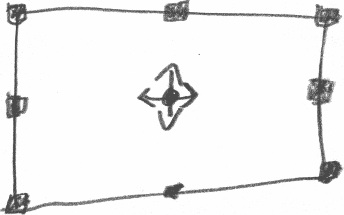
- eight resize handles, instead of four on the corner;
- I made the handles double the size (quadruples the area), and solid (instead of a one‐pixel outline) to speed up the interaction;
- a move handle in the centre of the shape.
With these simple rules, the resulting interaction is visible, direct, and on‐the‐spot. No keyboard required. I like that.
Further attempts to separate the other two categories (drawing constraints, addition mode) failed, so it was time for some hard choices.
fundamentals
Luckily, I had worked with the GIMP team before on defining a product vision, so we had a foundation to base decisions on. It all came together:
‘you know, these professionals spend most of their days building up complex selections’Mitch, GIMP developer
That was what I needed. Because the GIMP product vision is to be a high‐end tool, the observation above puts the priority on controlling the addition mode. So I assigned the combinations of shift and control to that. I also discussed with Sven and Mitch how visual feedback could—and should—still be given, to indicate the current addition mode.
So what about the remaining category, the drawing constraints? Well, we noticed that the current addition mode is only significant up to the moment the mouse button goes down for drawing a fresh selection. From then on it is fixed until the resulting selection has been commited.
So I said: ‘can we detect whether the shift and/or control key go down after the mouse‐down, to apply the drawing constraints?’ Yes, we could. Problem solved, then.
in short…
A fundamental issue that has been a skeleton in the closet for years. To the developers it looks like an unwieldy mess that cannot be solved elegantly.
Two hours of working with an interaction architect, and with some easy to implement measures, the problem has disappeared. Afterwards, everybody looked relieved and bemused: ‘was that all there was to it?’
Labels: GIMP, practical, product vision

If you like to ask Peter one burning question and talk about it for ten minutes, then check out his available officehours.
What is Peter up to? See his /now page.
- info@mmiworks.net
- +49 (0)30 345 06 197
- imprint

 Peter Sikking