designing interaction for creative pros /2
12 May 2015, 19:29
(here is part one). Let’s check them out.
freude am fahren
First up is the family car:
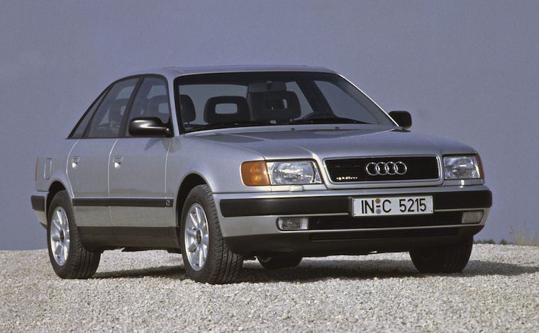 source: netcarshow.com
It stands for general software. It is comfortable, safe and general‐purpose. All you need to use it is a minimum of skills, familiarity and practice—in the case of cars this is covered by qualifying for a driving licence.
In the case of software, we are talking casual and enthusiast use. A good
example is web browsers. One can start using them with a minimum of skills and
practice. After gaining some experience one can comfortably
drive use a browser on a daily basis. If a pro web browser
exists, then it has escaped my radar.
(It would make a very interesting project, a pro web browser. But first a product maker would have to stand up with a solid vision of pro web browsing; its user groups; and some big innovation that is valuable for these users.
vroooom
When I think of creative pro interfaces, I think of this:
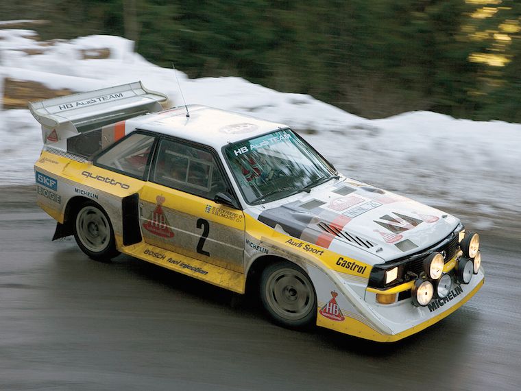 source: imgbuddy.com
The rally car. It is still a car, but… different. It is defined by performance. And from that, we can learn a couple of things.
speed, baby
First, creative pros work fast. They ‘wield the knife’ without doubt. A telltale sign of mastery is the speed of execution. I have this in mind all the time when designing for creative pros.
I vividly remember one of the earliest LGMs, Andy Fitzsimon went on stage and demonstrated combining pixel and vector in one image. The pace was impressive, Andy was performing nearly two operations per second.
Bam bam bam bam. At a tempo of 120 beats per minute; the solid tempo of marching bands and disco. That is the rhythm I aim to support, when designing for creative pros.
command and control
Second, creative pros really know their material, the medium they work with. They can, and need to, work with this material as direct and intimate as possible, in order to fulfil creative or commecial goals. This all can be technology‐assisted, as it is with software, but the technology has to stay out of the way, so that it does not break the bond between master and material.
The material I am talking about is that of film, graphics, music, animation, garments, et cetera. These can be digital, yes. However data and code of the software‐in‐use are not part of a creative pro’s material. Developers are always shocked, angry, then sad to learn this.
Thus Metapolator, has been designed for font designers and typographers who know what makes a font and what makes it tick. They know the role of the strokes, curves, points, the black and the white, and of the spacing. They are experienced in shaping these to get results. It is this material that—by design—Metapolator users access, just that it is organised such that they can work ten times faster.
dog eat dog
Third, it’s a competitive world. Creatives pros are not just in business. Also in zero‐budget circles there are real fun and/or prestigious projects where exactly those with proven creative performance, and ability to deliver, get asked.
Tools and software are in constant competition, also in the world of F/LOSS. It is a constant tussle: which ones provide next‐generation workflows with more speed and/or more room for creativity? Only competitive tools make masters competitive.
the point
Now that we got the picture, here is the conflict. The rules—the law and industry mores—that make good family cars may be a bad idea to apply to rally cars. And what makes rally cars competitive, may simply be illegal for family cars.
Every serious software platform has its HIG (human interface guidelines). It is the law, a spiritual guide and a huge source of security for developers. That is, for general software. It is only partly authoritative for software for creative pros. Because truly sticking to the HIG, while done all in good faith, will render creative pro software non‐competitive.
vorsprung durch technik
Rally cars contain custom parts, handmade from high performance materials like aluminium, titanium, carbon, etc. This is expensive and done because nothing off‐the‐shelf is sufficient.
Similarly creative pro software contains custom widgets, handmade at great expense—in design and development. For a decade I have witnessed that it is a force of nature to end up in that situation. Not for the sake of being cool or different, but all in the name of performance.
tough cookie
So, with loose laws and a natural tendency for custom widgets, can you do just what you like when you make creative pro software? Well no. It is tough, you still have to do the right thing. If this situation makes you feel rather lost, without guidance, then reach out and find yourself an interaction designer who really knows this type of material. Make them your compass.
picture show
To illustrate all this, let’s look at some of my designs for Metapolator.
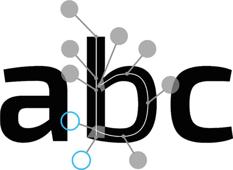
Speed, baby! Big handles to select and move individual points on the skeleton of a glyph (i.e. direct control of the material). During a brainstorm session with Metapolator product visionary Simon Egli, he noticed how the points could be connected by rigid sticks to big handles.
I worked out the design with big (fast) handles available for furious working, but out of the way of the glyph, so it can be continuously evaluated (unbroken workflow).
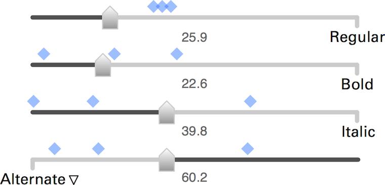
This is a custom slider set for freely mixing master fonts—metapolation—to make new fonts. In this case four fonts, but it has been designed to easily scale up to nine or more; a Metapolator strength (vis‑à‐vis the competition).
One of the sliders—‘Alternate’—is in an “illegal” configuration; it is reversed. This is done to implement the rule that the mix of fonts has to always add up to 100%. There is special coupled behaviour between the sliders to ensure that.
The design of this part included a generous amount of exploration and several major revisions. Standard widgets and following the HIG would not deliver that every sliders setting maps to one unique font mix. Apart from a consistency goal, that is also about maximising input resolution. So I broke some rules and went custom.
This is also a metapolation control. In this case a three‐dimensional one involving eight master fonts. Working with that many fonts is really a pro thing; you have to know what you are doing and have the experience to set up, identify and pick the ‘good font’ results.
The long blue arrow is a font family, with nine or so fonts as members. The whole family can be manipulated as one entity (i.e. placed and spanned in this 3‑D space) as can each member font individually.
Final example: complex selections. Across three different fonts and three different glyphs, several points have been selected. Now they can be manipulated at the same time. That is definitely not consumer‑grade.
If that looks easy, I say ‘you’re welcome.’ It takes serious planning ahead in the design to allow this interaction; for the three fonts to appear, editable, at the same time; for deep selections within several glyphs to be possible and manageable—the big handles‑on‐sticks help also here.
vroom, vroom
In short: if there is one thing that I want you to take away from this blog post, then it is that image of the rally car. How different its construction, deployment and handling are. Making software for creative pros means making a product that is definitely not consumer‑grade.
That’s it for part two. Go straight to part three: 50–50, equal opportunities.
Labels: design stage, lecture, metapolator, practical

designing interaction for creative pros /1
7 May 2015, 19:23
The lecture coincided with the launch of the demo of Metapolator, a project I have been working on since LGM 2014. All the practical examples will be from that project and my designs for it.
see what I mean?
‘So what’s Metapolator?’ you might ask. Well, there is a definition for that:
‘Metapolator is an open web tool for making many fonts. It supports working in a font design space, instead of one glyph, one face, at a time.
‘With Metapolator, “pro” font designers are able to create and edit fonts and font families much faster, with inherent consistency. They gain unique exploration possibilities and the tools to quickly adapt typefaces to different media and domains of use.
‘With Metapolator, typographers gain the possibility to change existing fonts—or even create new ones—to their needs.
‘Metapolator is extendible through plugins and custom specimens. It contains all the tools and fine control that designers need to finish a font.’
theme time
That is the product vision of Metapolator, which I helped to define the moment I got involved with the project. You can read all about that in the making‑of.
One of the key questions answered in a product vision is: who is this for? And with that, I have arrived at what this blog post is about:
Products need a clear, narrow definition of their target users groups. Software for creatives needs a clear definition whether it is for professionals, or not.
Checking the vision, we see that Metapolator user groups are well defined. They are ‘“pro” font designers’ and ‘typographers.’ The former are pro by definition and the latter come with their own full set of baggage; they are pro by implication.
define it like a pro
But what does pro actually mean? And why is it in quotes in the Metapolator vision? Well, the rather down‐to‐earth definition of professional—earning money with an occupation—is not helping us here. There are many making‐the‐rent professionals who are terrible hacks at what they do.
Instead it is useful to think of pros as those who have mastered a craft—a creative craft in our case. Examples of these are drawing, painting; photographing, filming, writing, animating, and editing these; sewing, the list goes on and on.
Making software for creative pros means making it for those who have worked at least 10.000 hours in that field, honing their craft. And also making it for for the apprentices and journeymen who are working to get there. These two groups do not need special ‘training wheels’ modes; they just need to get their hands dirty with the real thing.
the point
The real world just called and left a message:
making it for pros comes at a price.
First of all, it is very demanding—I will cover this in the follow‑up posts. Second, it puts some real limits on who else you can make it for. Making it for…
- pros
- is perfectly focussed, to meet those demanding needs.
- pros + enthusiasts
- (the latter also known as prosumers.) This compromises how good one can make it for pros; better keep in check how sprawling that enthusiast faction is allowed to be.
pros + enthusiasts + casual users- forget it, because pros and casual have diametrically opposite needs. There is no room in the UI for both, and with room I mean screen real estate and communication bandwidth.
pros + casual users- for the same reasons one can royally forget about this one too. Enough said.
the fall‐out
You might think: ‘duh, that speaks for itself, just make the right choice and roll with it.’ If it was only that easy. My experience has been that projects really do not like to commit here, especially when they know the consequences outlined above. And when they did make a choice, I have seen the natural tendency to worm out of it later.
I guess that having clear goals is scary for quite a few folks. Having focussed user groups means saying ‘we don’t care about you’ to vast groups of people. Only the visionary think of that as positive.
Furthermore, clear goals are a fast and effective tool to weed out bad ideas, on an industrial scale. That’s good for the product, but upsets the people who came up with these ideas. So they renegotiate on the clear goals, attacking the root of the rejection.
no fudging!
In short: define it; is your software for creatives made for pros, or not? Then compile a set of coherent user groups. In the case of Metapolator the ‘pro’ font designers and typographers fit together beautifully. Once defined, stick with it.
That’s it for part one. Here is part two: a tale of cars.
[editor’s note: Gee Peter, this post contains a lot of talk about pros, but where is the creative angle?] True, the gist this post is valid for all professionals. The upcoming parts will feature more ‘creative’ content, more Metapolator, and illustrations.
Labels: lecture, metapolator, practical, process, product phase, product vision
If you like to ask Peter one burning question and talk about it for ten minutes, then check out his available officehours.
 Peter Sikking is an
experienced
Peter Sikking is an
experienced
interaction architect. He unabashedly puts
shipping great products at the centre of his design practice. He is known for
his work for Google, Nokia, the
Metapolator &
GIMP
open source projects,
and startups.
What is Peter up to? See his /now page.
- info@mmiworks.net
- +49 (0)30 345 06 197
- imprint
