rethinking text handling in GIMP /1
20 May 2012, 23:02
At the beginning of this month, most of the open source graphics applications community convened for the libre graphics meeting in Vienna, Austria. After a one‐year hiatus, the GIMP team was back in force, and so were two of its UI team members, my colleague Kate Price and yours truly. We delivered a lecture about our most recent GIMP project, which we will write up in three parts. Here is the first.
beyond the text tool
This project was the first one in our series of open internships. I had created these last year, combining mentoring, open working and getting serious interaction design work done for the GIMP project.
Dominique Schmidt worked with us on this project, which goal is to rethink everything associated with text handling in GIMP. It would have been cool to have Dominique on stage in Vienna, telling the story himself. But he had this holiday booked; to a tropical destination; and surprisingly he insisted on going. Since projects means teamwork at m+mi works, Kate and I were instead fully able to report from the trenches.
The text project is quite a wide‐ranging one and at the moment of writing it is in‑progress. So there are going to be no magic bullets, or detailed interaction design specs to be presented—yet. Certainly a wide‐ranging project demands a structured approach, else it goes nowhere. It is exactly this structure that we will use to present it here, in this and the follow‑up blogposts.
direction
Step one: compiling a vision for the project. With text—and editing, styling it—being so ubiquitous in computers, it is very easy to get stuck in nuts‑and‐bolts discussions about it. The trick is to concentrate on the big issue: what is the meaning of text in GIMP work? What we needed was a vision: ‘what is it; who is it for and where is the value?’
The vision is compiled out of quite a few elements: of course it has to align with the overall product vision of GIMP; we interviewed the GIMP developers who have worked on text; it includes the GEGL future of non‑linear working; and we held an informal user survey on the developer mailing list—plenty of users there—about the essence of working with text.
building blocks
To show how the resulting vision, worked out, let’s discuss it line‑by‑line:
- ‘Text in GIMP is always part of the composition—unless it is an annotation.’
This puts text thoroughly in its proper place; it is never the end‑goal, by itself. Also defined is a separate annotation workflow: users adding notes for themselves or for collaboration purposes. This sets us up for a small side project: annotations in GIMP.
- ‘The canvas is not a page; there is no such thing as paging in GIMP.’
I love this one. The first part was phrased by Dominique, the second by Kate. This puts clear limits on what text functionality GIMP needs: beyond paragraphs, but short of page‐related stuff. Note that ‘paging’ is a verb, it is about working with pages and managing pages.
- ‘Text is both for reading and used as graphical shapes; meta data in text—mark‑up, semantics—are not supported.’
This puts on equal footing that text is for information transport and just shapes; an excellent example where the GIMP context makes a big difference. The second part excludes any meta data based processing: e.g. auto‐layouting or auto‐image manipulation.
And now, we get to the value section:
- ‘GIMP users get: minute control over typography and the layout of text on the canvas.’
If there is one thing we learned from surveying users, it is the essence of typography: to control exactly, down to the (sub)pixel, the placement of every text glyph. This control is exerted via the typographical parameters: margins, leading, tracking, kerning, etc. GIMP needs to support the full spectrum of these and support top‑notch typographical workflows.
- ‘GIMP users get: internationalisation of text handling, for all locales supported by unicode.’
This thoroughly expands our horizon, we have to look at use of text word‐wide: many different writing systems, different writing directions. But it also sets clear limits: if it cannot be represented in unicode, it is not in scope.
- ‘GIMP users get: text remains editable forever.’
This anchors the GEGL dream in the project: no matter how many heavy graphical treatments have been applied on top of a piece of text, one can always change it and see the treated result immediately. But also included here is a deep understanding of projects and workflows. E.g. Murphy’s law: a mistake in the text is always found at the last moment. Or the fact that clients always keep changing the text, even after the delivery date.
- ‘GIMP users get: super‐fast workflow, when they are experienced.’
This reflects that GIMP is for graphics production work and the speed‑of‐use requirements that accompany that.
it’s a wrap
And there we have it. Here they are again, together as the vision statement:
- Text in GIMP is always part of the composition—unless it is an annotation;
- the canvas is not a page; there is no such thing as paging in GIMP;
- text is both for reading and used as graphical shapes; meta data in text—mark‑up, semantics—are not supported.
GIMP users get:
- minute control over typography and the layout of text on the canvas;
- internationalisation of text handling, for all locales supported by unicode;
- text remains editable forever;
- super‐fast workflow, when they are experienced.
Nice and compact, so that it can be used as a tool. But these seven simple sentences pack a punch. Just formulating them has knocked this project into shape. The goals are clear from hereon.
And on that note, I hand over to Kate, who will continue our overview of the steps we took, in part two.
Labels: GIMP, internship, lecture, mentoring, product phase, product vision

teaching interaction /12
12 May 2012, 15:17
A few weeks ago I was again teaching my course, interaction design for the real world, at the FH Vorarlberg, Austria. As always, the course evolved further: a feedback session for draft documentation was built in this year, which proved to be very valuable.
Also I made headway with stamping out non‑designer vocabulary. Last year the taboo word was ‘intuitive,’ this year it was the phrase ‘the user.’ Interaction designers speak of ‘users’ in plural, to get the message across that there are many of them and that they are a diverse group.
working the seam
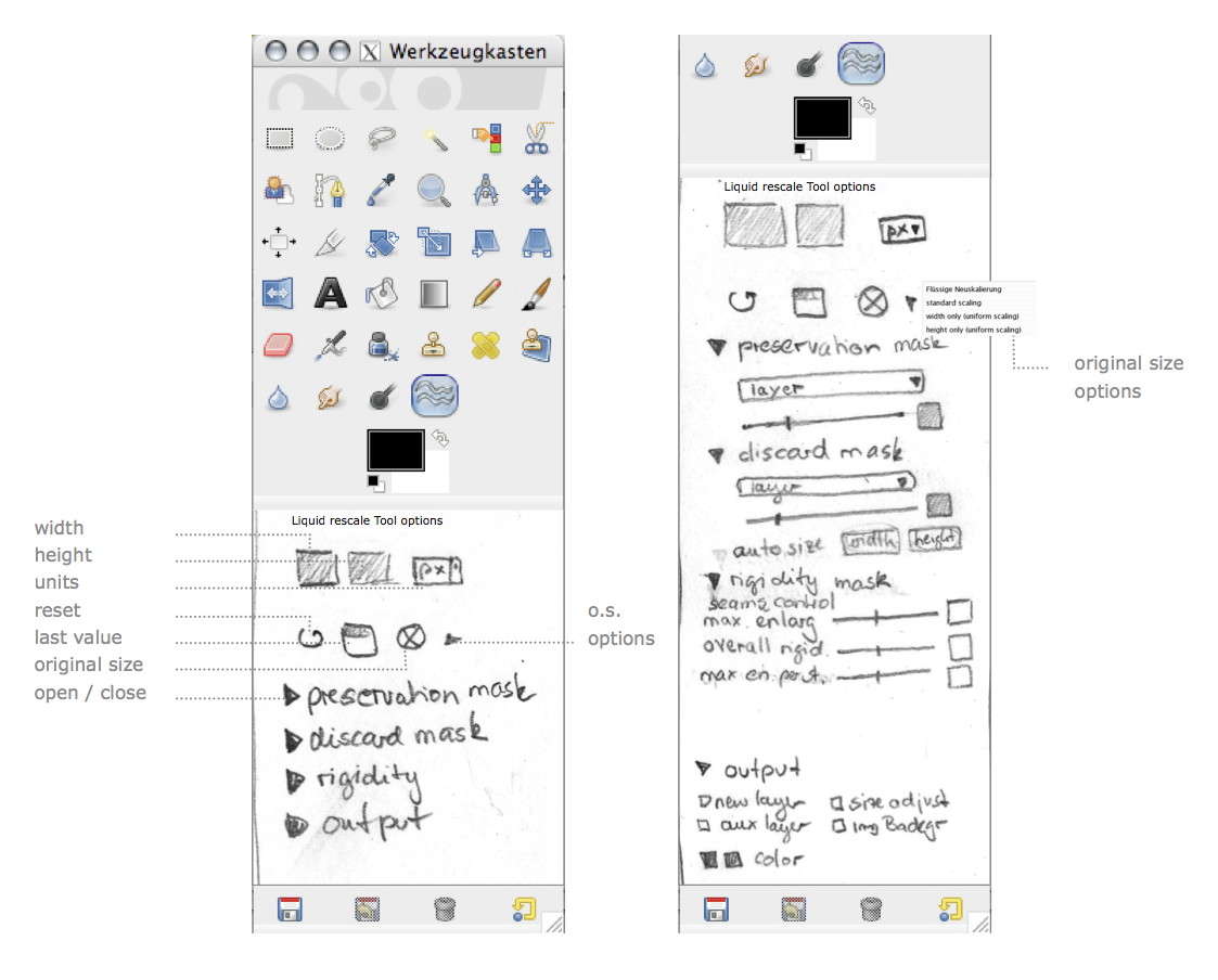
The real‐world design challenge that the students worked on was, like every year, from the GIMP project. This year I picked the Liquid Rescale plugin. It implements seam carving, which means that it finds the uninteresting portions of an image, and modifies only these to grow/shrink an image.
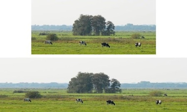 an example from
meetthegimp.org,
mind the cows…
an example from
meetthegimp.org,
mind the cows…
But things are not that easy. There is plenty of parameters to drive this and just about all of them are necessary:

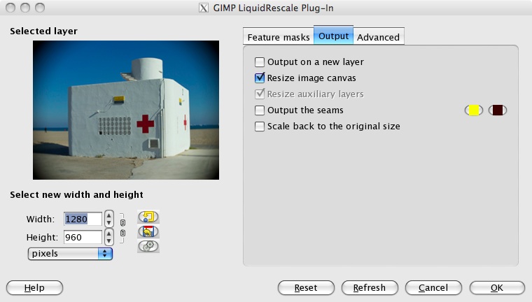

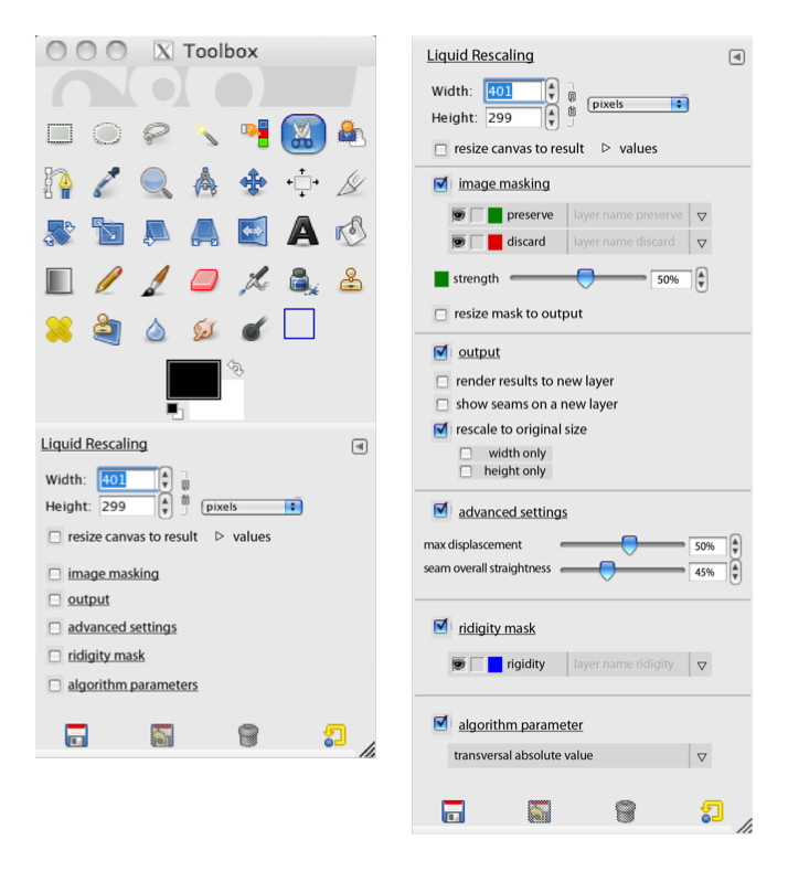
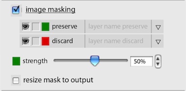
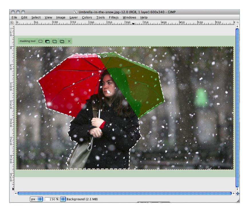
The most important of all these parameters are the preservation and discard masks, which let users specify which parts of the image (or more precise: the layer) are interesting and uninteresting, respectively.
scenarios + variants
To flesh out the essential use of Liquid Rescale, we made a few user scenarios:
- simple resizing, also in relation to a composition (say, a collage);
- precise control while resizing, using the preservation and discard masks;
- make objects disappear without a trace, using the discard mask;
- creative abuse, beyond the hi‑fidelity intentions of the tool.
The students used these scenarios for their evaluation of the interaction of the existing tool. With their insight into the good and the bad, the students were ready to brainstorm better solutions. This year the students were asked to do this in four directions.
This was in reply to two open questions. The first one was ‘should Liquid Rescale be a plugin in a dialog or a toolbox tool?’ The second one had to do with layer abuse: those preservation and discard masks have to be in the layer stack. So I asked the student to brainstorm the direction of using layers and the opposite: not use layers.
After the brainstorming the student teams picked their own course, while designing their solution.
three team results
And now the design results of the student teams. First let me make clear that the work of all three teams is available under the GNU Free Documentation License 1.2. I present them in team order.
team one
- members: Ana Beatriz Bravo Rojas + Elena Zabrodina
- design concept document (pdf, 5.4 MB)
Team one decided on keeping Liquid Rescale a plugin in a dialog. But they worked real hard on reducing the area occupied by the parameter controls, thus optimising the area available for previewing the layer that is being worked on:
I like that they designed these compact controls as a flexible system (quite a challenge), which can be used in different aspect ratios:
Team one settled for using layers to represent the preservation and discard masks and also designed the output of the tool to automatically appear as new layers.
team two
- members: Isabel Schmidt + Simon Wenglein
- design concept document (pdf, 4.6 MB)
Team two did the opposite of team one. They redesigned Liquid Rescale into a toolbox tool, which means it works fully interactive on the canvas. Since there are ample options they designed collapsing sections for them. Below left we see all sections collapsed; on the right all of them expanded:
Also they designed the preservation and discard masks out of the layer stack. They live inside the tool instead, where they can be created, worked on and managed:
Below you can see how team two designed a mask editing session. I like that they did not take the ‘making masks equals painting’ metaphor for granted. Instead they adapted the free/poly selection tool for mask definition needs:
team three
- members: Alexandra Genewein, Katrin Seidel + Nicolai Pritzl
- design concept document (pdf, 2 MB)
Team three also redesigned Liquid Rescale into a toolbox tool. Also with collapsing sections in the tool options. Below we see their take on the collapsed (left) and expanded (right) layout:
Team three gave their own twist to the preservation and discard masks. Treading the middle way, they made it optional whether these would be stored as layers. Below we see the mask edit session, using the established ‘making masks equals painting’ metaphor:
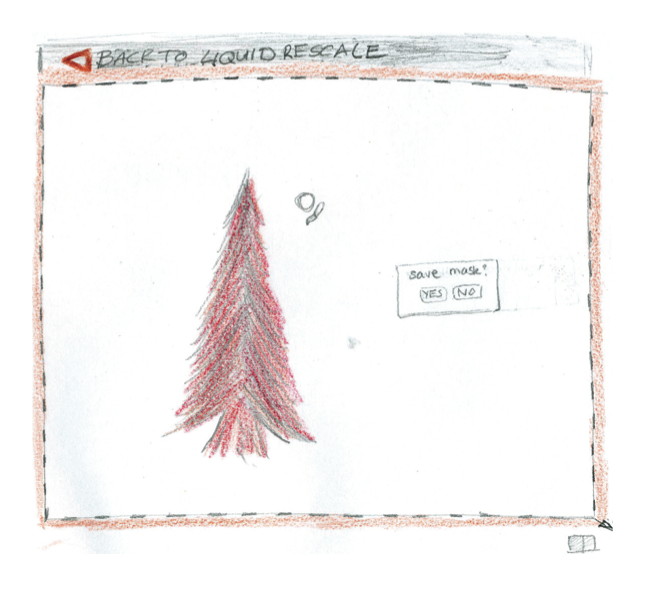
Thumbs up to team three for documenting their design with their pencil drawings. Working in pencil is the norm during my class and as long as it is clear, it is also fine for design documentation.
postscript
Again I had a great week at the FH in Dornbirn this year. The evolving course set‑up, and the fact that every year the design challenges stress different aspects of interaction design craftsmanship, keep things fresh and exciting. I would like to thank all the students for the hard work they put in and for the energy they returned.
If you like to ask Peter one burning question and talk about it for ten minutes, then check out his available officehours.
 Peter Sikking is an
experienced
Peter Sikking is an
experienced
interaction architect. He unabashedly puts
shipping great products at the centre of his design practice. He is known for
his work for Google, Nokia, the
Metapolator &
GIMP
open source projects,
and startups.
What is Peter up to? See his /now page.
- info@mmiworks.net
- +49 (0)30 345 06 197
- imprint
