mobx, mobile before January 9th, 2007
28 November 2011, 22:22
Hot on the heels of the WUD there was the MobX conference. Very cool to be invited for this one, the speaker lineup was promising and delivered. The feedback of the conference audience was enthusiastic, both on the day itself and via all the familiar networks. As usual, here is the write‑up of my lecture.
mobile before and after January 9th, 2007
. At that time, mobile looked like this:
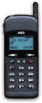 source:
handy-sammler.de,
thanks for the memory!
source:
handy-sammler.de,
thanks for the memory!
The pixels on this mobile’s screen were not square, they were rectangular; more high than wide. This was to save on screen cost and on memory needed to drive it.
More fun trivia: I did not own or use a mobile in those days. Only two years later I got my first mobile. I had seen mobiles before, more of them in the UK in ’95, less in Holland in ’96. But I had never made a call with one.
spec work
Work on mobiles was in those days driven by the GSM specification, which regulates how mobile networks work and type‐approval of mobiles. These specs are written by a committee of manufacturers, but I learned that they did this in order to please the network operators, to create new revenue streams for them.
The SIM toolkit, which I worked on in ’97, is an example of that. It lets networks add menus and UI to mobiles, for proprietary services. Speaking of services, in those days SMS was used by virtually no one, it was simply too expensive.
touch and go
Looking back it is quite amazing that we were working in ’98 on a touch UI model, for production. OK, it looked more like the model above than an iPhone, but still it had handwriting text input. Alas, that work stopped in the mid‑1998 when AEG got out of the mobile business. Nokia had invented segmentation—different mobiles for different people—and were solidly beating companies like AEG who were making only one model at any given time. Segmentation seemed to be the way of the future…
a cup of joe
We now fast‐forward to 2001, when a long stretch of mobile work started for me. Nokia was about to start working on their first java‐equipped phone, the 6310i:
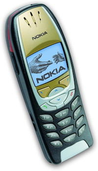
This model still had a 1‑bit, black and white screen; two softkeys and 2‑way scroll keys. I still see the 6310i in use today, nine years after its introduction. They were built to last.
Mobile models were at that time differentiated by ‘extras’ which had taken over from the GSM spec as driver of development. I was asked by Nokia to design the first java mobile applications (MIDlets) to ship with the phone, together with a Nokia colleague. From this phase of ‘old mobile’ I would like to discuss three things I learned that are still valid in today’s touch‐dominated world.
1. work on a chart
This is the UI chart of the first MIDlet I designed, the converter. It converts units, like pounds to kilos and gallons to litres:
The point is that this is the complete user interaction. It is accompanied by an error chart—derived from the UI chart, it shows what happens when things go wrong, e.g. memory full—and a short document, less than ten pages, that specifies details. This is all you need to develop and ship the MIDlet.
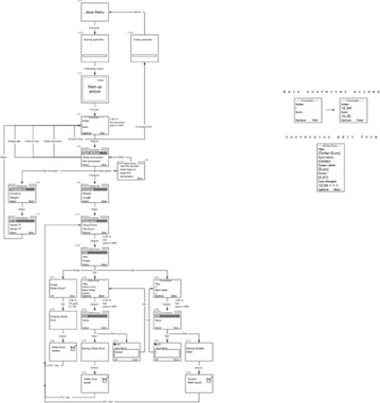
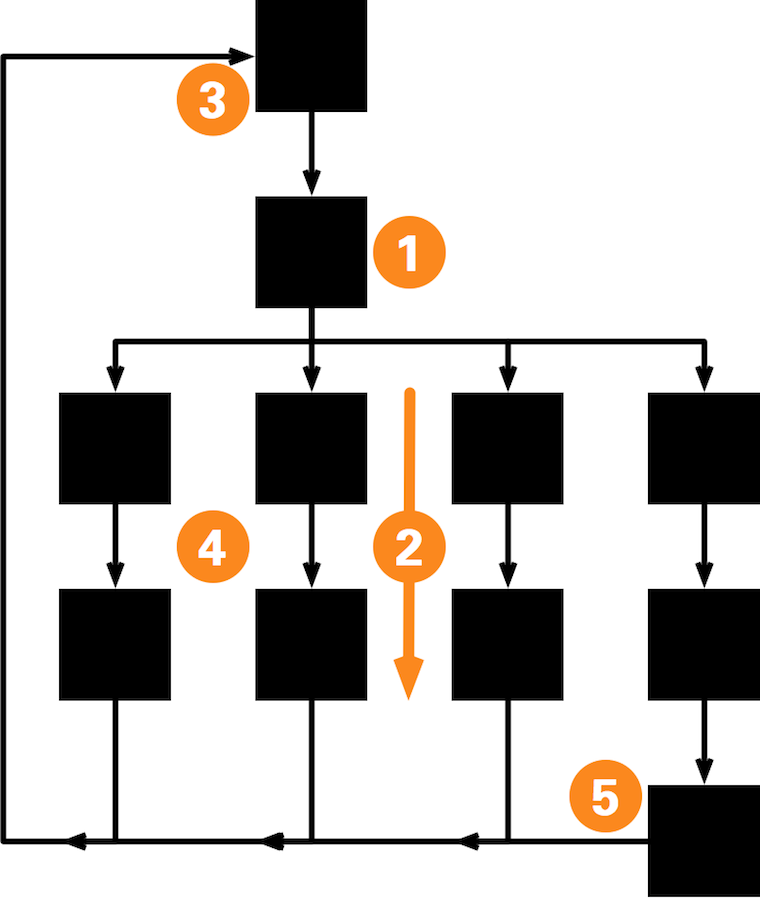
Case in point. A couple of years later I worked on version two and three of Nokia’s java email client. Version one reached me in the form of a 189‑page document. Text‐only: a section for each screen, with gotos at the end for the transitions. It had taken nine months to write and was unusable. I spent a week decoding the document and made this chart:
Now Nokia knew what they had been developing. The chart was my first deliverable and it was a revelation to them. Worth every penny, they thought. In a much shorter timeframe, nine weeks, I did a redesign for version two, which had a lot of new stuff included. The result had to be put on two charts, though.
incomplete story
Every once in a while, I see storyboards being used to communicate an interaction design. You know, a row of screens showing what happens in sequence:
This may work—even well—to present work to people who are not in on the project. But it is not a working tool for interaction designers. It is not fit for communicating the design to development. That is because it cannot show a complete and coherent picture of the interaction.
seeing is believing
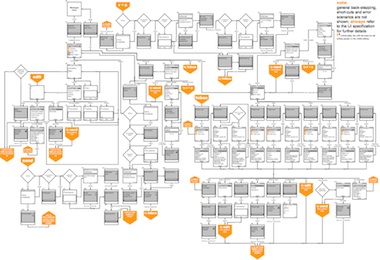
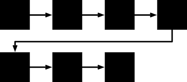
What I learned after a while is to read the chart. To see the quality of the user interaction from the patterns. This works because in old mobile, a lot of the interaction is not determined by what is on the screens, but by the flow between the screens. Here is the basic flow of old mobile, there is not much more to it than this:
- Without even looking at what is on the screens, you just know that this is the Options menu.
- Under it are the task flows, each completing a task.
- The return point for the flows. After a while I sensed that this is a point in the UI where users feel calmer, more secure.
- The flows themselves are more uncomfortable for users, they do not like to hang out there.
- Longer flows spell trouble; one screen more and I would be alarmed and investigate. Note that this is about feeling (see 4) and not about number of clicks (a most useless metric).
If a chart has arrows flying all over the place, then either you have not drawn it very well (try again) or the user interaction needs a redesign. This is why I like to have the complete and coherent picture. To see how everything is connected and relates to everything else. That’s why I say: work on a chart.
2. there is no such thing as cross‑platform
I learned this one the hard way. So there we were at Nokia. There was a java team that had to make a toolkit that would run any MIDlet in the world. And there was me asked to design real Nokia applications using this toolkit. This was a constant struggle.
I do not blame the java team. They had to adhere to a common‐denominator specification and do the best they could. But the loss of control on my side meant too many cases of close but no cigar. The make‑or‐break details of user interaction could not be put in order.
difference engine
After a while I was also designing for multiple devices. All Nokia devices, but the differences started to bite. It is easy to see the big impact of changing the number of buttons on a device. From two to three softkeys; introducing 4‑way scroll.
Remarkably more buttons was not always better: I had optimised the converter so much for two softkeys, that when the third came along, the problem was what action to assign to it. At the end I put the conversion selection, but it was clear that the converter had not been aching for three softkeys to come along.
size matters
More subtle were the differences in screen sizes of the devices. This meant changes in how much text or how many items one could fit on a screen. This situation is quite elastic, but sometimes there would be a catastrophe because something would not fit anymore or an opportunity because an extra thing would fit.
This would trigger a redesign, and I do not mean just of some screens. Whole flows had to be changed because of the catastrophe/opportunity. I think today with touch UI this screen size factor is even bigger than with old mobile. Pixels sizes do not count anymore, it is the finger grid, measured in centimetres. That means less elasticity.
So when somebody says ‘we are going to do this cross‐platform from one codebase’ or someone else says ‘I got a cross‐platform UI toolkit,’ then I say: no you don’t. You have no idea what user interaction is really about.
3. be obsessed with elegance
So there I was, designing these small MIDlets that really only did one thing. And I started to be obsessed with how elegant the interaction could get. An example is the Nokia translator, which translates a couple of thousand words between five languages.
This looked easy, but there was one thing that bugged me: should users constantly be telling the translator what they are translating (German–English or English–German?). Language is a two‑way thing, so this directionality had to go. I was obsessed with this for more than a week, day and night. But then I had it.
Language is the answer. Just look up the input word in all five dictionaries. Spelling will sort out in which language it was. We ran some tests that confirmed the plan. The result was a leap in elegance. And a small, very satisfying UI chart.
complex issues
I used to have a complex, designing these small MIDlets that really only did one thing. Other people were working on bigger things like call, phonebook or SMS that were also used by a lot more users. I have always estimated that one percent of users used these small MIDlets that I designed. With an installed base of half a billion that still gives five million users, which is not bad.
These days, small programs that really only do one thing, and are used by only a fraction of users, are called apps. They are perceived as beautiful and people have no hang‑ups about working on them. And elegance rules this domain.
grinding halt
With hindsight it is easy to say that being small is beautiful. This is because I can now see that around 2005 something was clearly going wrong:
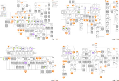
Meet sensor, today you would call it a social network, in this case a short‐range one: it worked via bluetooth only. It is so large it needed four UI charts; you can feel my pain. I redesigned this from the original symbian version. It was quite a bit of work, because there is no such thing as cross‑platform.
This is really exemplary of what was happening at the time. Mobile was getting bloated and more complex. Users were noticing it. Everything just felt slower. Straightforward things were no longer straightforward.
That is, until January 9th, 2007. Read about it in part two.
Labels: design stage, lecture, mobile, practical, top story

![]()
![]()
1 comments · post a comment
- at 29 November, 2011 01:40,
 commented
 - There is something on my mind for quite some time. I used to have old "2 function key" nokia which I could use blindly. The function-keys always had the positive or negative action you wanted to have (4 clicks on the left button to start a sms for example). Later models added the cursor keys, and whith them you had to use the keys much more "unpredictable" and alternating.
Siemens had that problem out of the box, so I never liked the S60 and other models.
With touch, that all get worse, you can hardly write a SMS any more without looking at the screen.
If you like to ask Peter one burning question and talk about it for ten minutes, then check out his available officehours.
 Peter Sikking is an
experienced
Peter Sikking is an
experienced
interaction architect. He unabashedly puts
shipping great products at the centre of his design practice. He is known for
his work for Google, Nokia, the
Metapolator &
GIMP
open source projects,
and startups.
What is Peter up to? See his /now page.
- info@mmiworks.net
- +49 (0)30 345 06 197
- imprint
