designing interaction for creative pros /4
30 May 2016, 20:08
Part one urged to make a clear choice: is the software you’re making is for creative professionals, or not? Part two was all about the rally car and the need for speed. Part three showed the need to support the free and measured working modes of masters.
We start by revisiting the cars of part two.
party like it’s…
It is no coincidence that I showed you a 1991 family car and a 1991 rally car:
 source: netcarshow.com
and imgbuddy.com
I did that because our world—that of software for creative pros—is largely stuck in that era. And just like 1991 king‐of‑the‑hill cars (even factory‐mint examples found in a time capsule), this software is no longer competitive.
 yes, it’s pants! source:
charliepants.com
It is my observation that in this field there is an abundance of opportunities to do better. If one just starts scratching the surface, on a product, workflow, or interaction level, then today’s software simply starts to crumble.
testing, testing, one two
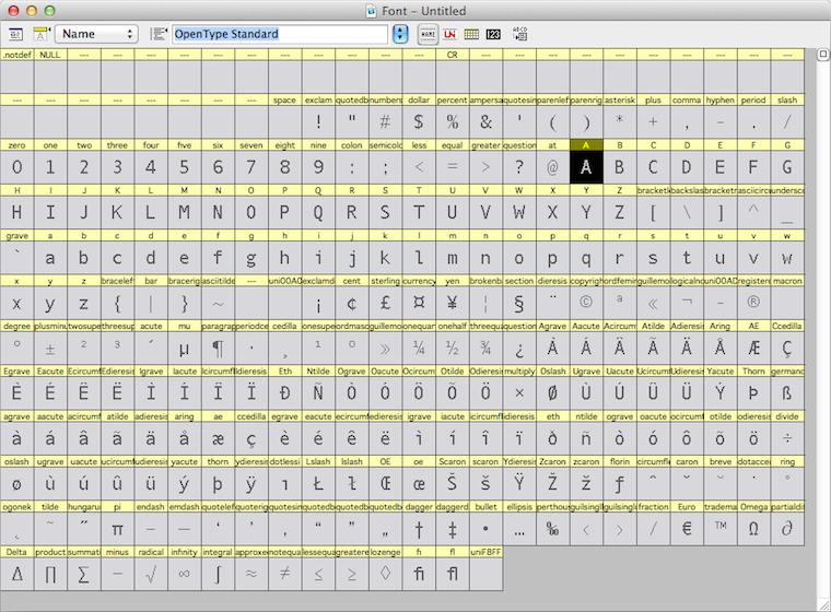
For instance, while doing research for the Metapolator project, I asked some users to show me how they work with the font design tools of today. They showed me the glyph range, the central place to organise their work and get started:
They also showed me the curve editor, where the detailed work on each glyph is done:
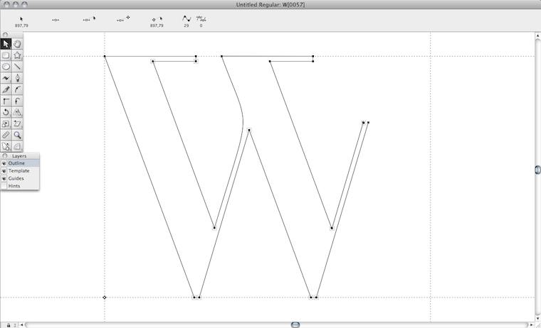
Both of them need the whole screen. In a short amount of time I saw a lot of switching between the both of them. I sensed wasted time and broken flows. I also saw tiny, slow handles in the editor. And I thought: this cannot be it.
They also showed me, in another program, designing in context:
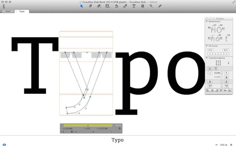
I immediately sensed this was a big deal. I saw that they had pushed the envelope—however, not broken through to the other side.
Besides that, I observed that editing was done in outline mode (see the ‘y’, above), but evaluation is of solid black glyphs. Again I sensed broken flows, because of switching between making and evaluating. And I thought: this cannot be it.
Frank sez…
Enough of that; let’s zoom out from my field report, to the big issue at hand. To paraphrase Zappa:
‘How it has always been’ may not be quite dead, but it sure smells funny.
The question is: how did we get to this situation? Let me dig through my experience to find some of the causes.
First of all we can observe that each piece of creative‐pro software is a vertical market product; i.e. it is not used by the general population; only by certain masters. That means we are in armpit of usability territory. Rereading that blog post, I see I was already knee‐deep into this topic: ‘its development is driven by reacting to what users ask for (features!) and fear of changing “like it has always been” through innovation.’
go on, have another cake
The mechanism is clear: users and software makers, living in very different worlds, have a real hard time communicating. Where they manage, they are having the wrong conversation: ‘gimme more features!’ —‘OK, if that makes you happy.’
What is happening today is that users are discussing software made yesterday. They are not able to communicate that their needs are so lousily addressed. Instead, they want some more cherries on top and this cements the position of this outdated software.
Constantly, users are telling software makers, implicitly and explicitly, ‘add plenty of candy, but don’t change a thing.’
This has been going on for decades—lost decades.
bond of pain
A second cause that I want to highlight is that both users and software makers have worked for years to get on the inside and it has been a really painful experience for all of them. This unites them against change.
Thus users have been fighting several frustrating years to get ‘into’ software that was not designed (for them; armpit of usability, remember), but instead made on terms favourable to the software makers.
Software makers spent year after year trying to make something useful. Lacking any form of user research, the whole process has been an exasperating stab‐in‐the‐dark marathon.
Thus a variant of the Stockholm syndrome spooks both parties. They are scarred‐for‐life victims of the general dynamic of the pro‑software industry. But now that they have gotten this far, their instinct is to sustain it.
the point
Two decades of experience shows that there is a way out of this misery; to become competitive (again). There is no incremental way to get there; you’ll have to snap out of it. What is called for is innovation—of your product, workflow, your interaction. A way that unlocks results is:
- user research
Experienced researchers cut straight past the wants and get the user needs on the table. (Obligatory health & safety notice: market research has nothing to do with user research; it is not even a little bit useful in this context.) - design‐driven innovation
When user needs are clear (see point 1), then a designer can tell you any minute of the project—first to last—what part of ‘how it has always been’ is begging to be replaced, and which part is the solid foundation to build upon. Designer careers are built on getting this right, every time.
Skip either point—or doing it only in a superficial, or non-consequential, way—and I’ll guarantee you’ll stay stuck in 1991. Making it happen requires action:
Software‐makers: enthusiastically seek out user researchers and designers and start to sail by them. Stop considering adding features a good thing, stop being a captive of ‘how it has always been’ and trust the accomplished.
picture show
To illustrate all this, let’s look at some of my designs for Metapolator. To be able to solve these problems of contemporary font design tools that I mentioned above, I had to snap out of the old way.
First of all, I pushed designing in context a lot further, by introducing in‑specimen editing:
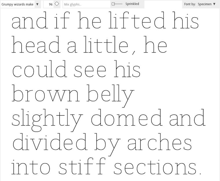
Every glyph you see above is directly editable, eliminating switching between overview and editing. The size that the glyphs are displayed in can be adjusted any given moment, whatever suits the evaluate/edit balance.
‘OK, that’s great’ you say, ‘but every once in a while one needs a glyph range to do some gardening.’ To address that, I used a handy trick: the glyph range is just another specimen:
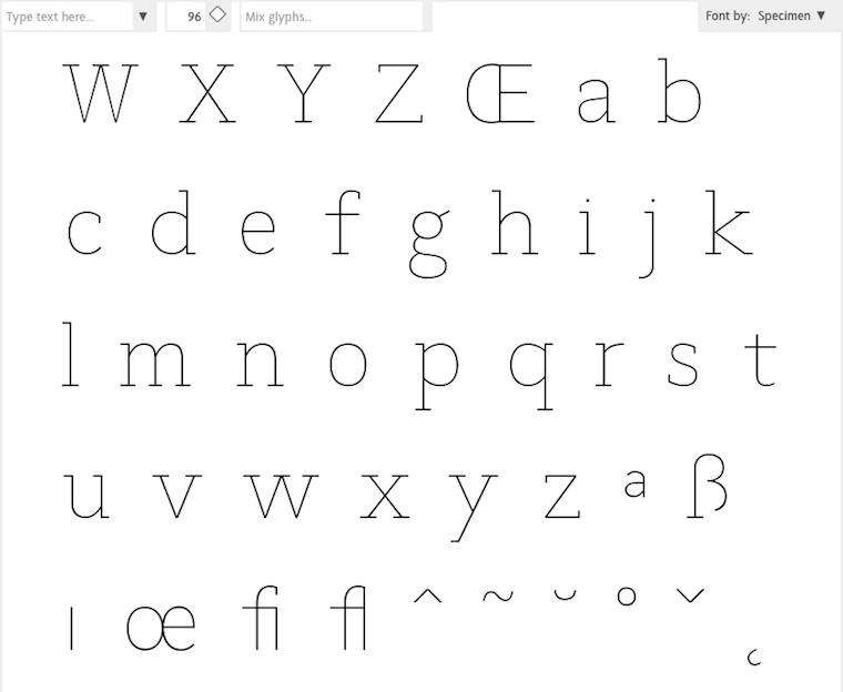
Everybody in the Metapolator team thought I was crazy, but I was dead set on eliminating outline mode. I sensed there was chance to do that here, because the focus moves from working at the edge of the glyph—the high‐contrast black–white transition—to the center line within:
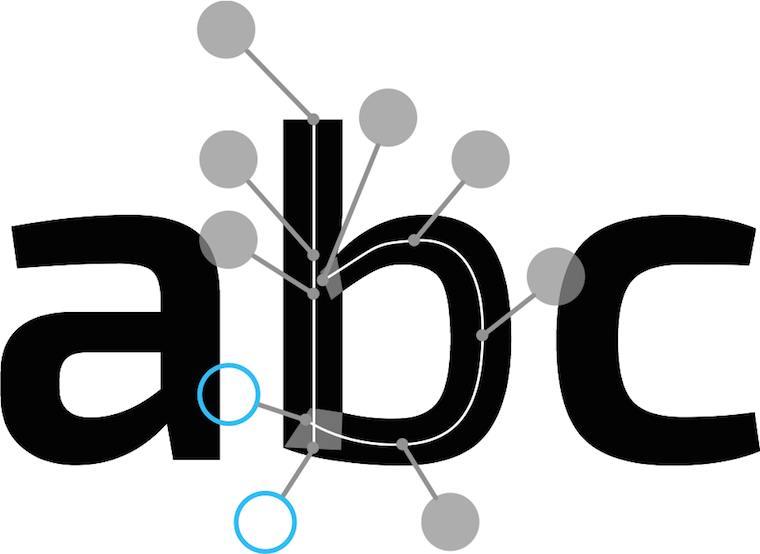
Then there was the matter of offering users generous handles that are fast to grab and use. After brainstorming with Simon Egli, the design shown above was born: put them ‘on sticks’ outside, so that they do not impede visual evaluation of the glyph.
pep talk
In closing: to be good in creative‐pro interaction, I encourage you to—
Do not ask how the past can guide you. Ask yourself what you can do to guide your software for creative pros into the 21st century.
Labels: design stage, lecture, metapolator, practical, product phase, top story

0 comments · post a comment
If you like to ask Peter one burning question and talk about it for ten minutes, then check out his available officehours.
What is Peter up to? See his /now page.
- info@mmiworks.net
- +49 (0)30 345 06 197
- imprint
 Peter Sikking