 our blog
teaching interaction /11
27 July 2011, 23:18
A few weeks ago I was again teaching my course, interaction design for the real world, at the FH Vorarlberg, Austria. The goals and structure of the course can be found in previous instalments. This year, in the name of continuous improvement, I made one change to stamp out what had been bothering me in previous years.
With alarming frequency, my students had been writing in their reports that one of the design goals was ‘to create an intuitive tool for GIMP.’ As I have written here before, there is no such thing as intuitive: all interaction is learned. All an interaction architect can do is harmonise the learning curve of a piece of software with its other design goals.
So this year I paid special attention to the fact that GIMP’s product vision sets ambitious goals for the freedom to create and for efficient working in production environments. The unavoidable trade‑off is that some serious training and practice is required from users before they can unlock this freedom and efficiency. I am happy to report that my students really tuned into this vibe and got their design priorities the right way around.
GIMP warped
Another year, another real GIMP design challenge for the students to work on. This time I picked the current summer of code project to bring the iWarp plugin to the toolbox.
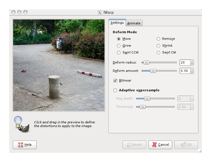
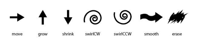
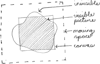
iWarp allows to deform image content by pushing pixels around like putty; growing or shrinking areas; swirling in either direction and touching up all of this by smoothing or removing these deformations. Taking this out of the confinement of a plugin and making it a true toolbox tool has been an obvious goal to the GIMP team for years. That seems to be a straightforward project and automatically solve quite a few problems: undo, zooming, panning and selections become available ‘for free.’
no free lunch
As the students found out, things are not that simple. Delivering the aforementioned freedom and efficiency asks for some serious interaction design. This multiplies with the fact that for a toolbox tool, opportunities for shortcuts are sparse: just about all keyboard shortcuts are already taken by the tool switching system and menus.
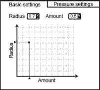
Another challenge was the integration of the pressure input of a graphics tablet controlling the radius and/or amount of the deformation. There were lots of design choices to be made about how straightforward or powerful one wants to make such a system.
scenarios + evaluation
To facilitate evaluation, we set up on the first day of the course three user scenarios that map out ‘the playing field’ of using iWarp. They ranged from perfecting realistic photos to wild ‘action painting’ with the deformation tool. In the middle of that range is the scenario in which a fantasy world is created out of a photo.
During the expert evaluation phase we not only evaluated iWarp on its own, but it was also quite useful to perform competitive analysis of photoshops’s equivalent tool: liquify. I was surprised to find that it is also a boxed‑in plugin, with a lot of functionality added to compensate for not being a toolbox tool, e.g. custom masking to compensate for not having the selection system available.
When done right, the in‑the‐toolbox strategy is clearly superior, in a way that a plugin can never compensate for. Also during the evaluation the students noted that iWarp was noticeable snappier than liquify, the latter bordering on being too slow to match the goals we had set for keeping out of the way of users’ flow. I can only hope/insist that iWarp maintains that advantage.
four team results
And now the design results of the student teams. First let me make clear that the work of all four teams is available under the GNU Free Documentation License 1.2. I present them in team order.
team one
- members: Selen Gürün, Recep Emre Koca + Sandra Beckstein
- design concept document (pdf, 1.9 MB)
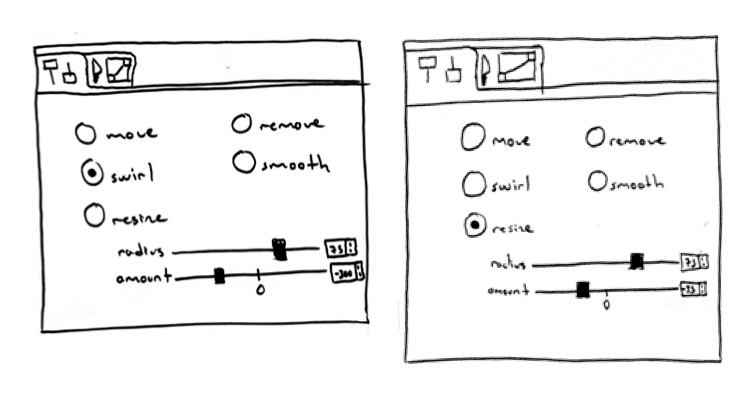
Apart from the freedom and efficiency goals, all teams were asked if there really are seven distinct deform modes (move, grow, shrink, swirl CW, swirl CCW, smooth and remove).
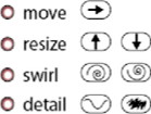
Team one took grow–shrink and swirl CW–CCW as positive–negative instances of the same deformation (resize and swirl). Uniquely, they put these on the ends of the Amount parameter scale. Thus, a negative amount does the opposite of a positive amount and (near) zero effect is in the middle of the scale:
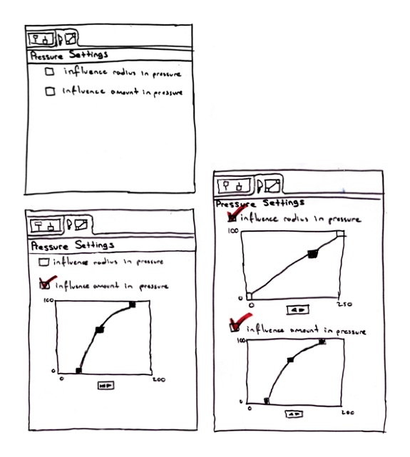
Team one elegantly managed what was a challenge for all the teams: the combinations of static and/or dynamic (by means of pressure from a tablet) control of radius and amount. They designed a clear dynamic override for each parameter and a full curve system for each, including reverse effects (more pressure, less radius or amount):
Finally, team one did a good job argumenting their design in their document: like it should be done, assertively, relating decisions back to the client’s product vision and the design goals.
team two
- members: Ingrid De León + Stephanie Nagel
- design concept document (pdf, 2.5 MB)
During the brainstorming phase, team two surprised me with a mind map of the problem and solution space:

Team two gave every deform mode—combining the swirls—its own tab to express that the parameters were unique for each mode. Then in the seventh tab (bottom one) they put the pressure dynamics handling:

team three
- members: Lorena Chan Guerrero, Niek Gerrits + Jennifer Paul
- design concept document (pdf, 3.3 MB)
Team three bristled with creativity and worked fast. I kept them on their toes by giving them one next‐level design challenge after another. First, the team designed a good set of gestures and a system for employing them to switch the deform mode of the iWarp tool (as a shortcut, of course, using the mouse right‑click):
Then, team three went furthest in combining deform modes. The beauty of this is in the shortcuts they attached to them, with <shift> toggling between the left–right columns in the picture below and <ctrl> setting the mode to detail while pressed (i.e. <ctrl> engages smooth for a moment and <ctrl><shift> erase):
Furthermore, team three came up with two‑dimensional input for the radius and amount parameters which has some really interesting workflow potential:
team four
- members: Heike Marlene Rosenberg + Analucia Moreno Concha
- design concept document (pdf, 4.7 MB)
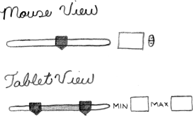
Team four had their own take on how to integrate the pressure dynamics into the parameters. The simple parameter slider (mouse view, below) for radius or amount changes to a dual slider (tablet view) which sets the parameter span between minimum and maximum pressure. Simple, effective solutions like this are not to be underestimated:
What was also a good move by team four is that they stepped in to deal with an issue that they found during their expert evaluation: how to deal with pixels on the edge of the region being deformed. This looks like interaction architects crossing over into the territory of pure algorithm design. However, since user expectations and interaction behaviour is involved, it was the right decision to start getting involved:
postscript
Teaching at the FH in Dornbirn is an annual highlight on my calendar and also this year did not disappoint. The classes are demanding for everyone involved, including me, but already at the end of the first day I was reminded of how much I enjoy it. Thanks to all the students for the hard work they put in and for the energy they returned.

working on Nokia’s first dual‑SIM phones
3 July 2011, 18:47
I am really proud to see the shipping of the first Nokia dual‑SIM phone: the C2‑00. Additionally a second product on the same basis, the hybrid‐touch C2‑03 (aka C2‑06) has been announced. Having been deeply involved with creating these, I would like to share some of my experiences with you.
revolution!
Although folks on the net write ‘gee, why did it take so long?’, the truth is that developing a dual‑SIM phone is huge undertaking. This is because the software codebase that you start from has been developed—over years, if not ten or more—with the casual, implicit assumption of one user, one SIM.
All of a sudden that fundamental equation is changed to one user, two SIMs. This impacts any software module that deal with voice, messaging or data going over the antenna: i.e. nearly all modules present on a mobile phone, hundreds in total.
a pair is two, no?
And when I say ‘two SIMs,’ I really mean two or more. Dual‑SIM phones do not invent a new way of using phones. They are a response to how single‑SIM phones are used by a large number of users, world‐wide. It is quite normal that these people are using three different SIM cards on any given day. And despite the burden of removing the battery and rebooting the mobile, these SIMs are swapped more times than you would think.
Now imagine what happens to that frequency when one takes that burden away. It was a smart move by Nokia to make one of the SIM slots hot‐swappable.
keeping it personal
When one talks to people about mobile phones for emerging countries, immediately they start speaking of groups, families and villages sharing a single mobile phone. Actually we know what that should be called: a mobile phone booth. Let it be clear that the products I worked on, the C2‑00/03/06, are not designed for that, they are single‐user devices.
Designing the user interaction of a mobile phone booth would be a groundbreaking undertaking. What should Contacts, Messaging or Call logs be like for such a mobile phone booth? I do not know, but certainly not what they are today on all our single‐user phones. If asked, I wouldn’t be afraid to take on the mobile phone booth project, but on the condition that we start from scratch and are supported by a boatload of research to ascertain users’ needs.
structure equals change
Let’s go back to the beginning of the project. ‘One user, two SIMs.’ Changes for dual‑SIM not only uproot the software of a whole phone, but also all user interaction. Same principle: if it has to do—even indirectly—with voice, messaging or data going in or out over the antenna, it is impacted. Yep, just about the whole phone. My job? Making it all work for users.
First thing I did was structure the interaction design part of the project. Having been asked to work as principal designer with a Nokia team of interaction designers, it looked only natural to me that I would design the general solution for dual‑SIM user interaction for the whole phone, and to deliver it in the form of interaction patterns.
The other part of this plan was that I immediately empowered my team of Nokia designers. Each of them was to take charge of a key part of the phone and redesign it, based on the general patterns that I designed. This straightforward plan addressed the questions of how to deal with a project on this grand scale and how to do it with consistency.
nowhere to hide
Also clear on day one was that existing competitor dual‑SIM phones were doing a dreadful job of supporting users with their two, or more, SIM use. To avoid the traps that these had fallen into—identifying SIMs with just a character (A|B or 1|2); always giving up screen space to show/set what SIM to use next—I started with the following principles:
- the solution has to be based on the three factors why users bother to use multiple SIMs: saving money; ensuring network coverage; projecting multiple personalities (life/work, etc.);
- these three factors are not independent—e.g. cost is always an issue; having no network reception spoils the best laid plans;
- these three factors fluctuate over a given day (mobile tariffs, reception depending on location, switching personalities);
- only users can decide on the spot, based on the circumstances and their priorities: is it urgent; can I call later; can I afford to pay more; is this marginal reception sufficient; can I give up my privacy?
- dual‑SIM is not an issue in phone use, most of the time;
- except, when voice, messaging or data is about to go out over the antenna, then users need full control over which SIM is used for that, every time;
- also, when voice, messaging or data starts coming in over the antenna, then users need to identify which SIM is involved, every time;
- make users freely name their SIMs, to express the role each one plays; use these names everywhere;
- design for three‑SIM use, not just the two that are in the hardware slots; also handle if there is just one SIM present;
- keep things nimble; do not lock users into using only one SIM; however, support repetitive use of the same SIM.
the right stuff
The solution I designed ticks all the boxes. In it, dual‑SIM is invisible unless there is a user need to interact with it. Then plenty of screen space is given to display the names given to the SIM cards; to show the network reception for both SIMs, at the moment decisions are taken; for direct control by users, with fast click‐through when everything checks out as expected.
Making it work for users is only half my job. Making it buildable is the other half. My solution avoided that hundreds of screens had to be redesigned. Or that hundreds of UI states had to have new input handling added. This saved a massive amount of effort and cost in design, specification, engineering and testing. Those existing competitor dual‑SIM phones did do all this effort, with sub‑standard interaction to show for it.
The overall architecture of my solution had, of course, a make‐or‐break impact on the feasibility of the whole dual‑SIM project. It is professionally satisfying to see how I was able to align the need for minimal disruption from users, technical architects, developers and interaction designers, enabling the success of the project.
the journey is the reward
After nailing the general solution and interaction patterns, a second phase of working with the Nokia designers started. I mentored, consulted with them and reviewed their detailed designs. Particularly fun was the phase where every week I was in a different country, spending two days on‑site with one of the Nokia designers.
We solved all of the tough interaction design questions during those days. This for instance involved going through all the user settings that relate to messaging and deciding for each if it was impacted by dual‑SIM. There is a surprising number of them and about half require detailed knowledge of messaging protocol or GSM legacy.
Normally nobody bothers with these settings, on either the mobile making or mobile using side. But we had to understand and check all of them. To see, if either for a technical reason—does it stop working?—or to enable any of the three factors, a setting had to be differentiated by SIM. This is the infrastructure aspect of going dual‑SIM: it permeates everything and the team of interaction designers has to think through the whole experience.
more fun
One thing I really want to share is how fulfilling it is to work on a useful product like this for emerging markets. During the project there was a sense, of urgency; of the real impact mobile has on the lives of people in these markets; of how much essential value our designs would deliver to end‑users.
In the same period as I worked on dual‑SIM, the Economist ran a special report on telecoms in emerging markets (make sure you read all six parts). First of all, it is humbling to read that the backwards mobile networks… are the ones in the western world. Second, it is uplifting to read that mobile phones in emerging markets are truly improving customers’ lives—their first phone line, first internet, first means of transferring money—and enable customers to raise their income, which lifts a significant part of them out of poverty.
one more for the road
So that is what it was like. A huge and complex undertaking; fundamental change to the whole mobile phone experience; make‐or‐break responsibility for user interaction and project feasibility; avoiding the traps the competition fell into; structuring, mentoring, travelling, consulting; designing the big picture and the obscure details; and in the end, very fulfilling work.
This is why I am really proud to see the shipping of the first Nokia dual‑SIM phone.
Labels: infrastructure, mentoring, mobile, practical
If you like to ask Peter one burning question and talk about it for ten minutes, then check out his available officehours.
 Peter Sikking is an
experienced
Peter Sikking is an
experienced
interaction architect. He unabashedly puts
shipping great products at the centre of his design practice. He is known for
his work for Google, Nokia, the
Metapolator &
GIMP
open source projects,
and startups.
What is Peter up to? See his /now page.
- info@mmiworks.net
- +49 (0)30 345 06 197
- imprint