teaching interaction /13
8 June 2013, 14:13
At the end of March I was at the FH Vorarlberg, Austria to teach my course, interaction design for the real world.
In a very natural manner, the value and traits of GIMP, as described in the briefing, became central to all evaluation and design work done during the course. Though not 100% premeditated, this is a very welcome development and I will certainly expand on it next year.
I also had the pleasure of introducing another interaction design taboo phrase. In the past two years they were ‘intuitive’ and ‘the user.’ This year it was ‘we tried,’ I have seen it used often enough by my students in reports. Interaction designers do not try, they make. Yes, not everything works exactly as expected, that is what iteration is for. But in general interaction designers are in a unique position for making, it work.
I just can’t get enough
The GIMP design challenge I picked this year was the align tool. It can be used to align—left, middle, right, top, centre, bottom—image layers with various image objects (layer, path, image, selection, channel). This relatively compact tool needs an interaction redesign, it has never received any design love.
While preparing the course, I checked out the tool. Within ten minutes I was asking myself why only layers can be aligned—i.e. moved—and not all the other objects (paths, channels, etc). Also the whole distribute mode does not actually distribute (objects evenly between themselves), it just aligns them with some extra offset. It became clear that the align tool is woefully underpowered: it has not enough functionality.
How quaint. Normally interaction designers have to fight too much and gratuitous functionality, and make it manageable. Conversely, during this course the student design teams had to concern themselves with what functionality to add, to make the align tool fit for use.
scenarios + variants
To flesh out the essential use of the align tool, we made a few user scenarios:
- just align
- this is as simple as it gets: align top/left/etc. of one object (layer, path, selection, channel) with another (all of the above, plus image).
- keeping things together
- pick multiple objects that belong together, e.g. a layer with a corresponding mask, and align as one unit with another object; the same for multiple of these units.
- true distribution
- distribute objects evenly among themselves, or in an absolute way with a fixed offset.
- all together now
- this is as complicated as it can get: combined alignment and distribution of combined units and single objects.
The students used these scenarios for their evaluation of the interaction of the existing tool. With the gained insight into the good and the bad, the students were then ready to brainstorm better solutions. Apart from ideas for fleshing out the functionality, I asked the students to brainstorm two variants of the tool: one as it is now—a toolbox tool—the other anything but a toolbox tool (i.e. using only the menu bar and dockable dialogs).
hands‑off
This was in response to the fact that the current align tool is not much of a toolbox tool. It does not let users change things hands‑on on the canvas (e.g. like paint tools do). On a higher level, it simply does not feel like a toolbox tool. The question then simply becomes: should the align tool be in the toolbox at all? This is what I let the students explore.
This exploration set the student teams up for their reasoned decision on which approach to take—toolbox tool or not—when they moved to the solution design phase. By exploring diametrical opposites they did not only got to know the potential of either solution, they also learned more about either solution, from studying the opposite.
As you will see in a moment, all four teams chose to design the align tool for the toolbox, with some teams adding non‑toolbox interaction to the mix.
four team results
And now the design results of the student teams. The work of all four teams is available under the GNU Free Documentation License 1.2. I will present them in team order.
team one
- members: Allison Cook, Dominic Berchtold + Eva‑Yola Hajdu
- design concept document (pdf, 1.2 MB)
Team one gets straight to the point where it comes to making the align tool a hands‑on tool. Layers can be grabbed and moved around and magnetic points will perform the alignment:
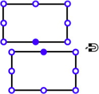
This is a good realisation of the ‘just align’ spirit of the first user scenario. For more complex situations, involving more layers, the team requisitioned the layers dialog, which changes appearance to reflect that (right):
On the left, in the tool options, users can see the list of layers which have been selected for manipulation and unselect them there without having to dig around either on the canvas or the layers dialog.
team two
- members: Dylan Burns, Paula Hidalgo + Nora Huber
- design concept document (pdf, 2.3 MB)
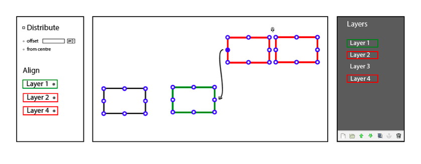
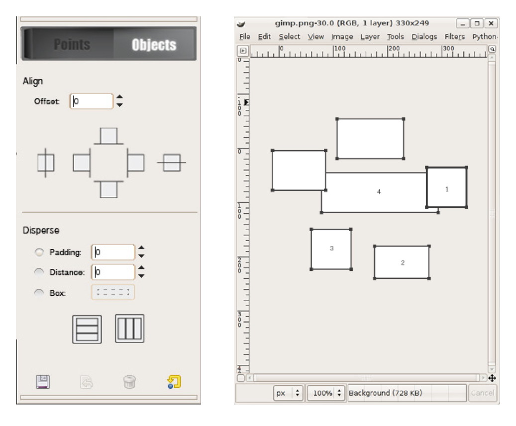
Team two put their minds towards providing quite a few ways to align and distribute (or disperse, as they called it). There is the objects mode, which further develops the existing align tool:
And then there is the points mode, which lets users set a point, a marker on each object that needs to be aligned with a reference point (the star):

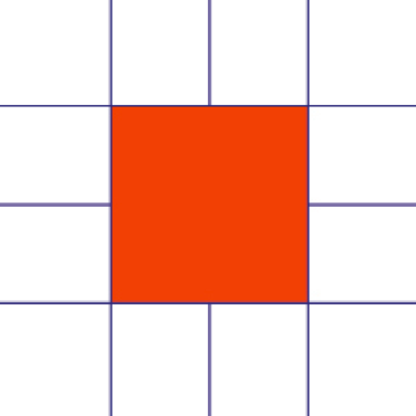
This takes into account that in pixel‐based applications like GIMP, the ‘edge’ or ‘centre point’ of subject matter is not necessarily that of the layer, path or mask. Apart from the two modes, also magnetic snapping—similar to team one—is part of the design.
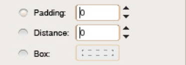
Nice and compact is their design of three different ways to distribute objects in the tool options. The Box mode lets users define a rectangle on the canvas to set up distribution.
team three
- members: Florian Rehlendt, Linda Latzelsberger, Madeleine Mouton + Lizzie Hinojosa Allen
- design concept document (pdf, 508 KB)
Team three expanded align in three new directions:
The outcome of these three are shown below. Align‐along‐path (middle) makes very good use of the path concept:

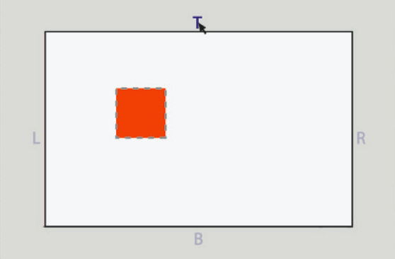
Team three allows the centre point simply to be moved. As stated above, it is not necessarily located in the centre of a layer or mask (left):
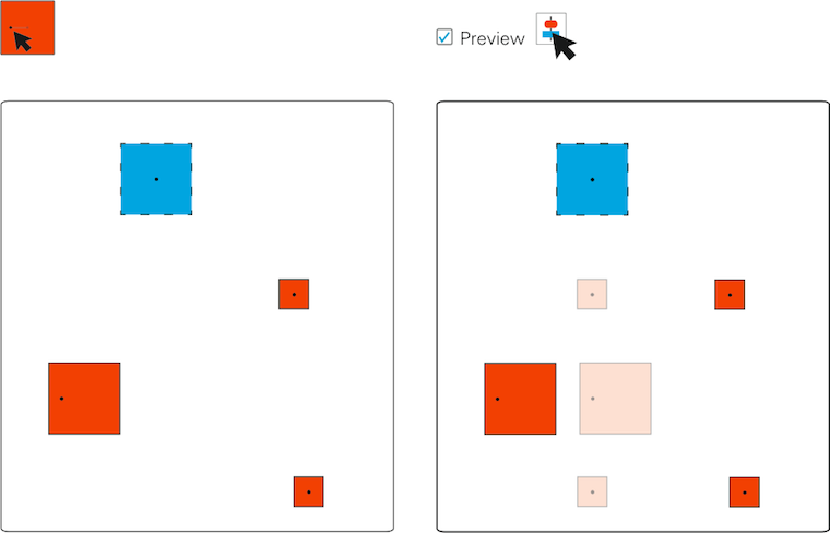
On the right we see the preview option demonstrated, invoked by hovering over an align or distribution button.
team four
- members: Sabina Loacker, Barbara Nader, Nicole Paulo + Thomas Windisch
- design concept document (pdf, 2.4 MB)
Team four designed a different version of working hands‑on on the canvas. Their reference object shows an ‘alignment map’; clicking one of these six lines aligns other highlighted objects with it:
They extended this to the edges of image canvas; click them to align objects with them:
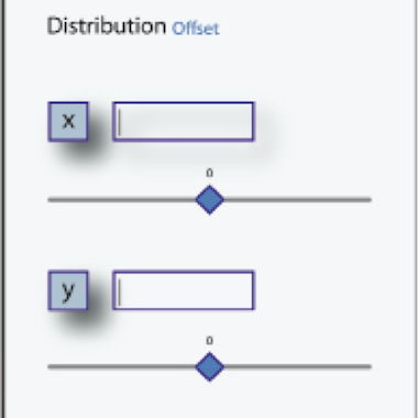
Good to see that team four allowed for different horizontal and vertical offsets and clearly shows these can be negative:
postscript
What started as fleshing out an unassuming tool turned into serious design work when user needs entered the picture. At the end of the final design day, one of the students said ‘there are just so many things in my head!’ Yes, that is what designing is about: connecting many, many things.
Again I had a great week at the FH in Dornbirn this year. I would like to thank all the students for the hard work they put in and for the energy they returned.

If you like to ask Peter one burning question and talk about it for ten minutes, then check out his available officehours.
 Peter Sikking is an
experienced
Peter Sikking is an
experienced
interaction architect. He unabashedly puts
shipping great products at the centre of his design practice. He is known for
his work for Google, Nokia, the
Metapolator &
GIMP
open source projects,
and startups.
What is Peter up to? See his /now page.
- info@mmiworks.net
- +49 (0)30 345 06 197
- imprint
