rethinking text handling in GIMP /2
21 June 2012, 13:51
A guest blog post, by Kate Price:
Taking over from Peter, I am going to describe the following stages in our process. It’s important to note how we use the steps one by one to undertake the next part of our design process. It really is an accumulation of knowledge and insight.
Then I will start to take us through the first building blocks of the solution that has grown out of our design process.
functionality
This is essentially a list of everything that text in GIMP can do. Because we have a vision, we know what these functions should be. Users have to be able to meet those goals. Functionality is completely independent of the UI and tools. Therefore we have categorised the text functionality as follows: annotation, textboxes, rulers, typography (character, line, paragraph), opentype.
It would be far too long‐winded to go through all the individual functions here… If you’re interested you can review them yourselves.
scenarios
Scenarios for us are narratives which express how a particular type of user may experience using the product we are designing. To help us make them we have the vision and we know what functions the text‐handling needs to include. We could then look at the scenarios made for the programme as a whole, and ask the question—how would these users incorporate text into their working practice with GIMP?
We came up with:
- Photographer
- The photographer wants to add information and text to his image. He needs to control how, when and by whom this information is seen. Thus the photographer scenario is all about workflow.
- Creating text as original art: text as graphics
- Users who make original art using text need to be able to be experimental and creative. The text may go through many stages of transformation. they will need a very high level of control.
- Creating text as original art: text as information
- This scenario was very much in our mind after our discussions on IRC about how people user GIMP. Again and again they said, ‘we use GIMP for making posters—because we have made the original art in GIMP.’ So here users need to be able to have total typographical and layouting control—all in the context of their original image.
- Icon design
- This is all about design and manipulation on the glyph level.
- Web images
- It is in the GIMP vision that the application is for web production. So this scenario reminds us that we must integrate automation, when possible and text handling should include optimisation for export to web formats.
evaluation
Evaluation is always our next step. We evaluate the current situation in GIMP, as well as any designs that are existing. We also look at the applications around us—Photoshop, Inkscape and Scribus, for example, and we ask ourselves what can we learn? But what can we learn in the context of what we know from making the vision, functionality and scenarios. We have the means in place to evaluate according to our users’ needs and our design needs.
analysis
We now have a whole lot of gathered information, and we need to take stock and start sorting this out. We are trying to find a way to turn all of our learned knowledge and our insights into a model which will form the basis of our approach. That will enable us to create a functional, meaningful, useable UI that meets the needs of our users. The needs that we have expressed in our scenarios, and laid out in the vision.
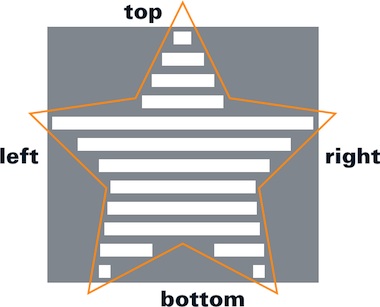
Here is an example of how we work, this is one of the first ‘analysis’ scribbles that Dominic and I made together:
You can see we have already started sorting and breaking down our discoveries into broad areas. These are: creation/editing, typography/text/layouting and text area definition.
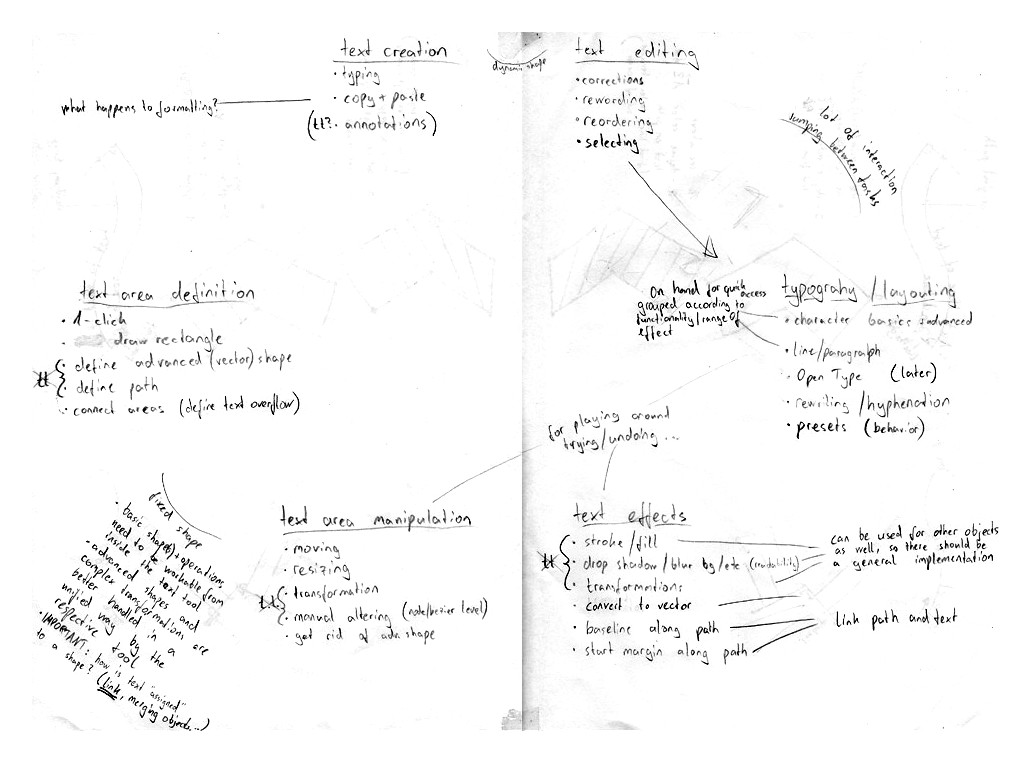
Breaking it down this way meant we could come up with our first model:
- text (and the creation of);
- simple placement—i.e. layouting using text boxes;
- complicated manipulation—applying the whole gamut of treatments, effects and transformations available in GIMP.
These three main areas cover the whole gamut of text interactions that users can make. However, it quickly became apparent that this model would not suffice, as it is essentially hierarchical. It assumes a build‑up of complexity.
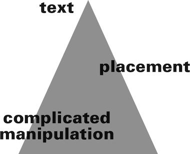
So we moved on to another model:
- we create text;
- we place text;
- we manipulate the text.
This model is cyclical, non hierarchical. Users can move around the circle, they can go back. Because one thing we have learnt about how people need to use text in GIMP, is that they need to be able to go back, to start again, to change—in other words to freely create.
And so, we were at the point when we could use this model to clearly see what the five building blocks of text handling in GIMP should be.
1. text
So here’s no surprise, the first building block of text handling is, yes, text itself. What is paramount to our model is that we perceive text alone, as it’s own entity.
Let’s consider—a user clicks on the canvas and starts typing and creates text. The text runs and runs, until a page break, or a paragraph break is inserted. This is the only way to shape pure text.
So what exactly is meant by text? Well, at it’s simplest text consists of the glyphs and all the parameters associated with typography, and that includes margins.

It must also include the coordinates of where that text is placed on the canvas—in this case we are writing left–to–right so the starting point is the top‐left corner of the text—where the margin starts.
This is the text entity—text in it’s purest form.
2. vectors
This text of course, can be better laid out if it is contained, and this is done using vectors.
- In it’s simplest rectilinear form this is the text box.
- The vector shape contains the text and wraps the text to it’s shape.
- It is essentially a marriage of vector and text, but not an amalgamation.
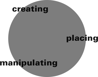
Of course vectors can be as complicated a shape as our users want to make them. Let’s consider a slightly more complicated example:
The text has wrapped to the shape but it retains a nominal ‘box’ which denotes it’s orientation. This is the text’s own delineation. If we make a transformation—say rotate the text within the vector we can immediately see the power of this—the text retains it’s orientation—how it runs—as well as all it’s other parameters, like the margins.
We can see that the marriage of these two—not the assimilation—allows for a flexible workflow. We cannot predict or dictate when and how this marriage comes about. Users may create text and then want to lay it out—and put it in a ‘box.’ Or they may have a vector that they want to put text in. They may have text and a vector which they want to join. We can only enable this, give them the chance to always go back, and the freedom to create.
It also means that we can see which functions should be within the text tool, and which ones not. Everything which is to do with pure text should of course be in the text tool. Everything which is to do with creation of simple ‘text boxes’ and layouting should be too.
But vectors have a world of manipulation possibilities all by themselves, which we want to harness. So things are going to get a lot more complicated yet—which is where Peter is going to take up the story in the next blog post…
—Kate
Labels: design stage, GIMP, lecture, practical, product phase

If you like to ask Peter one burning question and talk about it for ten minutes, then check out his available officehours.
 Peter Sikking is an
experienced
Peter Sikking is an
experienced
interaction architect. He unabashedly puts
shipping great products at the centre of his design practice. He is known for
his work for Google, Nokia, the
Metapolator &
GIMP
open source projects,
and startups.
What is Peter up to? See his /now page.
- info@mmiworks.net
- +49 (0)30 345 06 197
- imprint
