 our blog
responsive web sizing: the facts
19 September 2012, 00:30
Last week I wrote: ‘it would be very interesting to take all the devices of the wikipedia page and plot both their long and short sides on this graph.’ Well, I got curious, then busy, and here we are.
The wikipedia page in question is a List of displays by pixel density, with a wide selection of screen sizes (currently) on the market. The graph I spoke about is a resolution vs. pixels graph that I used to demonstrate how one could move to real (cm) sizes as a basis for responsive design of web layouts.
prepping data
All statistics can be faked, so in the name of full transparency, here is how I gathered and prepared the data:
- took all the desktop and portable screen sizes and used their listed widths, this accounts for all those users who somehow insist on maximising their browsers;
- for all the other users who resize their browsers, I added for each screen of 1024px (and up) a 960px datapoint—quite a popular desktop layout size—at the screen’s resolution;
- same as above for the OLPC products;
- omitted the 3840×2400 monitor size, a big outlier that only compressed the rest of the graph;
- added both the long and short sides of handheld products from: Amazon, Apple, Asus, HTC, LG, Motorola, Nokia, RIM, Samsung, Sharp, Sony and also the E‑ink screens;
- divided pixels and resolution by the css pixel ratio, where applicable.
This is not perfect, with probably some duplicates and a screen (orientation) or two that cannot be used for web browsing, but overall this gives me 412 good‐enough datapoints to plot.
lift‑off
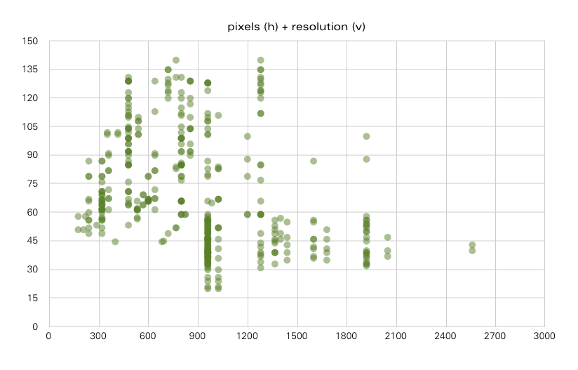
Here we go. The datapoints have 50% transparency, which means that where the green gets darker, there is more of them piling up in that spot:
First impression: there seem to be two worlds; one of high resolutions and low pixels, and one of high pixels and low resolutions, divided by a thinly‐populated diagonal. These are roughly the worlds of hand‐held devices and desktop screens, but only roughly.
Second impression: the long vertical stretches of datapoints at common pixel widths (240, 320, 480, 800, 960, 1280 pixels) show again how meaningless it is to base responsive decisions on these pixel widths. With those variations in resolution, the resulting real (cm) sizes are all over the place.
get real
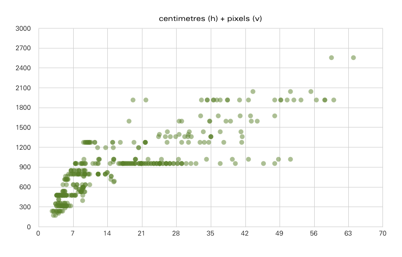
Speaking of real sizes, now that I had all that data in a spreadsheet, it was easy to calculate them and plot against the pixel sizes:
Here the long horizontal stretches of datapoints put the final nail in the coffin that pixel sizes can be trusted. Take the line at 960px, that popular desktop layout size. It runs from 7.5 to 32 centimetres, with some blips reaching 48cm, the latter being big‑old, low‐resolution monitors. I am sure most designers think of that 960 layout as generous, meant to work out at 25cm or more, not as something displayed on 7.5–15cm.
The two worlds of the first chart can be found on this one too. The world of high resolutions and low pixels can be found in the dense lower‐left corner, below 13 centimetres—call it Florida. Unlike pixels or resolutions, 13cm‑or‐less tells you immediately what kind of screens Florida represents: hand‐held ones. The rest of the chart is the other world of high pixels and low resolutions.
the sunshine state
Now let the compactness of Florida not fool you; it is not uniform, nor is there some kind of magic correlation between pixels and cm sizes. Here is what it looks like, more up close:
Still plenty of horizontal stretches, with the cm sizes varying by a factor of two. Because of the hand‐held factor—it’s tactile, related to the size of your hand— and because of closeness, both to the body and to being zero in size, a couple of centimetres difference matters, a lot.
At the narrow end (3–5cm) it is all about what can be displayed comfortably, regardless of the number of pixels available; at the wider end (9–12cm) users’ expectations go up about the content that can be displayed in ‘all that space’—it is mini‐tablet territory.
the long trail
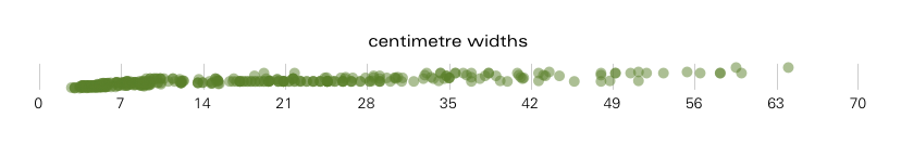
Let’s now forget about the pixels and concentrate on the real, centimetre sizes. For that I took the second graph of this post, removed the pixel gridlines and compressed the y‑axis to get the datapoint to look like one long trail:
Get your folding rule out, just to get a feel for some of these sizes here. Let’s start at the deep end. Widths of 32–45cm, not uncommon, no? Even bigger, 45–60+cm: not impossible. Measure these widths out against your current desktop monitor. That’s loads of horizontal space, how do you ‘respond’ to it?
And I mean really respond, with a plan, a new layout policy that puts that space to good use, not just with endless whitespace or overly long lines of text.
never ending story
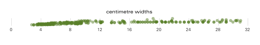
Now let’s look below 32cm:
If there was still a question whether designing in this mode is also about designing for a continuum of sizes then the stretch from 16 to 32cm should answer that. From close to the body (tablets), via laptops, to further away (desktop), it is all here.
I would not try to read from this graph where to switch layout policy—once, or twice—in the 16 to 32cm range. As I outlined before, your actual content will guide you to where these points are. Just make sure you have a continuously variable canvas to evaluate the interaction of content and cm widths.
mobile home
Back to Florida, now as one datapoint trail:
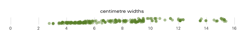
Definitely some gaps here (starting at 16cm itself), which would point at some natural grouping. I would not bet my design strategy on that, however. I expect manufacturers around the world to be working really hard to fill those gaps in a year or two, in the name of finding the perfect hand‐held format. Focus on the continuum, down to the smallest device.
postscript
And with that we have satisfied my curiosity. The conclusions from performing this exercise are clear‐cut, no need to repeat them.
For a next step I look forward to seeing resolution media queries work reliably, so that the strategies I outlined last time start being viable.

1 comments · post a comment
- at 08 June, 2013 10:33,
 Thera Dratara commented
 - Nice plotting.
I personally am more on the side of 'strangeling whoever thought it was a good idea to have cm and inch be static pixel numbers', and detecting the so-called 'high-res' and 'low-res' doesn't really cut it for me. (Especially because in all of this, they still haven't come up with a real solution for raster images, believe me, as an artist, I really don't want to display my artwork at 2x the size) (furthermore, as far as I could tell last time, these css statements seem to be very arbitrary, and will require constant updating of websites in the future, where knowing the actual device width would just allow designing for that width instead of some arbitrary lowres or midres)
Still hoping for truemm to get real popular.
If you like to ask Peter one burning question and talk about it for ten minutes, then check out his available officehours.
 Peter Sikking is an
experienced
Peter Sikking is an
experienced
interaction architect. He unabashedly puts
shipping great products at the centre of his design practice. He is known for
his work for Google, Nokia, the
Metapolator &
GIMP
open source projects,
and startups.
What is Peter up to? See his /now page.
- info@mmiworks.net
- +49 (0)30 345 06 197
- imprint