GIMP redux, full GEGL ahead
22 January 2012, 17:36
Recently I have been receiving requests to clarify the GIMP UI strategy surrounding GEGL, so I thought I’d write a catch‑up blog post about my 2010 LGM lecture. There I tackled this GIMP UI challenge: a first outline for a UI for a fully GEGLed GIMP. The thinking about this UI, and the discussions with Øyvind Kolås (the GEGL‐meister himself), have been going on for years. Its introduction will be the most profound change to GIMP in the foreseeable future.
two minutes of fame
I started off my lecture with introducing GEGL, the graph‐based image processing engine that is slowly, but surely, being integrated into GIMP. I could spend quite some time taking us through the complete GEGL graph (linked) below:
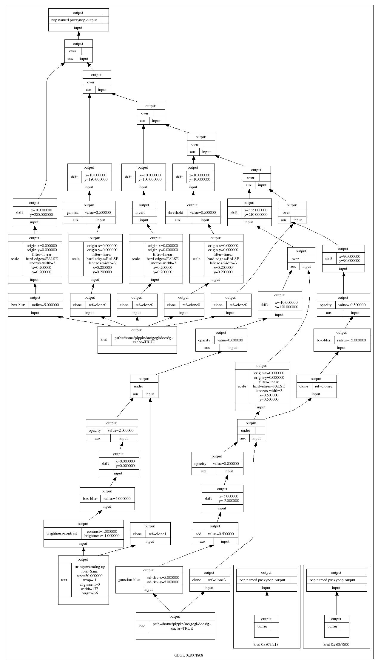
…and this is only a small one. Instead, here is the essence of it in four easy steps:
- there are input boxes that load an existing image, or render some vector shapes or text;
- there are chains of operation boxes that perform things like blur or change opacity of whatever gets fed into them;
- there are composer boxes that take two inputs and put one over the other, combining them in a certain way (think layer modes: normal, dodge, multiply);
- there are output boxes that either display the grand result on a screen, or export it to graphics file formats like png or jpeg.
so…great
Thus GEGL processes graphics by hooking up the boxes, inputs–to–output. Why does that matter? Well, because it is non‐destructive: the images in the input boxes are never modified.
If the structure of above graph is written to a file—apart from the input images, all other boxes are just snippets of XML—and a year later it is re‑opened in GIMP, then each of the operations and their parameters; each of the vector shapes or text can be freely changed. Even the input images could be swapped out for different ones. The result is a changed image composition, without any loss of quality.
It is exactly this promise of non‐destructive editing that played a big part in me joining the GIMP project years ago. I could see how that could lead to the end of some of the major workflow bottlenecks in today’s graphics software.
UI modelling
The integration of GEGL in GIMP is a disruption; it changes the rules of what one can do and how one can work. This is not a bad thing, it is a refreshing change. An interesting question is: how does the user interaction of GIMP have to change, in order to harnesses all this new power? In general there is a big urge, especially with developers, to just display the graph on the screen:
I call this the boxes and hoses model. If it looks familiar to you, it is because it has been around for decades: it is called visual programming. Which again explains why developers tend to choose this type of solution. One day a direct representation of the graph will appear in GIMP, as something extra. This is because the product vision defines GIMP as (also) being ‘a platform for programming cutting-edge image processing algorithms, by scientists and artists.‘
activity centre
To find out what the main UI in GIMP should be, we take from the product vision what the main activities are that GIMP is made for: ‘high-end photo manipulation’; ‘creating original art from images’; ‘producing icons, graphical elements of web pages and art for user interface elements.’
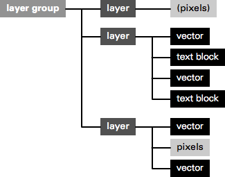
As a next step, it pays off to look at the nature of these activities. Users start with images or basic shapes (vectors) and apply image manipulation operations, one after another, to achieve the desired result. Users organise their work in layers and GIMP composites the result. Schematically that looks like this:
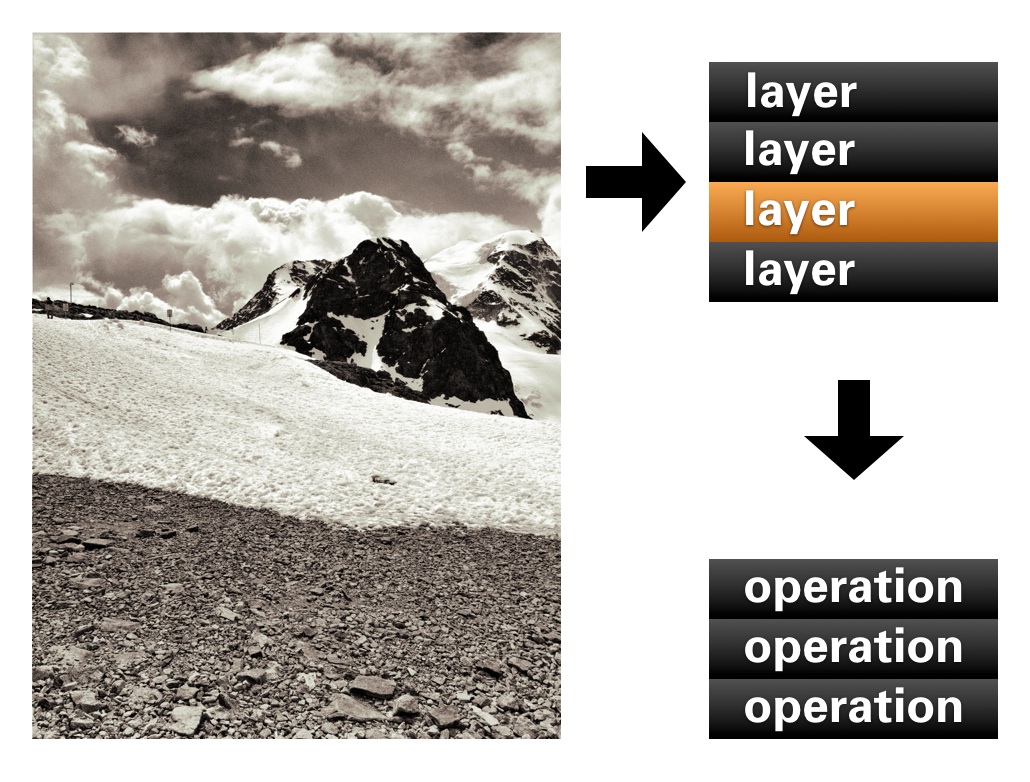
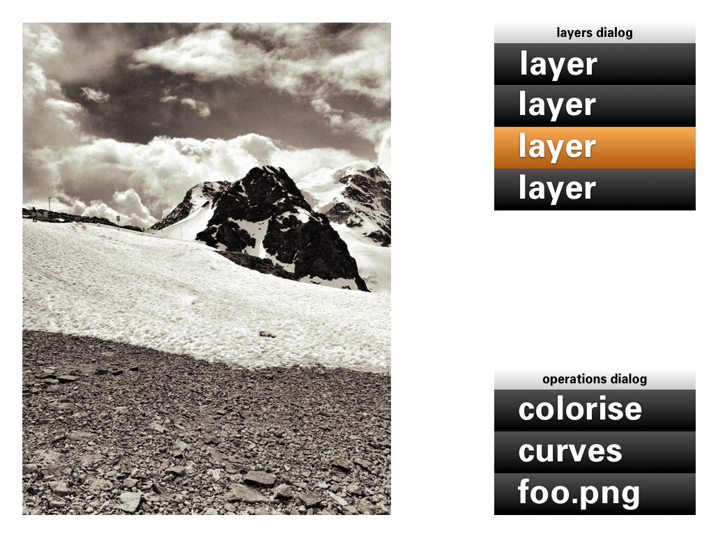
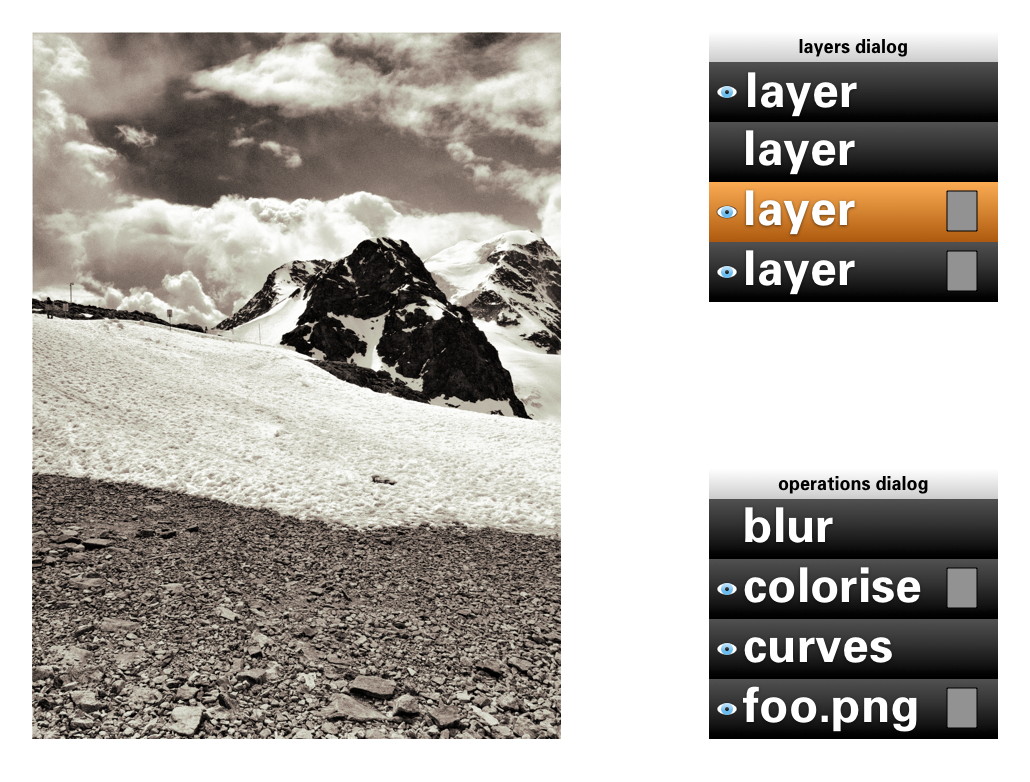
In short: a work (a composition) consists of layers, each with its sequence (in time) of operations. Now we got the start of a model for the UI. That list of layers we know already, as the layers dialog. The sequence of operations for the layer, we can call that the operations dialog:
- disclaimer
- Keep in mind that the user interaction shown in the image above, and all the ones below, is not a true mockup. It is more a diagram—with in part grotesque proportions—to show the principles of how the UI works.
We can see that the four GEGL elements are covered: The image material to start with: loaded pixels or rendered vectors; the layers that control the bulk of the compositing; the chains of operations; the output to the screen in the big image window.
Yes, the image window is the place for judging one’s work and for doing the actual work, hands‑on. The image window deserves a couple of times more screen space than any GEGL graph manipulation. Reversing this relationship (as shown earlier) is completely disregarding the nature of the activity.
back to the future
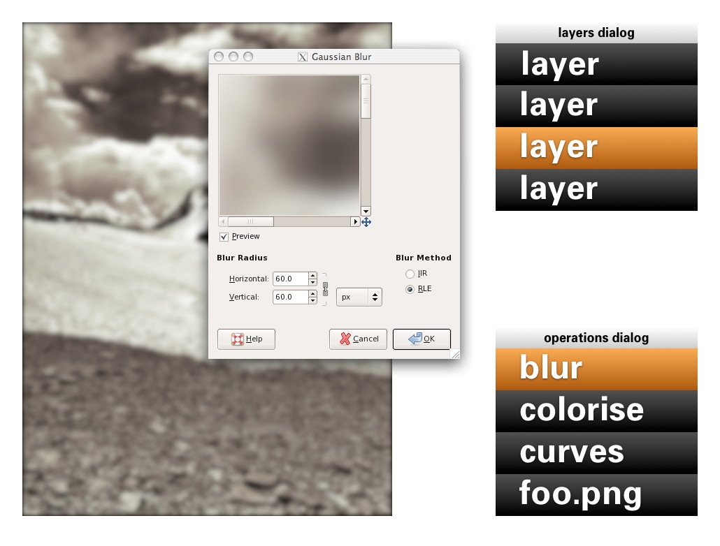
Adding an operation works as before: use a toolbox tool or invoke a menubar item. Here Gaussian blur is invoked and it appears at the top of the operations list:
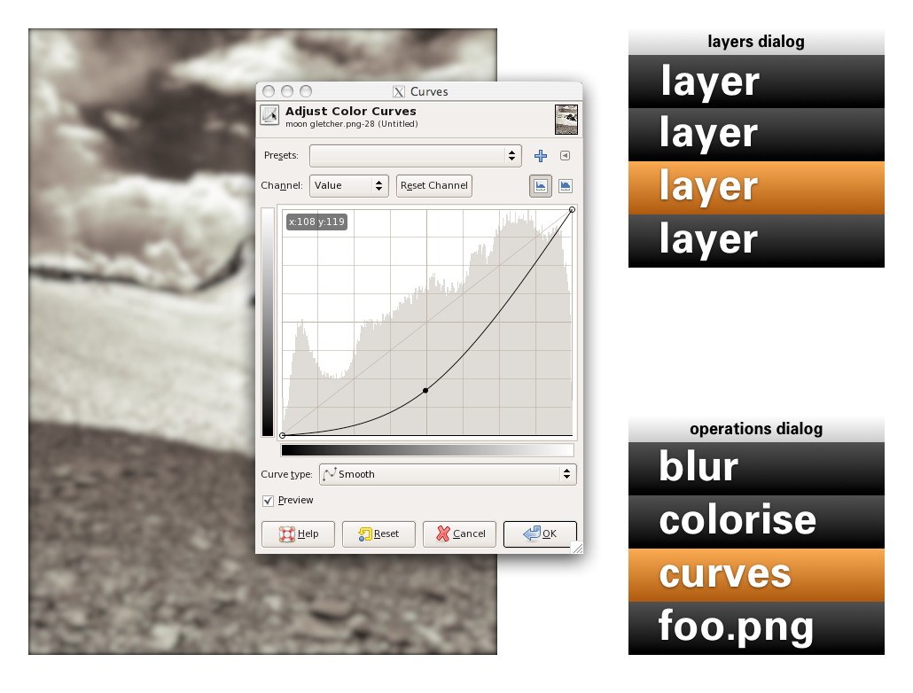
Now it gets more interesting: revisiting the past. No matter if it was done five seconds or five months ago, one can recall any previous operation applied to this layer and readjust it. Here the curves for this layer are revisited. While adjusting, the output updates through the complete chain of operations, including colorise and blur:
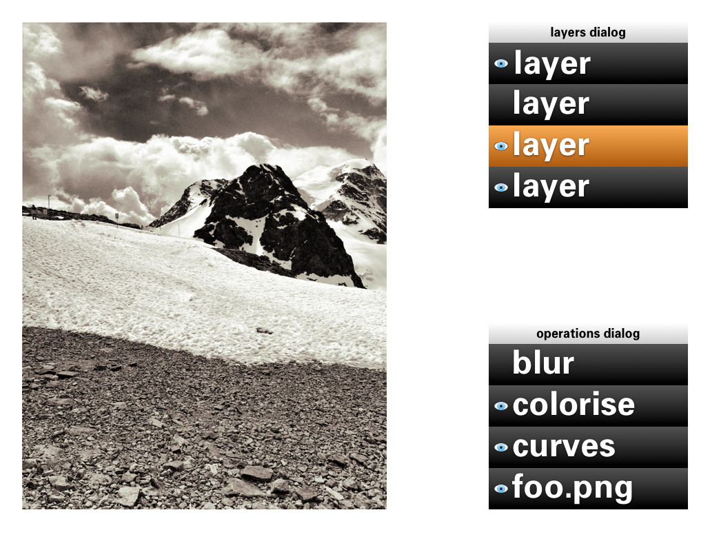
A lot of layers dialog behaviour can be reused for the operations dialog. ‘Eye’ toggles can be used to show/hide the operations:
Drag and drop can be used to rearrange the order of operations. The result of that may turn out to be more subtle than you think. Because GEGL processes everything in 32bit floating point, it will be much harder to get the rounding and clipping artefacts you get with 8‐ or 16‑bit integer processing. Only when an operation does not commutate by nature (i.e. the order matters), then it gets interesting to experiment with the order of operations.
Of course copy and paste of operations, between layers of the same or different files works. Dragging and dropping of operations on another layer copies or moves them, a modifier key (shift or ctrl) will sort that out. And before I forget: selecting some operations in the operations dialog and invoking ‘Make macro’ would be a good, natural way to get that started.
the holy trinity
Before we continue with more GEGL user interaction, here is a pop quiz. I took this b+w photo of the brilliantly named Kloten airport and coloured part of it red:

My question is: how did I apply that red?
- directly with a tool from the toolbox;
- making a selection, then invoking a menu item;
- using a layer with a layer mask.
Well, I have forgotten how I did it (it’s been a while) and you will never guess. My point is that it does not matter. All three methods listed above are a combination of an operation (apply red) and a greyscale mask, controlling where it is applied and how much. All three methods are fully equivalent, it does not matter to the software—or the viewer.
It does matter to users. Given the context, composition structure, the graphics material and the end‑goal, each user knows exactly which of the three methods she/he prefers. There is a million different use cases and only the individual user on the spot can take the right decision. It follows that each of the three methods is equally important and needs to be equally available to users. This I call the holy trinity of image manipulation.
pagan practices
However, at the moment, you quite often see the following: ‘if you want this feature, you’ll have to use it on its own, extra layer.’ This is layer abuse. I get misquoted on this so let me clarify: users never abuse layers, developers do. Here are some examples of layer abuse:
- the only way to do a non‐destructive operation is via an adjustment layer
- only one vector shape per vector layer;
- only one block of text on a text layer;
- the output of a filter plugin is always put on a new layer;
- the result of using a toolbox tool is always put on a new layer.
The problem is with ‘only,’ ‘always’ and ever more layers, whether users want them or not.
reformation
The abuse listed above is straightforward to fix. Quite a bit of it has to do with enabling users to redo or revisit the image manipulation. That is solved by the operations dialog.
Furthermore, there can be as many vector shapes and text blocks on a layer as one likes. Just show them—and stack ’em—as sub‑layer elements in the layers dialog. And when then one of these sub‑layer elements is allowed to be actual pixels, then it is clear that the whole notion of special vector/text layer can disappear:
Layer abuse has to stop. Developers should never force users to use another layer. Only users decide how many layers they want to use, purely as their own personal way to organise their work.
more blessings
So apart from that no image manipulation is exclusive to a layer, what are further implications of the dogma of the holy trinity?
- paint with anything
- Yep, with anything, also all the plugins that appear in the Filters menu. Also the obscure ones that you and I, and anyone on the GIMP team have never heard of. Just dip your brush in it and smear it on the canvas. Thinking of combining it with paint dynamics just blows my mind. It just takes one tool (Filter brush?) to enable this.
- adjustment layers with anything
- You see, I have nothing against accomplishing things with layers. It is perfect when you got a collage made out of dozens of layers and then want to apply some treatments to the whole thing. It just takes one adjustment layer with any number of operations to get that done. Again, with anything.
behind the mask
As mentioned, all three image manipulation methods consist of an operation and greyscale mask, controlling where it is applied and how much. The interaction for these masks can be analogous to that of layer masks:
This means that both the parameters of the operation and also the ‘where and how much’ can be revisited and adjusted, a second later or a year later.
in triplicate
By now you may be thinking ‘wow, every image manipulation must be possible in three different ways, does that mean that one day GIMP will contain three times more stuff than today?’ Well no. I have already mentioned two measures—Filter brush, adjustment layers with anything—that will make large strides towards fulfilling the holy trinity. And even today the trinity is partially in place at GIMP.
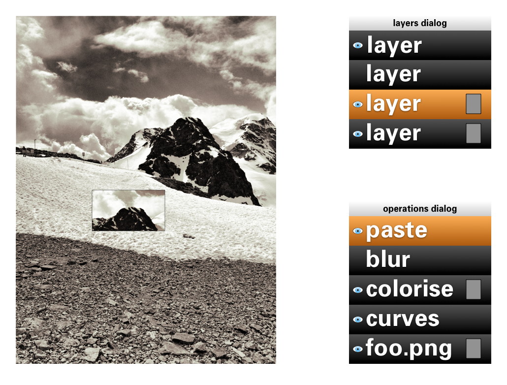
Take for instance composition, putting pixels on top of pixels. Sounds like the exclusive domain of the layer stack, no? Well, even today you can use toolbox tools to do the same thing: the Clone tool and its 90%‑identical cousin, the Heal tool. And the menu item to compose is called Paste. Yes, the current layers dialog interaction while pasting should go. The GIMP team is agreed on this for years. Instead paste is an operation on the current layer:
weird science
There is a fifth element to GEGL graphs, that I have been keeping under wraps in this blogpost until now: cloning. This is taking an in‑between result in the GEGL graph, anything from a simple vector to a huge sub‐tree, and ‘teleporting’ one or more clones of this result to another position in the graph:

The original and the clones can have the same or a different position on the canvas; undergo the same or completely different operations; be composited in the same or a completely different manner. The magic is of course in that when the original (the input to cloning) is updated, every clone immediately updates, with all further operations and compositing applied on top. This is going to be liberating, because of the amount of work this saves.
Let me give an example. Let’s take the scan of a snowflake and fix it up with a number of graphics operations. We clone the result 99 times and spread these over five layers to compose our snowscape. We make ever flake a different size and a different colour. Already laborious, no? And now, we decide we are not satisfied with how refined the snowflakes are. Solution: fix the original with more/less/different/updated operations, all 100 flakes will immediately show the improved refinement—in their different sizes and colours.
send in the clones
My plan for the user interaction of cloning is to make it a variant of pasting: Paste as clone. This includes doing further operations on the pasted (as clone) material, before closing off the paste (you can always revisit the paste operation and modify all of it). And as Ville Pätsi pointed out a while ago, there needs to be a way from each clone to access the original. A button or link on the Paste clone operation in the operations dialog might do the trick.
There is more tricky stuff coming up with this cloning, like cloning layers or layer groups. And to go fully meta on this: I am asking myself why chains of operations cannot be cloned and applied to different input material. But Øyvind is not up for that.
two more things
To wrap all this up I have two benchmarks that have developed out of the GEGL discussions. They are alternate manifestations of the holy trinity and they are serious tests of the direction the GIMP user interaction is taking.
First, in a future version of GIMP, if users really envision their work as one single layer—not that unusual with photographs—then they will simply be able to close the layers dialog. Their work will not be impeded in any way by this, everything is still available to them (twice, as toolbox tool and menu) with no limits in the sophistication with which they can express themselves:
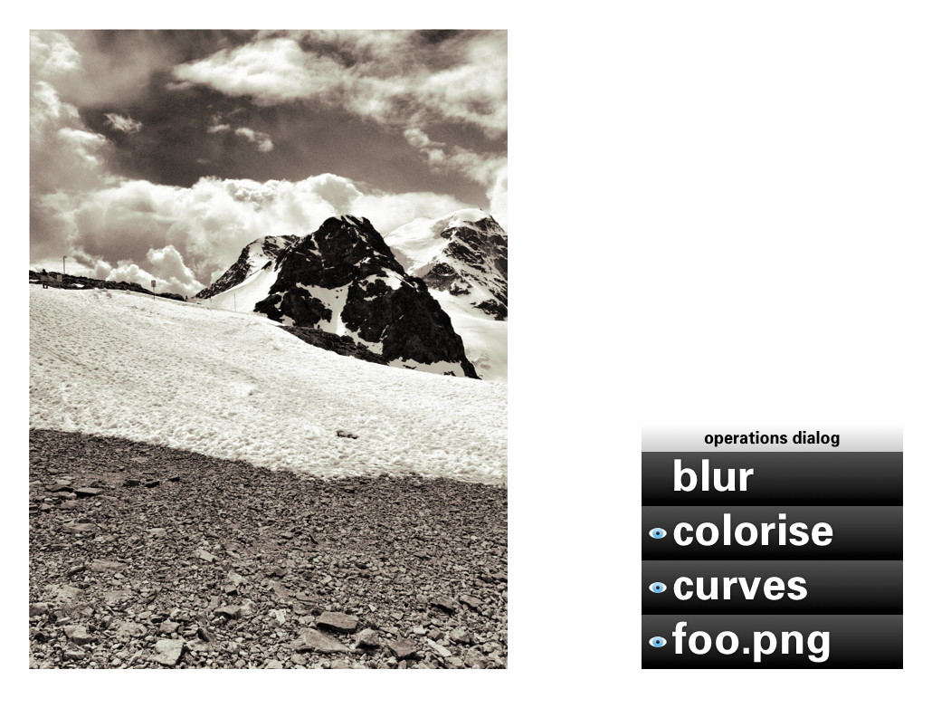
Second, in a future version of GIMP, if users are really not interested in switching operations on/off; rearranging operations or revisiting the past, then they will simply be able to close the operations dialog. Their work will not be impeded in any way by this, everything is still available to them with no limits in the sophistication with which they can express themselves:
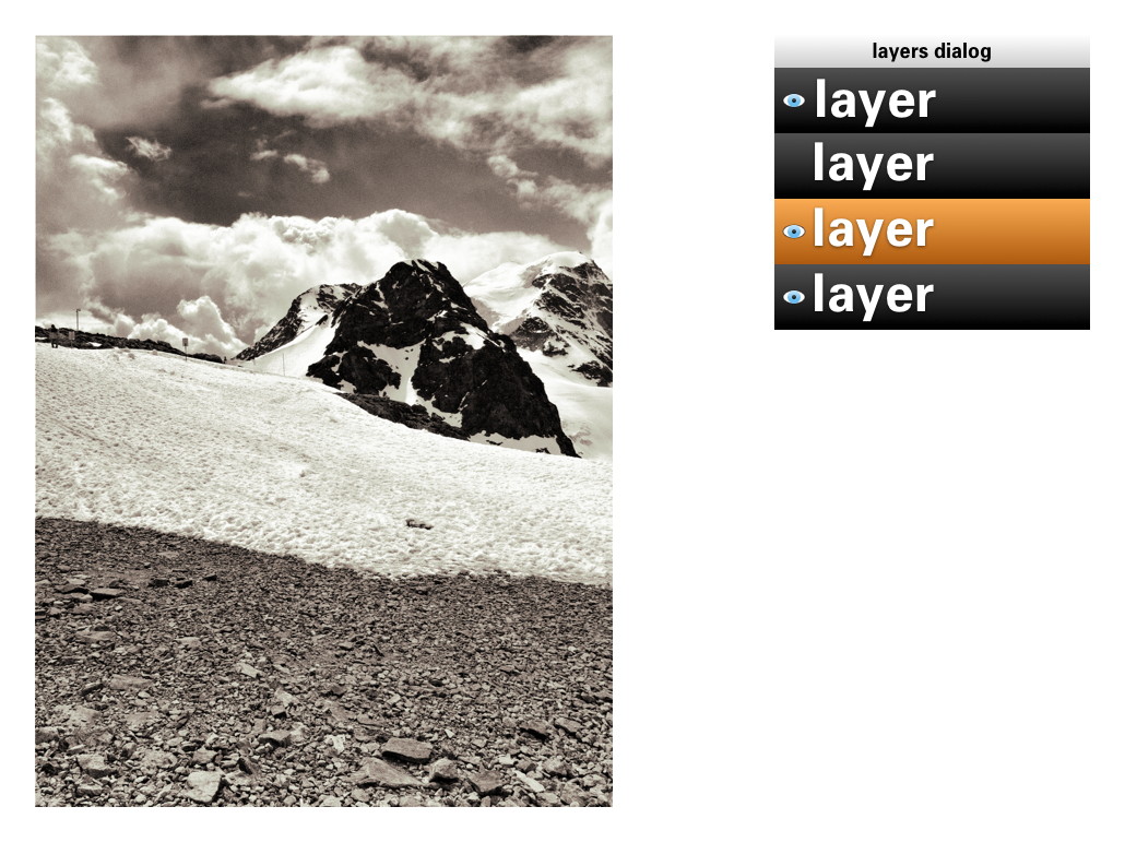
You could even combine the two benchmarks and GIMP would still work, without a hitch.
aftermath
Directly after the lecture at the LGM, Øyvind Kolås pointed out one flaw, one thing I had not thought of: those greyscale masks, that play such a central role, are not pixmaps. They are GEGL sub‐graphs themselves. Which creates the possibility of near‐endless drill‐down: operations with greyscale masks, which contain operations with greyscale masks, which contain… et cetera.
Is that a fatal flaw? Is that going to blow up my plan to reduce the complexity of the GEGL graph to a linear list of operations? Do we just have to confront users with the whole graph? Let not kid ourselves about the complexity of that graph. In practice, I’d say that a simple GIMP file starts at ten times the number of boxes in the example at the top, quickly moving to a hundred times and then beyond.
not my problem
To developers—especially the ones that are working up to their elbows in GEGL graphs—this problem looks like one of navigating the graph and making edits. But to me it looks like another problem needs to be solved: how can users navigate their working context? Already today GIMP users are doing this navigation. Which layer, which layer mask are they editing, or is it the quick mask?
It will have to wait for another day, but when this context navigation is going to be designed, the one thing not to lose sight of is the image window. Everything evolves around it, including this navigation, and feedback of the working context has to be inside it. I certainly think we can do a better job than currently happens with the layer masks.
And when this context navigation has been designed, taking into account the holy trinity and the two benchmarks, then the operations dialog can show the simple list of operations performed in that context, in their natural order.
Labels: design stage, GIMP, GIMP redux, lecture, practical, product vision

![]()
![]()
31 comments · post a comment
- at 22 January, 2012 19:29,
 Gez commented
 - Peter:
Very interesting read. I wonder if you considered going straight to a nodal UI (like the one you showed in the first screenshot, which is btw somewhat outdated. Compositing in Blender 2.6x is much better).
I've been using graphics programs for years, I used Photoshop since v3.0 and some years ago switched to GIMP, and I'm very used to layers, but after becoming more familiar with nodal compositing I found that layers are very limiting.
Of course nodal compositing looks daunting at a first sight, but once you used it you can't go back.
Iirc some time ago you proposed to kick the board and do something about layers, and iirc I siad it wasn't a good idea, but now I'm not so sure.
Switching from layers to nodes would be a disruptive change and probably a lot of people would react negatively, but if we take a look on high end digital compositing, all of the big players moved or are moving to nodes.
GEGL looks more compatible with that model than with layers, and probably creating stacks of layers and operations from that nodal structure would be harder to materialize than a nodal UI, and it would kill part of the flexibility of nodes. - at 22 January, 2012 20:19,
 Unknown commented
 - Gez,
it really pays to read the post above, because it answers all your questions.
But the short version is that in the UI I envision there is no limits imposed on the graph, it will just be a lot better organised than you see in the first two images in this post.
You will also notice that no one is going to force you or anyone else to use any layers. it is completely up to you...
--ps - at 22 January, 2012 20:47, Gez commented
- But I did read it! :)
It's clear that you left the door open for a nodal representation, but you say "one day". I was wondering if it wasn't a better idea to forget layers and going straight to that model, ditching layers.
Your proposal aims to bringing GEGL goodies to the existing model, adding non-destructive editing to layers.
My question is: why not starting with nodes, leaving that traditional stacking of layers and operations out, or at least as a legacy mode (keeping the current features but not adding new stuff).
That would force users to move to a more efficient and flexible workflow to get the good stuff.
Existing nodal compositing models are far more compact and easy to read than your reference image and by using collapsible groups and regions it can be as organized as a layer stack.
Plus I'd be really interested to see what can you do to nodal interfaces to make them better :) - at 22 January, 2012 21:42, Unknown commented
- I think Peter's idea of Non Linear Layers is very good.
Using stack like layers + operations is much faster in use than nodes. It also prevents to go too technical, than artistic, with edited images.
Nodes are awesome and it's true that Gimp should have have nodes as an extra view, but it should be second on the list.
Why.
Common pipeline/workflow for Artist working with complex comp's, is. DESIGN the comp first, with fast easy and a bit less organized but more organic, faster to use tool, like Gimp or Photoshop. After that, move to Nodal Compositor, to recreate this design in nodes, for final production, usually animation or matte painting.
It's well known technique, used in small and big studios.
NLLayers gives a power of non linear editing for Designer but preserves fast, direct workflow of stack approach.
Node view could be used then to further clean up the comp, and finalize the plan of recreating it in other software, or it will make Gimp the one that will be used to recreate this design. - at 22 January, 2012 23:02, Gez commented
- @Przemyslaw Golab:
Why exactly is much faster to use layers and stacked operations than nodes?
Don't think about creating and adding nodes manually like you'd do in Blender. For instance, think about adding a new layer from a button, just like now, and that would create a new image buffer to work with, like always.
Want to change its opacity or blending mode? What's the difference about doing it in the active layer dialog or in the active node properties? It's pretty much the same. It shouldn't be harder or much different.
The real advantage with nodes is when you want to do something complex, like using a channel from an image to mask another, or to control a filter.
That would require a lot of thinking to achieve it with layers, when it's very easy with nodes: You just add a decompose node and connect the desired channel to the desired input in the other node.
That would allow you to do compositing AND create images simultaneously and that's the kind of power that GEGL can give. Why leave it as something secondary?
We're not talking about using nodes for "post-production". GIMP with GEGL will use them for all the process internally. - at 23 January, 2012 00:39, Unknown commented
- @ Gez
Because You don't have to manage your nodes, everything is in simple to read, manipulate stack, not in graph that is more sophisticated to understand.
About, how it is easy to make complex tasks in nodes, it's true, yes, but You bite it from wrong side :)
You should think about how hard is to make something simple in nodes.
There is a difference, in using simple straightforward tools to make concept/design of an image/composition and using complex tool to make clean, flexible, final comp.
When you use nodes, you crate nodes, connect them, yes this task can be automated, then it is as easy as layers. Problem is, if you want to modify them, you end up modifying manually many not important for design, graphical technical noodles.
Nodes will take, a lot of screen-space and time, for functionality that I don't really need when I just want to test my ideas and make final design which I don't know how it will end up.
I just want few (sometimes more, sometimes less) layers to distinguish few core features of image, and I want work on them, one edit after another, many, many, many times go back, make something different, copy layer, compare them, delete the one that I don't like.
Non Linear Editing will help me if I would like to edit some operations that I made on them somewhere in past, so I don't have to save it in duplicate to go back or something, I just work don't worrying about huuuuge tree that I'm making in the process, because I don't see it, I don't care about it. I just have my layers, and if I want to edit, or retrieve some Operations form past, I'm able too do that. BIG time saver, that's all.
Differently as it would be in nodes, where I do care about how the image was made, not ONLY how it will end up looking.
I work in layers simply to make an image for the idea. After that, I will use this design to develop plan, how to recreate this in nodes, to use full power of nodes. That means, create a clean tree, that will be easy for tweaking, adjusting for different parts of shot in time, and reusable for other shots/comps.
If Gimp will be node editor, many users will have to use Photoshop, for example, to make designs for Gimp...
I hope, You understand me now. :) Nodes in Gimp still would be very, very useful and needed but first, we need Gimp to work on tasks that most of the users is using it now for.
Regards, n-pigeon. - at 23 January, 2012 03:10, prokoudine commented
- Well, I read this twice and I'm still missing an essential bit: how do I do non-linear editing without nodes?
Let's say I want to apply a filter to a specific channel of the image. That means I need to have some sort of UI that allows me to plug that filter to just one component of the image.
Now imagine that I need L component in LAB processed. That means that before I apply that filter I also have to convert my image to from native GEGL's linearized RGB to LAB. And maybe not a whole image, but a specific layer.
Or maybe I want to decompose the image with wavelets and apply a filter or use a brush on just one of the _virtual_ wavelet layers.
How would I do that without nodes? - at 23 January, 2012 03:14, prokoudine commented
- Or, to phrase it better, how would a linear UI visualise complex non-linear connections between edits and components?
- at 23 January, 2012 14:00, stippi commented
- Interesting read. My only gripe is that GIMP should have worked like this from the start. I know exactly what you are talking about and why it is needed, since I wrote a graphics application (for BeOS back in the day) that worked exactly like this. Well, not quite, which is why I work on a re-write, but real life leaves me with little time. The mistake I did in the first version was to organize everything in a flat layer list. I had a list of layers and on each layer existed a list of "graphical objects" (which eaqual your "operations"). In the re-write, I wanted to address a couple of things: Organize everything in a layer tree. You are speaking of two separate lists, the layers list and the operations list, but I think it is beneficial to put everything into a common tree. That is still not the node editor, but perhaps more flexible, especially for drag & drop of operations alias objects.
There was another reason I started the re-write: I wanted the rendering to happen on all CPU cores. This change was quite disruptive, but it is well worth it. The implications of cloning are that a single change that a user performs may result in many places in the node tree that need updating. This makes for some challenging caching techniques. I have written some articles back when I developed a threading and locking model for this stuff. Here are some links:
http://www.yellowbites.com/wonderbrush.html
https://www.haiku-os.org/documents/dev/using_snapshots_for_short_locking_times
I wish you guys the best of luck and I hope the transition of the internal programming model goes smoothly. Users will love this stuff if you guys manage to pull it off without a hard performance impact. - at 23 January, 2012 17:46, Gez commented
- @prokoudine: Exactly my point.
The stack approach would work pretty much like Adobe's approach on the same subject: basically layer filters and adjustment layers, and non-destructive management of assets (vector and text layers that stay editable, etc.)
That would be great, of course, but we would lose the opportunity to use channels and layers as non destructive modifiers of other channels and layers.
And that's something we can get with GEGL and it's around the corner with a nodal interface.
With nodes basically you forget copy and paste and start "connecting" the things you need and everything is non-destructive.
Probably this can be achieved also with layers, but I'm sure it won't be a simple inteface anymore, and I wonder if a stack with the flexibility of nodes would be still easier to visualize than nodes.
Apart from that, visual complexity in nodes can be tamed with regions and groups. GIMP could create such structures automatically (letting users modify them later, of course).
@n-pigeon:
I think you're missing my point. I'm not talking about turning GIMP into a digital compositing software (although what GIMP does with its layers is actually digital compositing), I'm talking about GIMP with the same features it has now, but with a nodal interface replacing the concept of layers.
All the things Peter described in this article can be achieved with nodes. What he calls layers (that can contain different type of graphic objects) is equivalent to node groups.
They can be created and connected automatically following the very same stacking order we use now (basically, creating a new layer on top of the active is adding an alpha-over operator. If you change the blending mode you change that alpha over operation to other mix operator (multiply, screen, overlay, etc.)
That can be created automatically and complexity can be hidden just collapsing nodes and showing a basic set of connectors.
Up to that point every "layer"would be seen as a block. Blocks would be connected with other blocks using a mix operator (alpha over or blending mode). Each block can be connected to another block, which is the filters stack.
Basically it's the same peter showed (two blocks, two stacks) with an extra node to conect them.
Complexity is hidden because blocks are collapsed. When users expand those blocks would see the inner connections and could do special tricks with them.
Best of both worlds in a really simple structure that allows both simplicity and power. Why not?
I repeat what I said in my first comment. Artists find nodes awkward the first time they get in touch with them, but after a brief period they don't want to look back. - at 23 January, 2012 18:33, Gez commented
- idea!
What if a special "layer node" is created?
That node would be a group consisting in the image buffer/s and the blending node.
Its default shape is a collapsed block, and in the node editor users would see just blocks connected in a stack.
that looks pretty much like layers, because you don't even have to use the mix nodes externally.
When ursers expand or break apart those "layer nodes" the internal structure is exposed, and all its sockets become available to connect.
Having "Layer" nodes and "modifier stack" nodes in a nodal UI would look pretty much like a layer and filters stack dialogs, but in the same editor.
Users won't find it very difficult to get used to that structure, and both simple and complex structures could share the same space. - at 23 January, 2012 18:46, Troy James Sobotka commented
- I am hesitant to weigh in here, but for any artist that has used nodes, layers simply feel like an anachronism.
If we start with nodes as the core base, a layer-like interface would be simply a matter of implementation. A parser for the nodal architecture.
Adding a layer would equate with a top down nodal layout via adding a node grouping.
Adding an image, filter, or operation would merely be a left to right addition of a node within the group.
To the UI layer parser, it appears no differently to the legacy layer feel in a tree-like view. For someone unfamiliar with nodal work seeking to leverage nodes, they are greeted with an understandable nodal implementation layout of their work in the node view.
And while I respect n-pigeon's opinion, the studio folks I have spoken with would dearly love a nodal painter application. PS has an anchor not because of layers, but other contextual and circumstantial reasons. Can nodal workflows as we currently see them be improved for a painterly audience? Absolutely.
I will concur with Gez in that there is much brilliant interface brainstorming to be had further elevating the nodal workflow.
TL;DR Can we not begin at a nodal pipeline and layer a parser on top for legacy layers? - at 23 January, 2012 19:05, Gez commented
- @Troy James Sobotka:
That was exactly the point of my last comment. Recreate the layers and filters stack with node groups collapsed as default.
Would look pretty much like layers and would let users do the same they do with layers, with the additiona benefit of being "ungroupable" to expand their potential to the max.
An option in preferences can control if that pseudo-layers and stacks are used or the nodal interface shows the expanded view as default.
Users looking for layers will have something that looks and act like layers but introduces the concept of nodal editing in a simple fashion.
Users looking a nodal UI with all its power exposed will also get what they want, with the same structure.
I'm working on a mockup showing this idea. - at 23 January, 2012 19:30, Unknown commented
- hey guys,
I am really thinking about what you are saying. reality checks are good.
but while you are saying do it this or that way, can we agree on some design goals:
- 70–80% of the whole screen area is going to be for the image canvas, because that is the result and it is the place where hands-on work is done; 20–30% of the screen is left for other UI (menubar, toolbox, dockable dialogs, and yes, graph management).
- a modest GIMP file (graph) is the one shown at the top of the blog post (click to see the whole thing) times ten. about 500 boxes/nodes/operators.
- no mess. the graph is displayed in a self-organising way.
- layers are optional, certainly for users. see the two benchmarks.
- GIMP will fully work without displaying (part of) the graph, if users are not interested in the non-linear bit. see the two benchmarks.
all of this is non-negotiable. designing the UI of software means making it work, the complete picture. - at 23 January, 2012 20:10, Troy James Sobotka commented
- @peter:
100% agreement. I don't see this as an either / or situation at all. Layers are simply a subset of nodal functionality.
For complex image manipulation, the artist can resize the node area to suit their needs.
It would seem with clever "auto alignment" via the layer interaction window, the nodes would keep order for the automated interaction, never needing to be seen or even interacted with in some scenarios[1].
If an artist chooses to expose only nodes, then the auto-alignment need not apply.
The industrial imaging apps all offer a form of auto-alignment and alignment tools for keeping order, even when the artist chooses to manually place nodes.
[1] It should be noted that Blender is an exception in the data presented in a nodal layout. The three top nodal compositors display no such extended data in their views, using additional information panes to display the node data and interface elements. - at 23 January, 2012 20:29, Unknown commented
- @peter sikking
I think, Gez, prokoudine and I, have one problem with this blog post.
It doesn't explain how Non Linear Layers of yours will work together with Node Graph type of Editor witch is fully Non Linear.
Layers+Operations, are in my opinion great idea, but we need design, how they will work WITH nodes, they have to be designed with Nodes in mind, even if Nodes are left to be second on the list of TODO.
I also had idea of Layers Stack Node, like Gez, that could be visible in Node Dialog and when selected (and as default) in Layers, Operations Dialogs.
Here is my rough diagram showing the idea.
1. Collapsed Stack Node
2. Expanded Stack Node for possibility of reading Layer Stack as Node Graph.
3. After converting Layers Stack to Node Graph possibility of editing ex-layers as nodes.
http://img6.imagebanana.com/img/8bsa1y29/nodes_gimp.png
@Gez
Remember that workflow that is working for You, may not work for others. I work in nodes very often and I know their pros and cons.
Actually your idea of Layers Node is interesting I have the same. - at 23 January, 2012 20:33, Unknown commented
- ‘For complex image manipulation, the artist can resize the node area to suit their needs.’
that is cheating. it simply has to work, very well, within that 20% of screen space.
‘The three top nodal compositors’
can you tell me which are those. - at 23 January, 2012 20:37, Unknown commented
- @peter sikking
And YES I think those design goals are good. - at 23 January, 2012 20:41, Gez commented
- @peter sikking:
Blender has the option of showing the viewers as backdrop in the node editor.
I wonder if it's really necessary to have the diagram (or the layers dialog) all the time on screen.
It's just a thought, I'm not sure if it's a good idea, but overlaying the layers or the diagram on the top of the canvas (by pressing a key like TAB or going to a special hotspot in a corner of the working area) doesn't seem too disruptive for creative workflow and doesn't add too much effort/time.
This can be enhanced by using the existing "views". If the canvas area has three modes: composite only, composite+nodes, nodes only, users can have three different views with those modes in each tab (or floating window)
In that case the diagram would share the canvas space and the active node properties could appear in the existing tool properties dialog. - at 23 January, 2012 21:43, Gez commented
- n-pigeon:
You see the pros and cons of the existing node implementations.
There's nothing like GIMP with nodes out there, so you can't really say it won't work.
I'm not talking about my own workflow here, but a flexible setup that allows traditional "layered" approach and a more modern nodal UI.
Both can co-exist and I don't understand why are we arguing since we have very similar ideas :)
Take a look on my mockup:
http://ubuntuone.com/7JHjebhEGR4Q4dss4fDbw9
It has several similarities with yours, except that I'm getting rid of the layer dialog, re-creating it with a combinations of simplified groups of nodes and the settings tool properties dialog.
This discussion is refreshing and very interesting. I'm looking forward to hear Peter's insights about these ideas.
The design goals proposed feel right. - at 23 January, 2012 21:54, Unknown commented
- Peter Sikking for president ;)
- at 23 January, 2012 22:03, Troy James Sobotka commented
- @peter:
Sorry Peter, I purposefully left the names out as it is sometimes suggested to not discuss alternate projects due to patent issues.
The three industry grade tools that feature nodal systems are:
Nuke
Houdini
Shake
Nuke offers a free beer personal learning edition.
Houdini offers a similar free edition.
Shake has been abandoned, but is still entrenched in some houses. - at 23 January, 2012 22:15, Unknown commented
- sorry guys, the canvas is going to be 70–80% of the screen, unobscured all the time.
‘It doesn't explain how Non Linear Layers of yours will work together with Node Graph type of Editor witch is fully Non Linear.’
the short answer to that is: because that node graph is not that complex. an upside-down tree where the only ‘wild’, criss-cross element is governed by clone nodes, which gives the solution how to handle it.
browsing the graph is browsing a tree. all I want to do is split that up between the context levels and the operation levels. - at 23 January, 2012 22:55, Gez commented
- @peter sikking:
The original example doesn't use channels (decomposed channels or even alpha channels beyond simple and stright-forward compositing).
I'm curious about how would you use them in your proposed structure.
For instance, let's say you need to multiply the blurred "warming up" text's alpha to the alpha channel of the final composite. How would you do that?
Also In that example many operations can be grouped.
Take for instance the text shadow in the lower left. Usually you have that kind of common operations stored as scripts or macros. That kind of procedures should be showed using a node group (which can be ungrouped or expended of course, but for simplicity sake its default shape should be a colapsed group).
The use of clones is arguable too: why not using the same node and connect it to different nodes instead of creating several clones of it? (the central region of the diagram has a file input node used in several outputs, three of them being exact clones, connected to exact scale nodes)
So, if scripted operations are reflected as node groups and groups can be re-used just connecting them (instead of creating clones) the graph is simplified a lot.
Please notice that I'm not trying to tell "you do this and do that". I'm just sharing some ideas, like in the old brainstorming page you had a few years ago :)
HTH,
Gez - at 24 January, 2012 01:10, prokoudine commented
- @peter
100% agreed on design goals too.
Another thing that comes to mind when I look at the mockup by Gez... How do we insert new operations between two earlier operations?
E.g. I figured out I want applying another filter between two other filters or maybe add it in the middle of the graph tree and feed its output directly into another filter's input. Do you think you could cater that need with elegance in the proposed layers/opertions paradigm?
@Gez
"Blender has the option of showing the viewers as backdrop in the node editor. I wonder if it's really necessary to have the diagram (or the layers dialog) all the time on screen."
Exactly :) There could be a one-key toggle to go for graph editing mode with nodes graph in the foreground and the image in the backdrop. - at 24 January, 2012 01:24, ZanQdo commented
- from my perspective as an experienced 3D artists I strongly favor full low level node setups with possibility to *group* complex setups into meta-nodes for easy re-utilization and sharing. People are usually afraid of nodetrees but imo they are the most natural way of handling interactions and processing and offer direct low-level and high level visualization and interaction. The same interface lets you change a math operation as easily as you tweak a complex filter. Stacks are a thing of the past
cheers - at 24 January, 2012 08:22, Unknown commented
- @peter sikking
But what if the tree will not be easy. I'm also interested how you can use layers to decompose and recompose the channels in deffrent color modes.
These are operations that are easier to nodes. For example, re-use of complex systems.
As I understand it, clones, it's just a concept for layers, node graph will be displayed as a node connected to several others, right? - at 24 January, 2012 11:46, Unknown commented
- @Troy: thanks for the 3 app names. good to have that industry info, their UI will be evaluated.
about clones: that is the design of the GEGL framework, by Øyvind/pippin. I must say I like the clones, because it gives users immediately something tangible to work with.
about channels (components):
1) forget about the current stuff with decomposing in layers. components (of any color model roundtrip-safe with rgb) are just sub-selectors of the context (layer, vector, text block, pasted material, clone).
2) first some work on the Channels dialog : take out the rgba channels and rename dialog to Selections; create new dockable named Components (credit to mitch); offer any color model roundtrip-safe with rgb (hsv, hsl, lab, ycbcr, etc—I think) + alpha; for one model at the time (+ alpha), the components can show/hide (eye) and one or more can be highlighted.
3) the highlighted components (for any context: layer, vector, text block, pasted material, clone) can be operated upon (any operation, also toolbox tool canvas work). this is shown in the operations list of this context, with annotation of the channels operated upon. GIMP inserts the necessary conversions (BABL or nodes).
4) the the highlighted components (for any context: layer, vector, text block, pasted material, clone) can be copied, then Pasted or Pasted as clone for further use, for instance directly as a mask into operations.
This is software supporting the working with color model components. SImilar that GIMP support working with selections and other masks as a matter of course.
@Gez: ‘let's say you need to multiply the blurred "warming up" text's alpha to the alpha channel of the final composite. How would you do that?’
1) set text block as context; highlight alpha in Components dialog; Copy.
2) most logical way to achieve it is: add adjustment layer at top of composition; Add some Alpha operation; Paste (as clone) the alpha.
@prokoudine: yes we need a highlight in the operations list to insert new ops at that point. Copying that (highlighted) op in the middle of the list gives us the chance to Paste (as clone) somewhere else in the graph.
@Przemyslaw: ‘But what if the tree will not be easy’?
No, the spec of the GEGL graph guarantees that it cannot get more complex than a tree, with hyperlinking/teleporting by means of clones.
In a way I would say: if you as an experienced user of node systems think it can be more complicated, then the software you are using right now is not doing a good job of showing the graph ;^}
From the feedback I sense that I am demystifying working with nodes in graphs, making it as straightforward as it actually is. Sorry to break up the god-of-hellfire magic. But really:
- the compositor nodes (and other ops with 2 or more pixmap inputs) make the tree (converge to a single output).
- the inputs (pixels on layer, vector, text block, pasted material, clone) are the leafs of the tree; they form the context that is being operated upon (OK, a compositor node creates a new context).
- operations are within a context form a single straight pipeline/list, between input and compositor or 2 compositors.
- clones create a new input out of an intermediate result in the tree.
OK, this discussion is really helping me to develop this model further, keep it coming.
thanks, --ps - at 24 January, 2012 16:38, Unknown commented
- @peter sikking
Many things are more clear for me now. :)
I have next questions for things that are easy and doable in node graph and should be mentioned.
I made few drawings to help us in discussion.
I ask only about Operations Dialog level, for now, so I assume that most of the time the "Output" will be a Layer.
I
Aaaaah so the graph can have only one output for input. Clones are like hyperlinks. Ok.
That could be nice, no longer overlapping or super long "noodles".
If I remember correctly Nuke haves something like this + old approach.
I made a drawing, for visual help:
http://img7.imagebanana.com/img/qvwu98a7/clones_1.jpg
Ad.1
Clone of Operation (and Layer?) can be used in different place for the same and other context?
If yes, how user can be informed where this clone is also used, to not to edit something, that shouldn't be edited? Only with graph, or is there other way?
Ad.2
Can I clone Context+Operations? If yes, how would it work?
The drawing below is only to explain what is going on.
Ad.3
Is there a way of grouping and saving few Operations (macro). For re-use and cloning?
II
Now about Components Dialog.
Drawing:
http://img7.imagebanana.com/img/j3l1hcof/components_1.jpg
Ad. 1, 2
Is it something like my drawing?
Each Operation can work in selected Color Mode end modify selected Channels?
The Component Dialog will show data for each Operation and each Operation can be in different Color Mode?
Ad. 2
Each operation or node will display somehow in which Color Mode it Works and which Channels it edits?
On my drawing there are Color Modes letters not edited Channels are dimmed.
III
Node Compositors allow to set up output nodes that will export or save rendered result in place where user wants to.
Would this be possible with Stack? If yes, how it will be done.
Drawing:
http://img7.imagebanana.com/img/fc8yhv33/outputs_1.jpg - at 24 January, 2012 17:27, Gez commented
- @peter sikking:
Sounds good. but... :)
I see you're proposing the linear UI to hide the complexity of the GEGL graph, and that's good, but I think there's a third option: a nodal UI for artists or let's call it "artist nodes", a simplified view of the GEGL graph that groups and hides things that aren't relevant for artists.
Clones seem a great idea for the stacked UI, but maybe not for a nodal UI.
In a nodal UI you'd be re-connecting the original node as many times as you want to different inputs and you wouldn't need clones.
Instead of duplicating nodes, you could use a snapshot from a particular node.
Meta-nodes (node groups) would replace scripted actions and would render the need or recorded actions (macros) unnecessary.
Imagine for instance a drop shadow effect (and let's forget layers and other dialogs and concentrate on the work done on the canvas area):
- you create a clone*
- colorize the image to the desired shadow color
- displace it
- apply blur
- alpha under the original
Now, if you go back to the panels, a layered UI with operations stack would show a single layer with 5 or 6 operations.
The GEGL graph would show the same amount of operations but deployed in a tree-like graph.
But:
- That portion of the graph could be grouped automatically into a meta-node.
The graph won't be complicated anymore. it would be just a block.
- That block can be expanded to tweak the internals (it would show exactly the same operations the operations dialog. No difference). You'd be expanding each group at a time, so the rest of the tree would look compact and only the expanded node would expose its internals.
- The initial clone can be hidden or discarded because it's not necessary anymore once you forked the original into a new operations stack and comp'd it back to the original.
- That node group can named as a custom filter. An option in the UI could allow users to use copies or instances of that "custom filter" to other objects directly from the filters menu.
- Those meta-operations can stay gropuped for users who don't want extra complexity/flexibility nd they would work exactly as layers and operations.
What I'm trying to say here is that it doesn't have to be as complicated as the full GEGL graph exposed always.
A good nodal UI allows to define groups an regions to organize the operations and although it sounds crazy, when the composite has hundreds of elements it ends up being a much more organized way to go than layers
Any user who created a file with more than 100 layers, even with layers groups knows that layers panel become too hard to follow.
It's clear that you're trying to reduce that amount of layers turning them into containers for several objects, but not only developers abuse layers. Users do too.
I think it's a great idea to take a look on Nuke, as Troy James Sobotka suggested. It's an impressive piece of software and it's easy to see why it's the most popular compositing package in the movie industry. The other packages also use nodes.
It's worth to notice that After Effects (which uses layers and filters stacks) isn't very popular among high-end compositors.
Blender nodal UI improved a lot (it's still far behind Nuke, though).
Take a look on blender's take on node groups and frames in it's compositor.
Maybe one of the biggest problems with blender is that it shows one socket and line per component, and that makes composites look more complicated than they really are.
A solution would be to "multiplex" all the sockets into a single line in the UI and let the inputs take the right component/s
Sorry for the overly long comment. - at 09 October, 2013 14:51, Unknown commented
- Peter,
"sorry guys, the canvas is going to be 70–80% of the screen, unobscured all the time."
This is just not true. There is no reason why it can't be obscured some of the time. It already is! E.g., when you show the menus the canvas is obscured. What is important is that whatever obscures the canvas isn't obscuring it when you use it.
If you like to ask Peter one burning question and talk about it for ten minutes, then check out his available officehours.
 Peter Sikking is an
experienced
Peter Sikking is an
experienced
interaction architect. He unabashedly puts
shipping great products at the centre of his design practice. He is known for
his work for Google, Nokia, the
Metapolator &
GIMP
open source projects,
and startups.
What is Peter up to? See his /now page.
- info@mmiworks.net
- +49 (0)30 345 06 197
- imprint
