rethinking text handling in GIMP /3
6 July 2012, 18:14
Having received back the baton from Kate, I will write up the final part of our LGM lecture. It consists of three more building blocks for text handling in GIMP. But before we dive in, I would like to recount an experience related to the vector building block that Kate outlined last time.
. Dominique, Kate and I were discussing in a design meeting and all of a sudden it became clear that vectors, text and text boxes are not different things in GIMP, but are part of the same continuum. It feels good when something like that happens and
Now, on with the building blocks.
3. warping
Where it comes to warping lines of text to a path, we found during the evaluation phase that across all of the applications, the current situation leaves a lot to be desired. Bits and pieces of it are available in different applications, but what is missing is a systematic approach. Hence we were forced to think of one.
Imagine this to be a block of text:

It is pure text, there is no box around it; linefeeds have shaped the text in this convenient shape. Note that these examples are all shown with left–to–right text, I will get to the internationalisation part in a moment.
We will be warping with this path:
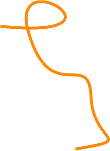
I thought I’d pick a non‐trivial one, intersecting itself and with some sharp bends. Now let’s warp that text, along the lines:
The path is not consumed by doing this, it is applied to the text. Remember that text is a real entity—you can see it in the final, exported image—and a path is nothing but a mathematical definition.
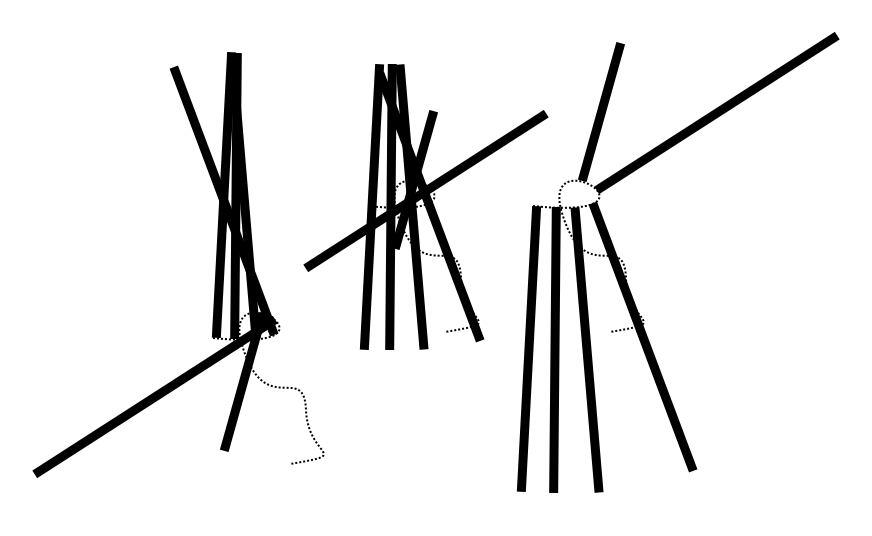
Now you may be asking: ‘what line is actually being warped here?’ Good question. We think it could be any of these five:

Each of these is typographically meaningful and gives different results, so we are going to let users pick any one. Also by having defined which line is used exactly, it is settled where tracking and kerning should be measured for text warped in this fashion.
So that is warping along the lines, what about warping across the lines; what candidates can we find for that? Well, there are these lines used for aligning text:
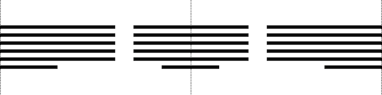
Here we go, warping that same block of text using the left, centre and right alignment lines:
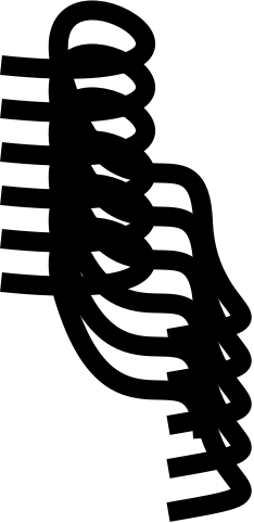
Up to now we have been looking at pure text, but what happens if it is boxed in? Let’s apply a shape (shown in orange on the left) and see the result (right):
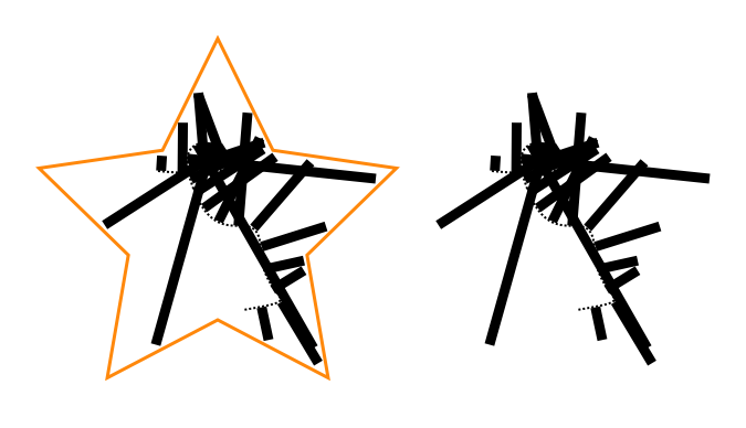
Yes, a box is nothing but a line wrapper. I did notice while preparing this example that it takes a certain offset between the shape and the warped text to make this all work.
exponential growth
Now things are getting interesting. We have defined two orthogonal types of warping and of course these can be combined, using a different path for each.
Also, we see that lines used for either type of warping are related to paragraph‐level typography: leading and text alignment. This means we can apply different warping(s) for each paragraph in a piece of text. Interaction for applying type specs per paragraph is very well established, thus there is no price—UI bloat—to pay for such flexibility.
Here is where internationalisation enters the picture. Changing the writing direction—left–to–right, right–to–left, top–to–bottom, and why not have a complete set: bottom–to–top—has a massive impact on the outcome of warping. Adding this to the mix quadruples the possibilities.
That is the part that is very satisfying: through the power of combinations, by adding a simple system, with no massive UI, we get the possibility of two orthogonal warps, five types along the lines and three types across, per paragraph, times four writing directions.
Looking back, we were triggered by the evaluation to get to the bottom of this topic. And instead of copying the status quo, we ended up with a very elegant model for text warping.
do what you like
What the evaluation also showed was that today, the usability of text warping is really not optimal. It usually works like a one‐way street: you have to start with component A, add B and then you have warped text, with no going back. Does it really has to be that way?
Instead we say: start anywhere. Combine an existing text and path to start warping; start setting type to an existing path; or directly warp the text lines, with the path tool.
4. tools
And with that we have started talking about tools. We have seen up to now that text in GIMP means combinations of different aspects. And that is how it pans out for the tools too:

From left,
- naturally, all text editing and typography work is done with the text tool; we have the possibility here to overload the general keyboard shortcuts and use them to speed up typography work;
- frequently during our design sessions we said ‘ah, but that is a general vector problem,’ meaning handling it falls to the vector tool; all work with the text box lives here;
- the path tool is used for warping, enough said;
- the upcoming combined geometry tool moves pure text blocks and also sizes, rotates, shears and distorts text boxes.
This is a very clear model. It is easy to design for interaction architects, easy to implement for developers and easy to ‘get’ for users. There is however one slight flaw with this plan: it is infuriatingly rigid.
During the evaluation of all the applications we saw plenty of tool switch‑o‐rama, while performing tasks that users perceive as atomic. And that is a nasty discrepancy. Remember one of the points of the vision for text in GIMP?
- ‘GIMP users get: minute control over typography and the layout of text on the canvas.’
That is actually one single task, not two related ones. From this we understand that some cross‐pollination must take place between above tools. Straightforward examples are being able to move a block of pure text within the text tool, and moving and sizing text boxes and vectors (same thing, right?) in both text and vector tools.
easy does it
It is essential to limit the amount of cross‐pollination, or else we end up with four bloated tools with mesmerising functionality. In short: we have to avoid landing in user‐request hell. Handling this is pure design work: building an understanding of the whole activity of handling text in GIMP and identifying the atomic tasks. This then drives the cross‐pollination decisions.
Surprises happen. For this occasion I prepared the (I thought) crazy example of users insisting that path editing and kerning belong to the same atomic task. Crazy, until I realised they are right. When adjusting the warpage of text with the path tool, the complementary parameters that control where the glyphs end up exactly are… tracking and kerning.
Do not expect tracking and kerning to become part of the path tool. However, we will have to deliver a design where users feel they can warp and control how far glyphs are apart, in one flow.
Finally, I did come up with a bonafide crazy example: path editing and colouring text glyph. I am confident that is not a single task.
5. editing
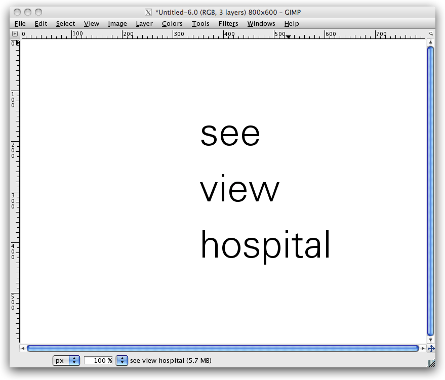
For our final building block, we are gonna go back to basics: text editing. Let’s start with some text on the canvas:
But wait, the vision for text says: ‘Text in GIMP is always part of the composition.’ OK here we are:

I picked a photo here, but it could have been a collage, or some other graphical composition.
The most natural way to edit this text and work on its typography is hands‑on in context (the orange lines are an indication of this; in no way is this a complete interaction design, OK?):
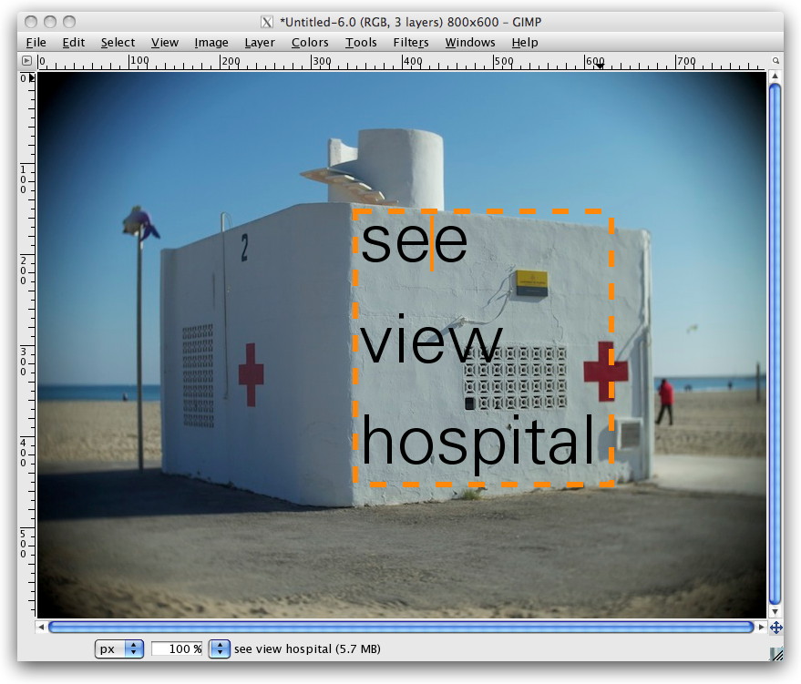
This should be the default in GIMP for working with text.
But there is more: GIMP is an image manipulation program. Text and vector are never the end goal in GIMP, they are the beginning, to receive graphical treatments:
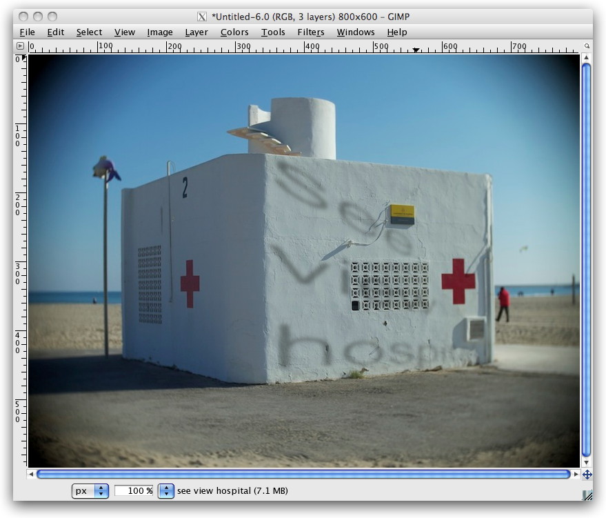
A bit hard to read, no? Not funny having to place a cursor in that, right? That is exactly my point. In a GEGL future, with fully non‑destructive editing, GIMP users will be able to correct that typo, and give that kerning some love, and immediately see the results with all graphical treatments on top.
This means there is a point where optionally—I repeat: optionally—users may want to make use of a clean sheet type of editor (again, this is just an indication; in no way is this a complete interaction design):

As Kate always reminds us: the clean sheet editor has to be out of the way of the same text on the canvas, because one has to see the result, in context.
And with that we have seen how the design of the simplest things is heavily influenced by the context. No amount of interface guidelines could have answered this question. It is simply work for interaction designers who are on the project.
postscript
This story started with a vision for text handling in GIMP. All we did in three blog posts was showing that a design process means vision realisation. Some of you may still ask: ‘where is the UI design?’ And I say: a big, fundamental chunk has now been presented here.
Before this project started, the UI team could only act like a fire brigade towards text handling in GIMP: react to calamities. That is now a thing of the past. This project with Dominique has put everything in a proper relationship. Which means we are on top of the situation now. What lies ahead of us is further refining these relationships and designing text handling in GIMP.
Labels: design stage, GIMP, lecture, practical

![]()
![]()
0 comments · post a comment
If you like to ask Peter one burning question and talk about it for ten minutes, then check out his available officehours.
 Peter Sikking is an
experienced
Peter Sikking is an
experienced
interaction architect. He unabashedly puts
shipping great products at the centre of his design practice. He is known for
his work for Google, Nokia, the
Metapolator &
GIMP
open source projects,
and startups.
What is Peter up to? See his /now page.
- info@mmiworks.net
- +49 (0)30 345 06 197
- imprint
