responsive web layouts: filling the gaps
11 September 2012, 12:09
We have launched our revamped website! Icing on the cake: its layout is now responsive, too. the following articles very helpful to get started:
- Responsive Web Design, by Ethan Marcotte;
- A Simple Device Diagram for Responsive Design Planning, by Adam Edgerton;
- Hardboiled CSS3 Media Queries, by Andy Clarke.
To get started, yes. But then
By the way, I am writing this blog post as Peter, the journeyman web developer (first); Peter, the prime website stakeholder (second) and Peter, the interaction architect (last). There will be some big‐picture insights, but especially the first part of this post is about my experiences in that first role. Now on with the gaps.
gap 1: starting at the wrong end
This first one is simply my own fault: we started going responsive while being completely ridgid. This website update was supposed to be a ‘quick’ content and visual design refresh. The new layout was briefed to fit a fixed width of around 940 pixels.
That’s a couple of big mistakes there, made by Peter, the stakeholder; shortsightedness, very likely encouraged by also being Peter, the web developer of all design changes.
despair
Then late, late in the day, already after the launch of the new website, it became clear that m+mi works—for more than a decade a leader in mobile interaction design—could not present itself on a handheld device with a fixed, 940px, desktop webpage layout (thanks, Aaron…).
Obviously, a responsive website is better designed as a system, from scratch. But practically speaking, we had missed that boat and it was not going to happen, this time. Then again, proof equals pudding and as you are reading this now via a responsive layout, it shows that it can be done, starting from a fixed layout. So for the tens of millions of websites that are in the same, ridgid, situation: don’t despair.
right time, right place
Looking back I realise that there were quite a few factors present in the revamped website that each made a conversion to a responsive layout a bit more feasible:
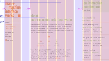
- a clean grid layout (above)
- Designed by Katrin Alt of hellowork.de, the grid system layout with 3 columns—that are not too dissimilar in width—made it straightforward to plan a re‑layout.
- low number of layout variations
- There are now three page layouts in use—blog, home page, the rest—instead of the ten (!) used previously. A radical slim‐down, made possible by my colleague Kate Price, who did the content strategy and interaction design (two excellent reasons why I shouldn’d and couldn’t do that myself: being stakeholder and developer).
- ‘retinafied’ images
- Double‐resolution images, we use them now where image crispness is an issue and the cost (i.e. size) of them is not too high. Having this resolution surplus on tap helps when downsizing images.
- web fonts
- Much more unified typography for the different platforms. And as a side effect, zero special handling of these platforms in the css. This stability created room for variation in font sizes for different devices.
- the (near) end of browser hacks
- With internet explorer 5.5 and 6 safely out of the picture, their layout hacks could be buried. A few remain for ie7. Also the new clean design did not ask for anything special, unlike the previous version. With no dicy tricks in the css, it is easier to radically re‑layout.
gap 2: the magic words
Before diving into the media queries as outlined in the articles, you need to say the magic words. Literally, in your html you need to put, before you get to the css with the media queries:
<meta name="viewport" content="width=device-width,
    initial-scale=1.0"/>
This aligns the width and device-width parameters
and you can do all your media queries using width
(i.e. min-width, max-width). The
initial-scale bit makes that what you set in sizes comes out
one‑to‐one in the browser.
However, there is a feature/bug in iOS browsers: when the orientation changes from portrait to landscape, the page gets re‑layouted using the increased width (good) and the whole page gets scaled up (ugh). You lose the one‑to‐one scale; users will have to pinch the page to make it fit as you intended. On the other hand, rotate landscape‑to‐portrait and everything works just perfectly.
whose side are you on?
Now you have a choice to make. If your website is really an application‑in‐browser, then I recommend you use the following:
<meta name="viewport" content="width=device-width,
    initial-scale=1.0, maximum-scale=1.0"/>
With that, Webkit will not scale the page larger than one‑to‐one; the rotate bug is gone. But neither can users scale up the page anymore. They cannot zoom in on content. Thus if your website is more content oriented (like ours) then I recommend you use the first code snippet above.
true type
Another magic phrase that you need is this bit of css:
body { -webkit-text-size-adjust : 100%; }
It ensures that the font sizes stay as you set them on mobile Webkit browsers.
gap 3: the missing sizes
Now you are ready to ‘respond’ to the width of the viewport your website displays in. But in a sense you are also responding to the kind of device it display on. To get a feel for this, I found the device diagram in Adam’s article very useful:
But as I later found out, there is something missing there. Checking out this wikipedia page of display densities, you’ll notice the term ‘css pixel ratio.’ You are probably already familiar with this factor: the iPhone 4 has a 640x960 screen, but divided by a css pixel ratio of 2 it reports itself to be 320x480 in a media query.
more refined, by half
In the android world, the css pixel ratio of 1.5 was/is used. Of those devices that do, the ones with 480x800 displays are the ones that matter: simply more, and more popular models and that is what the diagram is about.
These 480x800 android devices report themselves to have 320x533 screens. The 320px portrait size is of course already overwhelmingly covered by the iPhone, but the 533px landscape size fills a hole in the device diagram.
Even when that does not make an earth‐shattering difference in the sizes vs. kind device equation, it is handy to know about the pixel ratio when you are testing with one of these devices, and its 800px screen seems to produce not quite 800px results—as happened to me (Nexus one).
gap 4: what connects the dots?
Adam’s article then suggests to divide the device diagram into a number of ranges (good) and design a layout for each of these based on one design target, basically the most popular device within that range.
Coming from the opposite angle, the technical media query one, Andy’s article has the same effect: concentrating on single, ‘milestone’ devices along the device diagram continuum. That is taking your eye off the ball.
fluid + chunky
The minds of designers should be on that continuum of sizes: from a thousand or two, down to a width of 200—or less—pixels, every single size is possible. Breaking up the continuum into several ranges helps to focus the mind, resulting in setting a different layout policy (i.e. solution) for each range.
Where the specific devices play a role—and Adam’s article does illustrates that really nicely—is in determining how many ranges there should be and where their boundaries should approximately fall. Also the devices inform what kind of layout policy (e.g. two columns or one?) is right for the range. But design‐wise that is where it ends, devices only return later for testing.
gap 5: the invisible hand
While working with the size ranges that I had determined for our site—from the device diagram—I found out that the pixels are only half the story. The other half is the content.
The first level where this plays is the size of images—a reoccurring theme in responsive articles—and the length of lines of text: the measure. Compared to the font size, a line of text should be not too short, nor too long, else it will not read comfortably—i.e. will not get read.
Sensible sizes for images and text set definite limits to the size of columns. It forces decisions: time for a different layout policy. Context plays a role: I did notice that with small devices—smartphones and down—a shorter measure (chunky type on short lines) is acceptable, one that would not be on the desktop.
can you feel it?
The second level where content plays a role is more general and partly more subtle. I said in the previous section that the size range boundaries are known approximately, it is the interaction of content with the viewport width that determines these boundaries exactly.
For single‐column layouts on small devices this is set by hard facts: what fits? But for the exact points where to switch from 3–to–2 and 2–to–1 column layouts, it is a matter of what feels right. Using a desktop browser, I continuously changed the width of the viewport, watched the layout react and then it was simply clear where the boundaries should be.
gap 6: getting it to work
Now we know exactly what we want to achieve, but how to set it in css? Andy’s article gives some ‘hardboiled’ advice on css and Ethan’s article shows a good cascading approach, well adapted to handling the continuum. What is missing is to make it ‘always’ work, even with browsers that are in mainstream use, but do not know media queries from their elbow (like ie7 and 8).
I am now using the following structure. You can have a look at one of our layout css files, but of course reading somebody else’s code is a drag. So without going into the specifics of our layout—you know we are in a pinch, no?—I will walk you through the css:
- The first section, without any media query clauses around it, is the default of the website: the complete desktop layout. This will always work, even when browsers do not support media queries.
- Next are the media queries. They all lead off with the keyword
only, which ‘can also be used to hide style sheets from older user agents,’ says the w3c (in example 9). These queries are in effect protected from older browsers misinterpreting them. - The media queries are ordered from wide to narrow in pixel widths. Most of them cascade; as the viewport gets narrower, more and more css statements apply that modify the default, and also each other, in turn. The order in the file matches how the situation becomes more constrained, and how statements modify each other.
- There is one stand‐alone media query, with
min-widthandmax-widthclauses. It is the two‐column layout, which stands by itself between the three‐ and one‐column ones.
everyone’s a winner
This works ‘always’—fingers crossed—except for windows mobile 7, which is an unfortunate combination of a modernist‐styled handheld platform and a rather unmodern browser. As it is, the default desktop layout will be displayed on it; not very responsive, but not a disaster either. It is the 2007 way to display a website on a touchscreen mobile.
The bottom line is that one has to chose to either support ie desktop browsers (and serve up a desktop layout to windows mobile 7) or support windows mobile 7 (and serve a mobile layout to all ie desktop browsers). For our website it is clear that one of these is in decline but still used by ten percent of our visitors, and the other one is struggling to appear on our radar. You do the math.
I do want to mention that there are solutions to get windows mobile 7 on board. Then again a device for testing this solution is by definition scarce on the ground. Instead, let’s wait and see how fully‐baked windows mobile 8 is going to be.
gap 7: 320 and down
So your website now works great at 320px width. Now what about 240px; or even 176? Just some non‐exotic values I pulled from that wikipedia page. As I mentioned before, your content will set hard limits to how narrow your website can display. In my case I noticed that below 300px my layout was falling apart. Even the highly fluid example from Ethan’s article stops working below 240px. It still fits, but it does not work anymore.
Of course trying to display a website in a column of around 200 pixels is asking for trouble. It is the responsibility of the browser on the device to offer a solution for this, similar to how Safari on the original iPhone solved it for 320px.
letting go
We could wash our hands of the problem and just serve up the default (desktop) website when widths get ‘crazy low.’ ‘Let the browser on the device solve it.’ But that is taking it too easy; let’s give that poor browser a hand.
The solution I implemented is that below the minimum width that still works for me (300px), I give up on being being fluid and set the layout width to that 300px. The device browser still will have to deal with it (scaling etc.), but at least it is with something reasonable.
That initial-scale=1.0 we set before does come
back to haunt us here: the page will initially be too wide for the display, but it
can be pinched smaller by users to make it fit.
That wraps up the practical part of this posting, summing up my experience of making a responsive layout work today. And now, a bit about the future.
the final gap: still doing it wrong
Pixels, pixels, px. Everything evolves around them in this blog post, the articles and in the css that does the hard work in practice. But wait. Interaction with touch devices is always about centimetres, never about pixels. That gives us a hint.
A device reports an 800px wide viewport. What kind of device is it? The wikipedia page shows a ppcm range of 52–131 for its sample of 800px devices. That means one end of the 800px range is 6.1cm (2.4") long (modest smartphone) and the other end 15.4cm (6"; tablet range). We know immediately how to ‘respond’ to those cm sizes, the layout policy for each is crystal clear.
Related to this are font sizes. I could now construct a complicated story on how they should respond to screen resolution and viewing distances (the larger any of these two, the larger the font; in practice they compensate each other, in part). But we can also take it from the other side and decide on great working measures for text blocks. This in term will sort out the font size, automagically.
walk this way
Here is how I see that working in steps:
- determine the width of the viewport in cm (effective pixels / effective resolution); from this number of cm the layout policy that is most appropriate (just feels right) is set;
- for each layout policy:
- the pixel widths you are dealing with are now of course all over the place, by a factor of two or more; everything has to be designed proportionally (percents and ems) and it should be determined what the accordion parts are that absorb any leftover horizontal space;
- set the measure of blocks of text; from looking at the range of cm widths of the viewport (narrow to generous) and the effect that has on the text columns in this layout policy, experienced typographers will respond with shorter or more generous measures; when displaying on devices, the available column pixels (from the %s in the layout) divided by the measure give the font size;
- all further typography will be a mix of being proportional to the font sizes derived in the previous step, and more independent ‘measured’ choices in response to cm widths and its effect on the layout;
- determine the maximum resolution needed (raw number of pixels) for your images—very
high ppcm numbers is where trouble lives: devices that are small enough to need a single
column layout, but have 1280 (and rising) pixels on the long end of their screens;
alternatively, set some limits, serve popular devices (e.g. retina Pads and iPhones)
but call it quits for what goes beyond that, with some css:
max-width : 100%; height : auto;
noscript
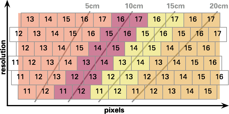
The steps outlined above can be achieved without resorting to javascript. Here is a graph of (effective) resolution vs. pixels, plotted on it a sampling of cm sizes:
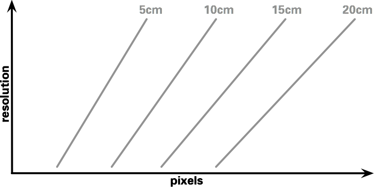
(it would be very interesting to take all the devices of the wikipedia page and plot both their long and short sides on this graph. update: done, have a look.)
By combining media queries for pixels and resolution, one can set layout policies based on cm sizes:
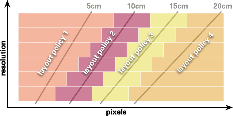
Yes, that is using six OR‑ed media query clauses per policy to build those stair‐stepped diagonals.
If you go through the motions of setting measures for your layout policies and then calculating the resulting font sizes for you whole continuum of pixels and resolutions, you will end up with something like this:
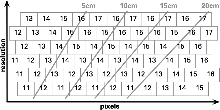
Again, can all be done using media queries; there are eight different font sizes in the graph, with on average eight clauses each.
There is a general trend for the font to increase towards the top‐right corner of the graph, but as the overlay below shows, policy changes reset this trend:
spanner
Back to today: I have experimented with media queries for resolution, but had no luck getting it to work. The internet is also not brimming with information or working examples on this topic. Until that is sorted out, we can put responding to cm widths on ice—or try our luck in javascript.

1 comments · post a comment
- at 29 September, 2012 02:50, Matt Caluori commented
- Great in depth info about responsive design. I started learning about responsive layout using the shortcut Wordpress theme method for my IRA site (yourIRAoptions.com). Building a responsive site from the ground up is impressive though. Nice work.
If you like to ask Peter one burning question and talk about it for ten minutes, then check out his available officehours.
What is Peter up to? See his /now page.
- info@mmiworks.net
- +49 (0)30 345 06 197
- imprint


 Peter Sikking