KDE UX sprint: inline outline
30 April 2011, 12:34
Last week I spent three full days at the KDE UX sprint. It was a lively meeting of KDE developers, a variety of (interaction) designers and usability folks. m+mi works contributed with two experts to the sprint, my associate Kate Price was also there to help out.
Many an interesting topic was discussed:
- What doe it take to bring the same application to different platforms, e.g. desktop, tablet and mobile touch devices? I say: more than just different widgets or rearranging screen layouts. The different vibe of each platform—the sofa factor of the iPad, being on the move with mobile—leads, in my experience, to non‑trivial differences in UI structure and flows, for the same app.
- Is it great that interaction designers can build a UI (prototype) themselves with languages like QML? I say: the interaction design must be specified first, with all the subtlety and freedom of the written word and drawings. Turning this design into the real thing/prototype always amounts to development. With good interaction designers so incredibly scarce, why should they do development instead of, well, designing?
- We looked for Calligra at screen layouts of windows, toolbars, inspectors for office‐suite applications. Even the ms‑office ribbon came up (Celeste Lyn Paul hit the nail on the head: icon puke). We quickly found out that the problem is highly complicated, with a lot of variables involved. I say: this is hardcore. Without a highly experienced team of interaction architects, implementing some strict, tight methods get a grip on the thousands of possibilities, this one will go nowhere. Oh, and one size does not fit all; applications in an office suite are still different enough to need different layouts.
- Overarching theme for three days: developer–designer relationships. The world could really do with more trust between both sides. I say: It takes developers and designers to create a decent piece of software. If either of them is missing, it becomes incredibly hard: mission impossible.
For the rest of this blog post I would like to report from the session that Kate and I worked on Friday afternoon. It was a classic example of interaction design consulting.
flowing in from the web
The topic was brought up by developer Aurélien Gâteau and concerned—we had to invent the name for it—inline dialogs. I am sure you have seen some of these; here is one that appears in my web browser for finding text on a webpage:
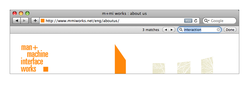
In the image above, a bar has been inserted in the window layout, between the title bar and the web page canvas, to handle some simple search interaction. Another example is positive (green) and negative (red) message bars that can be found at the top of web pages. We at m+mi works have been using them in recent years in our designs for several app‐in‐browser customer projects.
According to Aurélien these inline dialogs have recently started crossing over from web space into desktop applications. For KDE he was looking for guidance on how to design widgets for these and guidelines for developers to integrate them.
slicing + dicing
During our process that afternoon, we evaluated a number of examples, picking the good interaction ones, deconstructed them, settled on a classification, generalised these classes and took it from there. That took a couple of hours and here are the results.
The main reason for using an inline dialog in a desktop application is to not have a dialog overlap the window, combined with low (no) impact on the layout of said window. If that sounds too trivial to you, then here is a twisty corollary that I found: inline dialogs that do not span a full content column—and by definition smaller in pixels—are more intrusive than full‐width ones:
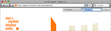
I quickly whipped up the example above by erasing more than half the bar. This ‘part‑bar’ is more intrusive because it is in effect overlapping the content: when scrolling up, content on the left will be covered later than content on the right. Yes, that is an issue fully driven by user perception, not by pixel calculations.
not in Kansas anymore
Another thing that can be said in general is that two of the reasons to use inline dialogs in web browsers; i.e.
- the fact that a web page is (nearly) fully disconnected from the browser menu bar that is displayed right above it; e.g. it cannot rely on Edit->Undo from the menu bar;
- the fact that the web browser has (nearly) no chance to insert its own controls in a web page; e.g. it cannot place a ‘Remember’ checkbox near every password field;
disappear in general for an application in a desktop environment. Unless of course, one or both reasons are valid for a particular desktop application. It takes however some serious stuff to trigger this condition, like a runtime environment where the environment owns the menu bar and the user interaction is running inside it as content (e.g. a web browser).
that’s classified
These inline dialogs are just that, dialogs. So the 30‑year‐old rules and variants of dialog boxes are all valid. Except for one: because inline dialogs are subtle and not exactly in users’ way—their main benefit, I say—they are not made for situations that need a modal dialog.
Now on to the classification, here are the different classes of use in desktop applications:
- negative feedback
- The same arguments that rule out modal dialog use, also suggest that inline dialogs—those negative (red) message bars—are too subtle on their own as negative feedback. So they only work in combination with something non‐subtle, something big, communicating failure. Then inline dialogs can be used for further clarification, close to the source of trouble.
- positive feedback
- Where for negative feedback it is too little, for positive feedback it is easily too much to use an inline dialog. It really only makes sense when there is a heightened user need for reassurance.
For both feedback classes above, I expect the normal situation to be that after doing some methodical interaction design, one realises that there are better solutions than using inline dialogs. They are to be used in exceptional cases. Two more classes of use:
- opportunistic interaction
- This is about offering low‐hanging fruit, on the side, e.g. after inserting a CD in the computer, a music collection program can offer to import it, as a ‘footnote’ in the overall window layout. I think this class of use can be very useful for getting chores done without breaking the main flow of an application. Get more done with less fuzz.
- secondary tasks
- Quite a mouthful this one: for tasks that are secondary—certainly not essential—for an application; users start them, concentrate on them for a while, intermittently if needed, until users decide it is done. Examples: find (and replace) and spell checking. The main benefit of using inline dialogs fits these situations well. Please, no close box on this class of inline dialogs, users are Done.
rewind; fast forward
And that is it. At Friday’s session we did not only put the necessary structure into inline dialogs in desktop applications. By also generalising in the form of above classification, we open up space for innovation in their use. I hope the results I have presented here will be as useful for you as it will be for us in our next projects.
Labels: design stage, fundamental, practical, product phase

![]()
![]()
0 comments · post a comment
If you like to ask Peter one burning question and talk about it for ten minutes, then check out his available officehours.
 Peter Sikking is an
experienced
Peter Sikking is an
experienced
interaction architect. He unabashedly puts
shipping great products at the centre of his design practice. He is known for
his work for Google, Nokia, the
Metapolator &
GIMP
open source projects,
and startups.
What is Peter up to? See his /now page.
- info@mmiworks.net
- +49 (0)30 345 06 197
- imprint
