the rise and fall of mobile empires
31 January 2011, 22:40
And now for part two of my world usability day lecture. Part one was all about the three‐point plan for the proper integration of interaction design and usability into development projects:
Today we will use these three as a framework to make sense of the shock waves that are currently going through the mobile devices world.
money talks
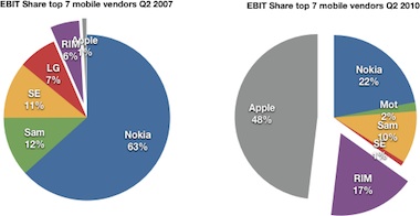
We have all seen these waves, in charts like these:
 source: asymco,
android’s pursuit of the biggest losers
They show that Apple is already eating almost half of mobile manufacturers cake (EBIT is ‘earnings before interest and taxation’). Or this chart, where we can see the trends:
 source: asymco,
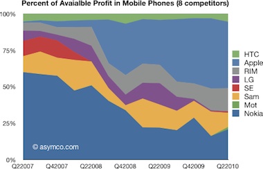
can android change the distribution of profit among phone vendors?
We see Nokia in steady decline; Samsung wobbling; Motorola back from the dead; Sony Ericsson disappearing; LG decimated; RIM growing a bit; HTC shrinking a little and Apple pushing all of them around. It is no coincidence that both charts start in 2007.
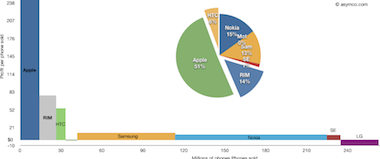
Remember that value forms one‐third of a product vision? Perceived value is also what people pay for:
 source: asymco,
making it up in volume?
What we see happening from left to right is commoditisation. Working chipsets are a commodity. Software that does not crash is a commodity. Plastic casing that disintegrates after exactly two years and a day is a commodity. Software features are a commodity. Yes, it is hard, nagging work to produce these and cursed are those products who do not meet minimum expectations. But there is no value in them.
analysis walks
Back to making sense of this all. What follows now is a swirling mix of first‐hand experience, first‐ and second‐hand stories from esteemed colleagues, and general internet insight and gossip. Shaken, then stirred, to protect the innocent.
Now, let’s use the three‐point plan to evaluate the rise and fall of of some mobile empires.
Siemens
- I have no idea whether Siemens mobile had a product vision or not. Not that it mattered because…
- …it was the kind of place where interaction designers were involved late in the project and their hastily made specifications landed in a drawer. You see, in that phase of the process, they had other priorities.
- ‘Absorbed by the system’ is how a front‐line professional once described what happened there to interaction design. Siemens is a prime example of an engineering organisation and the engineers that were promoted to managers were not planning on spoiling the fun.
And by colluding to keep their jobs fun, by marginalising whole dimensions that cannot be understood in engineering terms, the engineers found themselves out of a job one day, when Siemens mobile completely folded.
Nokia
- Nokia built its empire during the 90s on segmentation, on recognising that different target groups need different phones. That is at least one‐third of a vision being in place. But quite a bit more visionary was recognising early on that good UI would be a deciding factor, so they invested heavily in it. As a result, up to around 2003, ‘the next one was going to be a Nokia.’
- This was because of what is in many ways an exemplary process. The UI specification gets written first, by interaction designers. This spec is what gets build and it forms the basis for functional testing. The implementation better be exactly to spec and the spec better be completely thought through, without holes. Anything needs changing? You’ll have to talk to the interaction designer first.
- So where is the catch? Well, about five years ago things started to change. A culture of taking decisions by consensus took over. Interaction designers started taking the path of least resistance and pandering to the whims of product managers. Design by committee and a clear erosion of the authority of the interaction designer is the result.
This was compounded by the fact that Dilbert came to Nokia—the original Helsingin Sanomat article is a must‐read on the ‘morally corrupting effect of bureaucracies.’ Innovation means taking risk and Nokia is unable and unwilling to do it. This combined with a design by committee culture explains why Nokia is not capable of producing anything like an iPhone.
Apple
- There is certainly no lack of vision at Apple. Time and again, they see the ‘next big thing’ and create products—if not whole markets—out of it. And they make very hard choices about what to design in—at all levels: chips; hardware; software; user interaction—and what not, according to the vision.
- Obviously, things are first designed, then built at Apple. They have sworn off usability testing years ago, because it means tapping into a most reactionary force: users. I guess it also helps maintaining the (in)famous secrecy. It does mean we sometimes see Apple missing the target when they make another great (conceptual) jump: antennagate; iPod shuffle without buttons; rearrangements in iTunes. But they are not too proud to correct themselves, while keeping moving forward.
- From Steve Jobs downward, it is clear that user experience is everything. If it does not contribute towards that overarching goal, development and engineering ain’t worth a dime. There are some fantastic stories around about how it is enforced that the software matches the interaction design. Yes, the tiniest detail done ‘the developer way’ can derail a user experience. Although Apple is an organisation with tens of thousands of employees, they strive to make teams work like small start‑ups. This avoids death by bureaucracy.
This is the way to quake whole industries and be highly profitable at the same time. It means discontinuing your best selling product (iPod mini) because you know that the future will be different (the nano). It means getting the experience right, before being feature‐complete. It means ‘good enough’ is not good enough, when it comes to user experience.
Samsung
- Instead of vision, we can speak here of an anti‐vision. By releasing a stream of products superficially equal to an iconic competitor product, Samsung tries to reduce it to a commodity. Then the battle can be taken to familiar ground: features; alliances; marketing; fulfilling every operator whim; rebates (for operators, that is). Any notion of value and its relationship with user experience does not necessarily play a role in all this.
- The good news at Samsung is that interaction specification goes before implementation. The bad news is that the process can be described as one that would befit the Vatican. By which I mean that the task of specifying itself is more important than the designing—i.e. solving the problem—and that Machiavellian forces use the process to further causes that have nothing to do with user interaction.
- Samsung has a knack of having three teams working on the same user interaction. How can that work? Which team is supposed to have the accountability and authority? No, that is not compensated by any of the teams not knowing about the other two. A design team is not there to generate some cool ideas, for other folks to pick and mix. A design team is there to take charge of the interaction, all the way to the point it ships.
I guess one can play for time—for a long time—like that. Asian conglomerates must have that down to an art form. Oh wait, what happened to LG and Sony Ericsson?
modulo 3
Apart from sharing what I observed and learned in the mobile world for the last fourteen years, part two of my lecture also served to illustrate the three‐point plan from part one. Closing the circle, I am convinced that empires can be built on the proper integration of interaction design and usability. That is not exclusive to Apple or Steve Jobs, but it does take an insight, focus and a culture that is exceptional in today’s high‑tech world. And the empires that neglect interaction design and usability, those are doomed.
ps: as I finish writing this posting the latest numbers are in. The beat goes on…
Labels: lecture, mobile, practical, product vision

1 comments · post a comment
- at 01 May, 2011 04:05, Troy James Sobotka commented
- Egads Peter, this is a fantastic bit of thinking and opinion.
I must say, it made me extremely happy to read that 'c' word so many times. Even in italics!
Encore.
If you like to ask Peter one burning question and talk about it for ten minutes, then check out his available officehours.
What is Peter up to? See his /now page.
- info@mmiworks.net
- +49 (0)30 345 06 197
- imprint


 Peter Sikking