teaching interaction /09
28 July 2009, 14:40
At the end of May it was again my pleasure to teach interaction design at the FH Vorarlberg, Austria. I will discuss what was new and notable compared to last time, show which new GIMP functionality we worked on and then present the results.
full intent
Kicking off with ‘what’s different?’, I had fine‐tuned the goals of my course:
- structure, structure, structure
- If there is one thing I want my students to take away from this course it is a project structure that enables them to tackle any (interaction) design project. I took the structure and methods used in my daily practice and condensed them to a project survival guide. In a fine example of ‘the medium is the message,’ these structure and methods also form the programme of the course.
- true interaction
- Furthermore I want to introduce the students to what pure interaction design is and what it takes to do it professionally. I chose our design project such that no one could simply fudge their way through using visual design or information architecture skills. How the interaction flows in time is our focus.
The title, interaction design for the real world, reflected that once again the course was all about working on a real design project on real software. New this year was the increased ‘real world’ focus, where for many aspects I related to the students how these are ‘business as usual’ for interaction architects: to deal with certainty with the uncertainties of any given project.
time + space
The time set‑up was different this year, with three full days of working together at the FH and the students sending me their final work two weeks after that. Also different this year was that my course was fully booked, with sixteen students participating.
I divided the students into four design teams and used our three days together for intense and full‑time design work (hey, just like the real world…), using the structure: day 1: from 0–to–100 on the project, ending in an expert evaluation; day 2: brainstorming to create as many solution options as possible; day 3: narrow down to a single design concept.
Each team had to then deliver a design concept document two weeks later. Looking at what could be achieved in three days, I set the scope of this document to be a project‐internal briefing, for the principal interaction architect.
GIMP + vector
On to our design project. I want that the work produced during this course ends up contributing to the real word. So I chose GIMP as our ‘client’ to design for, because I can ensure there that interaction design is advanced towards implementation.
During LGM the GIMP team discussed readying last year’s SoC vector layers code for inclusion in GIMP v2.8. That was exactly the type and size of interaction design project I was looking for. I will now introduce the material my students started out with.
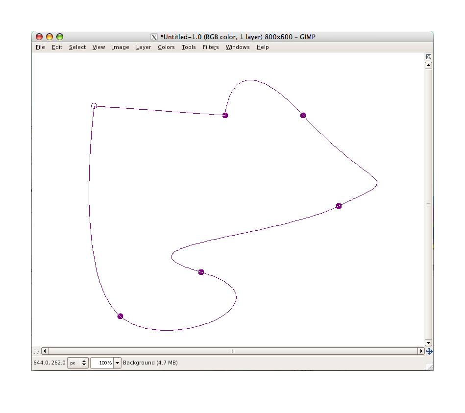
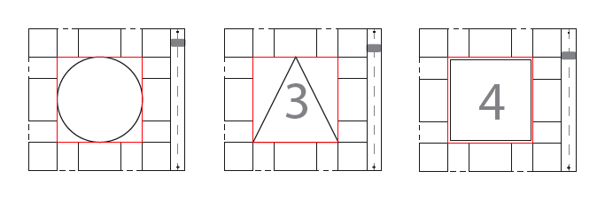
The proof‐of‐concept code allowed to take a path:
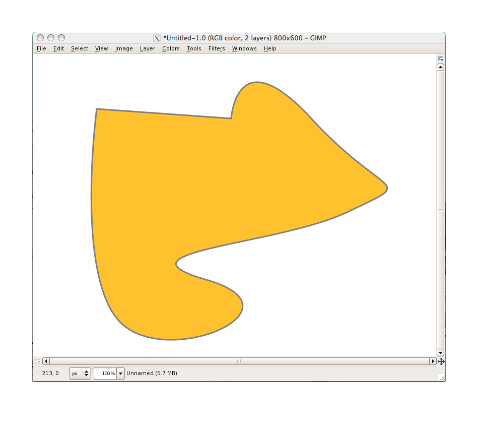
and convert it to a vector layer, receiving an outline stroke and/or a fill:

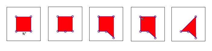
the shape of the vector can be changed for ever like any path, and when not edited display like this:
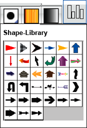
the fill and stroke parameters could be found and changed in one dialog:

and that was it.
spoiled for choice
The exact set of functionality (aka features) has a major impact on the interaction design and interaction architects have to rightsize this set before even starting to think about interaction. Usually this means fighting too many features, since anybody—developers; users; marketing folks; managers—can come up with more features.
In our design project, there was plainly not enough functionality to be useful/usable. So before the interaction designing started, each team sat down to brainstorm and then decide on their essential set of functionality. What struck me at the start of this phase was to hear talk of ‘window’, ‘click’, ‘button’, ‘slider’, et cetera.
That had to stop immediately. It took a couple of rounds of explanation—‘it is just a boring list of what functions it has’—to get the cold, analytical side out of my students. But then they were on top of the functionality, as it should be. As we will see next, functionality like vector layer management, managing and combining shapes and working with simple shapes (rectangle, ellipse, etc.) was integrated.
four team results
Now the grand finale, the results of the four teams. First let me make clear that the work of all four teams is available under GNU Free Documentation License 1.2. I present them in team order.
team one
- members: Andrea Chavez, Christoph Bischof, Julian Tomaselli + Tamara Christina Blumer
- design concept document (pdf, 2.7 MB, limited pdf viewer compatibility)
Team one was the one with the hottest debates. That may sound a bit inharmonious, but it was good to see the whole team so worked up about making good interaction.
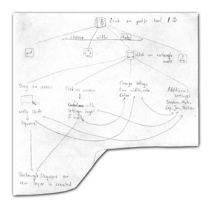
The main theme every team fundamentally had to deal with was the integration of the new vector functionality with the existing interaction, like that for paths and geometry transformation. This team solved it by introducing a shape tool in the toolbox and using the path tool for advanced vector manipulation.
Team one was the fist of several teams to arrive at the solution to use a library dialog for selection and management of a large set of user‐defined vector shapes. This works analogue to how brushes are selected and managed.
Apart from a doing a good job overall of keeping all the aspects of the interaction together, I especially liked their use of the modern GIMP sizing handles for the simple shapes.
team two
- members: Sara Geller, Laura Ramirez, Jakob Tripolt + Florian Wenger
- design concept document (pdf, 9 MB)
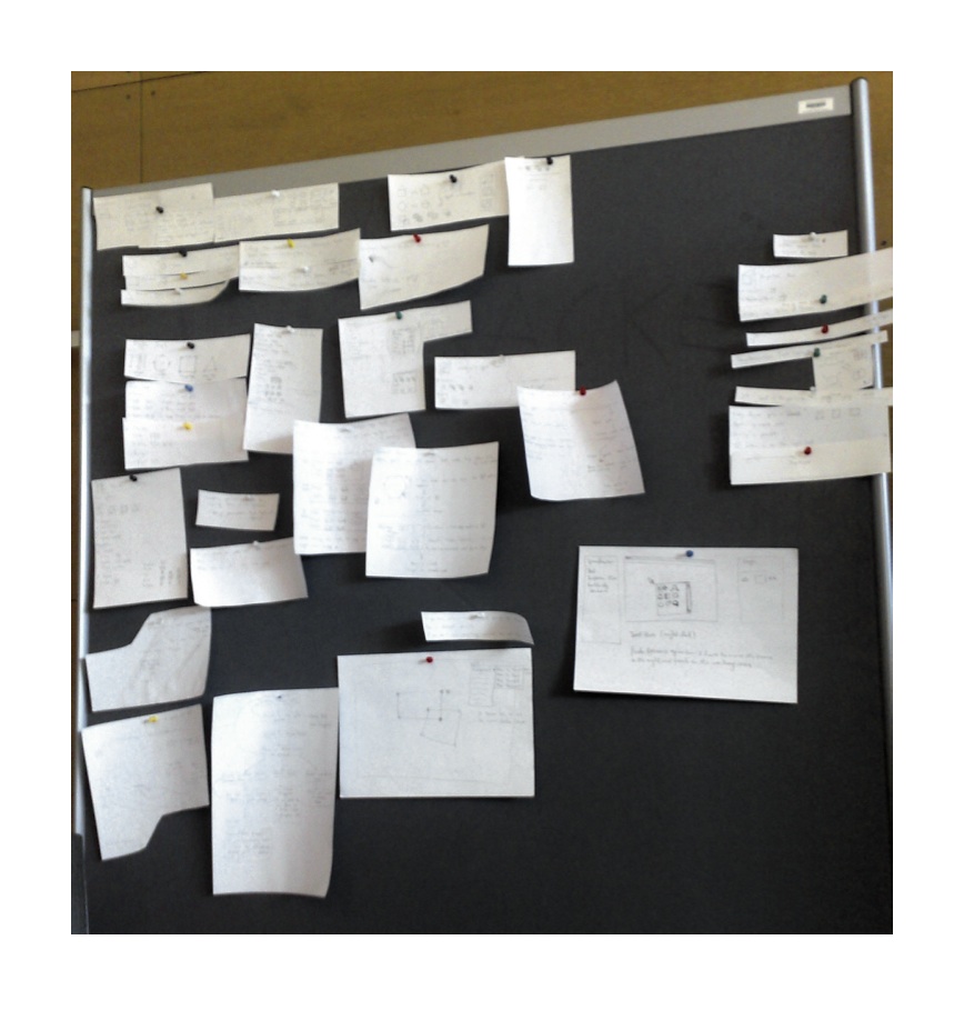
Team two shows us that all it takes to deliver a detailed design concept is pencil and paper. Funny enough this team, that did the most note‐taking, also resisted for the longest time to use the pinboards that I strongly recommended for gathering the results of the brainstorm phase. At the end, they did.
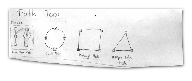
Team two integrated shapes and vectors into the path tool, giving the path tool different modes.
Overall they went deepest into a lot of interaction issues and solutions. I really liked their serious workflow analysis.
team three
- members: Mona Seiffert, Giselle Anahi Salinas, Markus Angerlehner + Anna Weiss
- design concept document (pdf, 732 KB)
Team three shows that it does not take a long document to get the core concept across. To my surprise this team dived into making pixel‐perfect mock‑ups of their ideas quite early in our design process. That was another thing that had to stop immediately.
In our high‐pressure environment where the teams had just enough time to arrive to a solid concept, the focus has to be on staying agile and creative. While all the time the scope of the design gets wider and the big picture becomes clearer, any part‐solution needs to be hot‐swappable for a better one until the very end. You can do that when solutions are pencil sketched, not so easy when they are visually designed with considerable effort.
‘Keep it brief’ is what I asked for the design concept document. But vector layers turned out to be a design project that was more multifaceted than the humble introduction would let one believe. So apart from the core concept, a lot of peripheral interaction issues needed addressing, as the other teams did.
team four
- members: Daniel Corn, Katherina Donner, Marko Heijnen + Lena Seeberger
- design concept document (pdf, 528 KB)
Team four introduced not one, but two new tools in their design concept. And for good reasons, like addressing smooth workflow, or an appreciation of the elegance of the free‑poly selection tool. So they introduced a freehand tool besides a shape tool, the former converts freely drawn shapes to stroked/filled vector shapes.

Also this team did a a good job overall of keeping all the aspects of the interaction together and I am quite taken in by their clean and effective little storyboards.
after the project is before the project
From the moment I selected vector layers as our design project down to the moment I am writing this, I have kept out of actively designing this feature, by simply not starting to. This in order to stay as objective as possible, while working with the students; while grading their work; even while describing it here.
But now it is time for me to get started. I will take the concepts of all four teams as the starting point for my interaction design of vector layers for GIMP. I’ll keep you up to date on that here.
Finally, I would like to thank the students for their hard work during the three intense days that we spent together. It was great to feel the vibe and I had a great time.
Labels: architects, GIMP, process, teaching

![]()
![]()
3 comments · post a comment
- at 28 July, 2009 20:27,
 Reverse : Proxy commented
 - it is interesting how 3 teams work quite differently on one specific topic. as i can remember, our course with you two years ago went nearly the same way. though, such a short time is hardly enough for serious results, it's suspenseful how a range of aspects are covered in detail.
i'm interested in your final considerations and looking forward to see them in "wildlife". - at 30 July, 2009 01:04, Killah Mate commented
- Best of luck in your work!
Though I must say, the GIMP team seem hellbent on fully integrating GEGL as soon as possible... I hope you and your team are able to design a smooth interaction framework for it in time! :-) - at 23 January, 2010 13:38,
 commented
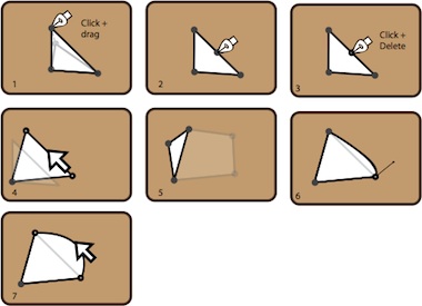
 - I really like storyboard 4,5,7 from the last set of storyboards.
Seems like very intuitive editing of the overall shape.
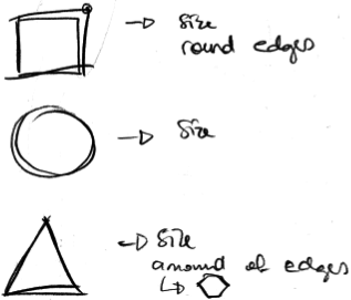
I also like the feature of making corners round in rectangles.
Does storyboard 5 mean something like extruding in a 3D program?
If you like to ask Peter one burning question and talk about it for ten minutes, then check out his available officehours.
 Peter Sikking is an
experienced
Peter Sikking is an
experienced
interaction architect. He unabashedly puts
shipping great products at the centre of his design practice. He is known for
his work for Google, Nokia, the
Metapolator &
GIMP
open source projects,
and startups.
What is Peter up to? See his /now page.
- info@mmiworks.net
- +49 (0)30 345 06 197
- imprint
