GIMP redux, single‐window mode
18 September 2009, 19:19
This blog entry covers the final part of my talk at the libre graphics meeting this year, after dealing with the schmuck and squaring a circle. It will also be pure falsification of history, Soviet‐style: I used my talk to kick off a discussion and to start the design process. Most of the interesting things I am showing you today were not even conceived when I delivered my lecture.
real history
Here is what was presented at LGM: First, I set the mood by showing a selection of single‐window contributions from the UI brainstorm:
The high number of contributions in the single‐window category confirms that this is a major issue where action needs to be taken. The many forms the contributions take shows us that a measure of flexibility and configurability is needed.
Next, I reminded everyone that it is a fifty–fifty world: about 50% of GIMP users love the multi‐window interface of today and do not want to lose it, about 50% of GIMP users would love to move to a single‐window interface.
one switch
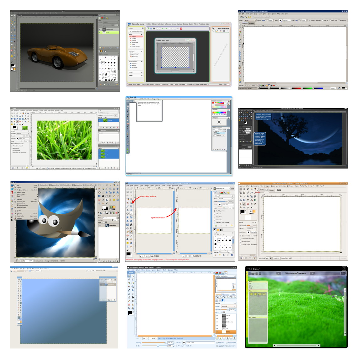
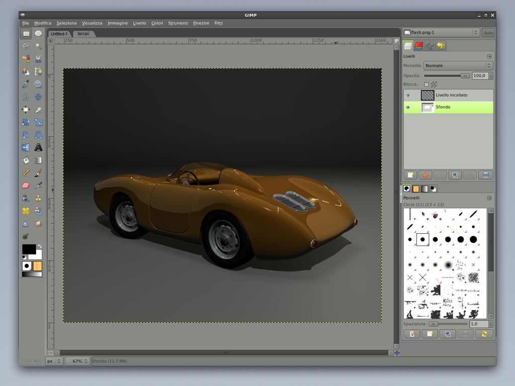
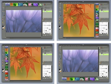
With the world fifty–fifty split, we will serve them with one switch in the Windows menu, switching between multi‐and single‐window mode. I used the mock‑up with the beautiful orange sports car from the brainstorm to demonstrate the basic idea (no real UI design implied here).
When set to single‐window mode, each document will appear in a tab:

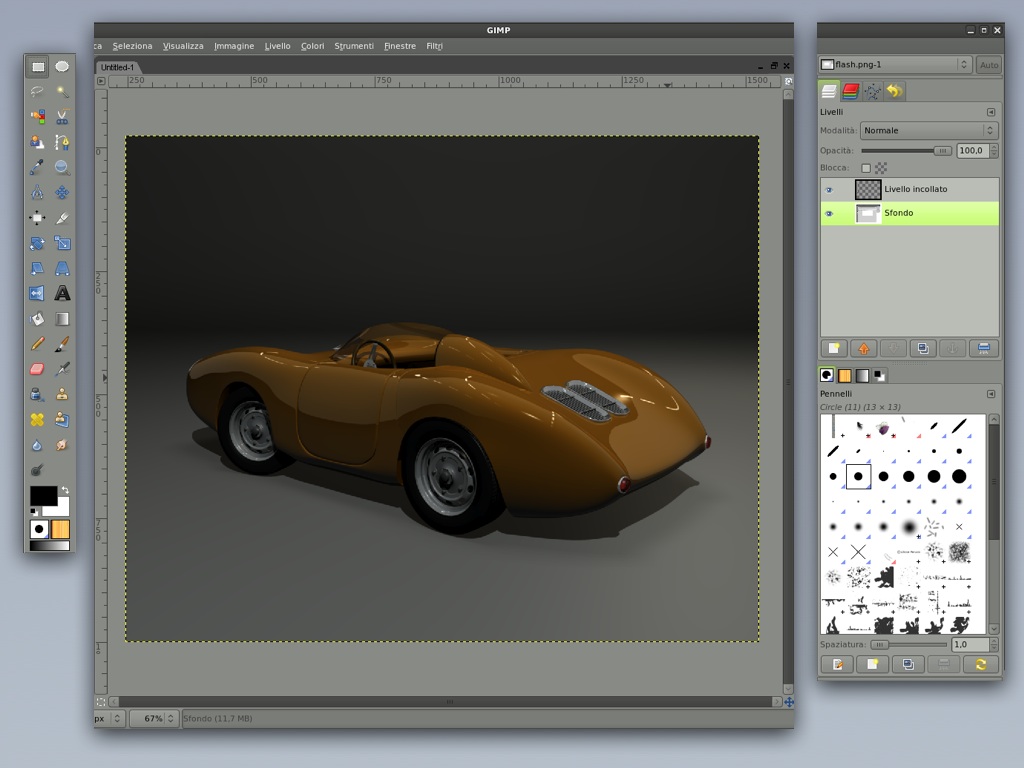
the toolbox and inspectors can be ‘torn off’:
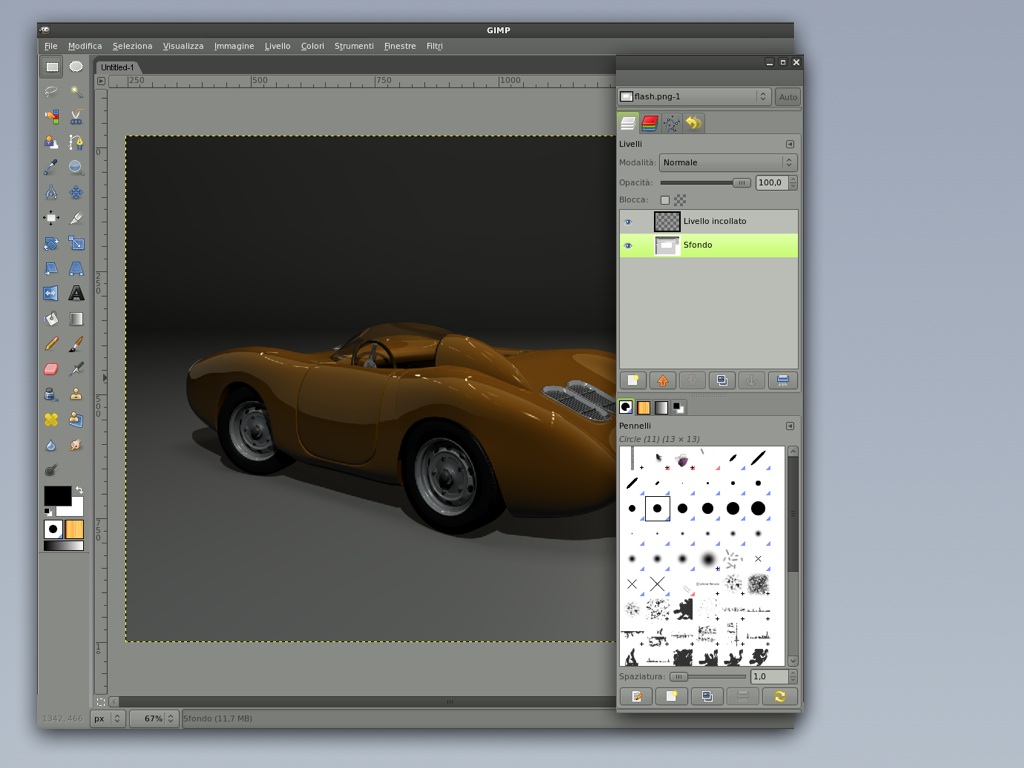
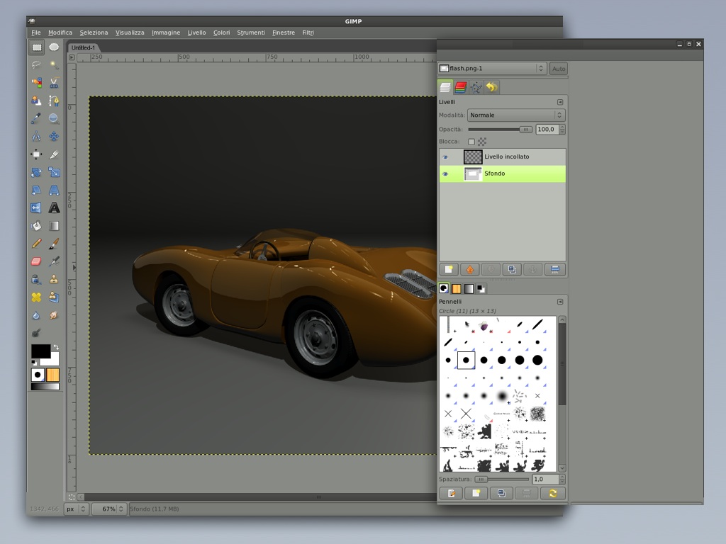
here the toolbox is side‐docked back and it is shown how the inspector floats:
and last, inspectors can be made multi‐column. Here, another column has been created to allow more dockables to be organised:
The eagle‐eyed will see that there is quite a bit of fudging in those images, so don’t sweat the details.
three problems
I closed off the talk with three things that were bugging me at the time:
- no tab tear‐off
- tearing off a tab and making that into a separate window—as seen on web browsers—would make our single‐window interface into a multi‐window interface. How annoyingly inconsistent.
- no side‐docking, to multi‐windows
- both toolbox and inspectors are unique for the application and by nature there are multiple window instances. That means it is unnatural to dock the toolbox and inspectors to windows. It is however possible to introduce multi‐column inspectors for multi‐window mode.
- no image comparison
- With tabs, only one image is visible at the time. Thinking about clever plans to see two images side‐by‐side in split panes, one sees immediately the confusion rising: which is the image that the menus perform operations on. Which one is shown in the layers dialog?
tomorrow starts now
So far, so predictable. Here is where the interesting stuff starts. After my talk I had a good round of brainstorming with Martin Nordholts on the tear‐off and comparison problems. The result of that is what I call the polaroid.
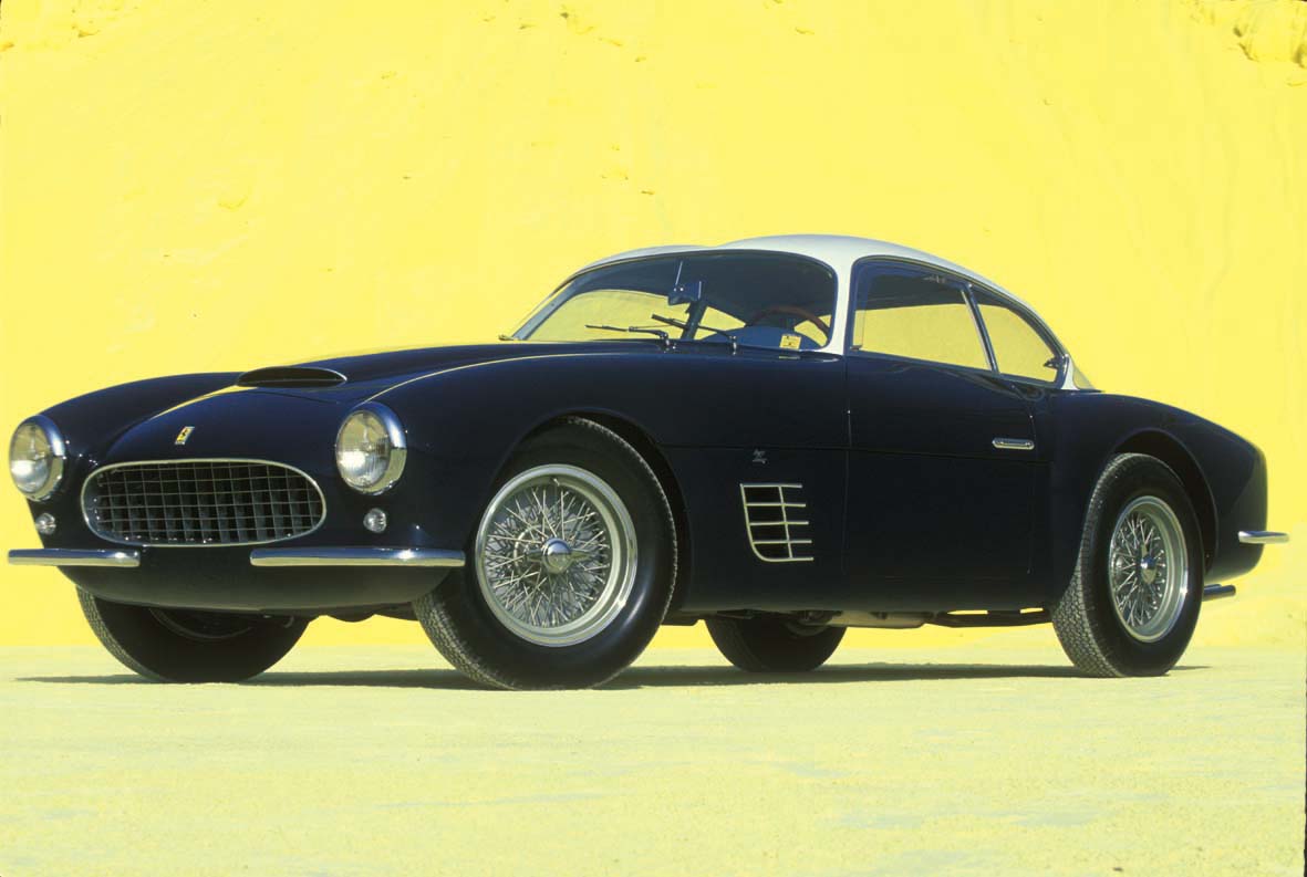
To demonstrate it, let’s say one is still working on that lovely orange sports car and in a second tab we have loaded this image of a cool Ferrari Berlina:
Now we want to compare our orange creation to the Ferrari. All we have to do is to tear off the Ferrari tab and presto: a polaroid of it appears:
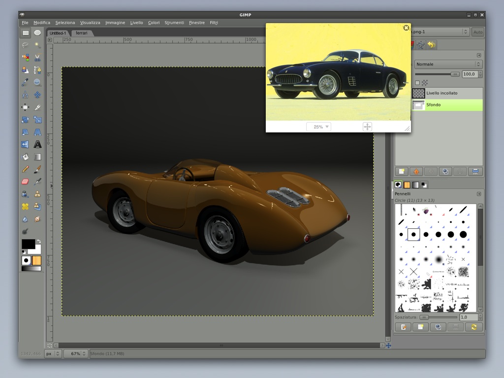
This is not a GIMP image window. It is not even a window, the window manager will know nothing about it. We avoid making it look like a window, down to ignoring the theme colors and executing the control strip at the bottom in paper white. You can move and resize the polaroid to your heart’s content, as long as it fits inside the GIMP window. You can zoom, pan and look at it, and that’s all.
voluntary confinement
That last point will be very hard to do, because everybody will be thinking of one little feature they would like to add, for themselves. But we have to be strict here to avoid mass confusion: every toolbox tool, every menu item, every dialog (in an inspector) only operates on the front tab—the orange car in this case— and never on a polaroid.
For example, when I discussed these plans with GIMP‐usability contributor Ellen Reitmayr, she asked: ‘so can you then select and copy a bit of image from these [polaroids]?’ Good question. After realising that this would mean interacting with the layer stack and selection tools, the answer has to be no.
It is however possible to open multiple polaroids of the same image. And also of the image in the front tab, where one is working on:

As you can see they can overlap and they will have to have their own stacking order. Just click on a polaroid to raise it to the top. The final thing you can do with a polaroid, is to close it…
the decline and fall of tabs
This is how things were more or less when I returned home from LGM. At that point there were still three things that were bugging me about using tabs in single‐window mode:
- too easy, too fast: the tabs got adopted from web browsers, without much thought;
- it would be rather logical to use a thumbnail on the tab itself to identify the image;
- sign of the times: the web browser folks themselves are looking at solutions beyond tabbed browsing.
And pretty soon I was looking at the image parade you see these days in many a photo app and viewer, mainly triggered by a visual association with a row of tabs with thumbnails on them:
There are some really interesting possibilities, when we replace tabs with that. Let’s try it out:
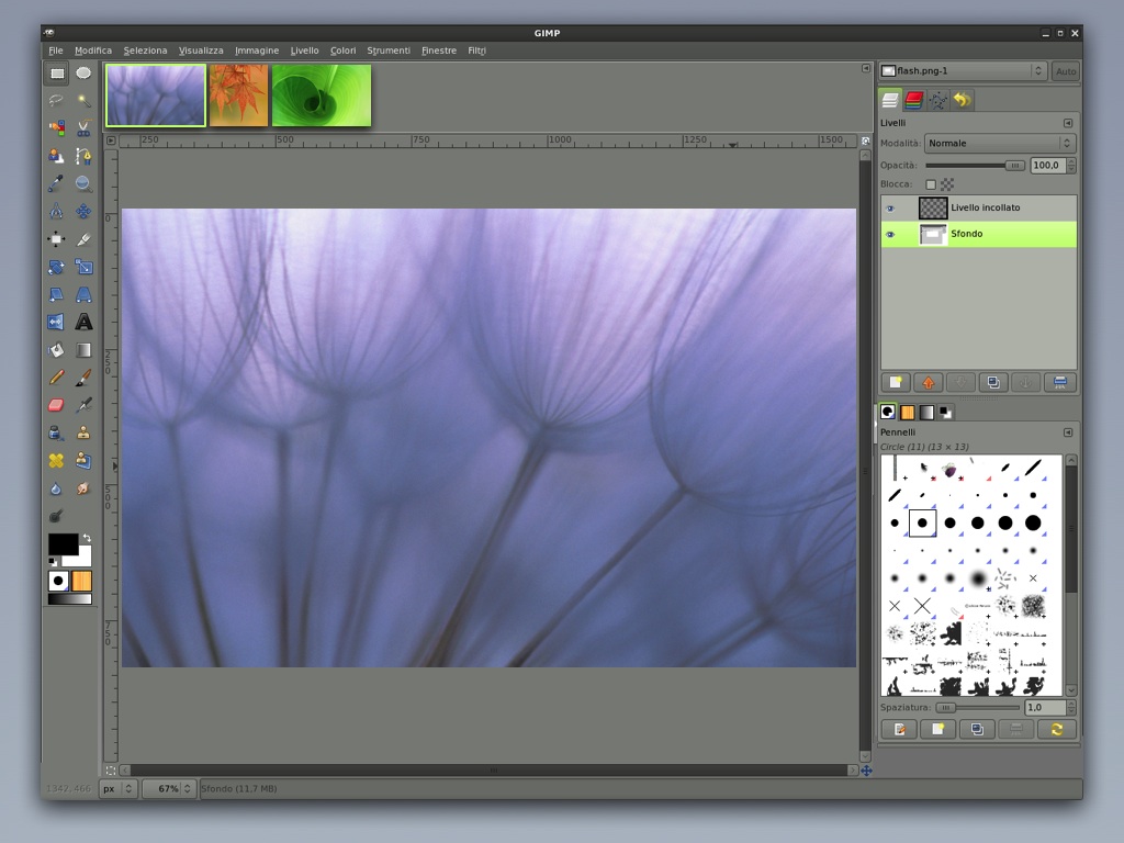
We see three open images and like you would expect, clicking on an image makes it the active image (the ‘front tab’) and dragging any of them up or down enough ‘tears’ it off to become a polaroid. A mouse‐over tooltip will display more info for each thumbnail, for starters: the filename.
history repeating
Now let us go a step further and not only show open images in the parade but also recent files that have been opened or worked on, the history:

Everything is in strict chronological order: open a file and it moves to the front of the parade. What I find very intriguing is that the notion of which file is open starts to blur. Having a file being loaded from disk becomes a side effect of clicking it to make it the current file. Similarly GIMP can decide to start closing files with no unsaved changes when there are too many of them open and memory gets tight.
My current thinking is that it is not necessary to mark files in the parade as being open. The concept quasi disappears for users. The white stars indicate unsaved changes.
One or more graphics files that are dropped on the parade get added—cued up if you want—right after the open files. Just as useful will be that a folder dropped on the parade cues up all the graphics files in it. Current work + history + cued up work + polaroids has a lot of potential, I think.
the Midas touch
I realised that it would be an eyesore and an absolute waste of space to introduce a scrollbar for the image parade. Still, it is going to scroll. It happens to be that in the last couple of years I have been working for two large companies on the interaction fundamental’s of iPhone competitors.
So how about using touch UI? A flick or a drag along the parade scrolls it; a push slows down, then stops the scrolling; a tap on a thumbnail makes it the current file; a flick or a drag of a thumbnail perpendicular to the parade creates a polaroid: it is perfectly doable, using mouse, trackpad or tablet.
non‐preferential customisation
All we need now, is some more flexibility. First, I think everybody will have their own idea what the right size for the image parade is. From pretty small:

to pretty big:

I think any size in between those has its purpose and why could that not depend on what one is doing next? Simply grab the dividing line between parade and canvas and adjust to fit your mood. Next, does it has to be at the top of our window? Left, right and bottom should also work:
I foresee every GIMP user having their own sweet spots, when it comes to combinations of size and orientation of the image parade for the type of projects they do.
raising the dead
It will not be necessary to introduce new items in the preferences dialog for anything I have shown you here. In that light I called during my LGM talk preferences ‘the graveyard of many a good idea.’
For configuring the image parade I have already built in a settings pop‑up in all the screens you see above. The top/left/right/bottom setting will be in there, as will be one for controlling the amount of history. Something along the lines of: 48 hours; a week; a month. And for those who never look back: a setting for no history at all.
red hot anticipation
To wrap up, for about 50% of GIMP users the good news is that single‐window mode is coming, complete with tear‑off toolbox and inspectors; multi‐column inspectors; polaroids; image parade with history and cued up work; touch UI and quick and easy customisation.
And it is coming faster than you’d think. Martin is ready to develop it for version 2.8 and this blog post was hotly anticipated to outline my complete plan.
For a different 50% of GIMP users the good news is that multi‐window mode is here to stay. It will benefit from multi‐column inspectors being introduced. But I actually expect that once single‐window mode is out there, there will be pressure from the community to have a look if multi‐window mode cannot be done a bit more, well, modern.
Labels: design stage, GIMP, GIMP redux, lecture, practical

![]()
![]()
86 comments · post a comment
- at 18 September, 2009 19:34,
 Unknown commented
 - Great post as usual. A random "blurted out" thought-- maybe people should be able to have many histories? I don't know anything about graphics people, but it seems like they might have one set of images for one project, and a completely different set of images for another-- if people really do do this, it might be annoying to have them all mixed up. Maybe "no history" setting+project files? Just a radom thought, blurted out.
- at 18 September, 2009 20:10,
 commented
 - Great job! I look forward to see it implemented :-)
One idea: wouldn't it be better if those history tabs be a little faded (so it would be obvious which tabs I'm currently working on)? - at 18 September, 2009 20:31, RobA commented
- Would the "Polaroid" replace the "New View" functionality?
- at 18 September, 2009 22:29, commented
- @M.: Isn't the "current image" equivalent to "leftmost thumbnail"?
- at 19 September, 2009 00:48, Nemes Sorin commented
- Well, talking about "image collection widget" position and layout - the vertical layout for images thumbnails will be a better solution keeping in mind that all computer screens go to the widescreen paradigm (16:10).
Also this way you can have 2 or 3 columns there without worry about space. At least horizontal scrolling (for horizontal thumbnail presentation)is a bit unusual and not very handy. - at 19 September, 2009 09:01, Unknown commented
- Some really great ideas there. Can't wait for 2.8 to be released.
Need some clarification though. You can't have two images open at a time? I like to drag a layer from one image to another image. Doing this from the drop down thingy on top of the layers dialog when you have ten images open is a pain.
Also, you can tear of the toolbox. Can you also tear of the image? Would be great to be able to focus on an image anywhere else then exactly in the middle of your screen, while still being inside the application. Currently I tend to sometimes click next to an image and loose sight of my image because I just clicked inside a different application that I had visibly open next to GIMP.
Being able to tear off images to make them float on top of the GIMP single window would have great advantages. It will give you the flexibility of a multi window interface but without the disadvantages of accidental clicking on another application and loosing sight of GIMP and without cluttering up your taskbar. - at 19 September, 2009 09:45, Unknown commented
- I think that users need a one, single window GUI and that means everything except window with your image/project(because it's very useful that way).
Images,painting area,whatever you call it, should be placed in separate windows, but these windows should be still sticked to area between toolbox and other panels.
It should look just like in every good program. Static tools, projects in windows(so you can compare them etc). Don't try to be original, it won't work. GUI should be user-friendly, it's that simple.
IMHO your idea of single window GUI is misinterpretation. I think users want static panels, that's all. It doesn't mean that something can't be windowed.
In that case, I find polaroid function nearly useless.
I don't want to be rude, but GUI is the most important thing to me, it should be designed to be useful.
If you won't allow users to move, resize, place many windows with images in one window of GIMP with static tools, it will be a huge mistake. - at 19 September, 2009 11:22, commented
- Very nice development!! I have been waiting for this for years! Now it is going to be fun and more fun to work with GIMP!
But I don't understand your concerns against split window editing. The half that is active simply gets a red box around it, and all actions go there... and by clicking into the other, it is made the active, red framed one.
Think of cloning a bit of one image to another image. Good with tabs, better in splitview. - at 19 September, 2009 11:23, commented
- P.S. if you made color-picking full screen aware (means you can pick any color on the whole screen whatsoever), you could use polaroids to pick colors from, without having to hassle with their source code. Like that idea?
- at 19 September, 2009 14:41, Unknown commented
- I'm afraid I'm gonna have to agree with wiorys. Although I like the polaroid function for just viewing, but think it's a bad idea not to be able to have two or move windows open in your workspace. Workflow should be far more important then sticking the the technical meaning of "single window"
Love the other ideas though, tumbnails instead of named tabs gets the thumbs up from me. And being able to dock docks next to eachother is great too.
Keep up the good work. GIMP is great and I appreciate it every single day. But please think about having the option to float windows in your workspace. Like I said in the mailing list. An option to rightclick on an image and have both "polaroid" and "float image" as possibility would make the interface just perfect. - at 19 September, 2009 14:42, commented
- You can already pick color from any point of the screen. Just try :)
- at 19 September, 2009 14:58, Unknown commented
- I'm sorry, about my previous post, I'm meant to say that I'd like the option to rightclick on a thumbnail and have both "polaroid" and "float image" as possibility.
To Anonymous,
The eyedropper that you can see in the window that pops up when you click on your foreground colour is able to pick any colour on the screen. Really handy feature. - at 19 September, 2009 16:39, Unknown commented
- first, thanks for all the comments, I am happy to see the topic have this resonance.
@M.: as I wrote: I am really interested in exploring the blurring of open vs. closed. but as rubikcube wrote: the stuff you work on would always be ‘at the front’ of the parade, but the thumbnails would not jump around all the time to be exactly the first in the parade.
@RobA: true that ‘New view’ would be rather odd in single-window mode, it would create a second editing window. remember however that a polaroid can only be looked at…
@Nemes Sorin: you are right in the real estate department, still ‘top’ looks to be the best default to me. having a setting in our config menu for 1, 2 or 3 rows/columns (depending on orientation) of thumbnails would be good, I think. thanks!
@jolie: copying layer to other images will be as easy as picking the layer from the layer stack of the current image and dropping it on the thumbnail of another image. If the latter was not open yet, it will be on-the-fly. you will also be able to build your own asymmetric window layout with the image off-centre, as you wish.
@wiorys+jolie: if you like multiple edit windows then we already got a solution for that: multi-window mode. actually it looks more like that you are asking for windows-in-window. that is not going to happen for GIMP. - at 19 September, 2009 17:22, Finn commented
- Very interesting ideas indeed!
One question: what will happen when you click on a thumbnail of an image that has been deleted/moved? - at 19 September, 2009 17:36, Tom commented
- Gimp is notorious for taking one out of flow, and this will be a plus towards Gimp as a professional tool for artist/designers.
I figure as long as one can drag content(layer/s) from current image to the tab/thumbnail to transfer layer/s to another image. as for cloning from one image to another could it be done by a preference in the tool option? or a ctrl+tab image switcher? - at 19 September, 2009 18:34, DarkRaid's Blog commented
- Can't wait for 2.8
- at 19 September, 2009 22:59, Waldir commented
- there's a typo on the post: where it says "(...) start closing files with no unsaved changed" -- that should be "changes".
Also, regarding the 50-50% division of people in the GIMP community wanting the single-window or not: I suspect that there are quite a lot of people who currently don't use GIMP, but would if it had the single-window mode -- I am one of those. I'll be looking forward to try out the 2.8 release! :) - at 19 September, 2009 23:03, Unknown commented
- I love all those ideas, they're brilliant!
Except one thing, why not window-in-window? You could make it exactly like what you've described by maximizing one of the sub-windows, so there's no disadvantage at all from a user point of view. The advantages are
1) simplicity - if you want to see four images tiled that's something users familial with windows already know how to do, why add a whole new elememt (polaroids)
2) window-in-window would allow locking of zooming and scrolling, so that while you zoom and scroll around the active image window you could have that locked to zoom and scroll around anotehr image, something you were using to help with the active one. That would be /very/ useful, if you stick with the polaroid idea I would still love to see a feature like that
3) speed - after doing something on one image and getting it just how you want it, it's nice to be able to quickly move to another image and do the same thing on that, still being able to see your previous image to remind you what to do. Say you were doing this with just two images, with the polaroid idea you'd either have to have polaroids of both of them open all the time, even when your'e in one of them, or you'd have to keep closing and re-opening polaroids each time you switch window.
Basically, and this is the gist of my post, I don't see why we need to lose one of the few advantages of the multiwindow layout when we make the switch to single window. Why not have window-in-waindow, given that by maximizing a sub-window you can have the same single-window interface you've described, without losing the one multiwindow advantage?
I'm sure you've thought about all this, so I doubt my thoughts will make any difference, and I want to end by saying I love the rest of the ideas there, and I very much appreciate the work you're putting in! ({)GIMP(}) - at 19 September, 2009 23:56, hellocatfood commented
- I agree with some of the people who basically just want windows within windows, but as long as this proposed UI works as good as or even better than windows within windows then I, and many other people will be happy.
- at 20 September, 2009 00:20, commented
- Very professional and elegant ideas -- I haven't been this excited about the GIMP for a long time. Keep up the excellent work!
- at 20 September, 2009 02:15, commented
- Seems like you are "getting your knickers in a twist" trying to achieve a single window interface.
Has such a strict single window interface ever been done before? If not my guess is that there is a reason for it not existing...
Window management should be done by the window manager. Confusing the issue with complicated app specific setups is only rarely worth it (Blender)
I'm looking forward to seeing the experiments though. Hopefully the results will be amazing! - at 20 September, 2009 04:04, Marc Fearby commented
- Excellent idea. I can't wait. Managing the multiple windows in the GNOME taskbar is a mess at the moment.
It would be nice if you could "split" the main display area so that you could easily switch between two images that are visible at the same time. Maybe clicking on the grey area around the image would focus it (thereby changing its colour, as well as highlighting its corresponding thumbnail in the "parade" of images).
And if you're working on several smaller images, you could further "split" a pane into smaller chunks (say horizontally instead of vertically, or vice versa to the main split) so that you could see several images at once without having to switch the entire view to that small image. - at 20 September, 2009 12:56, Unknown commented
- Please, think to the users with laptops and the reduced space (15 inches).
Thanks. - at 20 September, 2009 13:36, Johannes commented
- Excellent post! I wonder if it will be as fast as you say to implement, but anyway: it had to be done.
Thanks a lot for this, it will not only be great for many existing GIMP users, but also for migrating users.
I look forward to see it! All the best. - at 20 September, 2009 15:39, Unknown commented
- another round of replies.
@sam: the trick is to make the deleted images not appear in the parade. this does mean sorting out the moved image issue and what to do when images ‘return’: disk or servers where they reside get mounted again.
@Waldir: thanks, corrected.
more in general: there seem to be two major thrusts of feedback and they are ‘why not windows-in-window?’ and ‘can we work on images side-by-side?’ I will take that discussion over to the GIMP developer mailing list and seriously look at the user requirements behind these questions. you can help me by leaving in a comment here why you need windows-in-window or work-side-by-side . thanks… - at 20 September, 2009 15:49, commented
- I see a few flaws with your 'image tab' design.
What if the user has opened several revisions of a similar document, or has created a version for editing in an external program, or has created and saved different versions at different resolutions. With your current tab concept there is no easy way to tell the difference between them since the filename is not visible. This makes the design get in the way of a relatively natural workflow.
Secondly, if you're working on an extremely big document, I can see a potential frustrating user experience if Gimp tries to close that large document every time you switch tab to save memory, and then reopens it again, requiring a long reload from the disk. As such, you probably need to have special behaviour for large images to prevent such frustration.
Finally, a see an issue for people with low-resolution screens as the tab concept will likely take significant space that makes any usage of the application very difficult. Perhaps if the size of the split top section is small enough, it switches to text-only faux-tabs? - at 20 September, 2009 16:02, Unknown commented
- I like to work on multiple images side by side (hence my desire for WiW) because often I'm creating sets of images and I'll want to do the same (or very a similar) thing to several of them. The workflow going something like this:
-Image 1 and Image 2 (it's often mroe than two, but I'm using two in this example) are part of a set, I want to do a change to each one, and they need to match.
-I do something to Image 1
-When I'm happy with my change to image 1 I move to image 2 and do the same thing there (so I need to be able to see image 1 to replicate what I did)
-I might not be happy with exactly the same change on image 2, but I still need them to match, so I do something a little differnt on image 2, then move back to image 1 and do the same thing there and see how that works, and keep going between the images making (and replicating) little adjustments, until eventually I'm happy with the same change on each of the images I'm working with.
So that's why I like to be able to work on two or more images side by side.
If that could be enhanced by simple things such as locking the scrolling and zooming between two or more side by side images, that would be great.
Oh, and imagine if you could link a layer from one image to others, so that changes in one appear in the others in realtime? OMG that would be awsome!
While I'm on the subject, is it possible to grab a bunch of commands from an image's undo history and apply them to another image, or make a macro out of them? If not, that would be ace too. But I'm going rather off topic here aren't I?
By the way, I absolutely love the thumbnails, there is nothing I would change about your proposed implementation there, the history function, the lack of differentiation between open and unopen files (would require some thought to intergrate with WiW, with I haven't thought about, but I love it anhyway), the stars indicating unsaved changes, it's perfect! - at 20 September, 2009 16:59, Unknown commented
- Peter,
You want examples, well.. I'm a woman, I multi task. ;-)
Seriously, a real life example.
I was creating two collages of polaroids (the old fashioned ones, lol). One for a mother and one for her daughter. They wanted some of the same photos in it and some different ones. So I was creating them at the same time. Doing one thing in the first image and the same in the other. Sharing layers between the images, of the polaroid frames etc. Rotating and sharpening the photos with the same settings. Comparing and working on them side by side.
Hope this helps. :)
Jolie - at 20 September, 2009 18:05, Siegfried commented
- Working "production" with images, I have to agree with mazz0 100 percent.
Often I'm working on graphic ideas which involve working with as many as 12 to 15 images in the same window, switching back and forth over and over from one image to another while making use of zoom in three images and using a fourth for comparison, etc. etc. etc.
The Gimp should be awesome, fun, attractive, but as a graphic powerhouse also able to reduce time on heavy graphic workloads. And that only works if the user is able to open numerous images within a single open window while using those images any which way. So why not introduce something that most professional graphic "windows" applications use, by permitting the user to import or open numerous standard images within the application in order to work on those images as though that open application was a desktop?
No, this isn't already working since currently all of the gimp images have an entire menu attached to each image. Sure, the menu should be accessible at all times, but wasting precious desktop space by including the menu with each image is redundant. Once Gimp opens in a single window you'd only need the single menu ... in an environment where many graphics can be used simultaneously. Geee, I hope that I was able to explain this good enough.
I haven't used Photoshop in about 5 years, but as far as I'm concerned, Paint Shop Pro version 9.0 (later ones too) was perfect. It gave you a single window with all of the tools that anyone could ask for. To save on time it was possible to browse entire image archives with the built-in browser, right within the Paint Shop Pro application that was open on the desktop. Then the user could chose 1 or 5 or 10 or however many images, hit the enter key, and booom, all of those selected images opened up within th single windowed environment. And only *THEN* would the user decide how many of those should remain open by default, minimized *WITHIN* the already open application, etc. Now *THAT* was perfection, from the point of view by someone who works with images all of the time, pretty much daily. Thanks for listening, and greetings from Germany.
. - at 20 September, 2009 19:33, Unknown commented
- I was thinking about how the open/recent thumbnails would work with WiW, I suppose it's pretty simple - the GIMP would handle the closing of minimized internal image windows, but windows currently visible would always be open.
I don't know if you'd want to consider closing images that weren't manually minimized by the user but are hidden by a maximized internal image window... I suspect you would, since it would be so easy to get them back, and you would be getting rid of the oldest first... - at 20 September, 2009 23:12, commented
- I cant believe I'm seeing all these arguments for on of the most criticized aspect of MS Windows... the confusing window management (just try/compare Word & Excel with multiple documents).
Recent Gimps are excellent, one icon in the tray for each image no more no less. Move, compare, arrange in whatever way you like. Dual screen, single screen hexa screen no problem.
How many of you people are windows users? Gimp is less good on windows for sure. - at 21 September, 2009 07:33, commented
- I like the plan you laid out. looks good.
p.s. please don't add windows-in-windows like some people are asking for!! - at 21 September, 2009 09:19, eduperez commented
- Very good ideas (and very good photos, BTW).
IMHO, those screen-shots are exactly what I need. I use GIMP primarily for photo retouching: the tab system is acceptable, as I rarely ever do more than one photo at the same time; but gaining as much usable space as possible is really important to me.
Just my two cents. - at 21 September, 2009 10:06, commented
- native mac os x build?
- at 21 September, 2009 10:59, commented
- Wow, I'm glad that gimp making the UI more standard conform. I hated the multiwindows interface and didn't use gimp because of that. If we have the possibility of one compact UI, I will switch to gimp. I would love it. And the Mockups looking great. I will install Gimp on my MAC. :-)
- at 21 September, 2009 11:55, Unknown commented
- Great news. As petty as it may seem but ONE window as an option for whole gimp is great. People could now choose what they prefer.
I know a few people who prefer either way.
Personally, I always wanted one window because I couldnt learn to use the several windows (but actually I used Gimp quite a lot and it didn't distract me anymore.) - at 21 September, 2009 14:33, Unknown commented
- more answers:
@: Oliver: the similar-image issue is noted. about small screens, in this examplethe parade was fitted exactly in the space of tabs.
@ the rest: thanks for the input. - at 21 September, 2009 15:04, commented
- Thanks for such a nice details and awesome work..
I have few suggestions and questions..
1. How about making that thumbnail preview/tag dynamic. From dynamic I mean, when we hover the mouse over the area that thumbnail portion shows up else it remains hidden or maybe a small arron pointing up to make them active ?
Secondly where is Tools Option ? I cannot see them in any of the screenshot /?
Will these changes reflect in 2.7.1 ?
Rest fine :_Keep up the good work :)
Regards
Shashwat - at 22 September, 2009 04:44, Unknown commented
- Wow, thanks for letting us know. I like the ideas mentioned very much. Thanks also for keeping the "disjointed windows"-interface alive!
- at 22 September, 2009 14:25, Siegfried commented
- Okay, I hope this is permitted. I've created a bunch of images that I think will show cleary what all of the "hoopla" is all about, as far as having a windowed image application is all about. The final image shows me working with gimp, or rather, a gimp screenshot with images on my desktop. Here we go ...
http://www.accesspurple.com/psp704a_openapp.jpg
http://www.accesspurple.com/psp704b_browse_select.jpg
http://www.accesspurple.com/psp704c_mininside.jpg
http://www.accesspurple.com/psp704d_double_resize.jpg
http://www.accesspurple.com/psp704e_megatools.jpg
http://www.accesspurple.com/psp704f_savescripts.jpg
http://www.accesspurple.com/psp704g_previews.jpg
http://www.accesspurple.com/psp704h_contextmen1.jpg
http://www.accesspurple.com/psp704i_contextmen2.jpg
http://www.accesspurple.com/psp704j_manyfonts.jpg
http://www.accesspurple.com/psp704k_pagecurl.jpg
http://www.accesspurple.com/psp704l_gimpscreen.jpg
Don't get me wrong, I love the Gimp !!! However, there's a major difference between doing professional work on an image by image basis, or performing production work all of the time, with numerous/many open images. Both types of work can be considered professional, but the user who does image work on a production level also requires things to speed up the production process. A windowed Gimp with functions as shown in the now defunct PSP704 application would enable users like myself and others to perform production level ... QUALITY WORK ... quickly, on a constant level.
Greetings from Germany - at 22 September, 2009 14:46, commented
- I think it would be nice to have an "Open" icon on the left or on the right of the parade.
That would make it more obvious and save one click of the file->open.
Maybe also a paste button if the clipboard contains a picture. Showing the contents of the clipboard straight as a thumbnail in the parade would probably have serious performance problems.
Otherwise probably two editing windows, duplicating all the gimp GUI (tools and so on) would probably be needed if we don't want to go too often to multiple-window mode (if nothing else, cloning - within one image or between two images). If that doesn't exist I'm afraid single window will be "for newbies" and multiple window "for experts" and i don't think it should be like that (many photoshop users are not newbies ;-) ). - at 22 September, 2009 15:33, Siegfried commented
- QUOTE - If that doesn't exist I'm afraid single window will be "for newbies" and multiple window "for experts" and i don't think it should be like that (many photoshop users are not newbies - END OF QUOTE
I really don't believe this to be an appropriate or a fair assessment. I've been working professionally on images since 1992, even won 4th place in a global internet art competition once. For me (and I imagine others as well) the bottom line is simply that a lot more can be done faster ... if there's a frame that surrounds the image application, i.e. a frame that can be filled with dozens and dozens of symbols, to include ones with personally customized functions which would be included/docked permanently (if desired) in the framed portion of the app, so that absolutely nothing could ever obstruct any of the work being done within the app.
I really don't appreciate the above comment at all. To me, utilizing text tools which won't permit me to set the point/pixel size in advance, is absurd ... especially in light of the fact that in Ubuntu 9.04 any text that goes beyond the frame of the image is also cut off in reality. Sure, being able to memorize keyboard shortcuts over the course of 6 to 12 months is nice, but it's just as nice to be able to "dump" all of the required commands within the frame of the app. Oh, and what about those folks who aren't geniuses? They might not be newbies at all, just not so smart, and for them such symbols would be a great relief too.
The main argument that I have for a single, all encompassing framed application, is the fact that the frame surrounding it can be used far more productively than toolbars that are docked individually. And by the way, depending on the flavor of Linux, those toolbars may not stay where you want them either - or there aren't enough options for docking - or images tend to vanish behind open toolbars requiring them to be dragged out, etc. etc. etc.
With a single framed app., such problems could be permanently avoided too. It's all about productivity, and not whether you're a newbie just because the single framed version of an image application is your preferred way of working. Here's another example ... I've been wanting to switch from Windows to Linux for around 8 years now, but because Gimp wouldn't function like my 499.00 USD professional Adobe Photoshop application, I refused to make the switch since I didn't have the time to completely relearn and readjust what I've been doing. Learning all of the commands over is one thing, but having to completely relearn the manner of working with images at the same time makes it even harder. Both together a reason for many people not to make the switch to Gimp and/or Linux.
Greetings from Germany - at 22 September, 2009 15:37, commented
- Ooops ...
Sorry about that. Misunderstood the portion that I quoted. Geeez, feeling like a dork in chilly Germany. ;) - at 22 September, 2009 22:24, commented
- Multiple windows are great with the scale plugin which comes with the window manager. I dont wanna loose it. I already lost that thing: Gimp is open without any pic: 2 windows. When i click on the empty picture window for closing it (x), the WHOLE gimp is closing! What for? I do not need the option for a picture displayed, when no picture is displayed. I need space to dragdrop things on and from my desktop or my browser lying the whole time behind the pics. I hate that...
And why the toolbox has to be on the right? I want it near my layer window. Or not displayed, when Im drawing. I need space for the pic and infos of the colormanagement, position and dimension! Furthermore I use the shortcuts more often. I wish I could hide the toolbox somewhere in my "for all the other stuff I only wanna see, when I need it"-window.
Put the pictured recent history idea is cool! *thumbs up*
btw: When I dont need Gimp for a short, I change my virtual desk. Cant see the point, whether it could be messy on the desk with all the other progs...
Oh, I took two pics of my Gimp handling. The first: What did you see. Any mess?
http://img182.imageshack.us/img182/6586/bildschirmfotoo.png
The same virtual desk only a few seconds later:
http://img182.imageshack.us/img182/6586/bildschirmfotoo.png
All those pics and while running a browser (8 tabs I think), messageing and a little pic viewing software (will you find it? *s). Yes, on a one year old netbook. One window is the past. And Im a pro and non of my agency collegues are using one window like that one in the screenshot from the blog post. ;)
Pls think about it. :) - at 23 September, 2009 00:03, commented
- Oh... We still have a thumbnailed history. O_o
http://img87.imageshack.us/img87/5177/bildschirmfoto3r.png
3 version, u see?
Or what feature do we talk about here between the other stuff? *little bit confused* - at 23 September, 2009 00:21, commented
- awww, I messed up the links on comment 22:45
The second example should be this:
http://img225.imageshack.us/img225/5161/bildschirmfoto1t.png
:)
And this currently came up to my mind. How you draw on your real desk? Do you have one pencil and there lying some seperate drawing papers and you take this one to the front, where you want to draw on? Or do you have as many desks in your room and as many pencils for every single paper you work on? ;) - at 23 September, 2009 14:29, commented
- How about splitting the image pane like blender (click on border etc.) and if split focus follows mouse, drop and drag parade/thumbnails/tabs and allowing multiple instances of same image and slit pane arrangement like the Adobe Creative suite app framework (isn't this a single window workflow with floating panels)?
- at 23 September, 2009 17:08, commented
- I don't understand why people would be *against* windows-in-window... If the internal window is maximized, it makes no difference at all.
windows-in-window is necessary because otherwise, the multi-window setup is the only setup that would allow comparative, parallel work, and that would be a bummer. - at 23 September, 2009 18:01, Unknown commented
- more replies:
@Shashwat: tool options: yes, conveniently out of the picture in these mock-ups. we will have to suffer with them a bit longer until I get a plan together to get them out of the way but equally or better usable. - at 25 September, 2009 04:15, neuromancer85 commented
- I know that I'm a bit off-topic here, but are there any plans to add the "gimp-painter" patch in Gimp 2.8? I think it would be another great addition :D
http://sourceforge.jp/projects/gimp-painter/ - at 25 September, 2009 11:30, commented
- This is really great - very special. Can I have it now, please? ;-)
- at 03 October, 2009 07:36, commented
- I want single window mode for a long time !!!
I can't wait!!!
Thanks a lot~ - at 05 October, 2009 14:35, Unknown commented
- I think it has all been said before, so I would ask for the option of tear off palletes (for different situations, image sizes and times of day! - flexability = power and happy users!)
The different workspaces that PS has these days, with configurable customized workspaces is very handy.
the default workspace is very nice when you want order back!
The single window is very handy, if you have alot going on (i have revit, autocad, 2 or 3 firefox and a few image browsers open generally) if i hit minimize, i want it gone!
same applies to switching screens, full screen or 1/4 screen - you shoulnt have to chase each pallete PS CS4 is nicely flexible in this respect(not perfect - your idea of the preview image is great, probably better than PS's tabs, but why not allow the preview images to miniize to a tab?
just more happy users on superior software THAT RESPONDS TO USERS REQUESTS!
On the note of easing the transition for the new (potential) converts, why not have a Photoshop Style workspace, while we are at it, Corel draw and any other big shots.
If i can show the guys at uni a nice, free alternative to PS and Vista, that they can jump onto and get work on just as fast, or faster then they are sold, and wont look back!!!
If they cant find anything, non of the tools work in the expected way and when you move/minimize it, it leaves crap all over the screen, they will walk away to their pirated PS - We have 2000 architecture students at uni and less than 2% would have paid for PS.
I believe that given the number of google hits on "Gimp Gui improvements" the Gimp community needs to rethink its approach to majority of future user's needs - Ubuntu has been quite sucessfull with halting the developers from scoffing at the users, hence its recent sucess -
The consequences in the big picture is this stubborn stance is preventing hundreds of thousands of new linux users from making what should be a baby step.
The options you explored were interesting, but remember usability and flexibility - some of us have 15 minutes to patch up an image and email it off, while our colleages wait 'caus the office is off to the pub!!
Great job, looking forward to the next release - perhaps a photoshop, corel etc compatability choice during install? that would be nice ;) - at 07 October, 2009 17:35, Fabian commented
- I have to agree with all the people defending the idea of "windows-in-window" functionality (even if these are not real 'windows' but rather 'delimited work zones' for different .xcf files opened at the same time.
Single window, single global workspace = great, thanks, waiting for it for a long time, now !
But still...
Windows-in-window should be... one single window IF (one of) the internal window(s) is maximized.
If not maximized, windows-in-window would indeed be perfect for parallel and comparative work, so everybody is happy ! - at 08 October, 2009 11:19, Unknown commented
- Picture window independent menu in tool window is essential for texturing of my 3d animation pipeline. Many new texture documents are created (*.psd) or opened from 3d application and closed by Meta+F4. As i have many textures opened, i cannot to keep watch how many pictures are opened when i am closing window! So GIMP 2.4 multi-window management is still my one chance.
- at 09 October, 2009 18:11, VeggieT commented
- Good work, I can't wait til there is a single window system implemented. A few points I should like to add.
1. I agree with people that there should be a way to instantly change the window layout, rather than having to peel off, stick on etc...
2. A modern modern update of the multi-window might be an option to have "no-overlap" which would prevent the toolbox and dialogs from covering the canvases
3. I don't like the idea of history being included in the thumbnail bar, it doesn't look professional, but I would rather have my history be in one of the dialogs. I do however like the Idea of projects that would allow you to load multiple images of versions into the thumbnail bar.
4. multiple images. Why can't the canvas have multiple styles, 1 image, 2 image, 3 image, and 4 being the options. each images would be able to be 'in focus' or 'out of focus' to allow editing on only one image at a time. and it would be simple to drag and drop the images from the thumbnail list into the various canvases. this would allow not only image compare, but also copying and pasting type actions...
just a few thoughts - at 11 October, 2009 12:07, commented
- Single-window Gimp, a dream becoming true :-)
I understand that people used to gimp and using multiple monitor may like the current multi-window interface, but I think that occasional users (like me) would highly prefer a single-window interface, - at 16 October, 2009 09:47, commented
- I am wondering how this will working with a tablet in fullscreen mode? I would like to see a small turnbutton on one of the screencorners like in artrage that could be activated with the pointer device (stylus) without keyboard. thanks
- at 23 October, 2009 06:45, lankythoughts commented
- Warning: wild brainstorming: ;-)
About the polaroids:
The polaroid feature, though quite innovative and out of the box idea(the type I love and live for), has one major drawback:
How many basic users use more than 3 elaborately interdependent images (like when you edit theme files/ complex website mockups, etc.) ?
It is easy to compare if there are only two or 3 images, even without the polaroids. But any more polaroids, bring back the same sort of problems as Multi-window interface: As can be seen in http://www.mmiworks.net/pics/blog8/lgmmultipolaL.jpg , the Polaroids will start covering the other elements of the UI. *Horrors*. Of course you can easily drag them around. But where will you drag them to? You have to drag them over the image you are editing, if it covers the image you want to compare it to, whats the use of the polaroids?
Of course, one possible solution which avoids all these is "shortcut key". A quick short cut key that switches the polaroids on and off But what about Tablet users?
Okie: Now for some slightly off topic brainstorming:
What sets ideas apart is that some people are occasional users, and others pros.
The occasional users want simple "everything basic visible", and imitate real life workflows. But as you go towards the "pro" title, you get used to the level of automation and flexibility offered by a computer and want to make the best use of it. Thus, different disireable workflows emerges.
One of them I seriously would like is what I would call a "pouch" or a "pocket". A pocket would hold just about anything: Tools, tool presets, colours, gradients, menu items, probably even a few tool options!
For even moderately long and complex editing projects, the pocket would quickly fill with often used items. The number of mouse movements and clicks required to get to the item would come down drastically, navigating to other dialogs, inspectors only when necessary. Different saved pockets will help quickly get required tools for particular projects or scenarios. - at 31 October, 2009 16:17, commented
- Here are two real life examples of how artists work, both which are problematic for using a single window.
I do much of my drawing on a 12" 1024x768 tabletPC in GIMP under Ubuntu. The limited screen real estate, means I work in full screen all the time, and generally hide my toolbox. I would hate to waste screen space on tabs, or anything for that matter. I've tried using the Document History toolbox, and found it rather inconvenient. It's generally easier to find images I need by it's location on disk (File>Open) then by how recently it was used.
Secondly, I work at a company that has a number of artists working in Photoshop with multiple monitor setup. When they are painting they like to use the equivelent of New View, so they have the image they are working on, often zoomed in on some detail on one screen, and a second zoomed out view of it on the other. Using a single window, this would be problematic, especially if the two screens don't share the same resolution. It's also quite common for them to throw all the toolbox, layers etc. on one screen, and have only the canvas on the other.
I'm actually very happy with the interface in 2.6, it works for both small screens and multiple large ones, it's also a great improvement over older versions of GIMP. I wouldn't mind having tabs, as long as they're optional, much like in Firefox (e.g. open in new tab or window).
Siegfried: You don't need one menu per window, you can disable the menus in the preferences (under Appearance), and use right click instead. - at 06 November, 2009 12:59, Wahooney commented
- I like the polaroid idea, but having it totally inert is not a very hot idea. It would be great if one could sample colours and assign a clone/rubber stamp source from one of the snapped images.
This would be especially cool if the polaroid could be rotated and the clone source takes that into consideration, I can dream can't I? ;)
All in all, the changes will be MOST welcome. Your whole Windows user-base will be grovelling at your feet, myself included ;) - at 17 November, 2009 22:25, Unknown commented
- Brilliant... absolutely brilliant...
- at 06 December, 2009 22:13, commented
- Gimp single window, beeerk...!
- at 26 January, 2010 11:44, commented
- Single-window vs. multi-window is a false issue. You're going for an overly complicated solution to a problem that can be solved much more efficiently.
All those people who think they can't live without single-window couldn't actually care less whether an image window is a "true window" or a "window-in-window". What they really want is a single menubar at the top of the screen (or window -- they'll maximize it anyway), detached from individual image windows, and toolbar buttons right under that. The same they have in their browser, word processor, and every other application under the sun.
Just give 'em that. Strip the menu from image windows and append it over the toolbox. Then make the menu/toolbox window wide and low, and place it at the top of the screen by default. Now compare that to maximized single-window with window-in-window. DON'T THEY LOOK EXACTLY THE SAME? - at 27 January, 2010 01:42, Unknown commented
- @Onan the Barbarian
I disagree - we don't just want all the buttons along the top and floating windows everywhere else. We also want a single windowlist icon, and we don't want the distraction of being able to see other windows behind the images we're working on. - at 27 January, 2010 11:25, Nemes Sorin commented
- Mazz0 you say "...distraction of being able to see other windows behind the images we're working on."
they changed that with 2.7 on both Windows and Linux.
You can maximize the main window then all docs will float only over the main window - that's the point.
When you minimize - all windows wil go down, when maximize all windows will maximize.
Some designers and almost all studios use more than one screen for design.
For this case floating windows are like the bread or like the air. - at 27 January, 2010 13:09, Unknown commented
- Yes, but if you maximise one window it doesn't become like window in window like The Barbarian was saying, it becomes like tabbed. If you want window in window style you can't maximise one. Not that gimp's single window interface will support that anyway, which I think is a shame. People will still have to use multiwindow if they want what you want (and I see the appeal), and they still have that option, so it's all good :)
- at 10 February, 2010 02:07, JFC commented
- You wrote:
"Thinking about clever plans to see two images side‐by‐side in split panes, one sees immediately the confusion rising: which is the image that the menus perform operations on. Which one is shown in the layers dialog?"
No confusion. See how Lightroom does it.
No Compare mode would be a serious shortcoming. - at 22 February, 2010 19:28, Rick Yorgason commented
- I like most of your ideas, but not the polaroid.
First, limiting the polaroid so it can only be placed over my image means it's exactly where I don't want it! Not being able to move it to my second monitor is a big hindrance.
Second, I'm not sure why tabs and multiple windows have to be mutually exclusive. They're certainly not in web browsers!
If you implemented the "single-window" mode as you described, but had the option to make multiple image windows (complete with the thumbnail bar, and still editable), that would be extraordinarily useful.
That would make the term "single-window" a bit of a misnomer, but that's already true since you can tear off the toolbars. The "multiple-window" mode should really just be called "Open all images in a new window". - at 06 March, 2010 14:04, commented
- Peter Braunschweig Germany ;-)
I am comming from Imageprogramms like Corel or Adobe, so the multiwindow gui was an unhandy alien for me.
Waiting so long for this.....
Thank you for this solution and your work !!!
DANKE ! - at 08 March, 2010 14:32, commented
- I had great fun reading that you say there was a 50-50 split between having the windows "docked" or having them exist separately.
Yes - there might be a 50-50 split WITHIN the Gimp product, but on the outside market (which is where Gimp should focus to expand) there is more like a 90-10 split wanting it to be docked and following Adobe Photoshop style.
Adobe Photoshop is THE market leader, and trying to distinguish Gimp from the market leader by adding obscure and user-unfriendly interfaces is NOT in the best interest of the Open Source Foundation. - at 15 March, 2010 03:59, Unknown commented
- A great initiative. I don't use Gimp because of all I've read about its learning curve and counter-intuitive interface.
I've also recently starting using Mac OS-X and HATE the un-dockable floating palettes & inspectors. I have both Excel & Keynote open and the *!# palettes stay active when the application loses focus. VERY annoying.
Keeping all the controls inside the application windows sounds like a great idea to me. If you want them all around the edited image, just make your window larger.
I don't see why you want just one editable image in the window, though.
Word and Excel do a great job (yes, I hate to praise Microsoft, but some of the ideas they've taken up are good ones) in managing multiple views of one or multiple documents in one window. The benefits for navigation and dragging to cut & paste far out-weigh the minor overhead of keeping track of which has current focus (it's the one your working in, after all).
Please make the single window to contain all controls a reality, but please don't restrict the application to only showing one editable image at a time.
Then I might use GIMP to edit my several thousand photos rather than Lightroom (which is about the only app stopping me from finally completing my transition to Ubuntu from Vista). - at 26 March, 2010 21:42, commented
- Awesome news. Can't wait for the 2.8 release...
Currently I'm on ubuntu and the single thing that holds me from completely migrating from windows to linux is the image editor. Yes, I don't do really much image editing, but when I do, I like it to be clean and not get in my way. As it is right now, I can't minimize all of the gimp windows (just the image gets minimized, but the toolbox for example remains there) and I can't even see some of the icons on my desktop because of this. Another problem is that I can't maximize the Image window because then I wouldn't see the whole image because of the other windows'. Yes, the current layout might be perfect for professional designers and people with multiple montiors, but I want to thank you very much for thinking about us too. Us people with no multiple monitors, which like to do some image editing from time to time and don't like the program to get in our way when we do.
Thanks again and I hope for the 2.8 version to be release asap =) - at 09 May, 2010 06:17, Unknown commented
- I am throwing my lot in with Windows-in-windows but with caution on the implementation. When I refer to Windows-in-windows, I am not seeking a pseudo desktop. No cascading of the windows or moving of the windows across a MDI application space that was prominent in the brainstorm. However, still multiple windows in the single window space. Our needs for workflow control and customisation needs to marry with functional purpose. Cascading windows is not a functional necessity and contradicts the needs posed by those frustrated by having to deal with multiple windows instead of multiple sheets of paper.
The interface will still be dealing with multiple windows in a window but using the tried and proven methods of split view with adjustable columns and rows. Examples of applications that successfully implement this method are 3D modelling applications and Text editors such as Notepad ++ and others as well as text document comparison applications. The window that all functions are performed upon remains the window that has focus or both windows if the second window is, a) a clone of the first and b) the function operation is not unique to the view. A cloned image could view the same image under different conditions for example viewing in real-time image value and being updated in real time while the other view is being operated on. All contained in a single environment with docked controls as desired with the level of customisation for workflow ethic as proposed.
Keeping control over making the most of the workspace though is needed, so maximised and divisions of workspace is more important than seeing the background of the application where no image editing takes place. - at 10 May, 2010 03:45, Joe Pea (trusktr) commented
- Amazing!
Make sure you copyright, trademark, patent, WHATEVER IT TAKES, the new GUI ideas.
We don't need Adobe STEALING THESE
Get on it!!!! Patent it!!!!
NOW! - at 10 May, 2010 14:34, commented
- The biggest thing you could do to speed up the number of people who would use GIMP, is to build in Photoshop compatibility - For example: Importing PSD files with layers, layer styles, etc.
- at 02 June, 2010 21:35, commented
- You wrote:
"Thinking about clever plans to see two images side‐by‐side in split panes, one sees immediately the confusion rising: which is the image that the menus perform operations on. Which one is shown in the layers dialog?"
Not even polaroids do solve this problem, i'm afraid. Consider a side-by-side arrangement of image and polaroid, like this one. It's only the polaroid's footer that gives a hint about which one is the active image -- this is not much different from the canocical blue frame for marking activation in a traditional split screen scheme.
A crazy thought: throwing out the concept of a 'current image' and placing all images on a workspace might help: this would permit multiple viewports that can be used simultaneously -- without the need for one viewport being the active one. Mockups will follow...
You also wrote:
"tearing off a tab and making that into a separate window — as seen on web browsers — would make our single‐window interface into a multi‐window interface. How annoyingly inconsistent."
Well, with windows being displayed by the task bar, a kind of hierarchical tabs interface is the net result, like this example. Useful for extensive web searches, i think.
Thanks a lot for your work on GIMP!!! - at 21 October, 2010 18:24, jmj godville commented
- if a truth cannot work, of what use is it? Throw it into the garbage can, it is of no use.
now GIMP is really wonderful. - at 23 November, 2010 05:54, commented
- 50% of GIMP users love the multi‐"window interface of today and do not want to lose it"
*raises hand*
It's specially nice if you set different window behaviors on the OS' window manager, such as raising when under the cursor for a few milliseconds, or being able to lock a window as "always on top".
The OS already has window management, usually, it shouldn't be needed that the software had it's own redundant "second layer" of own window management, overriding the OS settings. - at 23 November, 2010 18:41, Joe Pea (trusktr) commented
- The optimal way to do this would be having the option to switch between single-window and multi-window modes. ;)
- at 08 December, 2010 11:21, Christian Clark commented
- the new GIMP 2.8 will be totality awesome!
- at 30 December, 2010 11:01, commented
- A bunch of nice and clever ideas around here... and we're all still greedy for a new GIMP release, I guess :)
May I introduce some of my thoughts about the future GIMP UI (although there most probably already is a devel roadmap)?!
- The GIMP devel team needs to make up their minds if their primary goal still is the Linux community ...if so, the preferences of (UI) development should aim to optimize workflow and ease of use in U*X environments.
Every U*X I know opts to provide several workspaces, aka desktops (this aint no Windoze;) -you don't have to minimize and rearrange your floating windows over and over again to 'find' all your other running applications: just place them on different desktops (your WM is your friend ;)
- Please, please, please: Avoid colourful memoryleakin' eyecandy- bloat (ain't no SnowLeo, too... remember KISS? ;)
- Otoh: if this is Linux, then suddenly all becomes easy:
there are many ways to get a job done, it's always been like that.
(Isn't that nice ;)?
Imho the only necessary change in the GIMP's UI is to make all those menus, toolbars, boxes, image windows (...): dockable + groupable/fixable.
That's all.
Let the user decide, what he/she wants to to, and how.
One big docked (customized:) group then will work similar to a MS Win Frame-Window, free floating elements will meet the needs of printing pros.
- Why not simply make use of all those features now coming along with GTK+ 3.0??
KDE users will take KOffice /Krita anyway...
- Please take into consideration how different needs and wishes of the users (and all those 'in spe') are. There is a whole world waiting for you ...and the GIMP :)
P.S. for Win2Lin -Migrants: consider trying out PhotoImpact X3 (affordable;) rather than pirated software while waiting for the GIMP 2.8 release: stable + nearly fully featured running under WINE 1.3.4
(for help, try to contact me via #!crunchbang forum)
--although not quite as powerful as GIMP itsef :)!!
Best regards from cb@Frankfurt to Peter Sikking@Berlin - thanks for a superb piece of work, keep on ;) - at 06 July, 2012 12:02, commented
- Why does GIMP have icons that belong in 1993? if you are going to serious about UI, for the love of God PLEASE start with the icons. Open source Software needs to grow up. There is no excuse for 1993 era icons in this world.
- at 06 July, 2012 21:10, Joe Pea (trusktr) commented
- Functionality isire important. You want better icons? Then make them? Have you though about that young man?
- at 07 July, 2012 00:54, Nemes Sorin commented
- to Anonymous who said : "...There is no excuse for 1993 era icons in this world ...".
===========================
I still don't get the full point dear another Anonymous ;)
this is the last problem of GIMP now.
But - if you want something "better" then you are free to choose from millions of free HQ icons / icon themes / icon packs (just ask Google) - pick icons you that you like - download them - put them on the web somewhere - point me to those "better" icons and I will make a GIMP 'All Avengers' theme - is that OK ?
BTW - do you know how the icons were looking in 93 ? - similar with Photoshop CS5 today - at 05 January, 2013 17:39, commented
- The only thing about The GIMP that prevents me from switching to it (I'm crazy about CorelDRAW PhotoPAINT; I'm talking about Windows now), is the floating Toolbox. It may be fine, if one has a widescreen monitor and can simply move it far away to the side, but I don't have widescreen monitors (and I dislike them, too), and the Toolbox is _always_ on top of the particular photographs I am working with. Half the time I am moving the Toolbox. It annoys the hell out of me. I post this, because I have The GIMP open and am moving the Toolbox, again. For crying out loud--get it changed. Devs: go take a look at the "toolbox" of CorelDRAW PhotoPAINT: it is never ever ever ever in my way.
If you like to ask Peter one burning question and talk about it for ten minutes, then check out his available officehours.
 Peter Sikking is an
experienced
Peter Sikking is an
experienced
interaction architect. He unabashedly puts
shipping great products at the centre of his design practice. He is known for
his work for Google, Nokia, the
Metapolator &
GIMP
open source projects,
and startups.
What is Peter up to? See his /now page.
- info@mmiworks.net
- +49 (0)30 345 06 197
- imprint
