next‑generation printing dialogs /3
23 July 2007, 20:05
Another round of working on the openPrinting dialog. As it turned out, it was an exercise in detailed design solving general issues.
The first issue I wanted to tackle was the (not so pretty) vacant space in the dialog when no tag has been selected. So I took the scissors to the dialog:
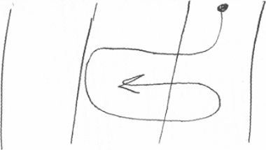
The idea I wanted to try out was a fluid layout for the tags and a dialog that would be sized smaller in the ‘no tag selected’ case. I cut the tags section in even smaller pieces and shuffled around until the idea worked. Here is a sketch:
rinse and repeat
Also I wanted to address the perceived complexity of the dialog, the gist of the feedback I had received. For this I had to practice what I preach:
‘the most important aspect is that you are able to throw everything out and start again from scratch’ps, whenever prototypes or mock‑ups are discussed
You have to stay agile as long as possible in a project. Else your hand is forced by existing drawings when trying to solve interaction issues. I ditched the visio files, visio itself, and the windows template. Moved on to omnigraffle, started with a clean canvas.
beyond the frame
I dealt with another issue at this point. Up to now I had been taking the window frame of the dialog into account. On linux the window frame can be any shape, graphic design and color.
To solve that, I literally took the window frame out of the picture. I deducted 30 pixels at the top and 4 for all other sides from the 640×480 maximum size we are working with and set my canvas size accordingly.
narrow down
I started with designing the smaller dialog for when no tags are selected. Before I show how that worked out, first our:
- disclaimer
- this is a quick‐and‐dirty lash‑up to show you what we mean; there are for sure some things missing and lots of small issues to solve; enjoy nonetheless…
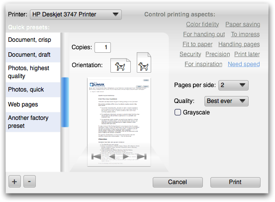
It has also been a while that I have reminded us all that the design shown here is for general inkjet only. The other printer clusters will have at least a different set of tags—mapped to a different set of printing parameters—if not more fundamental optimisations of the dialog itself. Remember that one size does not fit all.
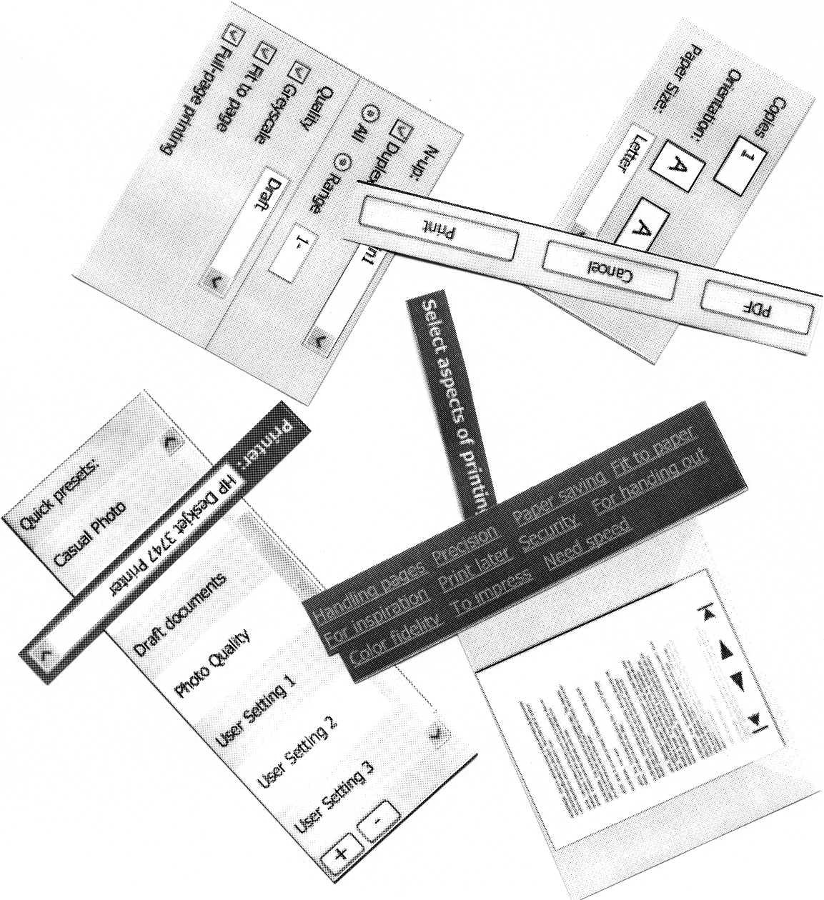
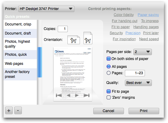
Here are some of the solutions I have put in:
- a slightly bolder appearance for the quick presets list, as it has a higher priority than all the tag and parameter stuff;
- sized the quick presets list items like I always intended: 1½ times the height of a normal list item, for a single line of label text; multiple label lines: normal size;
- shrunk the right column in the dialog to the size of the quick presets list (minus the scrollbar);
- flowed the printer + tags section into the right column;
- toned down the tags, which turns out to be quite tricky; it is easy to make them look disabled or not clickable at all;
- the return of the dogcow, to trace back our heritage.
This all sits inside the actual window frame. Before someone trips over the shadow: that is just a bit of ‘special sauce,’ to make it all come alive:
building up
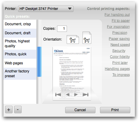
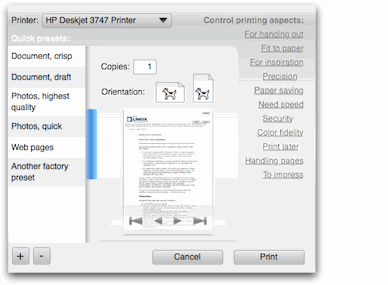
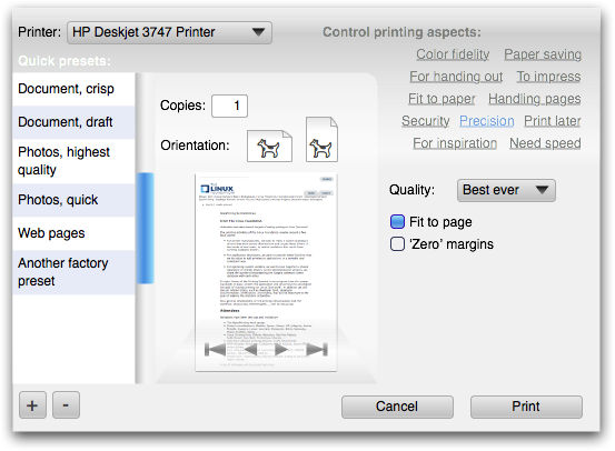
Next, what happens when a tag is selected? The dialog grows so that the right column gets the same width as the middle one. The tags move up—elegantly—to make room for parameters. The gradient under the tags is not decoration: it forms the connection between the tags and the parameter area:

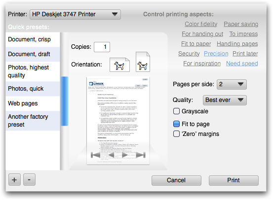
When more tags are selected, the dialog will need to grow vertically at some point to accommodate them. Before that happens, the tags can still move up a bit to make some more room:

Here are all the combinations of three of the tags, in all‑jerky, all‑dithered animated gif glory:
More full‐size dialogs: first, second, third, fourth, fifth
design on a toilet roll
If most users select up to three tags per application and with eleven tags as shown here, how many configurations are possible? Answer: two hundred and twenty.
How does the interaction architect that designs the dialog for a certain printer model stay in control of good UI, without being at the mercy of an algorithm or of the developer? Here is how it works:
- take the complete list of printing parameters, say for general inkjet;
- segment the parameters into logical sections, that make sense to users, as opposed to those that make sense to printer manufacturers;
- design the UI for each section, on a canvas with the width of the right column in the dialog;
- sequence the sections in a logical order, again a decision on a user interaction level; now you have designed a long column of printing UI;
- decide on the tags using usability research and map them to all the printing parameters;
- finished.
max headroom
Reviewing the list above I notice how similar the first four steps are to designing a contemporary printing dialog with tabs. I also notice an additional problem with tabs: you have to make a variable number of controls fit in an area of fixed width and height.
The problem is not having to fit a lot into a fixed area, you can always split it in two. The problem is having to fill out a fixed area with almost nothing. I can distinctly remember evaluating dialogs where desperate measures have been taken to make one or two checkboxes ‘fill’ a tab.
Our sections do not have this problem: at least their height adopts to any number of controls. A section with a single checkbox is perfectly OK.
gluing it all together
The following aspects make the steps above work:
- the interaction architect has absolute control over the contents: what is displayed and in what order; this includes the type of UI control: if a pop‑up list is the best solution, then a pop‑up list will be displayed; this situation is quite similar to content with HTML mark‑up;
- the dialog has absolute control over the presentation, it implements the UI style (KDE, gnome) and the UI theme; this includes all the margins between the items within a section and between sections; this situation is quite similar to a CSS style‐sheet determining the look of a website;
- when in the sequencing two sections need to be adjacent, this does not necessarily mean one above the other; they can also be placed side by side in two columns;
- not everything will fit the width of the right column, for instance when we get to work on the high volume printers, the booklet making section is going to be ‘interesting’ to design; the left column in the dialogs shown here is 128 pixels wide, the other two 200, so widths of 328, 400 and 528 are also available for exceptional interaction.
the parameter section is build up as follows:
- the user‐selected tags determine the parameters that shall be displayed;
- these parameters determine the sections that shall be displayed;
- within these sections only the parameters that shall be displayed are laid out in specified order;
- the sections are distributed—serpentine style—in specified order over the column(s) of the dialog:
wrapping up
‘It was an exercise in detailed design solving general issues,’ as I reported before. My intuition tells me that we can go one step further with simplifying the ‘no tag selected’ dialog, but that will have to wait for printing dialogs, round four.
Labels: design stage, openPrinting, practical

![]()
![]()
6 comments · post a comment
- at 24 July, 2007 13:35,
 commented
 - Reflowing the tags means the user has to scan them again to see what is where. I think more empty space initially is preferable to that.
- at 24 July, 2007 14:21, commented
- How does a user know his/her current settings? I think sometimes a user has to be able to quickly get an overview of all his settings. Using these flexible dialogs means the user has to try all tags so he has seen all settings at least once.
My opinion is this dialog needs some sort of summary (I'm not saying how this summary should look like: text, like Mac OS X, or something else) that gives the user an overview.
The link between the tags and the different settings has to be very clear. This will be very difficult as it has a many to many relationship. I'm affraid users will get a feeling like: "I know I can adjust my margins... Last time I got the dialog to show margin settings... What tags did I choose?... What tag was responsible for the margins... Let's try them untill I find it." - at 25 July, 2007 19:35, commented
- To be honest, this looks like about the most complicated printer dialog I've ever seen :/
- at 25 July, 2007 20:23,
 Unknown commented
 - thanks for commenting, a couple of things:
it is mandatory that the rearrangement of the tags is fluently animated, that is what I meant with elegantly. It is also crucial that the
tags stay connected like a harmonica, that gets folded and then separated again at the open end as sketched above.
if one of these two are not met, then we create mass confusion, as you say.
rutger: the preview is the overview/summary you ask for, it is what will come out of the printer. This—together with showing the aspect that actually matter to the user—is better than a grand list of parameters.
about ‘where are the margins?’ that cannot be found among the tags, then we have failed. That is why we will employ usability testing, instead of wild developer guessing, to settle on the tags.
and last: complicated, really? - at 24 September, 2007 18:00, commented
- I understand you're working on the dialog rather than on the underlying functions, but I think you should integrate booklet printing options, as well as all variants of printing several pages on one sheet of paper. (i.e. print 2,3 or 4 different pages per sheet, print 2, 3 or 4 copies of the same page per sheet, and so on.) If you want a reference, look to Microsoft Publisher, it's the program that IMHO makes it easiest to use those options.
It would be a huge advantage to have this available to every program in Linux, instead of needing specialized software, or a printer with those specific functions. - at 24 September, 2007 18:10, Unknown commented
- regarding the booklet stuff: that is included in the high volume printer cluster.
this means that we will design a version of the dialog with that included.
If you like to ask Peter one burning question and talk about it for ten minutes, then check out his available officehours.
 Peter Sikking is an
experienced
Peter Sikking is an
experienced
interaction architect. He unabashedly puts
shipping great products at the centre of his design practice. He is known for
his work for Google, Nokia, the
Metapolator &
GIMP
open source projects,
and startups.
What is Peter up to? See his /now page.
- info@mmiworks.net
- +49 (0)30 345 06 197
- imprint
