lgm 07, GIMP project overview
16 May 2007, 19:53
A week or so ago, I delivered a presentation at the lgm conference together with Kamila Giedrojć, my associate on the GIMP redesign project. Instead of dumping the keynote slides in a pdf and making you guess what we said, I will recount the presentation here in three episodes.
I started the presentation with a project overview:
in the beginning…
It all started at the lgm 06. Or actually, two weeks before it. We were discussing at the openUsability meeting, when I asked GIMP maintainer Sven Neumann: ‘so, what is GIMP actually?’ Sven replied: ‘good question.’
Sven invited me on the spot to the lgm 06 and to work with the GIMP team to develop a product vision. That took two hours, the first hour consisting of me explaining the team why we actually needed one. During the second hour we created the product vision.
Here is what it looks like on paper:
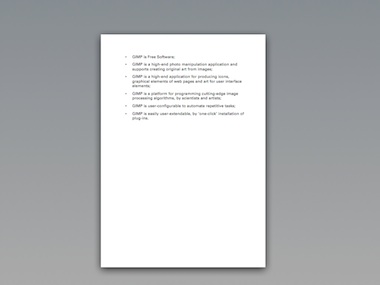
Nice and short, it contains only the essential. And by being so concise, we are able to use it as a tool.
definitely not
At the same time we also discussed what GIMP is not:
- not photoshop
- this means that there is no obligation for GIMP to do things the photoshop way; there is not point to work on a project just to provide a free and open version of some commercial software;
- also not painter
- the focus for GIMP is to work with ‘found’ images;
- not the only linux‐pixel‐oriented‐application on earth
- in the old days, GIMP had to save the day for everyone who wanted to change some pixels on linux; today, GIMP has been released of that obligation, and its team can focus on high‑end use.
- not a web page mock‑up application
- I brought up web mock‑ups, but we realised that seriously supporting this would mean introducing a ton of functionality; it is better done in a specialised application.
real‑life balance
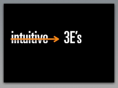
For interaction architects there is no such thing as intuitive interaction. However, we can talk about the 3E’s:
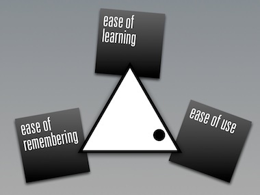
The triangle shows the relationship between them; the dot represents the real‐life situation that you cannot have it all. The trade‐off for GIMP is shown here: user efficiency (ease of use) is everything, with a nod towards ease of learning.
This can be derived directly from the product vision, which speaks about high‐end use and production of graphics.
This explains for GIMP users why it took considerable effort to learn to use the software. We cannot increase ease of learning, or we would lose out on ease of use. All we can do is make it a more gradual, incremental learning experience.
out of tune or auto‑tune
I like to compare this to learning to play the violin. For quite a while the results will be not pretty. But if you put in enough hours, the results can be beautiful, for both amateurs and professionals.
For developers this shows that hard choices have to be made in the UI design, in order to nail the right balance for the 3E’s.
getting involved
I would not have gotten more involved with GIMP if the team would not have managed to agree on a product vision. Without it any interaction architecture or usability effort is doomed.
Also the commitment of Sven to really change things for the better in the UI and the planned introduction of GEGL convinced me to get on board. We started with some ad hoc work on the selection/crop tools that will come out in version 2.4.
blastoff
Fast forward to August last year. In berlin openUsabilty, GIMP and m+mi works bundle forces to create the ‘season of usability’ pilot project. The news spread like wildfire around the world, and I selected Kamila to work with me on the GIMP project.
With Kamila working 20+ hours, and us having two–five meetings a week for the project, we really picked up some speed. To start with, my team needed an overview of all GIMP functionality. We need to know what we are talking about and I had set the target that it was going to fit on twelve pages.
Again I aimed to be as brief as possible, in order to create a tool instead of sprawling documentation. Two and a half months later we had it on eleven pages. And we knew GIMP.
plotting success
Meanwhile we held our scenario weekend, on which I reported here in detail. The result looks like this on paper:
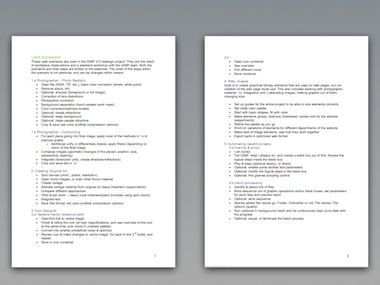
Again, concise and essential enough to be used as a tool.
this year
At the start of 2007, we commenced with the expert evaluation. Taking the user scenarios as the guide to essential use, we took an architectural look at the current interaction of GIMP.
By the end of February we were through…
Notice the contrast between the user scenarios—short and essential—and the expert evaluation: deep, structural and architectural.
the road ahead
At the moment of writing we are working on the analysis. And with all the work done up to now the solutions models are coming easy. These show us the way forward for GIMP UI.
next…
At this point in the presentation Kamila entered the stage to present with me the top‑10 user requests that are UI‑related, and our solution models for those. Read all about it next time…
Labels: GIMP, lecture, practical, product phase, product vision

5 comments · post a comment
- at 17 May, 2007 03:32, Dalai Felinto commented
- "At this point in the presentation Kamila entered the stage to present with me the top‑10 user requests that are UI‑related, and our solution models for those. Read all about it next time…"
I hope 3D texturing and post-process be included in top 10 request.
Regards,
Dalai
http://blendermaniacos.blogspot.com - at 17 May, 2007 20:41, Unknown commented
- Dalai, the top‑10 is of feature requests. Your specific use of GIMP comes up again and again, also in the form of questions during the lgm.
You guys are pretty scared that we will abandon you because there is no special user scenario for your workflow. I do not lose a moment’s sleep over that.
Between the making pieces of graphics of producing web elements, the creativity of original art and the realism of high‐end photo editing, I know we got you pretty much covered.
I am sure you will benefit from our innovation in the future. - at 23 May, 2007 17:41, commented
- I have to say I am quite disappointed to read this. Natural media support would be great but even Photoshop does not have it and still features a far more advanced brush engine than the GIMP. Hence even if you don't want to go into that direction a better brush engine would be very much appreciated.
If you are not interested in painting with the GIMP at all I think you are cutting a major user base out of the picture. Just look at what other raster applications like Photoshop are being used for.
It is good that Open Source software is going its own way without copying commercial applications but now that I have heard so often what the GIMP is not I wonder what it is supposed to be used for? Obviously it is neither a painting (needs more robust brush engine and larger image support) nor a vector application (obviously), it is not a compositor (that would be more like Cinepaint) or photo-retoucher (needs RAW, higher bit depths and more color spaces etc.), and not supposed to be used for desktop publishing. What exactly are you supposed to use the GIMP for, web graphics?
The lack of a feature rich 2d raster application is one of the few factors that makes dual booting with Windows or MacOS almost mandatory. - at 25 May, 2007 20:26, Unknown commented
- dear anonymous >^}
A better general purpose
parameterised brush engine: yes please.
We will make a cool UI for it.
I think it is pretty well defined what GIMP is supposed to be used for. You can keep us accountable to that.
Now that GIMP knows where it is going, we can work on that.
—ps (your agony aunt) - at 06 June, 2007 13:37, commented
- Sorry, I don't understand what you mean with your answer to anonymous:
"A better general purpose
parameterised brush engine: yes please."
Anyway I completely second anonymous' requests about a better brush engine (not interested in natural media).
You wrote:
1) "the focus for GIMP is to work with found images"
2) GIMP is a high-end photo manipulation application and supports creating original art from images;
3) GIMP is a high-end application for producing icons, graphical elements of web pages and art for user interface elements;
but no mention to creating "serious" images - I mean professional illustrations and the like. So users are legitimately thinking that there will never be a good brush engine in Gimp.
If, on the contrary, a "better general purpose parameterised brush engine" is planned, why not include in the product vision:
GIMP is a high-end application for painting 2D art (without natural media)?
Limiting Gimp scope to "found" images seems quite absurd...
If you like to ask Peter one burning question and talk about it for ten minutes, then check out his available officehours.
What is Peter up to? See his /now page.
- info@mmiworks.net
- +49 (0)30 345 06 197
- imprint


 Peter Sikking