lgm 07, top‑5 GIMP user requests
25 May 2007, 01:55
After my project overview at the lgm conference, Kamila Giedrojć joined me on stage to present the top‑10 user requests, and our solutions models for them. Here are the remaining top‑5:
5. avoid pop‑up dialogs
for tools, file plug‑ins, et cetera
During the expert evaluation we found unnecessary dialogs, whose default settings are fine, 99% of the time. The dialog simply creates more work and breaks the flow in these cases. Our conclusion: take them out.
Other examples of unnecessary dialogs include the rotate, perspective and scaling dialogs.
no vacancies
We also observed that the inspectors—the toolbox that by default appears on the left, and the dialogs‐column with layers, etc. that appears on the right—are already pretty much filled up with essential dialogs, and with the introduction of GEGL will be even more so in the future.
This means we cannot pursue a solution where most dialogs would stop popping up in the middle of the screen, and would instead appear in an inspector.
sneak preview
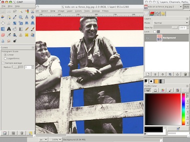
We found during the expert evaluation that a majority of dialogs offer either a limited preview of the effect they would deliver or no preview at all.
Our solution is to make the whole main window the preview. It is big, but still limited in the number of pixels that actually need to be calculated. And the image has the right size and the right zoom level, because users set it that way.
Here is the current situation in GIMP, working on an image, doing a Gaussian blur:
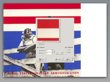
For this moment we have actually stopped working on the image itself. The work is done within the dialog, where the preview still has to be zoomed and panned to help us.
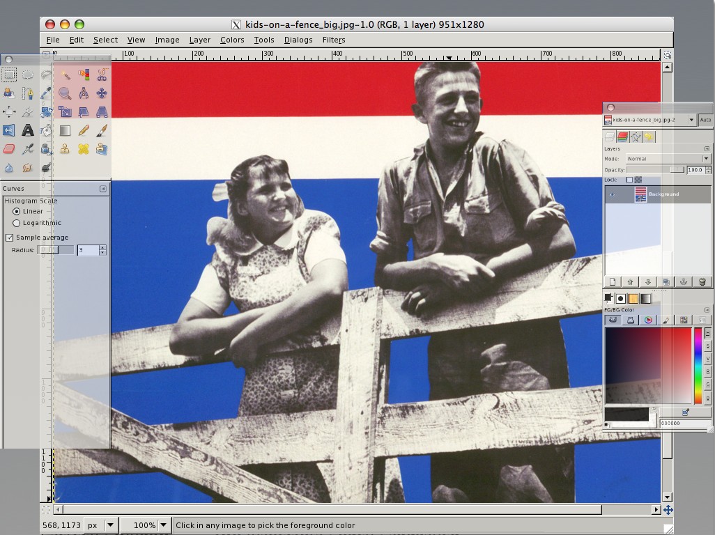
Below is our new solutions model. The heads‑up display with full‐window preview offers a continuous workflow on the image itself.
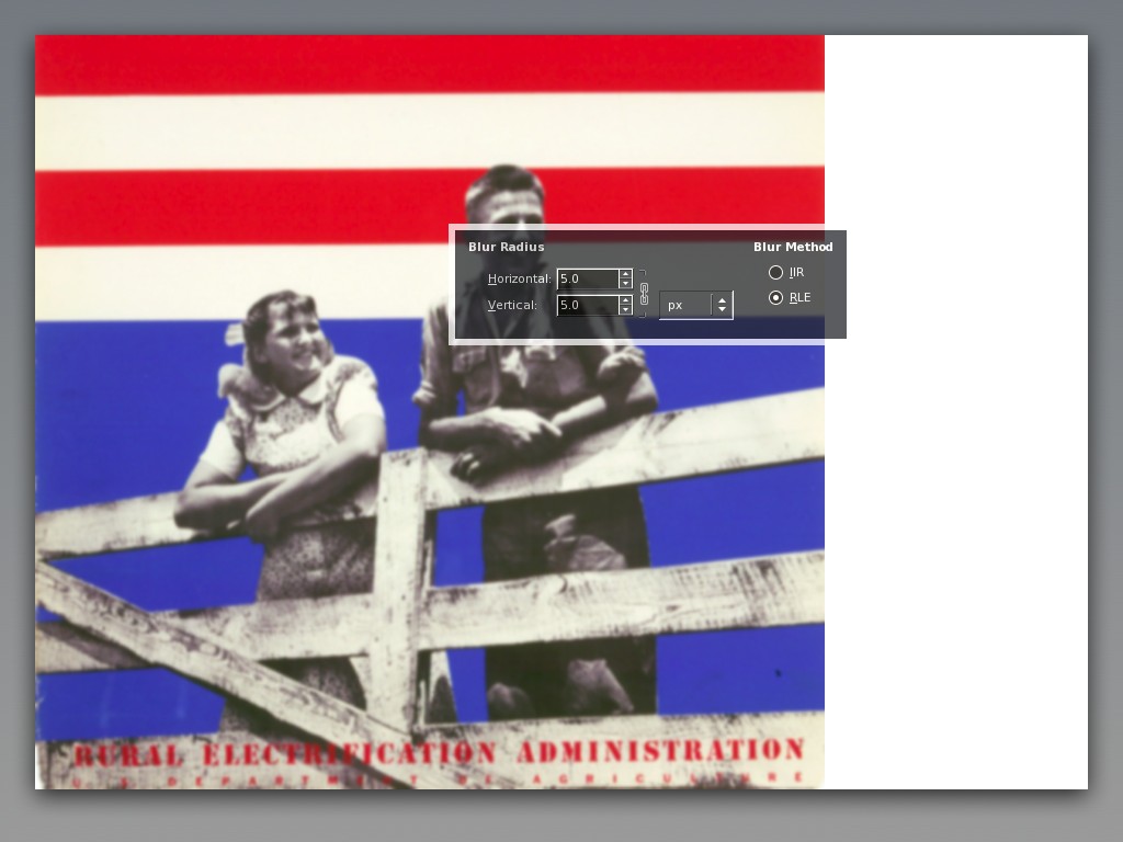
The partial transparency of the heads‑up display creates the user experience that one can work on the whole image, although technically speaking it still obscures part of the image.
- disclaimer
- this is a quick‐and‐dirty lash‑up to show you what we mean; there are for sure some things missing and lots of small issues to solve; enjoy nonetheless…
4. better painting tools
We presented some of the concepts we are working on at the moment.
In the expert evaluation we found the four brush models only available for color painting. Taking image content into account, we see that these brush models can be useful for any kind of brush based tool, like dodge/burn or sharpen.
Our solution is to make the brush models part of all brush tools, taking their icons out of the toolbox and into the tool options.
warped saturation
During our expert evaluation it became clear from all interaction aspects that the iWarp plug‑in should be a brush tool. Our workplace observation showed that if GIMP would implement that, then it would be the number one tool for photographers.
We found that there is a tool to paint with brightness (dodge/burn) but not with saturation. There are whole photography art movements based on reducing saturation, commercial photography depends on turning it up. A saturation tool completes the palette of basic painting tools.
power modes
We evaluated the paint modes and appreciated how powerful they are. However, we observed that there are ‘natural’ modes (e.g. dodge, saturation)—where one can actually predict what they will do—and mathematical modes, like multiply or color erase.
Because the natural modes can be easier matched to actual artistic goals, our conclusion is that these modes should be removed, and their functionality merged into existing and new painting tools. The mathematical modes can stay where they are, being powerful, oblique and fundamental.
dipping + smearing
During our expert evaluation of ‘wild brushwork’ we noticed that there is no equivalent of physical painting: having a palette in your hand; smearing this and that color on the canvas; even mixing in other materials, like sand.
So we created a solutions model for a file palette, which sits at the edge of the image window:
Nicknamed ‘blobs of paint,’ the blobs are dragged in from color selector swatches or project palettes, or eyedropper‑ed from the image. Furthermore the treatment from any filter or plug‑in could be dragged into a blob, which would mean one could paint with noise, for instance.
Just dip your brush in a blob and smear away on the canvas. Mixing between different blobs? We are thinking about it. Finally, even more important than creating blobs is deleting them: just drag it out of the palette. This is an easy‐come easy‑go palette.
Oh, and again our disclaimer…
3. layer trees or layer groups
During the workplace observation we saw users group layers, not only reducing clutter in their layer stack, but also for logically, when bits on the layers are part of the same concept.
Surprisingly, we saw users use layer groups to maintain versions of their file, labelling a group of all layers and then duplicating it to continue working on the next steps.
groups + sets
Groups are a physical organisation of consecutive layers, primarily used to reduce clutter. Here we see four layers organised in two groups:
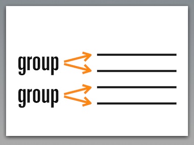
The logical way to display this in the layer dialog is like above: vertical, to the side of the actual layers.
Sets are a logical organisation of layers. A set ties layers together to a single concept. A layer can be part of multiple sets. We see that here:
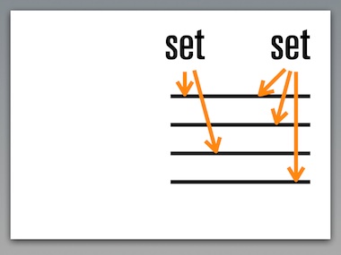
Sets, being distinctly different than groups, can be connected to any layer. Therefore it is logical to display sets different than groups in the layer dialog, horizontal, above the layer list, as shown above.
We conclude that both layer groups and sets should be implemented in GIMP, with distinctly different UI, as outlined above.
versions + approaches
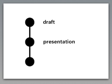
Layer groups or sets are not the most elegant solution for maintaining versions of a file. A more straightforward solution is to build simple versioning in to the file itself.
When we allow during the lifetime of a file a certain state to be labelled, and allow users to return to that state later on, then we have versioning:
The user scenarios speak of ‘compare different approaches.’ This can be different artistic approaches, or different technical approaches towards the same result.
This is elegantly supported by allowing branch versions. Different approaches can be developed and compared directly within the file:
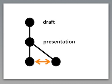
The introduction of GEGL will make it very natural to drag and drop ‘good ideas’ from one version to another.
Our conclusion is that versioning should be supported by GIMP, but not by abusing the layer stack. The key to success is to keep the versioning system as simple as outlined above, much simpler than the source control systems that developers use every day.
2. adjustment layers
This feature is perceived as powerful and we appreciate the immense value of being able to change your mind and readjust a graphics operation throughout the lifetime of the file.
The introduction of GEGL allows readjustment in a very natural way. Let’s say that we have applied levels–curves–noise–blur to a layer:
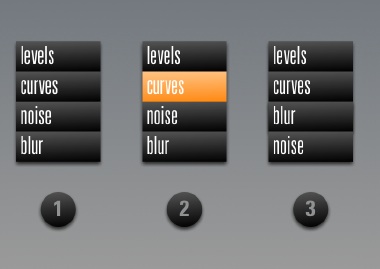
GIMP will show the performed operations in a list, similar to •1 above. When the image at this point is not punchy enough, there is nothing more natural than to select the curves operation again like in •2, and to readjust to taste.
Experimenting with the order of operations is as simple as dragging blur above the noise item in the list, as shown in •3.
as easy as 1‑2‑3
Architecturally speaking, the beauty of the layer system in GIMP is that the whole concept can be explained in a single sentence: ‘Layers are transparent foils with graphics, their stack forming the image.’
Introducing adjustment layers blows up this sentence into a full tutorial chapter. Architecturally speaking adjustment layers are a 90s highjack of an unrelated concept to achieve a certain goal: readjust operations later on.
Our conclusion is that adjustment layers are actually less powerful than taking full advantage of what GEGL can offer. We rather spend our effort on creating powerful control of graphic operations based on GEGL, than to introduce adjustment layers.
1. single window interface
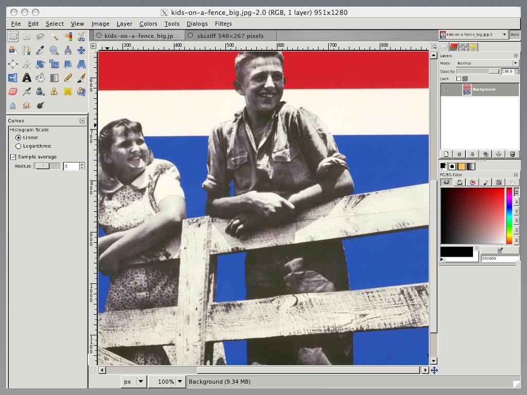
During our expert evaluation we found that the inspectors have the status of real windows, which means they show up in the task bar. And they occupy 440 pixels of screen width, as demonstrated here on a 1024 screen:
Cramped is the word. At this year’s lgm the GIMP team decided that a 1280 wide screen is the minimum supported. 34% of that screen width is lost to the inspectors. Even a whopping 30 inch, 2560 pixel wide screen loses 17%.
Then there is the very disturbing situation of two menu bars. We first have to solve these issues:
Oh, better throw in our disclaimer…
Removed the extra menu bar, the inspectors have been made real floating windows. This means that the items in the task bar now match the goals of users: images. A crude scaling represents our goal to slim down the inspectors. They shall be lean and mean.
Finally, the semitransparent inspectors make that in user experience terms, we can claim those 440 pixels back to work on images. A majority of tasks can be performed under the inspectors. Yes, selected parts of the inspectors, like the color selector, will become opaque when users focus on it.
#1 trend
Only when having solved these issues, are we in a state to discuss a single window interface.
Interaction architecture—like traditional architecture—undergoes changing solution trends. And there is no denying that the latest big photo applications, apple aperture + adobe lightroom, come with single window interfaces.
And there is no denying that single window interface is by far…
So it is disclaimer time again. Starting from the improved situation above, the view can be switched with a menu item to this:
The inspectors have been docked to the side of the window, not overlapping the image, they are opaque again. Multiple open images appear in tabs. Inspectors can be torn off to become floating, and additional inspectors can be docked in columns for people with seriously big screens.
drawbacks
As shown, there is no overlapping of the inspectors and the image pane, and we are working under cramped circumstances again. And having two different UI modes means double the documentation and double the support effort.
We have not reached a conclusion yet on the introduction of a single window interface. We are positive that the current situation needs to be improved.
wrapping up
And that concluded our presentation. I want to thank Kamila for working so hard on the project, and for presenting with me at the lgm.
Labels: design stage, GIMP, lecture, practical

![]()
![]()
15 comments · post a comment
- at 25 May, 2007 02:59,
 tilkau commented
 - Re: transparency:
I hope it will be able to be turned off.. my setup, with folding windows, looks like:
1
2
(folding state changes based on mouseover - whichever region I want to see fully. The actual screen size is 1024x768, as is the image area shown.)
My setup would just be confused by having the windows partially transparent.
Re: Single window interface:
If this turns out to be full screen, then it could be important to allow the image to be placed in a corner rather than inbetween - certainly when moving around a virtual screen, it's intensely annoying to try to centre the view on the image if the image itself is not in a corner. - at 25 May, 2007 05:34,
 commented
 - I like the possibilities that arise from making use of transparent windows. How about having the image window occupy 100% of the screen area, but a key press or a mouse click on a button in the image window brings a full-screen transparent panel to the front. On this transparent panel, the user can add, remove, and relocate any inspectors he choses. The workflow would consist of:
1. Toggle the inspector panel to the front. The inspector panel is fully transparent, and any inspectors attached to it are semi-transparent, so you can still see the image below.
2. Select your tool, set the parameters, etc.
3. Toggle the inspector window to the back.
4. Perform your desired operation.
I also like the concept of using tabs to control the image windows. Another option that would be nice for the image window would be to tile all open images to fit within the image display window.
So to summarize, I propose two windows. The TOOLS window is a full screen, fully transparent window onto which semi-transparent inspectors may be placed, removed, and repositioned. The IMAGES window is a full screen, opaque window that can display images in a tabbed manner (one image visible at a time, with tabs for selecting which image is visible), or in a tiled mode, in which all images are shown arranged adjacent to each other within the extents of the image window. A key press (and a mouse click) toggles the TOOLS window to the front/back as desired.
While I'm running on, a function of the tiled mode should be that clicking on the expand button of a particular image expands it to fill the extent of the IMAGE window and moves it in front of all of the other images. Clicking the minimize button for this image reduces it back to its tiled size and location.
And why not allow CTRL-clicking of multiple image tabs or tiled images and allowing various adjustments to be made to all of them at once? You could select three images and adjust curves on all of them simultaneously for example.
Thoughts???? - at 25 May, 2007 09:59, commented
- I must say this whole blog-post with the top 5 is just fantastic. IMO if GIMP would work like this it would speed up processes a few times and make it a lot easier to handle at that.
There might be some minor details that still need to be discussed but the whole concept is sound and should be implemented ASAP - depending on developer-resources of course. - at 25 May, 2007 16:52, commented
- Mixing between different blobs? We are thinking about it.
This artists palette is a great concept. I can see this saving a lot of time.
One idea for mixing would be to overlay the circles by dragging them. The intersecting area bcomes then the mix. This could be a new uniform blob of colour but perhaps more useful would be a degraded area with the mix weighted from one side to the other. This would also allow mixing several colours (or adding an effect to a mix).
A tool tip could be helpful showing the mix percentages under the cursor in the overlap area.
The whole thing becomes very powerful whilst remaining close enough to a physical paint blob to be intuitive.
However, I'm a bit dismayed at the choice of 1280 as a minimum requirement.
I have a good 1024x768 monitor that I dont intend to dump. I hope Gimp is not going to become unusable as a result of this decision.
From your screenshots, the transparent window idea does seem a good way to get maximum use from the available space.
I dont quite see why #1 is a contradictory to this. I long ago got used to gimp spraying windows everywhere but I still find it rather untidy.
Isn't it possible for the various windows to be semi-transparent floating panels on a unique Gimp window?
Maybe that's just a limitation of gtk+ or even x11.
Finally, on a general note, thanks very much for your excellent work on the interface. This long overdue application of some thorough, top-down interface design is finally starting to liberate the power of Gimp's functionality from an interface that is very inefficient to use.
And of course thanks to Sven for initiating this interface overhaul. - at 25 May, 2007 18:04, Renan Birck commented
However, I'm a bit dismayed at the choice of 1280 as a minimum requirement.
I have a good 1024x768 monitor that I dont intend to dump. I hope Gimp is not going to become unusable as a result of this decision.
Agreed. People using smaller monitors or older laptops often use 1024x768; I believe it is still the most widely used resolution.- at 28 May, 2007 00:12, commented
- You said:
Introducing adjustment layers blows up this sentence into a full tutorial chapter. Architecturally speaking adjustment layers are a 90s highjack of an unrelated concept to achieve a certain goal: readjust operations later on.
You acknowledge that the users view them as powerful, and that it is useful to non-destructively apply a filter/adjustment. Also, it is important to be able to modify the source of what the filter/adjustment was applied to.
This feature should not be panned simply because one can not easily come up with a short sentence to describe its function. Adjustment layers are needed. If gcc modified the source when it applied macros, most professionals wouldn't use it. Without adjustment layers, corrections to entire layers permanently modify those source layers.
The explanation sentence, "Layers are transparent foils with graphics, their stack forming the image," is as inaccurate for layers with modes such as "saturation" as it is for adjustment layers. I view layers with modes such as "saturation" as merely an early evolution and subset of adjustment layers.
Don't leave out the number 2 requested feature. Hopefully I am merely misinterpreting your comments. - at 11 July, 2007 03:02, commented
- I think your solutions are good and though i am very used to the existing layout i would welcome them; too much time is wasted manipulating windows.
Personally i would like some way, using the mouse buttons, to switch between recently used tools. This probably isn't a usability issue as such but it would speed up the workflow. - at 17 July, 2007 10:06, tilkau commented
- "Hopefully I am merely misinterpreting your comments."
Yes, you are (though not all the info you need was presented here). GEGL's tree (directed graph) based system will allow any effect to be applied nondestructively to the nodes 'above it'
The idea presented by Peter is essentially, you have a mini-stack of operations 'underneath' each layer (where a layer is, you know, a real layer -- with either raster or vector data, that can be rendered into pixels:), if I understand it correctly.
This achieves the same effect as adjustment 'layers' without breakage of the layers concept. - at 18 July, 2007 08:11, hpv commented
- Can I put in a word against single image window? It might be ok when only working with a single image (I'd argue that it still isn't, but that could be because the editors that use it do such a poor job) but when working with multiple images it's a complete pain.
I do a lot of graphics work that requires the simultaneous us of multiple images (creating graphics for games and 3D animations) and all of the duplicate floating windows or docks just clutter things up and make it hard to use. Even if they hide (like the floating panels in OpenOffice) it's still annoying. Especially on a Linux platform with focus follows mouse. This already happens enough with the auto layer panel setting in GIMP, such as when you move your mouse to the layers panel and in the space between there is another partially exposed window below that grabs focus momentarily.
If you really need to provide such a setting just make a container window (like Photoshop) and have the default setting be to start a new image maximized with the panels and toolbox docked. Please, please, please don't even consider going the route of Krita. That kind of interface basically makes it impossible for me to do the things that I need a graphics editor for.
Definitely don't force "image in a corner". Maybe make it an option if someone really wants, but don't force it. I'm sure I'm not the only person who likes to have their images centered somewhere around center on the screen and this (again Krita does it, but so does pbrush on windows) behavior is extremely annoying.
Other than that I really dig most of the ideas and hope you guys get somewhere, though I won't hold my breath from my previous experience with GIMP developers (like broken tablet support a while back). - at 19 July, 2007 09:10, tilkau commented
- I must agree with hpv - having image windows tabbed is something I've set up before using Ion3, and it only seems to work well when switching tasks - in my experience I want to check two images against each other much more often than I want to switch between editing one or the other.
Making the image window a Dockable might be better - then you could have multiple image windows, but could also have multiple images tabbed in one window.
Also, hpv, GIMP doesn't handle tablets at all, just supports them. Tablet handling is implemented in GTK and GDK, which are separate projects. GIMP only interprets the values that GTK reports to it; a few people at least have reported tablet issues as a GIMP bugs, when they are really GTK bugs.
"I'm sure I'm not the only person who likes to have their images centered somewhere around center on the screen " -- actually, yeah. After changing window manager, I see that it's the image window that should be placable in a corner, rather than the image (if you understand the distinction I'm trying to make.)
"duplicate floating windows and docks"
Are you saying that you get a copy of the docks etc for each image you open?
Then this is either:
a) You making the error of asking 'gimp' rather than 'gimp-remote' to open image files. Opening a file with 'gimp' will open a new instance of gimp each time; Opening a file with 'gimp-remote' will open gimp if it's not already open, and ask the running gimp instance to open the file.
b) A bug in GIMP - at 16 August, 2007 14:57, commented
- The lack of these dynamic adjustment layers is what has kept me away from Gimp, and will do that eternally before they will be solidly supported. It's kind of sad that I will with the present speed of development will be stuck with Photoshop 37 still on the year 2050 or so.
- at 21 August, 2007 21:16, Bruce commented
- Re: "Adjustment layers are needed. If gcc modified the source when it applied macros, most professionals wouldn't use it. Without adjustment layers, corrections to entire layers permanently modify those source layers."
The GIMP should be totally non-destructive (which hopefully will happen with GEGL).
I was a little unclear on what the conclusion was on adjustment layers. Is it simply that there's no point in having specialized layers; that it is just a layer? - at 28 August, 2007 18:10, commented
- In the single window interface, panes can be made to float and even be transparent also.
Please see the Netbeans docking framework for one of the good (and very stable) solutions out their (ignoring the fact that it is swing). - at 24 September, 2007 06:36, commented
- If the developers of GIMP have tried to follow a tutorial for their program, they will know what a "Single Window Interface" means to users. Certainly, minimizing the 3 GIMP windows( maybe more) ,looking at the tutorial and going back to GIMP is a usability nightmare. Hope this single window interface comes soon.
- at 05 August, 2008 15:18, commented
- What I would require for the "full preview" is key toggle to get a comparison with the original in a snap. And I don't mean "touch the key, then wait five seconds, then toggel again and wait another 20 to return to the preview" but an instant "that's the old one, that's the new one". Maybe even with buffering the current view instead of using the whole picture data...
Oh, and I definitely want to be able to control whether I use one or multiple windows and whether or not I use transparency. That's a flexibility I MUST have because different tasks need different setups!
cheers!
P.S: please consider using http://recaptcha.net/
If you like to ask Peter one burning question and talk about it for ten minutes, then check out his available officehours.
 Peter Sikking is an
experienced
Peter Sikking is an
experienced
interaction architect. He unabashedly puts
shipping great products at the centre of his design practice. He is known for
his work for Google, Nokia, the
Metapolator &
GIMP
open source projects,
and startups.
What is Peter up to? See his /now page.
- info@mmiworks.net
- +49 (0)30 345 06 197
- imprint
