economic outlook
16 June 2007, 01:02
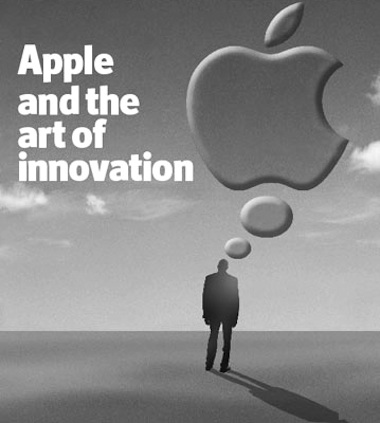
two interesting articles in this week’s The Economist. First one is the leader article that accompanies the cover:

Some of my favourite snippets:
‘…Apple illustrates the importance of designing new products around the needs of the user, not the demands of the technology. Too many technology firms think that clever innards are enough to sell their products, resulting in gizmos designed by engineers for engineers.’
‘But too few technology firms see “ease of use” as an end in itself.’
‘Listening to customers is generally a good idea, but it is not the whole story. For all the talk of “user‐centric innovation” and allowing feedback from customers to dictate new product designs, a third lesson from Apple is that smart companies should sometimes ignore what the market says it wants today.’The Economist, Lessons from Apple, June 7th, 2007
economic brain scan
Second, there is the portrait of Mark Shuttleworth of ubuntu. More snippets:
‘A successful South African entrepreneur during the dotcom era, he wants open‐source zealots to lose their religion and concentrate on ease‐of‐use instead.’
‘…open‐source software lags behind in many areas too, Mr Shuttleworth admits. “The community tends to build for functionality, not for comfort,” he complains. “We have to inspire the free‐software world to make the user environment attractive. This takes an order of magnitude more work.”’The Economist, Bringing free software down to earth, June 7th, 2007
business 101
The Economist sets the agenda for business leaders and other decision makers. The more remarkable then that innovation in user experience is in effect their front‐page story. The snippets above resonate with my everyday business.
‘by engineers for engineers’
This is the norm in software today. Remarkable are the few—and I mean just a few—pieces of software in the world that actually have a functioning user interface. I say it is remarkable that the world puts up with this situation.
One of the things I have to accomplish in each of my projects is to get accepted that UI decisions can no longer be based on the technical structure of the code, nor on the personal user preferences of the developers. They can only be based on solid interaction architecture.
‘an end in itself’
A decent UI is seen as a ‘nice enhancement,’ something we can work on ‘after we have shipped this important version.’ Somehow unusable, off‑putting or productivity‐wasting interfaces are not a serious bug.
The companies I work with are the ones who have realised that in any piece of software that has a UI, the value is created by users, and user interaction can make or break this.
‘ignore what the market says’
Software innovation is not born by listening to markets, and UI improvement does not result from listening to users. Both follow from a keen understanding of what markets or users need.
It is exactly this keen understanding of what users need that companies seek when they approach m+mi works. It is the essence of what we deliver.
‘concentrate on ease‐of‐use’
Usability of open‐source software is generally bad, but that of commercial software is only a fraction better. I see the factors of literally being made ‘by engineers for engineers’ and too much development at the whim of users contributing to the worse position of open‐source software.
The methods that I introduce in the projects that I work on have the same effect in the commercial and the open‐source world: a new awareness that we are not making the software for us, and that value and innovation is created within the project team, if we underpin the UI with a solid concept.
‘an order of magnitude more work’
Yes, it takes work to replace the unusable user interfaces of today with something that actually functions. We are not talking a slight tweak here. But that does not mean doubling the number of GUI developers, and therewith quadrupling the amount of discussion in the project team.
The companies I work with get the specialist in, to do the heavy UI concept work. This stops the discussions in the project team, and lets the developers concentrate on what they do best: engineering of user interfaces.
Labels: fundamental

1 comments · post a comment
- at 01 April, 2009 13:50, Shopping Cart commented
- Hi,
The article of this blogs is very nice and informative for the users.
In my point of view the economy of the any country have performed a very important role in the developing of the country,If the economy of the country will be strong so there is many chances for the government that they extend their technology.
If you like to ask Peter one burning question and talk about it for ten minutes, then check out his available officehours.
What is Peter up to? See his /now page.
- info@mmiworks.net
- +49 (0)30 345 06 197
- imprint


 Peter Sikking