teaching interaction
6 June 2007, 00:43
Mid‐May I was for a week at the FH Vorarlberg, Austria, to teach interaction design. I had arranged for the students to work in project teams: to create a concept for real‐world software, under real time pressure, with a real presentation at the end of the week.
I had asked the students to prepare by reading specific articles about activity based design and my own methods. However, they not know what software they would be designing for. Let’s jump in like they did.
monday morning, 9:00
After getting acquainted, I introduced the software we would be working for: ksysguard, performance monitoring for KDE. Showing processor; memory; network or disk usage, et cetera.
design brief
When I first put my eyes on ksysguard, I thought ‘this application needs an overview,’ a summary that shows the essential. So I set the goal to design a cool object for the desktop, that at a glance informs about the performance and stability of the local or a remote machine.
Oh, and anything that looked like the same old graphs that have been around for twenty years was forbidden.
first things first
While preparing for the course, I had interviewed our customer, the developer of ksysguard, for several hours via irc. It was a typical interview to find out the product vision of the software: what it is; who should be using it and what value does it deliver.
I went with the students through the complete interview, then we discussed and wrote down a product vision:
ksysguard allows to monitor different soft‐ and hardware parameters that influence the performance and stability of a local or remote computer system.
It allows tech‐knowledgeable users, or admins of a few computers, to detect and go to the bottom of (rising) problems, and do something about them.product vision of ksysguard
The product vision was then approved by the developer.
User scenarios could be skipped for this project. I realised that there is not a wide variety of use that needs to be reduced to the essential. We spent the rest of the day sorting out the functionality that should go into our desktop overview, according to the product vision.
tuesday…
…concept day. I divided the students into two teams and sent them on their explorations. They had to solve the problem of mapping these machine parameters (processor, memory, et cetera) to different display dimensions.
The display dimensions include space, 2‑D or 3‑D; color; transparency; time; texture and animation.
vision driven
Being the part‐time team leader of both teams, I maintained the overview for both teams and ensured that they were solving the right problems. I encouraged the good concepts they came up with, and steered them towards alternatives for the not‐so‑good.
Time and time again, I made a team check the product vision, to focus on the ultimate goal. Aspects like ‘monitor’; ‘performance’; ‘stability’; ‘detect and go to the bottom’ had to be realised by us.
wednesday
The concepts where gelling, we moved from pencil + paper to mouse + screen to prepare for the presentation. An A0 poster and a short animation film had to be produced.
I focussed both teams on producing the minimum of concept visualisation that would have a maximum of impact. One should not have too much blood, sweat and tears invested in a concept, to be able to ditch it when a better solution crystallises.
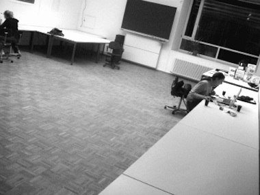
The teams moved out of our classroom. Christian and Andrea (team 2) worked in parallel at the mac‑pool…
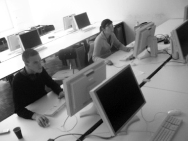
…while in their atelier, Katharina and Verena (team 1) worked on opposite ends of the project:
thursday
Crunch time. In the morning I had both teams sketch out a quick script/storyboard for their film. This way they could keep track of what they really needed to produce and I knew they would not lose the plot.
I showed the teams how to structure their poster. Instead of just showing all the cool stuff, it is better to show first that it was not divine intervention that produced the design, but methodical work.
friday
Usability day at the FH Vorarlberg. Theme: ‘inform with computer animation.’ It was no coincidence that my course was tacked before the uDay, it gave us a real deadline and a real venue for presentation.
I had selected ksysguard from the list of projects at openusability.org because of the animation angle. Animation comes natural when handling real‐time data.
showtime
Bleary‐eyed from finishing the film and poster the night before, we exhibited throughout the uDay to usability and animation professionals:
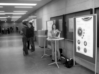
I made that into a crash course in engaging people at exhibitions or trade fairs. And an introduction to the number of interesting conversations one can expect during such a day.
Visible in the photo above are the posters:
Watch out, those pdfs (1, 2) are 3.3 MB large. Now, let’s have a look at the individual concepts.
team 1
Disco mirror ball; Saturn ring; lava lamp; the meatball in the pea soup. It was fun discussing concepts with Verena and Katharina. But as usual, these far‑out discussions delivered results.
See the film on youTube.
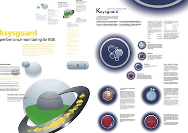
I am impressed with how they use two dimensions of the ring to display on. On the side of the ring is the instantaneous value of load and cpu usage, and on the top of the ring is the five‐minute history of both:
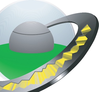
They did have to take the hard choice to not go into multi‐processor details here, but that choice paid off handily.
I also like a lot how they used animation to display a parameter. When a disk partition starts running out of space, the green fluid starts bubbling, lava lamp style:
The more critical the free space situation gets, the more hectic the animation becomes: cool metaphor.
For more details, check out the poster.
![]() The work of team 1 is licensed under a
Creative Commons Attribution‐Share Alike 3.0 License.
The authors are: Verena Mayer, Katharina Seidowski and peter sikking.
The work of team 1 is licensed under a
Creative Commons Attribution‐Share Alike 3.0 License.
The authors are: Verena Mayer, Katharina Seidowski and peter sikking.
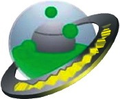
team 2
‘Circles must be in fashion this year’ I thought when I saw the lyrical sketches from Andrea and Christian. On that Tuesday team 1 was also ‘going in circles,’ and I feared we were going to end up with very similar concepts.
See the film on youTube.
I am impressed with how they worked hard to keep the ‘nothing to worry about,’ everyday look of the desktop object very clean by employing several strategies:

First, they introduced a level of drill‐down in the desktop object, displaying details in ‘pods’ around the central ring. This way details for up to 16 processors cores; disk partitions or memory hogging applications can be shown:

I like how this enables users to monitor details of one parameter for a while.
Second, when an certain parameter needs user attention, then the ring that represents it not only gets an opaque centre, it also grows in size:

This is a clever use of screen space. Whenever users’ attention is needed or users focus on details, most of the overall circle is used for that.
For more details, check out the poster.
![]() The work of team 2 is licensed under a
Creative Commons Attribution‐Share Alike 3.0 License.
The authors are: Andrea Thum, Christian Haudum and peter sikking.
The work of team 2 is licensed under a
Creative Commons Attribution‐Share Alike 3.0 License.
The authors are: Andrea Thum, Christian Haudum and peter sikking.
looking back…
I had a great time teaching at the FH. I would like to thank Philipp von Hellberg for cooking this up with me, and the FH staff for making everything run smoothly.
And thanks to Katharina, Christian, Verena and Andrea for working so hard with me on this project.
Labels: practical, product vision, teaching

![]()
![]()
0 comments · post a comment
If you like to ask Peter one burning question and talk about it for ten minutes, then check out his available officehours.
 Peter Sikking is an
experienced
Peter Sikking is an
experienced
interaction architect. He unabashedly puts
shipping great products at the centre of his design practice. He is known for
his work for Google, Nokia, the
Metapolator &
GIMP
open source projects,
and startups.
What is Peter up to? See his /now page.
- info@mmiworks.net
- +49 (0)30 345 06 197
- imprint
