next‑generation printing dialogs /2
8 July 2007, 21:35
For the openPrinting Meeting on the linux foundation summit in Mountain View, I prepared a presentation. I updated our mock‑ups of the printing dialog for the occasion.
As discussed last time, the usability team had some constructive critique for the first mock‑ups:
- printer selection pop‑up at the bottom? from looking at the task logic it needs to be at the top of the dialog;
- there can be confusion over what a quick preset does (change the printer settings, not any dialog parameter display) and what a tag does (change the parameter display in the dialog, not any printer settings); the dialog could do more to avoid this confusion;
- there needs to be a stronger relationship between the tags and the the parameters shown; a stronger showing of cause and effect.
starting at the top
I started with the first point, printer selection to the top. I noticed that choosing a printer configures the actual dialog: which quick presets are available, and which tags. Also, the tags purely configure the dialog itself.
Combining this led me to take printer selection and tags out of the content of the dialog and make them part of the frame of the dialog. This addresses in part the second point of critique.
Before I show how that works out in practice, first our:
- disclaimer
- this is a quick‐and‐dirty lash‑up to show you what we mean; there are for sure some things missing and lots of small issues to solve; enjoy nonetheless…
Keeping that in mind, here is the dialog in default appearance: no tag selected:
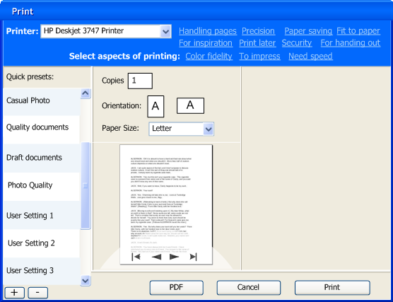
Note that I lightened up the quick presets list on the left, but the items are still nice and big for quick access. Also I wanted the tags to form a cloud with a loose structure. This whole top printer + tags section has much more a ‘written sentences’ feel than ‘controls on a grid.’
I have used color and position here to make the top section part of the dialog frame, to show the principle. However, on linux the dialog frame is set by the window manager, which can give it any shape and color. So later a different solution will be needed for KDE or GNOME and I will work with the developers of the Qt and gtk toolkits on this.
Also there is the ‘written sentences’ aspect, which becomes interesting with internationalisation for right‐to‐left languages. But nothing that can’t be solved.
pretty vacant
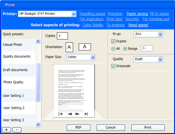
Here are some tags in action:

More full‐size dialogs: first, second, third, fourth
The big wide open space at the right of the dialog—when zero or one tag are selected—is not very satisfying. The dialog can be more compact in that case. However, keeping the quick preset list nice and big, and the overall dialog make‑up relatively stable, will require some fluidity in the printer + tags section. To be continued…
blink
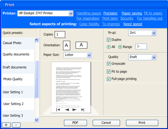
To address the third point of critique I introduced animation when a tag is switched on or off, to show the connection between parameters and tags. I could have gone for the matching parameter widgets to fly in and out of the tag. Instead, I settled for a color highlight of the labels of said parameters:
coming up
Jan mühlig of relevantive talked to me about a couple of quick rounds of usability testing. With both of us analysing the test results together and me refining the dialog concept in between every round, that makes a nearly ideal design set‑up.
I am looking forward to that and to report about it in printing dialogs, round three.
Labels: design stage, openPrinting, practical

![]()
![]()
2 comments · post a comment
- at 09 July, 2007 20:22,
 Sean commented
 - The printer selector is still a totally horrendous idea for large networks like a school library. Seeing 50-200 printers in a drop down will be hell.
You're also cramming a bazillion different things into one view when 99% of the time all a user is going to want to do is print the document with default settings, and maybe selecting a number of copies. You don't need to cram that much crap into the dialog when it isn't going to be used most of the time.
You've also still got this non-standard display stuff going on, such as the title-bar-esque header information combined with "links" that change the dialog instead of opening new windows/content like a link normally would.
Get rid of your aversion to tabs and split the display up into logical chunks. Unless users are able to select multiple tags (I don't think that's the ideal approach, and even if it was, the result wouldn't fit in the dialog anyway), get rid of the link visual and replace that with a drop-down on a different tab. Replace the printer drop-down with a tree-view or list that is sortable and easily navigated. Put only the small handful of common controls on the main dialog, and put the rest of the stuff in other meaningfully labeled tabs. - at 26 July, 2007 11:30, Unknown commented
- From working on this project with the pros from the printer manufacturers, I know that there are organisations where all worldwide printers live in the same network zone. That is 10.000 (or was it 100.000) printers.
That pop-up list will contain the printers that are installed, not all the ones on the network.
The (currently giant mess of) installation of printers will be dealt with in the next phase of the project, including using using different printers every day.
If you like to ask Peter one burning question and talk about it for ten minutes, then check out his available officehours.
 Peter Sikking is an
experienced
Peter Sikking is an
experienced
interaction architect. He unabashedly puts
shipping great products at the centre of his design practice. He is known for
his work for Google, Nokia, the
Metapolator &
GIMP
open source projects,
and startups.
What is Peter up to? See his /now page.
- info@mmiworks.net
- +49 (0)30 345 06 197
- imprint
