linuxTag, printingTag
10 June 2007, 19:32
Last week the linuxTag expo and conference was held here in berlin. It was also the site for the openPrinting in‑between UI summit. I had set for this occasion the goals of showing mock‑ups of what we thus far had only been talking about and to start getting the linux UI platforms (KDE, gnome) involved.
from thoughts to paper
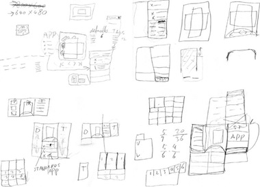
To prepare, I spent a day sketching the printing dialog, together with Andrea Alessandrini—my associate on this project. We had set ourselves the target of ‘fits on a 640×480 screen.’ Dialogs need a modest size, and this way it can still be used on mini‐sub‑notebooks.
In this dialog we have to show the sections that form the core of our solution:
- quick presets
- aka printing defaults; with one click, the printer is set up for what one wants to do: print a high‐quality photo, a document, some internet images; these presets ship with the printer for instant success, and users can make their own; quick presets need to be directly clickable, not in a pop‑up menu, else they are not ‘quick’ enough.
- preview
- a square area (shows portrait + landscape) where one can preview if the print is correctly transformed to paper; shows also staples, punched holes, duplex, watermark; includes controls for flipping through the pages; the preview needs to be big enough to be reliable, but no need to be able to read text on the page either.
- tags
- these stand for the aspects of printing that can interest users; by selecting one or more tags users configure their own dialog; using the tags should be effortless, users should not even notice that they are configuring their dialog.
- printing parameters
- these really control the printing in detail; the number of parameters that need to be displayed varies and depends on the tags selected.
Most of the day saw us probing where to put the tags, and how to cope with this seriously varying number of printing parameters:
from paper to screen
The weekend before the linuxTag was spent making mock‑ups of the dialog for general inkjet printers. Yes, they are in windows look + feel, but that happens to be a neutral position in the great KDE vs. gnome stand‑off. Andrea used visio, which comes with a windows l+f template, so we did not need to reinvent the wheel. But first:
- disclaimer
- this is a quick‐and‐dirty lash‑up to show you what we mean; there are for sure some things missing and lots of small issues to solve; enjoy nonetheless…
Keeping that in mind, here is the dialog in default appearance: no tag selected:
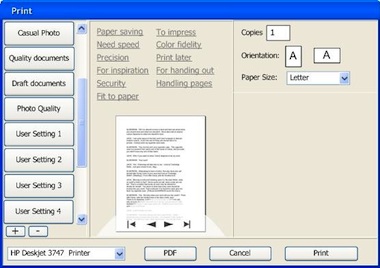
The quick presets are in the left column, with two buttons to add and delete presets. Tags are shown in the centre column, with the preview below them. The preview has a semi‐transparent heads‑up display for page navigation. In the right column are the printing parameters, showing here only the absolutely essential.
many–to–many
The tags shown are just examples to demonstrate that they do not only cover technical aspects of printing, but also user experience aspects. Here is the relationship between three of the tags (left) and their seven parameters:
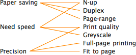
Note how each tag is connected to a low number of parameters. And how two of the parameters (N‑up, Print quality) each belong to two tags. The parameter section builds up according to the tags selected:
Full size dialogs: 1 tag, 2 tags, 3 tags. Which tags were selected will be persisted on a user + printer + application basis. This means that users optimise the dialog for each application they print from.
When even more tags are selected, The dialog will grow vertically to accommodate the extra printing parameters. The centre and right column have the same width, so parameters can be placed in both.
design decisions
The actual tags, parameters and their mapping come straight ‘from the printer,’ e.g. the driver or the PPD. It is ultimately the interaction designer that works for the printer manufacturer who decides what makes sense for a particular printer model.
Our team will set the standard here by designing tags and mappings for the seven printer clusters that we are working on. Usability surveys and test will be used to fundamentally answer the question ‘what aspects of printing do actually interest users?’
think different
For manufacturers, the tags are an excellent way of differentiating themselves. Not by introducing a tag ‘manufacturer xyz’ and associating some proprietary parameters with it. Instead, by representing unique benefits with a tag:
Say a manufacturer has a line of office printers of which the unique selling point is that these make your meetings 33% shorter (cool). Then introducing the tag ‘Shorter meetings’ and associating the parameters that enable that is the way to go.
expert evaluation
At the linuxTag, the openPrinting interaction architecture and usability team met, together with project organiser Till Kamppeter. The usability and interaction experts present (Celeste Lyn Paul, Jan Mühlig and me) discussed the dialog mock‑ups.
We found the concept in general really promising. It can be a definite improvement over the current printing dialogs of any desktop platform. But:
- printer selection pop‑up at the bottom? from looking at the task logic it needs to be at the top of the dialog;
- there can be confusion over what a quick preset does (change the printer settings, not any dialog parameter display) and what a tag does (change the parameter display in the dialog, not any printer settings); the dialog could do more to avoid this confusion;
- there needs to be a stronger relationship between the tags and the the parameters shown; a stronger showing of cause and effect.
These combined would probably cause this dialog to fail a usability test. The good news is that for us it is straightforward to sit down and solve these points. We are working on it.
automatic for the people
I was anxious to hear what Josef Spillner, our resident guru on auto‐configuring dialogs, had to say about the feasibility of our concept. The fact that parameters can belong to multiple tags makes for tricky grouping of parameters. This is not your fathers’ dialog with tabs:
Full size dialogs: first, second, third
Josef thinks that he and his team can crack this puzzle. We discussed the additional challenges of keeping parameters grouped in a logical way and giving the interaction designer that works for the printer manufacturer the means to override the auto‐configuration in exceptional cases.
all aboard
The first contact with folks from KDE and gnome and their respective UI toolkits, Qt and gtk, was very encouraging. My demo with the mock‑ups created a lot of enthusiasm, and the tag system was perceived uniformly as ‘very cool.’
LinuxTag was the first step on the road to cooperation. In the next weeks more steps will be taken, together with both the gtk community and Trolltech.
Labels: design stage, openPrinting, practical

3 comments · post a comment
- at 11 June, 2007 00:24, Unknown commented
- Wow, I think that this is way better than any current print dialogues.
Just some quick questions / Comments
1) Will there be pre-set tags for options that aren't controlled by the printer ppd (eg landscape / portrait
2) Page selection: is it handled in this dialogue or elseware? at work I print out lots of worksheets which come in a single pdf file, so having an easy way of printing 30 copies of worksheets (pages) 1,5,10 and 11 is very important...
3)Advanced options. I imagine that for items like N-up printing that there are some good defaults, but that you may want to have access to finer control over the process, for example the amount of border to use around the pages.
4) What does the pdf button do? it looks a bit out of place at the moment, even if I can see the intention
5) Just for a note, my current favourite printing dialogue is the new adobe acrobat one on windows...
6) which brings be on to the division between an application like acrobat 8, which provides a lot of extra functionality when printing, and the printer / driver - there seems to be quite a lot of features that are purely software in nature which seems a wast to code in every application, and also a wast to code for every printer, when it could? be done in a common middle layer...
then again, you probably already know that ;-)
tomh - at 13 June, 2007 12:00, mintze commented
- Looks good.
1)Have the same doubt about PDF button.
2) What is more of interest to me is: how does this kind of interface take care of passwords, user ids etc, which can be part of the PPD? Is there any provision, like there are pop-ups in Windows? The foomatic approach does work, at least with XPP, but will it work with this interface too? - at 28 June, 2007 20:19, Sean commented
- That tags display doesn't sit well with me. The dialog is way too crowded, and the tags are completely unobvious in their nature. Maybe if you made them checkboxes instead of link-type objects. (Links open new windows in browsers. They don't open sub tabs in a print dialog. When I first saw that I just thought they were some kind of instructive label, not something you click to configure things.)
The printer selector is also going to be a huge problem. I'd stab myself in the eye if I had to use this dialog in any university lab I've ever used - 250+ printers in one drop-down box... ugh.
Maybe replace the tags with a selector - not like tabs, which in general implies different unrelated sets of data - but a selection box that opens any and all related options to that tag. If you need two tags to set something up, there's probably something wrong with the whole layout concept. Put the printers in a more browseable list format w/ searching capability, and reduce that huge god-awful list of configurations on the left with something that doesn't take up 1/3 of the whole dialog.
If you like to ask Peter one burning question and talk about it for ten minutes, then check out his available officehours.
What is Peter up to? See his /now page.
- info@mmiworks.net
- +49 (0)30 345 06 197
- imprint

 Peter Sikking