lgm 07, top‑10 GIMP user requests
22 May 2007, 01:12
After my project overview at the lgm conference, Kamila Giedrojć entered the stage to present with me the top‑10 user requests, and our solutions models for them.
Now let me say first here, that a solutions model shows the way forward, based on analysis of the user interaction aspects. It is not a finished solution. It takes quite a bit of work to solve and design all the details, and we are not in that phase yet.
It is both the direction of the solutions models and ensuring that the details do not undermine the concept behind a solution, that are the greatest contributions of an interaction architect to a project. Now without further ado:
10. better printing support
Starting with the product vision we see that it mentions high-end photo + original art. It is a matter of course that part of this work will end up on paper, for sale or exhibition.
It is important to realise that printing is fully part of the workflow, not an afterthought. Placing the image on the page is a creative step towards the final result.
Compare bog standard printing…
…to creative placement:
Our conclusion is that printing should be integral to GIMP, not an extra plug‑in. Furthermore we conclude that the placement of an image on paper is a creative, hands‑on affair.
This is done best by preparing the print in the main window, placing the image there on a virtual piece of paper with a tool similar to the new selection/crop tools. This should be supported by a handful of interrelated number fields for margins, image size and printing resolution.
9. painting with ‘natural brushes’
Returning to the discussion of the product vision, we see that GIMP is an application for working with existing images, not for painting from scratch.
Furthermore, nowhere during the whole expert evaluation did painting with ‘natural brushes’ rise as a secondary requirement for performing an essential task.
Our conclusion is that natural brushes should not be part of core GIMP, nor of the standard distribution. The beauty of the plug‑in system is that when somebody out there still feels the need for painting with ‘natural brushes’ they can write and distribute the plug‑in themselves.
8. improve the text tool
typography, along paths, geometric distortion
During the expert evaluation we observed:
- text being used in both original art + web graphics, both creatively and functional;
- no requirements for page layout functionality;
- at some point users have to make a choice: is this text pixel or vector based;
- requirements for text styling + typographical control, e.g. kerning and baseline shift, to be able to produce the professional results mandated by the product vision;
- the current ‘one text per layer’ doctrine is not practical. Producing ten buttons on a single canvas for a website, ten layers are needed to label them.
Our solution is to allow multiple text blocks within one text layer. Because they can overlap, they will have their own stacking order.
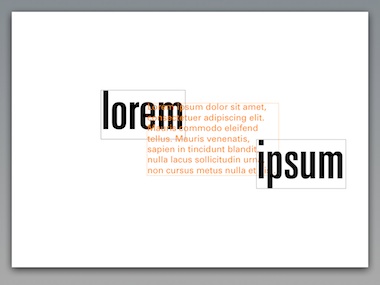
With the introduction of GEGL, users need no longer be concerned with the ‘pixel or vector’ question. And that can only be a good thing. Text will be editable until the end of time. It will be very natural to apply geometric distortion or pixel effects to texts.
7. save for web
Production of web graphics is part of the product vision. The user scenarios reflect this and the scenario for web images speaks of ‘export parts in optimised web format.’
kilobytes
It is important that web images are as small as possible. The ‘customer’ who commissioned the graphics is also picking up the bill for the network traffic they generate.
Combine all of the above with the fact that there are only a handful of web formats compared to more than a hundred in general. We conclude that save for web is a separate workflow where one compares the few web formats to solve the size versus quality question.
before + after
Does the quality of a jpeg compressed image needs to be compared side by side with the original? On the final website there is only the jpeg, and it either looks ‘professional’ or not. It is up to the GIMP user’s internal value system to judge what is good enough in each case.
Our solution is to reuse the main window for the save for web workflow, plenty of room to inspect the image quality. Standard zoom tools can be used to work at a level of detail where one is comfortable. GIMP can help with checking feasibility (gif) and doing the size calculations to recommend the optimal file format and ‘best’ default settings.
6. organise brushes, palettes, gradients in categories
Resources accumulate, and users ask for categories to break down their collections. The problem is that a resource (here a palette) can only be associated with one category:
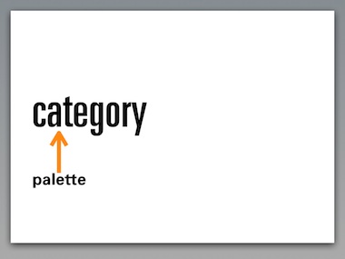
This means that there is only a single way to find back the palette: via this one category. This is similar to files and folders: there are a lot of unfindable files hiding on your hard disk.
Tagging allows to attach multiple concepts to a resource:
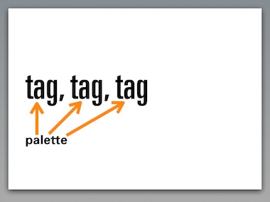
For instance customer name; project name; that it is a warm palette; a retro palette. This means that the palette can be found back via any of these concepts.
For this to be successful, we need to create UI that makes it incredibly easy to tag resources with existing and new tags, whenever users feel like it, in an incremental fashion.
next…
That was to bottom‑5 of the top‑10. Read all about the top‑5 next time…
Labels: design stage, GIMP, lecture, practical, product vision

![]()
![]()
4 comments · post a comment
- at 24 May, 2007 14:54,
 commented
 - So if I understand this right the term ‘natural brushes’ does not include all those nice things one could to with the existing (or slightly enhanced) brushes that are already in The GIMP, no?
What I mean is something similar to the Parameters/controls as in the photoshop brushes (as the anonymous poster already mentioned above) and the like - I know The GIMP is not PS, but the concept behind its brush-system is sound (and very flexible at that). It's just too good of a thing for various workflows to ignore :) Even better if you have a tablet or similar device.
They would at least be very useful for the the ‘Wild brush work’ (2. Creating Original Art) :)
PS: Texture artist (among other things) here as well ;) - at 25 May, 2007 20:20,
 Unknown commented
 - dear anonymous >^}
yes, I think it is cool to upgrade the brush system with more parameters some of them will give a more organic results.
But I draw the line when it comes to a dedicated ‘oil painting’ brush. Not core GIMP.
—ps (your agony aunt) - at 13 June, 2007 21:43, Unknown commented
- I suppose that I can dig the fact that GIMP should not have natural brushes, however, there are a great number of things that the vision you've got there disagrees with itself on.
The opinion that GIMP is a tool to work primarily with preexisting images is a good one and one that meshes with Photoshop's vision quite well which, despite not wanting to do a Photoshop too application is what GIMP more-or-less is. This can all be said however, I think that there are several modes for general mode image editors like this:
Touch-up
Modify
Create from elements
Create from scratch
Thus you've basically got a small step from the last one to "Create from scratch using... 'x' " where 'x' is the functionality of natural brushes, variable Wacom input or whatnot. The plug-in architecture should support heavily extending (not modifying, just adding more buttons to panels and whatnot... don't make us live in the plug-in ghetto) the base UI so that a module such as "GIMP::Paint" could be added and worked with as natively as "GIMP::Core" which looks like what you're talking about here.
I realize that it's a slippery slope to start thinking about features like this however, issues such as this should be accounted for in the API.
Just a usability request from a UI-savvy plug-in developer. - at 12 April, 2011 23:16, Gozzin commented
- Ok,this is my rant about the Free Select Tool.
Free select was fine the way it was,then with the latest Gimp polygon edges were added and free select was transformed into a source of extreme irritation.(That's an understatement.)
What I would like to see is the original free select back the way it used to be and the way it has been for all the years I've used Gimp.
I don't want,not do I need polygon edges, so here is my suggestion;
The polygon edges lasso could be a separate lasso,but turned upside down so people know its the polygon edges tool.
To say that I hate the addition of the polygon edges to this tool is an understatement. It would also perplex a newbie so much I can see the diving right back into the arms of Photoshop. And yes,I came very close to doing that myself.Could I have found Photoshop that worked with Ubuntu,I would have deleted the Gimp and bought Photoshop,just so I would have a normal free select tool. That is how frustrated I have felt over the "improvements" in this tool.
I also simply hate those stupid circles And when it comes time to close whatever I've cut around,no matter which circle I click on,it's the wrong one. I have to hit enter to close the loop.It took me hours to find that little tip. Most newbies are not going to bother to look.
I end up copy/pasting from one image to another with eclipse select cause if I touch free select to the canvas,I get a stupid circle and a line behind it that follows my mouse to hell and back,then I have to select another option to make the stupid circle/string go away.
Who thought this was a good idea?
I end up having to click twice as much to get around this ad on as I need to an I find it excessively annoying.
If you like to ask Peter one burning question and talk about it for ten minutes, then check out his available officehours.
 Peter Sikking is an
experienced
Peter Sikking is an
experienced
interaction architect. He unabashedly puts
shipping great products at the centre of his design practice. He is known for
his work for Google, Nokia, the
Metapolator &
GIMP
open source projects,
and startups.
What is Peter up to? See his /now page.
- info@mmiworks.net
- +49 (0)30 345 06 197
- imprint
