a survival guide for designing in a service context
10 November 2012, 00:26
The world usability day came early to Berlin this year. Apart from a special date, we also had a special location; the location scouts of the organisation team had worked hard to secure the iconic kalkscheune to receive a record number of visitors.
This year our theme was digital payments & service design. I contributed with a lecture titled simply designing in a service context—a survival guide. You can see the video online (in German), or read it below.
cliffhanger
Thinking about the theme of this world usability day, I asked myself: can I show some complete service design projects? The answer: positively maybe.
Let me explain.
What happens a lot in practice is that we get asked to design the user interaction for a piece of software—an app, website, portal, application, or even for a whole device—and in no time we find out that it is part of a whole service. , i.e. fixed:
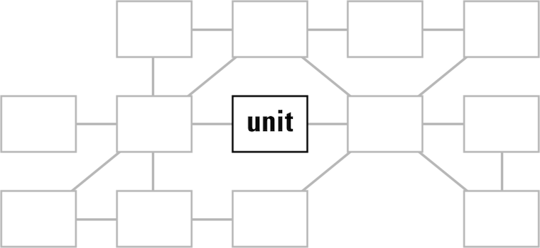
This is of course a rather unfortunate situation and basically a dilemma for interaction architects who are used to seeing the whole picture and shaping it.
rationalisation
There are plain, practical reasons for concentrating on one unit instead of designing the whole service. The first one is hardcore: time = money. In every project I have been involved in in the last two decades, effort—as counted in man‐months—was the bottleneck. Either time or budget was limited, or both. This does not mix easily with shifting the focus to the whole service, which does make a project automatically grow in size.
Besides that, every person has the need to divide a daunting task into ever‐smaller chunks, until these subtasks become small enough to be grasped and worked on in a secure way. Software development is full of this: modules–source files–functions so that developers can do their job, securely. The problem is that once a daunting task—say, a service—has been broken into pieces and grasped, it is hard for most to step back and look at the big picture.
Similarly, every organisation or firm gets divided into ever‐smaller chunks, divisions–departments–teams, so that people actually function. But it also creates fiefs and bureaucracy, with nobody willing or able to take responsibility for a whole service.
‘life is not meant to be easy’
What we can learn from this is that for service design to happen one needs time, stamina and budget; big‐picture thinkers in charge and the will to break departmental borders and bureaucracy. And one needs all of the above, or service design is not going to happen and the work will concentrate on a single software unit, aka catch‑22.
looking in my rear‐view mirror…
Now that we are completely rational, I would like to point out that it does not happen very often that customers say ‘hey, here is a project that is actually part of a whole service.’ Usually interaction architects have to figure that out by themselves. In my experience, that happens pretty fast. Below I will review some of my recent projects to give a glimpse of how that works.
But before we jump in, let me mention that I found the economic definition of service quite helpful to get a grip on the theme. Of the five characteristics, variability is the one that gave me most pause for thought; the fact that a service cannot be cookie‐cutter by definition.
Now on to the examples.
an e‑care portal for a mobile network
This portal is used by customers to configure and renew their contracts, among other things. A mobile network clearly delivers a service, check for instance the intangible and perishable characteristics of it. Another boost to the service design vibe is that multiple platforms/media are part of the mix: websites, call centres, SIMs being delivered in the post, brick‑and‐mortar stores.
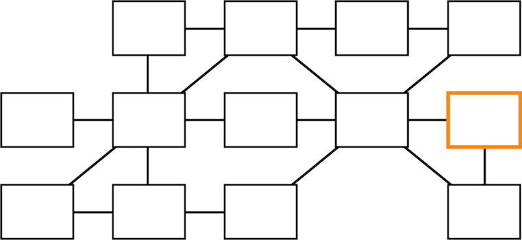
As the highly‐abstracted service view above shows, the e‑care portal in question lives at the far end of the service flow. It is vital to understand its role of regenerating customers in the system, by enabling them to engage with their subscriptions and renew them.
The clear service factor and the multiple platforms/media involved make me say with confidence that we worked here in a service design context.
a startup that will take the pain out of printing
We were asked to have a look at their desktop + mobile printing clients. When we started working with them it became clear that they were delivering a service: keep printing running in companies. Also the multiple platforms/media factor is there, with software and online components, toner delivery and even printers themselves in the mix.
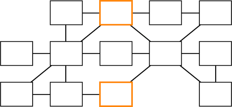
Thus we took the service view and put the printing clients in their proper place, on the sidelines of the service.
an image editor for professionals
One can also take this service thinking too far. This image editing application is tightly integrated with its online manual; there is a registry for plugins, to extend its capabilities with one‐click installation; there is a whole community in online forums around it:

However, the service vibe is not there. This application is not perishable, once you have downloaded it, you’ve got it. It is a tool, you can almost touch it.
Service design is not a cure‑all, not a universal approach to tackle the whole digital world.
a social network for the ad film world
We had already a good look at this one last year. A social network is certainly a service, you may recall how outspoken I am about their perishability and indeed after they decline their is nothing tangible left (also kidding there, folks).

There is an email component in addition to the website, but as is shown above, the overall service is just not complicated enough for me to warrant a service design approach. It is just not worth the effort.
a multi‑SIM mobile phone
This project we have also discussed before, twice. I reviewed it for the heck of it and found something interesting. I was trying to construct some kind of service argument around that this mobile, with its hot‐swap SIM slot, keeps tabs on five different mobile services at the time:
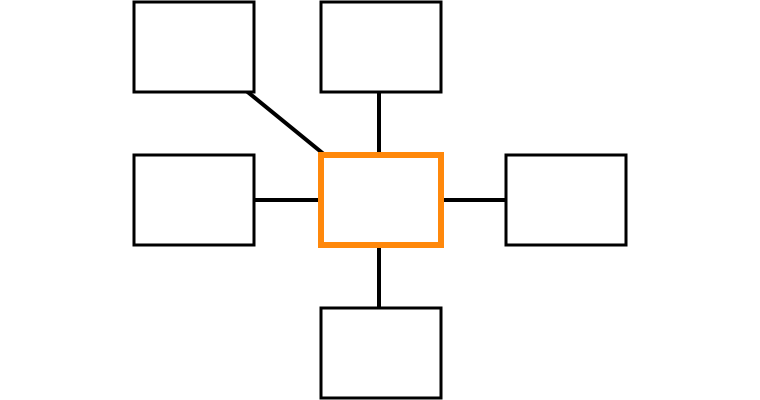
But then realised something else: this is not service design, this is contra‐service design. In a counter move, this product breaks the service tie between mobile network and mobile phone, reducing networks to commodities. It is literally a case of ‘power to the people.’ This is exactly what my team had in mind when we designed its user interaction.
walks like a duck, quacks like a duck
What I conclude from these project reviews is that in order to get in the service mood, I need to encounter a project that has serious service characteristics and has a nice complex structure, which preferably spreads over multiple platforms/media (desktop, online, devices, the real world—the one with humans and buildings).
At the end it is a judgement call—yep, gut feeling—whether the service context is present or not. This reflects the current start of the art, with publications lamenting that there is no such thing as a commonly accepted definition of ‘service, as used in service design.’
This situation reminds me of today’s confusion surrounding the term UX. That has the positive effect of creating the freedom to ‘simply do the right thing’—a source of many an innovation. But this situation is also cynically exploited at the moment and that discredits the movement to get UX at the top of the agenda.
elementary
And now, as promised, the survival guide. To recap, it is about dealing with the catch‑22 situation of concentrating on the user interaction design of a single unit (app, website, portal, application or device) that lives in a service context.
I will now go through the design project phases that I normally use and explain how to scope the design work so that the best is made of the situation—but without ballooning the effort involved.
product phase
The product phase lays the foundation of the project. With compact methods the goals and context are defined, and the whole as‑is situation is evaluated. Here we go:
- product vision
- There is no project without defining what needs to be achieved. A product
vision is a short, sharp statement of the identity of the product; its user
groups (narrowly defined) and the value it should deliver, as defined in a
moderated session by the persons leading the product creation.
- To cut to the chase, the vision we should work against in our catch‑22 project has to be that of the whole service: a service vision. Exactly, this is the moment where the ‘whole service view’ can be locked into the goals of the project, without any extra effort.
- This is also our last chance in the project to find out that a service context is present; if we find out later then we will have to start again from this step, or ignore it and plod on. Luckily the vision session method is 100% made for finding out what it is that we are designing. In the printing startup project that is what happened. As soon as we saw signs of a service context in the vision session, we switched gears and focussed on the service for their vision.
- functionality
- A functionality overview is compiled for two reasons:
- to get to know the project;
- to have checklist of everything that is ‘in the box,’ every point of functionality that has to be given a place in the interaction; the checklist is literally used as such during the design phase.
- For the first point mentioned, it is best to focus on the unit under design, but also go—in a more fleeting manner—through the service context:

- There is an opportunity here to discuss the relationship of the functionality in our unit and that of the rest of the service, and maybe move some of it around. It is good service design to distribute functionality thoughtfully across the service; i.e. when one platform (web, desktop, devices) covers a functionality point, it may be omitted elsewhere.
- Point number two: when compiling the functionality checklist, simply concentrate on the unit only, in accordance with the project brief.
- user scenarios
- These capture typical and essential use of the product. Imagine a playing
field, with the different ways to use the product spread over its two dimensions.
User scenarios are journeys over the field that show how big and diverse the
field is:
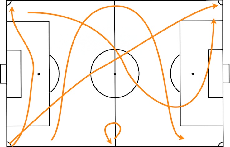
- You can see it doesn’t take many scenarios to cover the whole field. Three is minimal, six is fine and twelve is a good limit for huge, complex products. In our service context it translates like this:
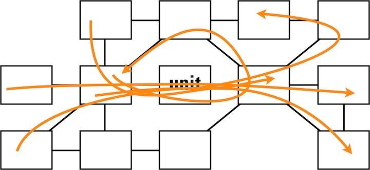
- Every scenario goes through our unit, but they also exercise the typical and essential parts of the service.
- expert evaluation
- The user scenarios are our guide during evaluation. Anything related to
the project—existing software, plans, designs, prototypes, competitors—can
be evaluated: does it fulfil the service vision?
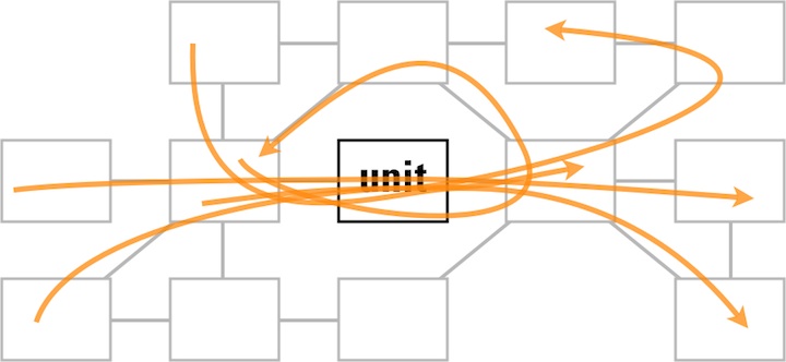
- As shown above, the scenarios make us focus on the unit under design, but also make us evaluate the typical and essential parts of the service.
design stage
The design stage is where we stop looking backwards and start moving forward, to solve the problems found and create the design. Since the bulk of the effort of an interaction design project is found here, there is not so much room anymore to take the whole service into account.
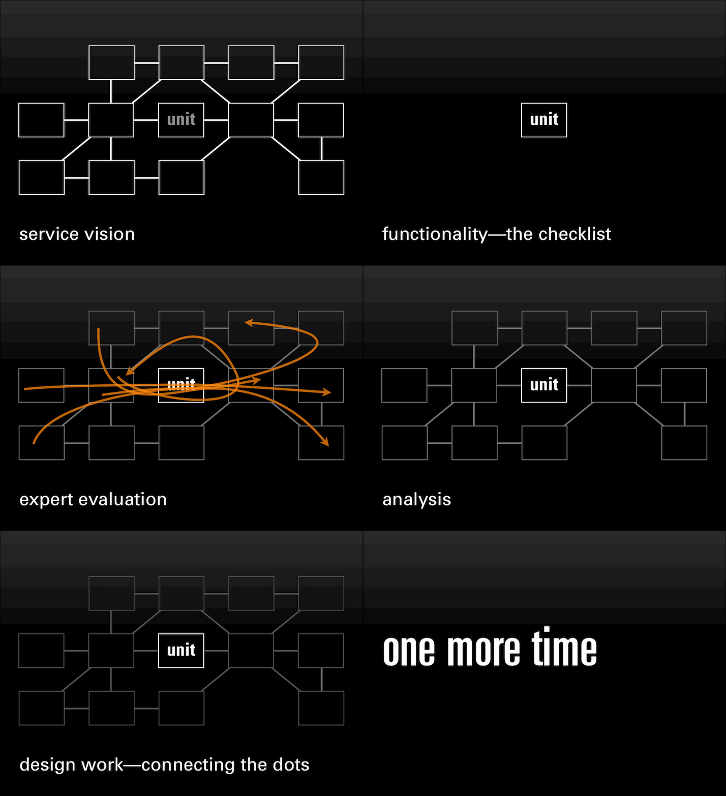
However, the first part of this phase is analysis, which is fully based on the expert evaluation, which in turn is shaped by the user scenarios. These made us focus on the unit, but still guided us through the whole service. Also the service vision was used as a tool during all evaluation and this takes the ‘whole service view.’ Thus the service plays a leading role in our analysis.
the party is over
But when we move on with all further design work we will have to focus on the unit we are designing, exclusively. Remember ‘time = money’? Here is where interaction architects have to be rational and work according to plans and budgets.
All we can do during the whole design stage is to highlight in all communication, with our collaborators and partners, how everything is connected in the service; how choices elsewhere in the service impact our design; how our design decisions create requirements elsewhere in the service.
implementation support
The last component of a design project is implementation support; collaboration with developers and media designers. The point of this is getting the product shipped, while keeping the interaction design together; ensuring that it does not crumble to dust one step at the time during implementation.
Since this is a follow‐through on the design work, we will again have to focus on the unit we are working on, exclusively.
the heartbeat
You can see the steps I just described in the animation below. Notice how the scope of the work pulses throughout the design project (animated gif):
introspection
Now is the time to stop and look back. Did I just present a way to fake a service design project? A way for managers to avoid having to think at the ‘whole service’ level and let interaction architects sort it out, one unit at the time?
Can a project set‑up like this produce OK results? Well, as long as there is an interaction architect on the job who can implement the described steps methodically, that is guaranteed.
Can a project set‑up like this produce good results? That mainly depends on how good the interaction architect is.
Ah, you are looking for great results? Then you need time, stamina and budget; big‐picture thinkers in charge and the will to break departmental borders and bureaucracy. Then a multi‐disciplinary team needs to design the whole service as if it was shaped by a single hand.
Then, you need service design.
Labels: lecture, practical, process, product vision, top story

If you like to ask Peter one burning question and talk about it for ten minutes, then check out his available officehours.
What is Peter up to? See his /now page.
- info@mmiworks.net
- +49 (0)30 345 06 197
- imprint
 Peter Sikking