design lessons with Daft Punk
23 May 2013, 22:51
I am sure you have noticed the Daft Punk marketing master plan that is taking over all media channels at the moment. And I admit that I am happy to consume—and inhale—anything (semi‐)intelligent that is being written about them.
Yesterday I read this Observer interview with the ‘notoriously shy French duo.’
punk rules, OK?
Below are Daft Punk quotes I lifted from the article, followed by what I associate with each. There are also a couple of cameo appearances by hit‑production legend Nile Rodgers.
‘The music that’s being done today has lost its magic and its poetry because it’s rooted in everyday life and is highly technological.’
Wow, not the most hands‑on quote to start with. But I swore that I’d present them in the order they appear in the article. With the mentioned ‘magic and poetry’, I associate fantastic design work. This means sweeping solutions, for which there needs to be at least one designer on the project with a big‐picture view.
Being constantly ‘rooted in everyday life’—e.g. relying on testing (A/B or usability); or working piecemeal, or driven by user requests, or in firefighter mode—shortens the horizons and shrinks the goals. It surely programs the project for mediocrity, i.e. humdrum, incremental solutions.
Every user has to deal every day with software that ‘is highly technological.’ Everybody thinks this sucks. Making software is highly technological when one is staring at code; when thinking about code; when taking prototyping capabilities into account; when technology informs the interaction, verbatim. Designing great interaction means not making any of these mistakes.
‘In early interviews they came across as suspicious and aloof. “It’s because you’re 18 and you feel maybe guilty: why are we chosen to do these things?” says Thomas. “There’s definitely reasons to feel less uncomfortable now. It’s one thing to say you’re going to do it and another to have done it for 20 years.”’
Now that is the voice of experience talking. The first part of it is this early phase; fresh out of school and real (work) life is starting. This suspicion of one’s own talents, entering a company, scene or industry and expecting the folks around you to be like you, see things like you. And then they don’t. Very confusing, who is wrong here?
The second part is having ‘done it for 20 years.’ If that involved a portfolio of successful work; continuous self‐development; the discovery of what a difference ‘being experienced’ makes and getting to know a few peers, then it has become more comfortable to be a designer. Just don’t get too comfortable; make sure every new project you take on challenges and develops you.
‘The only secret to being in control is to have it in the beginning. Retaining control is still hard, but obtaining control is virtually impossible.’
The first level where this holds is getting a design implemented. Quite often developers like to first put some temporary—and highly technological—interaction while they sort out the non‑UI code. The real design will be implemented later. Then time ticks away, the design lands in a drawer and the ‘temporary’ UI gets shipped.
I do not think this is a malicious trick, but it happens so often that I do not buy it anymore. The only secret to getting interaction design implemented is to do it in the beginning.
The second level is that of the overall collaboration; ‘obtaining control is virtually impossible,’ no matter how big a boost a designer has given the project. So one has to start out with control from the beginning, it has to be endowed by the project leadership. And then one has to work hard to retain it.
‘Guy‑Man, who designed the artwork, says that Thomas is the “hands‑on technician” while he is the “filter”: the man who stands back and says oui or non.’
Filter is the stuff designers are made of. In the case of interaction designers it means filtering out of all the things users say, the things they actually need. It means saying non to many things that are simply technologically possible, but useless, and oui to exactly that what realises the product, addresses users needs and is, yes, technologically possible.
Being the filter does not always make you friends, having to say non to cool‐sounding initiatives that in the bigger scheme of things are incredibly unhelpful. But being a yes‑man makes an ineffective designer, with non‑designed results.
Making software is not a game with unlimited time and resources; user interaction is not one with unlimited screen space and communication bandwidth. A filter is crucial.
‘“The genius is never in the writing, it’s in the rewriting,” says Rodgers. “Whenever they put out records I can hear the amount of work that’s gone into them—those microscopically small decisions that other people won’t even think about. It’s cool, but they massage it so it’s not just cool—it’s amazing.”’
I learned some years ago that it is not only the BIG plans and sweeping solutions that make a master designer. It is also in the details. All the tiny details.
All these ‘microscopically small decisions’ have to be taken in the way that strengthen the overall design, or else it will crumble to dust. This creates tension with all the collaborators, who ‘won’t even think about’ these details. They cannot see the point, the crumbling. Masters do.
‘We wish people could be influenced by our approach as much as our output. It’s about breaking the rules and doing something different rather than taking some arrangements we did 10 years ago that have now become a formula.’
Design is not a formula, not a sauce you pour over software. Design is a process, performed by those who can. A designer cannot tell upfront what the design will be like, but knows where to start, what to tackle and when it is done. That sounds trivial, but for non‑designers these four points work exactly opposite.
Apply the design process to a unique (i.e. non‑copycat) project and you will get an appropriate and unique design. Blindly applying this design to another project is by definition inappropriate.
‘“Computers aren’t really music instruments,” he sniffs. “And the only way to listen to it is on a computer as well. Human creativity is the ultimate interface. It’s much more powerful than the mouse or the touch screen.”’
This quote hits the nail on the head by setting the flow of creativity between humans as the baseline and then noting how computer interfaces are completely humbled by it. It is too easy to forget about this when your everyday world is making software.
The truth about software for designers (of music, graphics and other media) is that not much of it is designed—the interaction I mean, although it may look cool. Being software for a niche market makes it armpit of usability material: developers talking directly to users, implementing their feature request in a highly technological way.
To make an end to this sad state of affairs, a design process needs to be introduced that is rooted in a complete—but filtered—understanding of the activity called human creativity.
‘Enjoying the Hollywood analogy, Thomas says Daft Punk were the album’s screenwriters and directors while the guest performers were the actors, but actors who were given licence to write their own lines.’
I am also enjoying that analogy, and the delicate balance that is implied. On the one hand, interaction designers get to create the embodiment of the software ‘out of thin air’ and write it down in some form of specification, the screenplay. Being in the position of seeing how everything is connected, it also falls naturally to them to direct the further realisation, by developers and media designers.
If that sounds very bossy to you, it is balanced by the fact that these developers and media designers already have complete ‘licence to write their own lines.’ For developers every line of code they write is literary theirs.
The delicate balance depends on developers and media designers being able to contribute to the interaction design process—in both meanings of that phrase. And it depends on all written lines fitting the screenplay.
‘“What I worked on was quite bare bones and everything else grew up around me,” says Nile Rodgers. “They just wanted me to be free to play. That’s the way we used to make records back in the day. It almost felt like we’d moved back in time.”’
This is what design processes are about; to create a space where one is free to play. This in the dead‐serious context of solving the problem. Play is used to get around a wall or two that stand between the designer and the solution for making it work.
It takes a ‘quite bare‐bones’ environment to be free: pencil and paper in the case of interaction design. That may ‘feel like moving back in time’ but it is actually really liberating; it offers a great interface for human creativity. Once you got around those walls and hit upon the solution, every part of the design can grow up around what you played.
And on that note, I’ll finish today’s blog post.
Labels: fundamental, process

masterclass in san francisco
13 May 2013, 13:58
The day after Volkswagen + Wolfsburg I was on my way to San Francisco. I had been invited by the California College of the Arts (CCA) for their Dutch Design Week, ‘a series of events celebrating Dutch Design and fostering exchange between Dutch and American Designers.’
begin the beguine
While I was planning the class, Kristian Simsarian—chair of the interaction design program at CCA—encouraged me to pick a topic which I am passionate about. So I picked two: product realisation and mobile. The last decade these have been the most important themes in my design practice, with the highest impact.
So the masterclass was going to consist of designing a proper mobile website or app for a software product, a service, website or organisation. Question was: which one?
uncanny valley
I am not comfortable with structuring my teaching around imaginary projects. Only when there are one or more persons inside a project who burn to make something valuable, it is viable for designers to work on it and realise this goal.
So instead of making up an imaginary project for this class, I asked the participating students to bring their own project, one they are passionate about. I was curious to see what they would bring in: could be some app they love but wanted to redesign, or a local community project. At the end each student brought a personal project to work on, some of them with a local (transport/biking) flavour.
on the one
Fast‐forward to the first morning of the masterclass. The CCA’s SF building is like a cathedral part‐filled with a labyrinth of cosy spaces to teach and work. Next door to my class was the one of industrial designer Maarten Baptist. Right in front of us, the floor of the ‘nave’ filled up with the graphic design students of Marijke and Chantal, i.e. Cobbenhagen Hendriksen, working on posters. Everyone was inspired.
After a riveting introduction by Alexander Baumgardt—who had been instrumental in bringing me over for the week—it was time for me to get to know the students, seven graduates and five undergrads. I am always interested in the reason why each chose to participate, it tells me something about this student and her/his expectations, and the future of my industry.
get with the program
I then explained the main building blocks of the class, product realisation and mobile, and two auxiliary ones: ‘design is solving the problem’ and ‘designing is done pencil on paper.’ I wove these together with an overview of my career, to show where they are coming from and why they play such an important role in my practice.
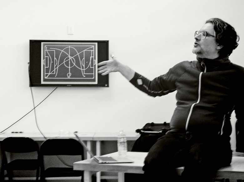 explaining the tactical deployment of user scenarios;
photo © Kathleen Moynahan
Next, I structured our work for the first day. We started off with the product phase; building a foundation for the design work: product vision; functionality overview; user scenarios; expert evaluation. First up was the method that I see as crucial for product realisation: compiling a product vision.
vicious games
Experience tells me that it is incredibly hard for project insiders to define their vision; it’s like pulling teeth. It also takes a long time; weeks of pulling teeth. I did not have the time for this, although I had created the situation that every student entered the class as a full insider of her/his own project.
What I needed was what every project needs: a moderator to tease the vision out of the project insiders. Luckily I had a class full of potential moderators. Product realisation means working from a vision, thus it became natural to go through the exercise of moderating one.
1 + 1 = 2
During the morning, I introduced the product vision method and told the story of how I developed it years ago. I showed the Krita example—long live open working—and explained what each part means, down to single words. Then I asked the students to work in pairs.
Because I found the interaction specialisation vs. maturity asymmetry in my class interesting, I asked the undergrads to pair up with a graduate student, just to mix things up. Looking back I can report that collaboration was exemplary.
Within each pair, one would take the role of moderator, helping the other—insider to her/his own project—to formulate a vision. Then they swapped roles.
altogether
Getting a product vision together takes time and each pair had to formulate two of them. As a result we spent a couple of hours on this method. Apart from doing Q+A and guidance with the six pairs, I also held two rounds of discussion with the complete class.
In these discussions we spoke about how we were doing, what we were observing and experiencing, and I explained the more tricky parts of a product vision. From the reaction of my students, I got my first dose of unintended consequences.
1 + 1 = 4
By now you know that I had the students work on a vision in both moderator and insider roles just to stand a chance of getting it done. I could have predicted that by playing both roles they would get twice the insight into the product vision method.
But judging from the overwhelming reaction of my students, I seemed to have a struck a quadratic effect. They were enthusiastic and ‘getting it’ as if they just had four times the insight. That really made my day.
can you dig it?
Here are three product vision statements made in the class:
‘The Thrive App gives a voice to household plants. Thrive lets busy, novice plant owners know their plant’s well‐being via a paired sensor in the soil and recommends appropriate care through the voice of the plant.
‘Thrive notifies owners of their plant’s vitals in real time. Thrive connects people to nature in a small way by creating an emotional bond between people and their plants.’vision © Ramunė Rastonis, moderated by Allison Leach
‘Echosphere is a mobile application that creates and controls sounds based in your movement.
‘By combining live movement with sound and visuals, it helps an older audience reawaken their sense of play.
‘Echosphere is an individualized, immersive experience that encourages breaking out of analytical thought.’vision © Kathleen Moynahan, moderated by Evan Litvak
‘MyWay is a smartphone app to optimize the daily use of public transportation. Users can personalize their regular destinations and schedules. The app keeps track of the public transportation times and provides accurate feedback to the user, sending updates. It learns from users’ behavior and automates their routine trip plans.
‘It is meant for San Franciscans, in their 20’s to 50’s, who use public transportation, own smartphones and are familiar with the streets of San Francisco. The users have busy schedules, commute daily with normally 2 to 4 regular destinations.
‘With MyWay people will be able to clear their minds from repetitive tasks of keeping tracks of their time to catch public transportation. It will free the user from the burden of keeping constant eye on the transit schedule.’vision © Tatsiana Siadneva, moderated by Francis Nakagawa
It is clear what each of these three is about and what value it aims to deliver. And that is the point of a vision.
bat man
On the second day of the masterclass the accent moved to mobile interaction. It was time to lead the students to a series of hard mobile design choices that they had to make for their project. For instance:
- mobile website or app?
- This choice should not be based on how cool, or confident one feels designing it, but on what is best implementing the product vision.
- fragmentation
- With limited time available for this class, I made the students pick one platform and one screen size (‑range, in cm/inches of course) to design for. In the real world, each (supported) combination of these two needs a separate, optimised design.
- the nr.1 issue in mobile
- a.k.a. the battery. It has been the issue for decades. As interaction designer—i.e. designer of ‘the whole thing’—one will either be confronted with severe limitations set by the platform on how much the app/site can be ‘alive’ all the time, or there are no limits and one has the full responsibility to not drain the battery, all the time.
The overall goal of the masterclass was to design a solutions model; i.e. the broad‐strokes plan that solves the main design challenges, plus a strategy to design the rest. A complete (draft) design of even a small app would have been too much work for our two days.
go west
I encouraged my students to explore and brainstorm before working reductive and settling for a solution. But in practice, quite a few of them settled too quickly.
So I challenged these students: ‘I see your design hinges largely on XYZ, It would be good if you brainstorm a few ideas that do not involve XYZ. Either you’ll find something better than your current plan, or you will learn valuable lessons about XYZ.’
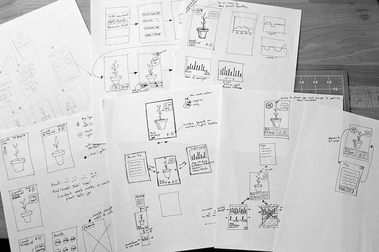 Thrive
interaction sketches, © Ramunė Rastonis
go next
Working with the students showed a lot of variation. Each had her/his own pace, project, approach, and design. I enjoyed immensely working with each individually and I am sure all of us would have enjoyed a couple of days more of designing together. Then there was the second case of unintended consequences.
The feedback of most students was that they were going to continue working on their project. This is really different than usual, where the project gets dumped the moment the class is over. Why was it different this time? Ah, because each of them brought a personal project.
All in all it is very rewarding to see the impact of the masterclass. To see how the project of every student made at least two steps in the right direction. To see how the students ‘got’ something out of it that they can use during their design careers.
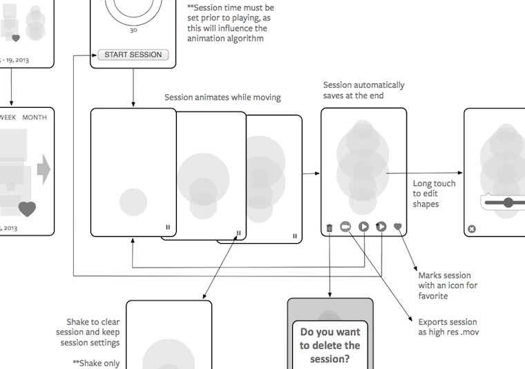 Echosphere interaction wireframes, worked out after the class,
© Kathleen Moynahan
postscript
I did a panel discussion and a Q+A session with first year interaction design students during the CCA Dutch Design Week. I also met a lot of interesting people. But the masterclass stands as my personal highlight because from all the feedback I got, it was clear that both the students and the CCA got a real kick out of it. And so did I.
I would like to thank the students for their hard work; Tatsiana, Kathleen and Ramunė for allowing me to share their work here; Alexander Baumgardt for getting the ball rolling; and all at the CCA and the Dutch consulate who enabled this trip.
Labels: mobile, product vision, teaching

If you like to ask Peter one burning question and talk about it for ten minutes, then check out his available officehours.
What is Peter up to? See his /now page.
- info@mmiworks.net
- +49 (0)30 345 06 197
- imprint
 Peter Sikking