working on the GIMP
6 July 2006, 20:33
After a tentative start, I am getting seriously involved with the GIMP project. Long term, this is a very hot project for an interaction architect to work on. But for now Sven asked me to do some solutions consulting for the upcoming 2.4 release. So we met up on a warm summer’s evening, Mitch also joined. He has been working for a long time on solutions for the issue‐at‐hand.
shortcut shortage
The topic was building up a selection mask in the GIMP from simple shapes (rectangle, ellipse), combining them with not‐so‐simple shapes. There are a couple of categories of control over this process:
- drawing constraints
- constrain the bounding box of the simple shape to a square; draw from centre.
- addition mode
- operarator used to add a fresh selection part to the existing selection mask: replace / add / remove / ‘logical and.’
- minute adjustment
- move or resize the fresh selection part before commiting the result.
The questions from the GIMP team were:
- how to control all of these option categories from the keyboard, when the only two available keys seem to be shift and control;
- also the interaction of the third category (minute adjustment) was only part‐done, they were looking for ways to integrate it into the overall workflow.
deal with a problem: ignore it
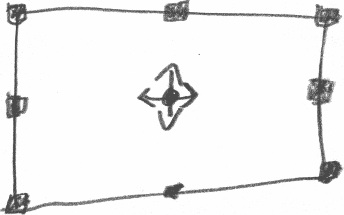
The first thing I did was looking for ways to avoid conflict, to stop the three categories competing for the same keyboard keys. I lifted the third category (minute adjustment) out of the whole conflict, using interaction ingredients already present in the GIMP:

- eight resize handles, instead of four on the corner;
- I made the handles double the size (quadruples the area), and solid (instead of a one‐pixel outline) to speed up the interaction;
- a move handle in the centre of the shape.
With these simple rules, the resulting interaction is visible, direct, and on‐the‐spot. No keyboard required. I like that.
Further attempts to separate the other two categories (drawing constraints, addition mode) failed, so it was time for some hard choices.
fundamentals
Luckily, I had worked with the GIMP team before on defining a product vision, so we had a foundation to base decisions on. It all came together:
‘you know, these professionals spend most of their days building up complex selections’Mitch, GIMP developer
That was what I needed. Because the GIMP product vision is to be a high‐end tool, the observation above puts the priority on controlling the addition mode. So I assigned the combinations of shift and control to that. I also discussed with Sven and Mitch how visual feedback could—and should—still be given, to indicate the current addition mode.
So what about the remaining category, the drawing constraints? Well, we noticed that the current addition mode is only significant up to the moment the mouse button goes down for drawing a fresh selection. From then on it is fixed until the resulting selection has been commited.
So I said: ‘can we detect whether the shift and/or control key go down after the mouse‐down, to apply the drawing constraints?’ Yes, we could. Problem solved, then.
in short…
A fundamental issue that has been a skeleton in the closet for years. To the developers it looks like an unwieldy mess that cannot be solved elegantly.
Two hours of working with an interaction architect, and with some easy to implement measures, the problem has disappeared. Afterwards, everybody looked relieved and bemused: ‘was that all there was to it?’
Labels: GIMP, practical, product vision

0 comments · post a comment
If you like to ask Peter one burning question and talk about it for ten minutes, then check out his available officehours.
What is Peter up to? See his /now page.
- info@mmiworks.net
- +49 (0)30 345 06 197
- imprint

 Peter Sikking