designing openType‐features UI /intro
23 June 2015, 09:24
a bit of a situation
First things first. It is quite likely that when you are reading this, you know what openType features in fonts are. But just in case you don’t, here is a friendly, illustrated explanation of some of the features, without putting you straight into corporate specification hell. The reason I said ‘some’ will become clear below.
What is interesting is that there is a riot going on. The 800‑pound gorillas of (typo‐)graphical software—the adobe creative suite applications—have such bad and disparate UI for handling openType features that a grass‐roots protest movement started among typographers and font designers to do something about it. What followed was a a petition and a hasty promise by adobe to do better—in the future.
meanwhile in Toronto…
These events prodded Nathan Willis into action, because ‘open‐source applications aren’t any better in this regard.’ He organised a openType workshop at this year’s LGM to get a process started to change that. I went there because this is smack in the middle of one of my fields of specialisation: interaction for creatives. As you can read in Nathan’s report, I got immediately drawn into the UI discussion and now we have a loose‐knit project.
The contents and vibe of the questions, and my answers, in the UI discussion all pointed in a certain direction, that I was only able to name a day later: harmonised openType features for all F/LOSS (typo‐)graphical applications definitely has an infrastructure component.
the untouchables
Pure infrastructure—e.g. tap water, electricity, telecoms—offers its designers some unique challenges:
- everybody uses it
- and everybody’s needs are equally important; there is no opportunity to optimise the design for the specific needs of user groups.
- nobody cares
- usage is ubiquitous, i.e. we all do not even register that we are using this stuff all the time—until it stops working, then we miss it a hundred times a day. This makes it very hard to research; no recollection, feelings or values are connected to infrastructure, just entitlement.
- anyplace, anywhere, anytime
- there is no specific contextual information to work with: why is it used; what is the goal; what does it mean in the overall scheme of things; how much is a little, and a lot; it is used sparsely, all the time, at regular intervals, in bursts? It all depends and it all happens. Just deal with it, all of it.
- millions of use cases
- (not that I consider use cases a method that contributes positively to any software project, but‐) in the case of infrastructure something funny and instructive happens: after a week or two of exploration and mapping, the number of use cases grows exponentially towards a million and… keeps on growing. I have seen this happen, it is like peeling an onion and for every layer you peel off, the number goes up by an order of magnitude. These millions of use cases are an expression of everybody using it anyplace, anywhere, anytime.
- heterogeneous capabilities
- this is not always the case, but what is available can vary, a lot. For instance public transport: how many connections (incl. zero) are available for a given trip—and how fast, frequent and comfortable these are—is set by the network routes and timetables. An asked‑for capability is on offer, or not. It all depends and it all happens. Just deal with it, all of it.
I have worked as design lead on two infrastructure projects. One was Nokia dual‑SIM, the other openPrinting, where we designed printing dialogs for all linux users (everyone), as used in 10.000 applications (anyplace, anywhere, anytime), connected to 10.000 different printer models (heterogeneous capabilities). I dubbed it the project with five million use cases.
Ah, and since both application and printer configure the available options of the print dialog, there are potentially 100 million configurations. Even if in reality the variability is far less (say, just 1% on both application and printer side; i.e. 100 significantly different printer models and 100 apps that add serious, vital printing options), then it is still an overwhelming 10.000 configurations.
drowning, not waving
In my experience, designing infrastructure is very demanding. All the time one switches between making the big, abstract plan for everything, and designing, minutely, one of many details in complete isolation. Mid‑level interaction design, the journeyman, run‑of‐the‑mill, lay‑out‐a‑screen level, is completely missing.
It is like landscaping a featureless dessert, where every grain of sand is a detail that has to be dealt with. With no focus on particular users, no basis for research, no context, no just‑design‐the‐example, millions of use cases and highly variable capabilities, I have seen very capable design colleagues lose their bearings and give up.
back at the ranch
Enough war stories. How large is this infrastructure component of openType features in (typo‐)graphical software? Let’s check the list:
- everybody uses it—nope. Whether the user groups turn out to be defined real narrow or quite wide—a matter of vision—they will have in common that all of them know their typesetting. That is a craft, not common knowledge.
- nobody cares—well, soon they won’t. Right now there is upheaval because nothing is working. As soon as users get a working solution in the programs they use, it will become as interesting as the streetlights in your street.
- anyplace, anywhere, anytime—right on! This has to work in (typo‐)graphical software; all of it—even the kind I have never heard of, or that will be invented in five years from now. All we know, is that serious typesetting is performed there by users, on any length of text selection.
- millions of use cases—not quite. The limited user group provides the breaks here. But there is no such limit from the application side; on the contrary: most of these are (open‐ended) tools for creatives. Just thinking about how flexible a medium text is, for information or shapes, gives me the confidence to say that 10.000 use cases could be compiled, if someone would sit down and do it.
- heterogeneous capabilities—hell yeah! OpenType‐features support in fonts is all over the place and not just because of negligence. First there is the kaleidoscopic diversity of scripts used around the world, most of which you and I have never heard of. Latin script is just the tip of the iceberg. Furthermore, what is supported, and how each supported feature is actually realised, is completely up to the font designer. The openType‐features standard is open‐ended and creates opportunities for adding sophistication. This is only limited by the combined imagination of the font design community.
Adding that up, we get a score of 3½ out of 5. By doing this exercise I have just found out that openType features in (typo‐)graphical software is 70% infrastructural. This is what I meant with that it is a special, complicated project.
structure—the future
In projects like these structuring the design work is make‑or‐break; either we set off in the right direction, or never get to any destination—not even a wrong one. The structure I use is no secret. Here is my adaptation for this project:
A product vision is not that easy to formulate for pure infrastructure; it tends to shrink towards ‘because it’s there.’ For instance at openPrinting the vision was ‘printing that just works.’ I still regret not having twisted some arms to get a value statement added to that. There were times that this value void was keeping us from creating true next‐generation solutions.
Apart from ‘what’s the value?’ also ‘who is this for?’ needs to be clarified; as we saw earlier, openType features is not for everyone. The identity question, ‘what is it we are making?’ may be a lot less spectacular, but it needs to be agreed. I will take this to the Create mailing list first, mainly to find out who are the ‘fish that swim upfront’, i.e. the people with vision and drive. Step two is an online vision session, resulting in a defined vision.
The deliverable is a to‑the‐point vision statement. If you want to get a good picture of what that entails, then I recommend you read this super‐informative blog post. Bonus: it is completely font‐related.
we want the funk, the whole funk, nothing but the funk
A deep understanding of the functionality is the key to success in this project. I already got burned once with openType features in the Metapolator project. Several font designers told me: ‘it is only a bunch of substitution rules.’ Until it turned out it isn’t. Then at the LGM meeting another surprise complication surfaced. Later I briefly check the specification and there is yet another.
This is what I meant before with that friendly page explaining some of the features. I do not trust it to be complete (and it is only Latin‐centric, anyway). As interaction architect I will have to be completely on top of the functionality, never having to rely on someone else to explain me what ‘is in the box.’ This means knowing the openType standards.
Central to it is the feature tags specification and the feature definition syntax. This contains both the material for understanding of how complicated it all can get and the structures that I can use to formulate UI solutions. It is one of the few aspects that are firm and finite in this project.
The deliverable is a functionality overview, written up in the project wiki.
talking heads
I will do user research, say interview half a dozen users, to gain insight into the act of typesetting, the other aspect that is firm and finite in this project. Which users to recruit depends on what is defined in the product vision. Note that the focus is on the essence of typesetting, while ignoring its specific role in the different (typo‐)graphical applications, and not get swamped by the latter’s diversity.
The deliverable is notes of interest from the interviews, written up in the wiki.
I look forward to an exchange with F/LOSS (typo‐)graphical applications via the Create list. This is not intended to get some kind of inventory of all the apps and how different they are. In this project that is taken as abstract and infinite—the good old infrastructural way.
What I want to find out is in how many different ways openType features must, or can, be integrated in the UIs of (typo‐)graphical applications. In blunt terms: how much space is there available for this stuff, what shape does it have and what is the duty cycle (permanently displayed, or a pop‑up, or…)? These diverse application needs are clustered into just enough UI models (say, six) and used below.
The deliverable is the UI models, written up in the wiki.
getting an eyeful
Then it is time to do an expert evaluation of existing openType‐features UI and all these UI ideas offered by users when the petition did its rounds. All of these get evaluated against—
- the product vision: does it realise the goals? Is it appropriate for the defined user groups?
- the functionality: can it cope with the heterogeneous capabilities?
- the user research: how tuned is it for the essence of typesetting?
- the UI models: how well does it fit with each model?
All of it gets analysed, then sorted into the good, the bad and the ugly. There will be a tiny amount of gold, mostly in the form ideas and intentions—not really what one would call a design—and a large catalog of what exactly not to do.
The deliverable is notes of interest from the evaluation, written up in the wiki.
warp drive
Then comes the moment to stop looking backwards and start working forwards; to start creating the future. First a solutions model is made. This is a combination of a broad‐strokes solution that cuts the project down to manageable proportions and a defined approach how to deal with the rest, the more detailed design work.
The next stage is to design a generic solution, one that already deals with all of it, all the hairy stuff: text selections of any length, all the heterogeneous capabilities, the typesetting workflow, clear representation of all openType features available and their current state. This will be specified in a wiki, in the form of UI patterns.
With the generic solution in place it will be real clear for the central software library in this small universe, HarfBuzz, which new capabilities it will need to offer to F/LOSS (typo‐)graphical software.
home straight
The final design phase is to work out the generic solution for each UI model. These will still be toolkit agnostic (not specific for KDE or gnome) and, btw, for desktop UI‐only (touch is a whole ’nother kettle of fish). This will also be specified in the wiki.
With this, every (typo‐)graphical software project can go to the wiki, pick a UI model that most matches their own UI structure and see a concrete UI design that, with a minimum of adaptations, they can implement in their own application. They will find that HarfBuzz fully supports their implementation.
While working on Metapolator in the last year I had good experience with sharing what I was doing almost every day I was working on it, through its community. There were encouragement, ideas, discussions, petitions and corrections—all useful. I think this can be replicated on the Create list.
Labels: design stage, fundamental, infrastructure, openType, practical, process, product phase, product vision, top story

a half‑century of success
11 June 2015, 12:48
To complete the round number of fifty, I present the final dozen + two of these for your reference. If you are a product maker, or manage a product‐shipping organisation, then you can initiate at least one of these today:
Make the lead designers of your hard‐ and software work as a pair; make them inseparable.cf. ‘The hardware specs are fixed, now we can start with the software design.’
Define your focus so tightly, it hurts (a bit); deploy it so you ship, instead of discuss.cf. ‘We spent ages discussing this, trying to find a solution that pleased everyone.’
Make interaction design the backbone of your product realisation; or compete on low, low price.cf. ‘We thought we could spend a couple of man‐days on the low‐hanging usability fruit.’
Deploy lightweight design and engineering documentation to keep everyone with the programme.cf. ‘The source is the ultimate documentation.’
Ban hacks, at least from those who are supposed to shape your product for the long term.cf. ‘There is no need to go for the gold‐taps solution.’
Set a ‘feature budget’ and set it way below bloat; be frugal, spend it on user value.cf. ‘It does not hurt to have those features as well.’
Set the goal to be competitive on each platform you support—that starts with your interaction.cf. ‘One code base; fully cross‐platform.’
Root out boilerplate thinking for any product aspect; your design process is your QA.cf. ‘You have to pick your battles.’
Set up your designers for big impact on the internals of your software, instead of vice versa.cf. ‘Once you get familiar with the internal workings of our software, it becomes easy to use.’
Define your target user group(s) so tightly, it hurts; focus on their needs, exclusively.cf. ‘Our specific target user group is: everyone.’
Introduce this KPI: the more your developers think the UI is ‘on the wrong track,’ the better.cf. ‘Our developers are very experienced; they make the UI of their modules as they see fit.’
Hire those who are able to take your interaction beyond the HIG, once you achieve compliance.cf. ‘We religiously adhere to the HIG.’
Regularly analyse workarounds adopted by your users; distill from them additional user needs.’cf. ‘You can do that by [writing, running] a script.’
Make the connection: product–users–tech. Design is the process, the solution and realisation.cf. ‘What do you mean “it’s all connected”? we just don’t have the time for those bits and pieces.’
ask not what this blog can do for you…
Now, what else can you do? First of all, you can spread the word; share this blog post. Second, I invite you to connect via twitter, g+, linkedin, or xing.
And third, if you able and willing to take some positive action, then email or call us. We will happy to help you ship successful products.
ps: you can check out part three if you missed it.
Labels: act to succeed, practical, top story

designing interaction for creative pros /3
4 June 2015, 10:13
two‐way street
There are two ways for masters to get the job done. The first way is to start somewhere and to keep chipping away at it until it is right:
 heads up: animated gif
So let’s throw in some material, move and size it (bam, bam, bam)—right, done. That was quick and the result is perfect.
like putty
This is called free working; squeeze it until it feels right. It is always hands‑on and I always move both my hands in a moulding motion when I think of it, to remind me what it feels like.
Although done by feeling, it is still fast and furious. Don’t mistake this for ‘trying out’, ‘fiddling’ or ‘let’s see where we end up’; that is for dilettantes. When masters pick up their tools, it is with great confidence that the result they have in mind will be achieved in a predictable, and short, amount of time.
on the other hand…
The second way for masters to get the job done is to plan a bit and then create a precise, parametric, set‑up:

This is called a jig. Now the master only has to ‘cut’ once and a perfect result is achieved:
 another animated gif
measure twice, cut once
This is called measured working. It is an analytical approach and involves planning ahead. It delivers precise results, to the limits of the medium. You will find it in many places; everywhere where the hands‑on factor is zero, parameters are entered and—bam—the result is achieved in one stroke.
It might be tempting to think that setting up the jig always involves punching in numbers. However also making choices from discrete sets, e.g. picking a color from a set of swatches, is part of it. Thus it is better to talk in general of entering parameters.
old‐skool
I did not make up all this by myself. I am indebted to this very cool book that goes deep into the matter of free and measured working, as practiced for centuries by masters. Luckily it is back in print:

Once familiar with this duality in how masters work, it can be used to analyse their workflows. For instance while reading this article about Brian Eno working with the band James.
In the sidebar (Eno’s Gear) it says ‘I don’t think he even saves the sounds that he gets. He just knocks them up from scratch every time’ about using one piece of gear, and ‘It’s stuffed full of his own presets’ about another. Reading that, I thought: that has, respectively, the vibe of free and measured working.
I have looped that insight back into my designs of creative‐pro software from then on. That is, giving equal importance to users building a collection of presets and knocking‑it‑up‐from‐scratch for tool set‑ups, configuring the work environment and assets (brush shapes, patterns, gradients, et cetera).
(There are more nuggets of that’s‐how‐masters‐work in the Eno article; see if you can spot them.)
the point
And with that I have arrived at rule numero one of this blog post:
All masters work free and measured; the only thing predictable about it is that it occurs 50–50, with no patterns.
We cannot rely on a given master taking the same route—free or measured—for all the different tasks they perform. It’s a mix, and a different mix for every master. Thus design strategies based on ‘remember if this user tends to do things free or measured’ are flawed.
We cannot rely on a given task being predominantly performed via either route—free or measured—by masters. It’s a mix, a 50–50 mix. Thus design strategies based on ‘analyse the task; is it free or measured?’ are flawed.
same, not same
The same master doing the same task will pick a different route—free or measured—at different times, based on the context they are in. For instance how difficult the overall project is. And for sure their own mood plays a role; are they under stress, are they tired (that night shift meeting that deadline)?
Masters will guesstimate the shortest route to success under the circumstances—and then take it.
dig it
With this 50–50 mix and no patterns, software for creative pros has only one choice:
Equal opportunity: offer every operation that users can perform in—at least—two ways: one free, one measured.
If you now say either ‘man, this will double my software in size’, or ‘yeah, my software already does that’, then my reply is: experience says that once we really start checking, you will see that current creative‐pro software achieves 60–80% equal opportunity.
how low can you go?
The question is not how do we prevent this list of operations from ballooning. It is: are there any more innocent, boring, easy to overlook operations to go on our list? For instance: setting the document size. Yeah boring, but often enough key to the creative result. A crop tool is the free way to do that operation.
From the Brian Eno episode above we have seen that it is not enough to filter the operations list by ‘does it change the creative end result?’ There we saw that meta‐operations (set up tools, configuring the work environment and assets) are also fully in scope.
picture show
To illustrate all this, let’s look at some of my designs for Metapolator.
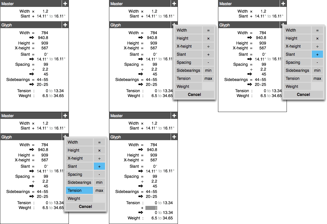 a final animated gif
This is measured central: the parameters panel. Literally here parameters are entered and—bam—applied. With the popup action shown the system is taken to the next level. Preferably for wide‐ranging selections, expressions of change (e.g. new value = A × old + B) can be built.
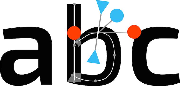
Most on‑canvas interaction is by nature of the free variety. The hands‑on factor is simply up for grabs. In Metapolator this interaction complements the parameter panel shown above to achieve equal opportunity.
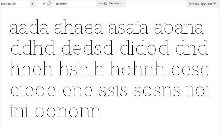
Specimens are a huge factor in the Metapolator design. It is the place to evaluate if the typefaces are right. That makes it also the logical place to squeeze it until it is right: free working.
All on‑canvas interaction is performed directly in the specimens for this reason. If that looks natural and normal to you, I say ‘you’re welcome.’ This is completely novel in the field of font design software.
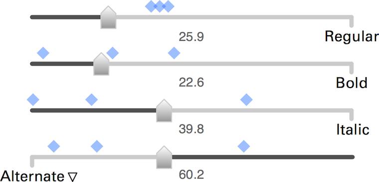
Here are these fellows again, the slider set for freely mixing master fonts to make new fonts. These new fonts are shown by the blue markers, so that users can feel the clustering and spread of these new fonts—clearly a component of free working.
The numbers you see are all editable, also quickly in a row. This supports measured working. That number input is straightforward and gives predictable and repeatable results was a big factor for me to choose the algorithm of these sliders over alternatives.
boom, boom
In short: software for creative pros has to offer every operation that users can perform in two ways: one free—squeeze it until it feels right—one measured—involving planning ahead, entering parameters and ‘cutting’ once.
That’s it for part three. Stay tuned for part four: how to be good.
Labels: design stage, lecture, metapolator, practical, top story

If you like to ask Peter one burning question and talk about it for ten minutes, then check out his available officehours.
What is Peter up to? See his /now page.
- info@mmiworks.net
- +49 (0)30 345 06 197
- imprint
 Peter Sikking