collisions in software projects… and a Volkswagen bus
26 April 2013, 11:37
A week or two ago I was the guest of Volkswagen, in their hometown of Wolfsburg. They had asked me to lecture on in‑house software projects, friction and usability. Great question, could fill many an hour answering it. With one hour at my disposal, I picked one main aspect. Here we go.
the fashion trade
Usually I design interaction for software products; off‐the‐peg software so to say: desktop applications, in browsers, and since 1997 also mobile. A recent twist are services, for instance social networks or B2B websites.
A quite different world is that of software projects; bespoke software, made to measure for clients and—hopefully—its users too. Comparing software products and projects, there is remarkable effect that I want to address in this blog post.
slidin’ down
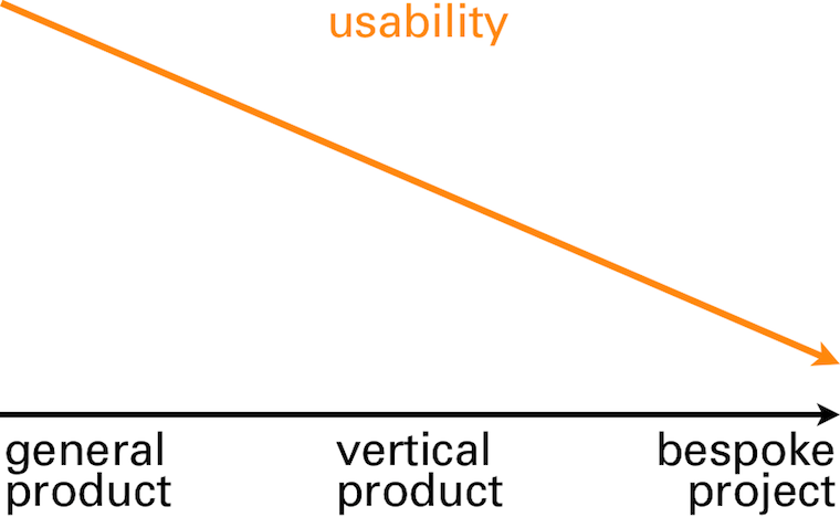
Below we see from left to right a continuum of software specialisation: from general (email, web surfing), via specialised (software for doctors, or engineers) to bespoke projects. Plotted against that is their usability, in general:

its cause and effect.
clients
The first world we will take a look at is that of clients. This is logical because it is clients who instigate software projects (there are also illogical ways to start a software project—e.g. have to spend the budget before year’s end, ask supplier how—but I will disregard these).
A first client need in software projects is to get ‘it’ built; ‘finished and working.’ This alone is already a cause of many a conflict in software projects. I will show later how to get a much better handle on this issue.
people, get moving
Another client need in software projects is to save money. At least, it used to be in the past decades, when software automated a lot of mechanical, brain‐dead labour, especially in office environments. Additionally, looking at a software project in this way is very spreadsheet‐friendly. The temptation of this should not be underestimated.
But time has moved on and just about all mechanical jobs have been rationalised away. What remains is creating value. This is exactly what people do: deal with situations with flexibility, provide a human touch to communication, solve issues and create new ways to do things. Machines and software do not stand a chance there. Over the years I have made this value creation the core of my design praxis.
intermezzo: what about value?
Let’s take a short detour and see some examples of value creation. We start with a plain project description:
‘We need a new order‐taking system.’
Then we ask where the value is:
‘We need a new order‐taking system, tightly integrated with manufacturing and warehouse operations.’
No, that is not it. That is still a very mechanical description of what needs to be achieved. Try again:
‘We need a new order‐taking system that allows users to unbureaucratically engage with any customer wish.’
There we have it: value. Feels really different than the previous two, doesn’t it? Introducing software that realises this will be of clear competitive advantage to this client.
‘We need a new order‐taking system that allows users to be order makers, instead of order takers.’
Another statement with value; not better, not worse, just different. This demonstrates that defining value is a strategic choice for clients.
Flesh out the two statements above to three paragraphs, answering ‘what is it we are making, who is it for and where is the value?’ and you have what I call a vision. And vision is exactly what I expect from management and leadership in a software project.
back on track
Where were we? Ah, value is definitely a client need in a software project. And by formulating that in a vision statement we have moved to the first thing clients have to offer.
We did already see that clients offer that software projects exists at all. And therefore they have to offer funding, because projects without funding turn out to be sad affairs, in my experience.
tech
The second world that we will take a look at is that of technology, i.e. the in‑house IT department or the external suppliers. All engineers, developers, technical architects, DBAs and functional analysts are part of this world.
Cut to the bone, the sole reason these in‑house IT departments and external suppliers exist is to hoover up those software projects and budgets that clients have to offer. It is their first, and prime, need. This is a marked difference with the world of software products, where technology departments are achievement‐focussed.
XOR
The second need the tech world has is that of clarity. From the zero/one definition of a bit upwards, in black and white terms. What needs to be built and when can we call it finished? This is compounded by the need of the tech world to frame and communicate everything in technical terms.
As such, the tech world is completely at ease working from the statement we have seen before:
‘We need a new order‐taking system, tightly integrated with manufacturing and warehouse operations.’
Given enough time and budget, they can bring this to a good end by themselves. But they are completely lost with the value part in this statement:
‘We need a new order‐taking system that allows users to unbureaucratically engage with any customer wish.’
Yes, the sales types of the tech world will nod understandingly when clients express the value they need. But when the actual work starts, their colleagues will hem and haw until the statement is reduced to something like the first one, i.e. technically precise, but without value.
truly, always
What the tech world has to offer is the engineering and building of software. Everyone knows that in order to get software, it needs to get built, i.e. code developed. The brutal reality of software making is that everything else I describe in this blog post is perceived by clients as optional, even down to the proper engineering part: ‘just bang some code together.’
The tech world expertly plays this ‘you need to get it built’ card. They play it to get (just about) all of the available budget, and to bury deep under the ground anything they don’t ‘feel’ like doing.
users
The last world that we will take a look at is that of users. And here the circle closes, because what users have to offer is value creation. We can now see what software is:

It is a means of value transport, provided by the client and built by technology. The software is there to meet its users, pick up the value they create and bring it back to the client:

But to pick up that value, the users will have to get on the bus. Paying them is not enough, neither is a direct order. These will make them endure the software, but they will not even consider getting on the value bus.
How do you entice users to get on the bus? You do it by observing the needs of these users and addressing them in the software. What are these user needs? Well, that is exactly the question the IT industry has been struggling with for the last 50 years.
Morse code
What happens traditionally in software projects is that (indirectly) the three worlds—client, tech and users—sit down to discuss what users need. It is literally three different worlds meeting, three different cultures, speaking three different languages:

You can see that the intersection of all three is very small. It has a name: discussing features. Features, features, ever more features. A very human phenomenon is feature hoarding. Just like kids and toys, there can never be less features. No, that is a regression.
Everything gets phrased as a feature request—the only means of communication available. Often users are asking that an existing feature gets improved (e.g. finally made findable, or usable), but it gets phrased as an additional feature.
gimme some dough
Features are a commodity, think staple foods like rice, corn and wheat. Sure, not enough and users will starve. But increase supply beyond enough and you have glut. In real life, people’s attention turns to better food when they have enough. In the software world, the need for a better meal is answered by a huge buffet of mediocre food.
The biggest mistake the software industry makes is listening to these feature requests and supply what users want. This is the prime reason supposedly tailor‐made project software ends up being the armpit of usability. Remember, the goal was to find out what users need. There is a solution for this, it is called usability.
intermezzo: what about usability?
Another detour. There are two definitions for the word usability that you have to know:
- Measure of how usable, i.e. fit for use, something is. It is qualitative; this makes the tech world nervous because there is no hard numbers.
- A group of empirical professionals who measure usability and survey user needs. Their general background is psychology. Tech‐splanation: they are specialised in this type of hardware called humans.
This is incredibly useful. Usability professionals can be engaged to deliver an exact map of a software project users’ needs and measure whether software is actually fit for use. The effort and cost of this scales with the size of the project. In general it is peanuts compared to what development hoovers up.
back on track
Where were we? Ah, knowing users’ needs is fully within reach, a question of just do it. Now we need one more thing. We need to connect the world of clients, technology and users; to translate between them and hook up the needs and offers. There is a solution for that, it is called interaction design.
That is what I do as interaction architect. It involves making the plan for the bus. For clients I realise the value transfer; for tech I make clear what needs to be built; for users I ensure their needs are met.
To show how this works I will now present my recommendations for software projects, in nine easy steps:
1. you got to have a vision
Before kicking off a project, even getting that budget, why not make it crystal clear what value is going to be created and formulate a project vision? I help my customers all the time to discuss, clarify, reach consensus and formulate one; this fits nicely in a one‐day workshop.
It serves as a first feasibility check, getting a convincing vision together. And it can be immediately used to ‘sell’ the project internally and get a modest budget for the next steps. Costs involved? One–two man‐days for the workshop.
2. start with user needs
Right here, at the very beginning of the project, is the right moment to get the user needs mapped out. These are already a useful foundation for strategic platform—desktop, browser, tablet and/or smartphone?—and architectural decisions. Why take these without knowing what is needed?
Usability specialists survey and observe your project’s users and bring back the facts. As mentioned, you are still not spending any serious money at this point.
3. integrate usability + interaction
Now is the time to integrate usability and interaction design with your project. This does not happen by itself. The software industry has the tendency to bolt on interaction design somewhere at the bottom of the development pyramid and stick usability research in a drawer. Sorry, but that is not going to help you.
Usability professionals are the only objective partners a client has for knowing what users need and if the software is really working. The interaction architect is the partner for realising your project vision of value creation. Processes will have to change too; you cannot make software like you did ‘last time’ when the results should really not be like last time.
4. design it first
With your vision, user needs and platform choices known, the largest open question of the project—what do we need to build?—can be answered. A first, rough design of the user interaction can be made by an interaction architect (‑team for larger projects).
This will include a solutions model: a large‐scale solution for realising that value creation, plus a design strategy for working out the complete software in detail. This will take the whole project out of the dark, into the light.
It is a good idea to have your prospective tech partners on board during this design stage as discussion partners. Technical feasibility has a profound impact on interaction design. And vice versa: interaction design has the same profound impact on the architecture and design of back‑ends.
5. test it first
Yes, not a line of code needs to be written to find out if the interaction design is meeting your users’ needs—and by extension, if the goals you set for value creation are fulfilled. A usability test with your users can be performed with a paper prototype. I have seen many of these and they simply work.
These tests are practical, quick and lightweight, involving six users, maybe up to twelve if your user group is very heterogeneous. Anything beyond that is project bloat, making it less agile. If you do insist on having it tested on a real computer/tablet/mobile screen, then a prototype can be made. This should take three days, not weeks or longer.
6. refine + test again
The reason we made a rough design in step 4 and performed practical, lightweight testing in step 5 is that we are going to iterate. From the analysis of the tests the interaction architect keeps the parts of the design that work well and redesigns the parts that performed badly.
These changes can be sweeping, because up to now relatively little time, budget and commitment have been invested.
Then it is time for another round of usability testing and it will show that giant step have been taken towards a fully working interaction design. If still any big issues are found, then repeat this step of refinement and test.
7. make interaction spec part of the contract
You still have not spent any serious money up to now. You do have a refined interaction design specification that shows what has to be built. It has been tested to fulfil your users’ needs and to realise your vision of value creation.
Now is the time to take this specification to your tech partners, the in‑house IT department or the external suppliers, and ask for a quote. It will be much easier to provide an estimate on this basis and it will be more accurate. You will also be able to define much better contractually what ‘finished and working’ means.
8. test + test
That’s two different tests. The first one is the usual, functional testing of what is being built. Doing this against the interaction design specification ensures that you get exactly what you expected. Passing these test gives the tech partners an exact moment to call it finished.
The second type of testing is usability testing of alpha versions of the built software. It checks for more subtle usability issues and validates the overall interaction design. Again the interaction architect resolves the issues and refines the design. The project impact of this is low, because all the bigger issues were dealt with before development started.
9. agile? interaction architect is co‑owner
Agile development was invented in + for the world of software projects. Working agile does not change much of the eight steps above. In step 4 one certainly needs to get to a solutions model, to knock the project into shape.
More detailed interaction design can be postponed, to be delivered just‐in‐time for the start of an implementation sprint. Usability tests are performed on the evolving software, as described in step 8.
In the piecemeal work that agile entails, it is very easy to lose track of a coherent user experience, one that meets your users’ needs. Making the interaction architect software co‑owner in the agile process, highly involved in planning of the next sprint and further sprints, solves that.
postscript
And that’s it. I have shown that it is fully possible to set up software projects where the needs of all the parties involved are met. The clients’ need to get it built and for value creation; the tech worlds’ need for clarity on what needs to be built and of when it can be called finished.
Last, it is straightforward to find out what software users’ needs are and to meet them through interaction design. At that point you can build the value bus, one that users are pleased to take, to bring their value home:
 bus symbol from
openclipart.org
Labels: architects, design stage, lecture, practical, process, product vision, top story

If you like to ask Peter one burning question and talk about it for ten minutes, then check out his available officehours.
What is Peter up to? See his /now page.
- info@mmiworks.net
- +49 (0)30 345 06 197
- imprint

 Peter Sikking