GIMP redux, full GEGL ahead
22 January 2012, 17:36
Recently I have been receiving requests to clarify the GIMP UI strategy surrounding GEGL, so I thought I’d write a catch‑up blog post about my 2010 LGM lecture. There I tackled this GIMP UI challenge: a first outline for a UI for a fully GEGLed GIMP. The thinking about this UI, and the discussions with Øyvind Kolås (the GEGL‐meister himself), have been going on for years. Its introduction will be the most profound change to GIMP in the foreseeable future.
two minutes of fame
I started off my lecture with introducing GEGL, the graph‐based image processing engine that is slowly, but surely, being integrated into GIMP. I could spend quite some time taking us through the complete GEGL graph (linked) below:
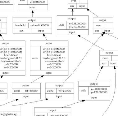
…and this is only a small one. Instead, here is the essence of it in four easy steps:
- there are input boxes that load an existing image, or render some vector shapes or text;
- there are chains of operation boxes that perform things like blur or change opacity of whatever gets fed into them;
- there are composer boxes that take two inputs and put one over the other, combining them in a certain way (think layer modes: normal, dodge, multiply);
- there are output boxes that either display the grand result on a screen, or export it to graphics file formats like png or jpeg.
so…great
Thus GEGL processes graphics by hooking up the boxes, inputs–to–output. Why does that matter? Well, because it is non‐destructive: the images in the input boxes are never modified.
If the structure of above graph is written to a file—apart from the input images, all other boxes are just snippets of XML—and a year later it is re‑opened in GIMP, then each of the operations and their parameters; each of the vector shapes or text can be freely changed. Even the input images could be swapped out for different ones. The result is a changed image composition, without any loss of quality.
It is exactly this promise of non‐destructive editing that played a big part in me joining the GIMP project years ago. I could see how that could lead to the end of some of the major workflow bottlenecks in today’s graphics software.
UI modelling
The integration of GEGL in GIMP is a disruption; it changes the rules of what one can do and how one can work. This is not a bad thing, it is a refreshing change. An interesting question is: how does the user interaction of GIMP have to change, in order to harnesses all this new power? In general there is a big urge, especially with developers, to just display the graph on the screen:
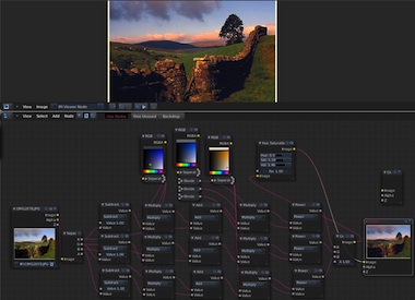
I call this the boxes and hoses model. If it looks familiar to you, it is because it has been around for decades: it is called visual programming. Which again explains why developers tend to choose this type of solution. One day a direct representation of the graph will appear in GIMP, as something extra. This is because the product vision defines GIMP as (also) being ‘a platform for programming cutting-edge image processing algorithms, by scientists and artists.‘
activity centre
To find out what the main UI in GIMP should be, we take from the product vision what the main activities are that GIMP is made for: ‘high-end photo manipulation’; ‘creating original art from images’; ‘producing icons, graphical elements of web pages and art for user interface elements.’
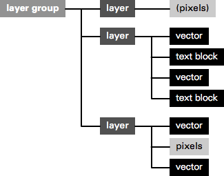
As a next step, it pays off to look at the nature of these activities. Users start with images or basic shapes (vectors) and apply image manipulation operations, one after another, to achieve the desired result. Users organise their work in layers and GIMP composites the result. Schematically that looks like this:
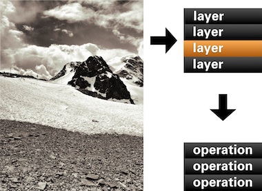
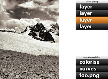
In short: a work (a composition) consists of layers, each with its sequence (in time) of operations. Now we got the start of a model for the UI. That list of layers we know already, as the layers dialog. The sequence of operations for the layer, we can call that the operations dialog:
- disclaimer
- Keep in mind that the user interaction shown in the image above, and all the ones below, is not a true mockup. It is more a diagram—with in part grotesque proportions—to show the principles of how the UI works.
We can see that the four GEGL elements are covered: The image material to start with: loaded pixels or rendered vectors; the layers that control the bulk of the compositing; the chains of operations; the output to the screen in the big image window.
Yes, the image window is the place for judging one’s work and for doing the actual work, hands‑on. The image window deserves a couple of times more screen space than any GEGL graph manipulation. Reversing this relationship (as shown earlier) is completely disregarding the nature of the activity.
back to the future
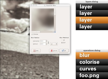
Adding an operation works as before: use a toolbox tool or invoke a menubar item. Here Gaussian blur is invoked and it appears at the top of the operations list:
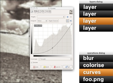
Now it gets more interesting: revisiting the past. No matter if it was done five seconds or five months ago, one can recall any previous operation applied to this layer and readjust it. Here the curves for this layer are revisited. While adjusting, the output updates through the complete chain of operations, including colorise and blur:
A lot of layers dialog behaviour can be reused for the operations dialog. ‘Eye’ toggles can be used to show/hide the operations:
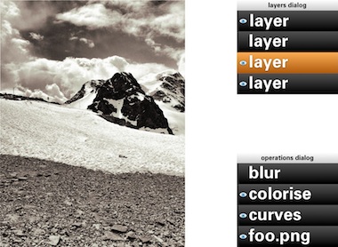
Drag and drop can be used to rearrange the order of operations. The result of that may turn out to be more subtle than you think. Because GEGL processes everything in 32bit floating point, it will be much harder to get the rounding and clipping artefacts you get with 8‐ or 16‑bit integer processing. Only when an operation does not commutate by nature (i.e. the order matters), then it gets interesting to experiment with the order of operations.
Of course copy and paste of operations, between layers of the same or different files works. Dragging and dropping of operations on another layer copies or moves them, a modifier key (shift or ctrl) will sort that out. And before I forget: selecting some operations in the operations dialog and invoking ‘Make macro’ would be a good, natural way to get that started.
the holy trinity
Before we continue with more GEGL user interaction, here is a pop quiz. I took this b+w photo of the brilliantly named Kloten airport and coloured part of it red:

My question is: how did I apply that red?
- directly with a tool from the toolbox;
- making a selection, then invoking a menu item;
- using a layer with a layer mask.
Well, I have forgotten how I did it (it’s been a while) and you will never guess. My point is that it does not matter. All three methods listed above are a combination of an operation (apply red) and a greyscale mask, controlling where it is applied and how much. All three methods are fully equivalent, it does not matter to the software—or the viewer.
It does matter to users. Given the context, composition structure, the graphics material and the end‑goal, each user knows exactly which of the three methods she/he prefers. There is a million different use cases and only the individual user on the spot can take the right decision. It follows that each of the three methods is equally important and needs to be equally available to users. This I call the holy trinity of image manipulation.
pagan practices
However, at the moment, you quite often see the following: ‘if you want this feature, you’ll have to use it on its own, extra layer.’ This is layer abuse. I get misquoted on this so let me clarify: users never abuse layers, developers do. Here are some examples of layer abuse:
- the only way to do a non‐destructive operation is via an adjustment layer
- only one vector shape per vector layer;
- only one block of text on a text layer;
- the output of a filter plugin is always put on a new layer;
- the result of using a toolbox tool is always put on a new layer.
The problem is with ‘only,’ ‘always’ and ever more layers, whether users want them or not.
reformation
The abuse listed above is straightforward to fix. Quite a bit of it has to do with enabling users to redo or revisit the image manipulation. That is solved by the operations dialog.
Furthermore, there can be as many vector shapes and text blocks on a layer as one likes. Just show them—and stack ’em—as sub‑layer elements in the layers dialog. And when then one of these sub‑layer elements is allowed to be actual pixels, then it is clear that the whole notion of special vector/text layer can disappear:
Layer abuse has to stop. Developers should never force users to use another layer. Only users decide how many layers they want to use, purely as their own personal way to organise their work.
more blessings
So apart from that no image manipulation is exclusive to a layer, what are further implications of the dogma of the holy trinity?
- paint with anything
- Yep, with anything, also all the plugins that appear in the Filters menu. Also the obscure ones that you and I, and anyone on the GIMP team have never heard of. Just dip your brush in it and smear it on the canvas. Thinking of combining it with paint dynamics just blows my mind. It just takes one tool (Filter brush?) to enable this.
- adjustment layers with anything
- You see, I have nothing against accomplishing things with layers. It is perfect when you got a collage made out of dozens of layers and then want to apply some treatments to the whole thing. It just takes one adjustment layer with any number of operations to get that done. Again, with anything.
behind the mask
As mentioned, all three image manipulation methods consist of an operation and greyscale mask, controlling where it is applied and how much. The interaction for these masks can be analogous to that of layer masks:
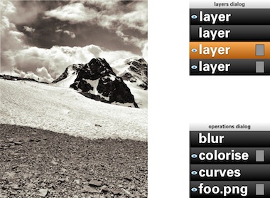
This means that both the parameters of the operation and also the ‘where and how much’ can be revisited and adjusted, a second later or a year later.
in triplicate
By now you may be thinking ‘wow, every image manipulation must be possible in three different ways, does that mean that one day GIMP will contain three times more stuff than today?’ Well no. I have already mentioned two measures—Filter brush, adjustment layers with anything—that will make large strides towards fulfilling the holy trinity. And even today the trinity is partially in place at GIMP.
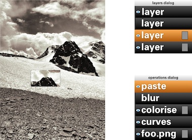
Take for instance composition, putting pixels on top of pixels. Sounds like the exclusive domain of the layer stack, no? Well, even today you can use toolbox tools to do the same thing: the Clone tool and its 90%‑identical cousin, the Heal tool. And the menu item to compose is called Paste. Yes, the current layers dialog interaction while pasting should go. The GIMP team is agreed on this for years. Instead paste is an operation on the current layer:
weird science
There is a fifth element to GEGL graphs, that I have been keeping under wraps in this blogpost until now: cloning. This is taking an in‑between result in the GEGL graph, anything from a simple vector to a huge sub‐tree, and ‘teleporting’ one or more clones of this result to another position in the graph:
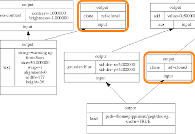
The original and the clones can have the same or a different position on the canvas; undergo the same or completely different operations; be composited in the same or a completely different manner. The magic is of course in that when the original (the input to cloning) is updated, every clone immediately updates, with all further operations and compositing applied on top. This is going to be liberating, because of the amount of work this saves.
Let me give an example. Let’s take the scan of a snowflake and fix it up with a number of graphics operations. We clone the result 99 times and spread these over five layers to compose our snowscape. We make ever flake a different size and a different colour. Already laborious, no? And now, we decide we are not satisfied with how refined the snowflakes are. Solution: fix the original with more/less/different/updated operations, all 100 flakes will immediately show the improved refinement—in their different sizes and colours.
send in the clones
My plan for the user interaction of cloning is to make it a variant of pasting: Paste as clone. This includes doing further operations on the pasted (as clone) material, before closing off the paste (you can always revisit the paste operation and modify all of it). And as Ville Pätsi pointed out a while ago, there needs to be a way from each clone to access the original. A button or link on the Paste clone operation in the operations dialog might do the trick.
There is more tricky stuff coming up with this cloning, like cloning layers or layer groups. And to go fully meta on this: I am asking myself why chains of operations cannot be cloned and applied to different input material. But Øyvind is not up for that.
two more things
To wrap all this up I have two benchmarks that have developed out of the GEGL discussions. They are alternate manifestations of the holy trinity and they are serious tests of the direction the GIMP user interaction is taking.
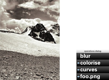
First, in a future version of GIMP, if users really envision their work as one single layer—not that unusual with photographs—then they will simply be able to close the layers dialog. Their work will not be impeded in any way by this, everything is still available to them (twice, as toolbox tool and menu) with no limits in the sophistication with which they can express themselves:
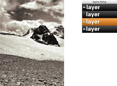
Second, in a future version of GIMP, if users are really not interested in switching operations on/off; rearranging operations or revisiting the past, then they will simply be able to close the operations dialog. Their work will not be impeded in any way by this, everything is still available to them with no limits in the sophistication with which they can express themselves:
You could even combine the two benchmarks and GIMP would still work, without a hitch.
aftermath
Directly after the lecture at the LGM, Øyvind Kolås pointed out one flaw, one thing I had not thought of: those greyscale masks, that play such a central role, are not pixmaps. They are GEGL sub‐graphs themselves. Which creates the possibility of near‐endless drill‐down: operations with greyscale masks, which contain operations with greyscale masks, which contain… et cetera.
Is that a fatal flaw? Is that going to blow up my plan to reduce the complexity of the GEGL graph to a linear list of operations? Do we just have to confront users with the whole graph? Let not kid ourselves about the complexity of that graph. In practice, I’d say that a simple GIMP file starts at ten times the number of boxes in the example at the top, quickly moving to a hundred times and then beyond.
not my problem
To developers—especially the ones that are working up to their elbows in GEGL graphs—this problem looks like one of navigating the graph and making edits. But to me it looks like another problem needs to be solved: how can users navigate their working context? Already today GIMP users are doing this navigation. Which layer, which layer mask are they editing, or is it the quick mask?
It will have to wait for another day, but when this context navigation is going to be designed, the one thing not to lose sight of is the image window. Everything evolves around it, including this navigation, and feedback of the working context has to be inside it. I certainly think we can do a better job than currently happens with the layer masks.
And when this context navigation has been designed, taking into account the holy trinity and the two benchmarks, then the operations dialog can show the simple list of operations performed in that context, in their natural order.
Labels: design stage, GIMP, GIMP redux, lecture, practical, product vision
If you like to ask Peter one burning question and talk about it for ten minutes, then check out his available officehours.
What is Peter up to? See his /now page.
- info@mmiworks.net
- +49 (0)30 345 06 197
- imprint
 Peter Sikking