working on GIMP’s transformation tool
24 March 2009, 13:17
Last week Wednesday there was the local Berliner usability meeting (‘stammtisch’). Desdemona Strauß thought it would be cool to try out an idea from IxDA Vienna: ‘bring two slides about what’s on your mind concerning usability or interaction design.’
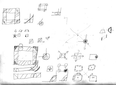
So I did. I talked about what I am cooking up for GIMP: a unified transformation tool. I spoke quite a bit about the nuts and bolts of how it is going to work, but you can read about that in the spec. Instead let me recount here some of the behind the scenes topics I talked about.
pre‐historical
This tool has been a long time in the making. I remember during my early GIMP work with Kamila Giedrojć the form follows function handles were created: a parallelogram for shearing and a circle for rotation. During one or two LGMs I have spoken about the need to bring the number of tools in the toolbox down and to integrate them.
Last October saw a GIMP UI team meeting here in Berlin. Thomas Viehweger, Kamila and I worked on the transformation tool, among other things. This is where the sharing of the corners between the scale handle and the perspective handle was born.
slow going
During that meeting we also had a look at the free transform tool of the latest photoshop, mainly because one GIMP developer labelled it ‘ideal.’ Finicky, cryptic—and ultimately—slow is the interaction we saw. We already knew we could do better.
can you feel it?
So here we go. The overriding benchmark for me here is ‘does this tool support creativity; does it allow users to stop thinking about the tool?’ Before creating, reviewing and refining interaction, I concentrate on the vibe of shaping image material freely, on a positive feedback loop for users between their intermediate result and their next step taken.
And I am not kidding about the ‘pace of around two actions per second.’ I have observed that kind of working as fast as ones imagination and here is where ‘freely’ and ‘stop thinking’ are required.
By concentrating on the vibe, I am able to take the hundreds of decisions required, without falling for the lure of particular use cases or petty rules of thumb. For instance, it settled the argument whether to introduce modes for scale, rotation, shearing et cetera or to have separate handles for all these actions. By thinking about forming clay (made of pixels), touch–push–release, I was able to feel that the handles variant is more direct and hence superior.
mathematically
All those warm, fuzzy feelings got combined with systematic rigour. Although the other people involved would hate to admit it, it is the interaction architect job to completely shape how a piece of software works on the outside. And therefore interaction architect must completely know how that same piece of software works on the inside, although not down to a code level.
That meant finding out all the functionality of the current geometry tools, including asking the developers to check the code for any hidden tricks. Next was describing this functionality universally in terms of modifying corners, sides or angles under a series of constraints and symmetries. I then found a few holes in the system—for instance, more forms of shearing and perspective transformation—which I took into consideration.

Also, I went through the whole UI brainstorm to find everything related to transformation. I am happy to report that these contributions triggered ideas that are part of the mix in the final design.
start making sense
So now we have the existing pile‑up of GIMP functionality, with on top another pile of potential functionality. How to organise that into something elegant? Well, by not trying to do everything plus more. Aiming for compact yet comprehensive functionality. Realising that it is the UI that has to be conductive to the vibe. And that the selection of functionality is subordinate to this.
It has always been my intention that this tool would not do it all. It covers the spontaneous side of geometry transformation, complementary tools and menu commands cover the planned, deliberate side. It is with a clear conscience that I ban the dialog boxes and numeric input of the current geometry tools because they go against the vibe: that can be done elsewhere in GIMP.
q + a
During the stammtisch there were some interesting questions:
‘Can’t you use gestures to determine what transformation to use?’ Wow, that one rattled me for a moment. But I also felt immediately that gestures could not be it. I thought of forming clay (made of pixels) again and that one needs to get hands‑on to do that. Waving one’s hands in the air to magically form it would be too fluffy a method.
‘Can one hide the frame with the handles to have a good look at what one is doing?’ Good idea. I can see how it can help to temporarily have a clear view. I will add a way to do that.
‘You talk not designing this tool for yourself; banning your own experiences, how do you do this?’ That is a tough question. And only as I write this do I have the complete answer: I have to filter and interpret my own experiences exactly as the feedback of any other user. This usually ends with my own experience not mattering at all, or being a minor data point on an immense continuous scale.
That allows me to look at user interaction in an architectural way. Looking how one set of interaction is going to do justice to the distribution of requirements of a million users.
trivia
Just as I was explaining during my talk that all handles shown on‐canvas have to be drawn in transparent black or white and not in grey, I realised that they could be done in grey and still be visible under all circumstances. So now some are. You can actually click your way trough the different iterations of the transformation frame design.
The complete for specification the transformation tool is not finished yet. You can follow my progress in the next few weeks by checking out the wiki.
Labels: design stage, GIMP, practical

If you like to ask Peter one burning question and talk about it for ten minutes, then check out his available officehours.
What is Peter up to? See his /now page.
- info@mmiworks.net
- +49 (0)30 345 06 197
- imprint

 Peter Sikking