the armpit of usability
20 September 2008, 11:27
I remember it clearly, it was during the first world usability day in Berlin, during a lecture by Jochen Prümper on productivity and SAP. He was talking about the relationship between verticality and usability. Suddenly, years of project experience and analysing software products gelled.
down the ramp
The graph below shows how the average level of usability ramps down to zero, depending on how vertical the market of a certain type of software is:
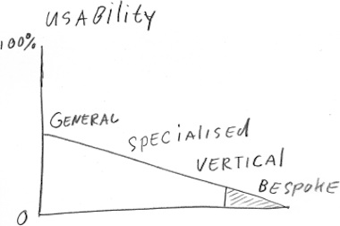
Software gets more specialised as we move from left to right:
- general
- intended to be used by everybody. e.g. desktop environments; web browsers; email, chat and call software. Office applications live on the border with the specialised category, with inherently lower usability.
- specialised
- not general‐purpose but still used by many in many different situations. e.g. graphics, drawing, charting, outlining, presentation and project management software.
- vertical
- focussed on supporting one profession or hobby only. e.g. CAD, accounting, simulation, audio/video production, genealogy software.
- bespoke
- made‐to‐order software: projects instead of products. Includes custom implementations of software products (SAP et al). Both the number of users and developers can range from singles to thousands.
‘I am doing just fine…’
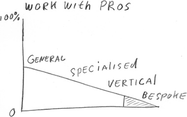
What is remarkable is that this usability ramp is matched by an identical average willingness to work with interaction design and usability professionals:
cause and effect
I am convinced that the primary driver of the usability ramp is contact between users and developers: the more vertical the software, the more direct the contact between them.
There may still be a layer of (project/product) managers or functional analysts between these two groups. But the more vertical the software, the more tempting it is for these folks to wash their hands of user requests and pass them on directly to developers. The customer asks—and pays—for it, no?
mind the void
Because users are living inside the software they use, for them innovation seems to consists of yesterday’s software—like it has always been—with some new features added. A lack of real innovation combined with feature‐bloat equals destroying the little usability that was there to begin with.
So the more vertical the software, the more its development is driven by reacting to what users ask for (features!) and fear of changing ‘like it has always been’ through innovation. And that ramps usability to zero.
splendid isolation
At the general end of the ramp the relative isolation of the developers forces that they have to think more systematically about their UI, which is beneficial to usability. Still these developers make all the classical mistakes—like imagining themselves to be typical users—which limits severely the maximum of usability that can be reached.
Everywhere along the ramp the exceptional occurrence of good usability raise the average. These exceptional specimens have ignored what users asked for and instead given them what they really needed. They have innovated their UI beyond ‘like it has always been’ and not fallen into the ‘people are used to outlook’ trap.
The quickest and cheapest way to get there is to integrate interaction and usability professionals in your development processes. But…
‘I said: I am doing just fine, really…’
…then there is the work‐with‐pros ramp, which I have used since its invention to quickly estimate if a company will really go ahead to improve their usability, or are just talking the talk. It holds up pretty well up to now.
At vertical‐software companies, the domain knowledge they took the years to gather about their niche markets is considered a barrier to entrance to interaction and usability professionals: how on earth could we help them? I have given up on trying to explain that we are highly experienced in getting tuned in in a matter of days into the activity of their customers, in dimensions these companies did not know existed.
penny‑wise
When it comes to bespoke software, it is very simple: unless the customer insists on interaction/usability pros on the project and is prepared to pay in full for them (including a nice mark‑up for the software company), it is not going to happen. Any other interaction/usability set‑up is a direct threat to the bottom‐line of software companies and their room to fudge/negotiate a project into a ‘finished’ state.
Looking at both ramps—seeing rotten usability and slim chances of that changing at the sharp end of the wedge—I have dubbed vertical‐market and bespoke software to be the armpit of usability:
the implications for open source
Open source software has a reputation for especially bad usability. I say: it is not that much worse. From my lofty position there is not that much difference between awful (commercial) and goddamn awful (open source) usability. Both decimate our productivity and daily joy‑of‑use.
I see open source tracking the usability ramp of commercial software, starting off lower at the general end. By the time commercial software slides into bespoke territory, open source does not fare worse:
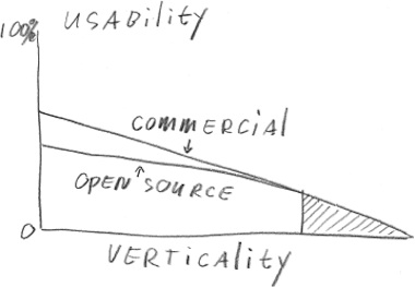
The difference is that because of the community character of open source, developers are more in direct contact with users than their equivalent commercial developers. This makes open source developers work more ‘vertically’ than they have to, at the cost of usability.
a win‐win situation
In the future usability ramp and work‐with‐pros ramp will multiply to cause a quadratic effect for the former: at the general end, interaction and usability professionals will steadily improve average usability, while the armpit of usability will be as miserable a place as it is today.
Labels: fundamental, practical

If you like to ask Peter one burning question and talk about it for ten minutes, then check out his available officehours.
What is Peter up to? See his /now page.
- info@mmiworks.net
- +49 (0)30 345 06 197
- imprint
 Peter Sikking