teaching interaction /10
18 August 2011, 18:16
This is a catch‑up blog post, about the 2010 edition of my course, interaction design for the real world, at the FH Vorarlberg, Austria. Last year the course fell right in the middle of my involuntary blogging sabbatical. However, everyone involved—students, FHV, the GIMP project—deserves that the results are published, so here we are.
For developments in the goals and structure of the course I will refer to this year’s and previous instalments. So let’s cut straight to the chase, the class‐of‐2010 interaction design challenge.
natural selection
For a couple of years, I have had the notion that the four tools in the GIMP toolbox that perform selections based on pixel values are quite similar. Select by color ‘works a lot like the Fuzzy select tool.’ Intelligent scissors traces ‘any high‐contrast edges it can find.’ Foreground select appears to do all of this, on steroids.
 from left: fuzzy select, select by color, intelligent scissors and
foreground select tools
from left: fuzzy select, select by color, intelligent scissors and
foreground select tools
It could be worthwhile to condense these four tools into one, maybe two, new ones. This meshes well with my top‑level interaction architectural goal of reducing the number of tools in the toolbox. Thus it became the students’ brief, a top‑down goal driven by design intuition.
Since this type of project is designer‐initiated—instead of client‐driven—there is more creative freedom involved, to define further goals and even to pick the right amount of functionality.
use the force
All that freedom might look like a recipe for artistic doodling and ‘design’ for its own sake. Luckily methodical working—one of the cornerstones of the course—ensures that also these type of projects are properly researched and analysed, leading to rational and practical results.
The guiding rails for the evaluation of the existing software and new designs were, as usual, the user scenarios. We constructed three. The first one embodied that simple things shall be simple: selecting a square of uniform color (rotated so that the rectangular selection tool would not work). This should be a no‑brainer with the redesigned selection tool(s).
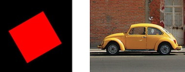
A second more complex scenario was selecting a car, separating it from a real‐world background. This meant joining the several parts that make up the car into one selection. The third dealt with selection of material spread over several layers.
three team results
And now the design results of the student teams. The work of all three teams is available under the GNU Free Documentation License 1.2. I present them in team order.
team one
- members: Martina Peer + Adriàn Fallas Valverde
- design concept document (pdf, 194 KB)
Like the other two teams, team one decided on a single selection tool to replace the four old ones. They boiled foreground (content) selection down to the essential: drag the mouse over what has to be inside the selection.

Complementing this stark reduction, team one thought outside the box and combined the free selection and straight line aspects of the free‐poly tool, with the edge‐finding capabilities of the intelligent scissors:

team two
- members: Marianne Minar, Sebastian Platzer + Florian Steinbichl
- design concept document (pdf, 2.8 MB)
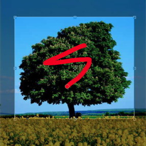
Team two used a gesture (‘shake’) to engage foreground selection mode; it matches the wavy lines one typically sees drawn when marking the foreground object:
Shortcuts were handled deftly by team two, with <shift> always having the meaning of addition and subtraction engaged by <ctrl>.
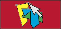
Promising is the natural way how manual adjustment of the selection outline was integrated by team two: approaching the selection outline with the mouse pointer reveals path nodes automatically inserted for this purpose; nodes can also be added and deleted:
team three
- members: Steffen Fridgen + Sarah Montti
- design concept document (pdf, 6.7 MB)
Team three designed a pie menu to switch tool modes, it appears under the mouse pointer when <shift>‑x is held:
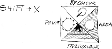
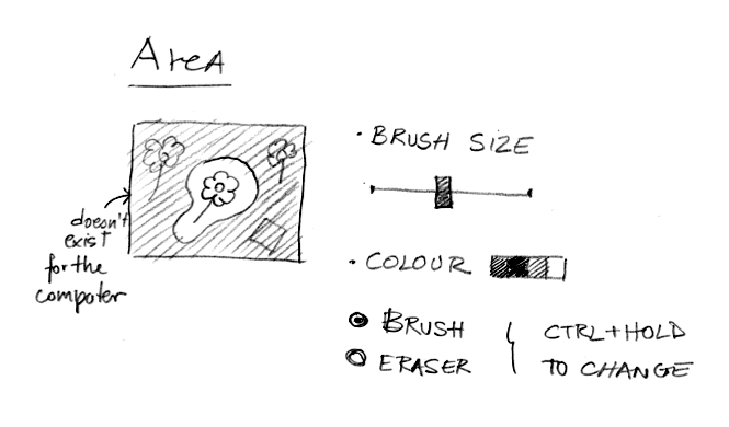
A good design move by team three was to take some of the more deluxe aspects of the old foreground select tool and make them generally available in the new tool. For instance, the exclusion of certain parts of the image from the selection algorithm could be set up with the Area mode (shown with its tool options):
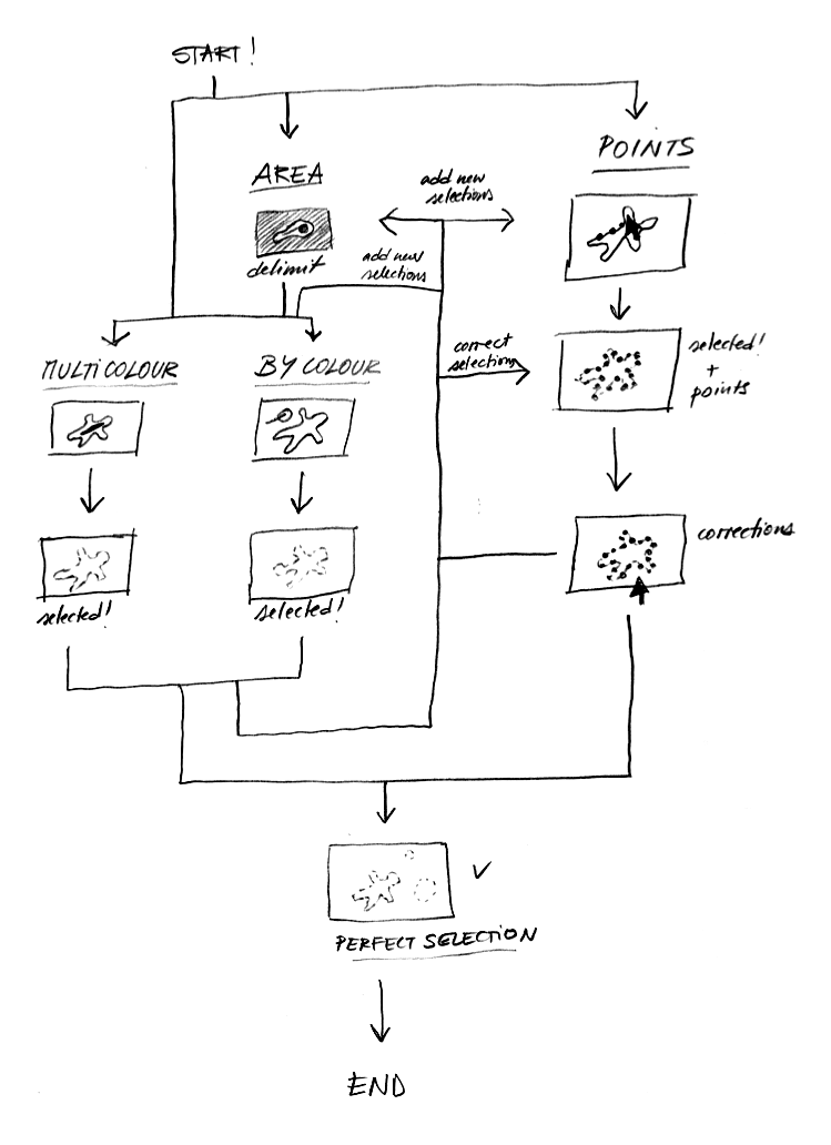
Team three finished their documentation with a clear flow chart of how selections, both simple and complex, can be accomplished using their design:
back at the ranch
I would like to thank the students of the class‐of‐2010 for their hard work. My apologies for taking this long to publish the results. With these dues paid, I can now look forward to teaching interaction, in 2012.

If you like to ask Peter one burning question and talk about it for ten minutes, then check out his available officehours.
 Peter Sikking is an
experienced
Peter Sikking is an
experienced
interaction architect. He unabashedly puts
shipping great products at the centre of his design practice. He is known for
his work for Google, Nokia, the
Metapolator &
GIMP
open source projects,
and startups.
What is Peter up to? See his /now page.
- info@mmiworks.net
- +49 (0)30 345 06 197
- imprint
