GIMP redux, single‐window mode
18 September 2009, 19:19
This blog entry covers the final part of my talk at the libre graphics meeting this year, after dealing with the schmuck and squaring a circle. It will also be pure falsification of history, Soviet‐style: I used my talk to kick off a discussion and to start the design process. Most of the interesting things I am showing you today were not even conceived when I delivered my lecture.
real history
Here is what was presented at LGM: First, I set the mood by showing a selection of single‐window contributions from the UI brainstorm:
The high number of contributions in the single‐window category confirms that this is a major issue where action needs to be taken. The many forms the contributions take shows us that a measure of flexibility and configurability is needed.
Next, I reminded everyone that it is a fifty–fifty world: about 50% of GIMP users love the multi‐window interface of today and do not want to lose it, about 50% of GIMP users would love to move to a single‐window interface.
one switch
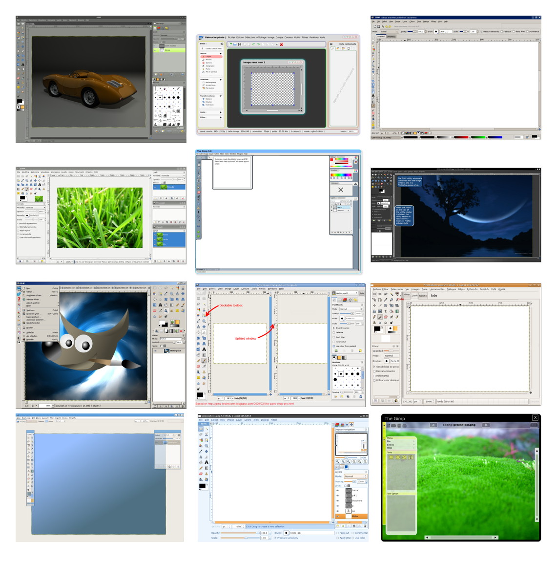
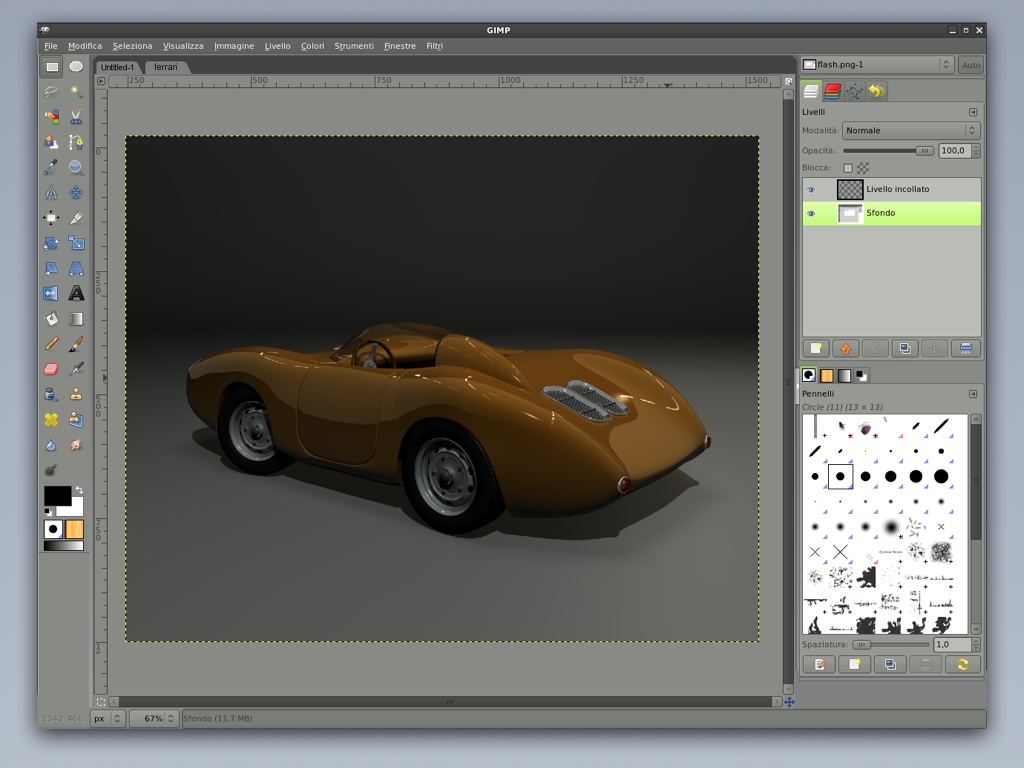
With the world fifty–fifty split, we will serve them with one switch in the Windows menu, switching between multi‐and single‐window mode. I used the mock‑up with the beautiful orange sports car from the brainstorm to demonstrate the basic idea (no real UI design implied here).
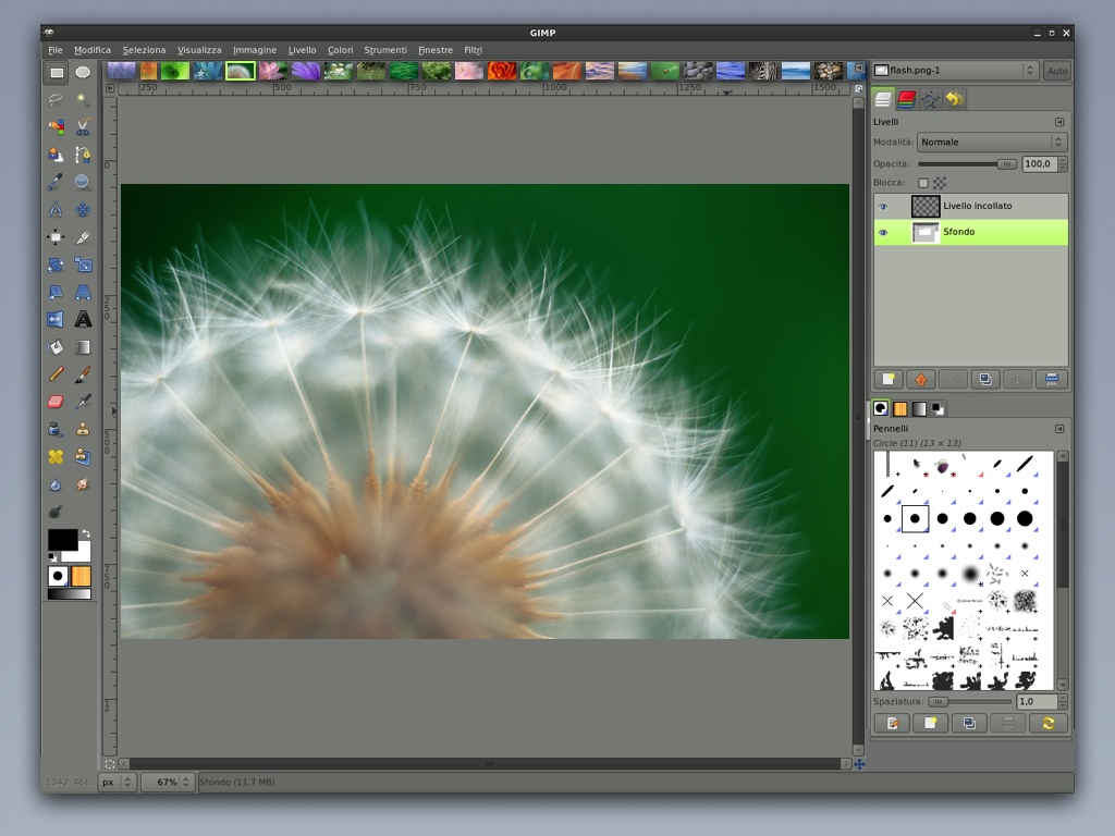
When set to single‐window mode, each document will appear in a tab:

the toolbox and inspectors can be ‘torn off’:
here the toolbox is side‐docked back and it is shown how the inspector floats:
and last, inspectors can be made multi‐column. Here, another column has been created to allow more dockables to be organised:
The eagle‐eyed will see that there is quite a bit of fudging in those images, so don’t sweat the details.
three problems
I closed off the talk with three things that were bugging me at the time:
- no tab tear‐off
- tearing off a tab and making that into a separate window—as seen on web browsers—would make our single‐window interface into a multi‐window interface. How annoyingly inconsistent.
- no side‐docking, to multi‐windows
- both toolbox and inspectors are unique for the application and by nature there are multiple window instances. That means it is unnatural to dock the toolbox and inspectors to windows. It is however possible to introduce multi‐column inspectors for multi‐window mode.
- no image comparison
- With tabs, only one image is visible at the time. Thinking about clever plans to see two images side‐by‐side in split panes, one sees immediately the confusion rising: which is the image that the menus perform operations on. Which one is shown in the layers dialog?
tomorrow starts now
So far, so predictable. Here is where the interesting stuff starts. After my talk I had a good round of brainstorming with Martin Nordholts on the tear‐off and comparison problems. The result of that is what I call the polaroid.
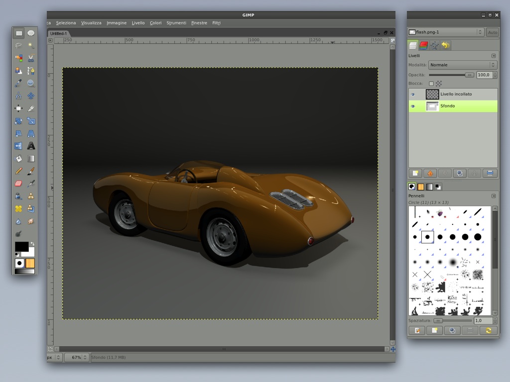
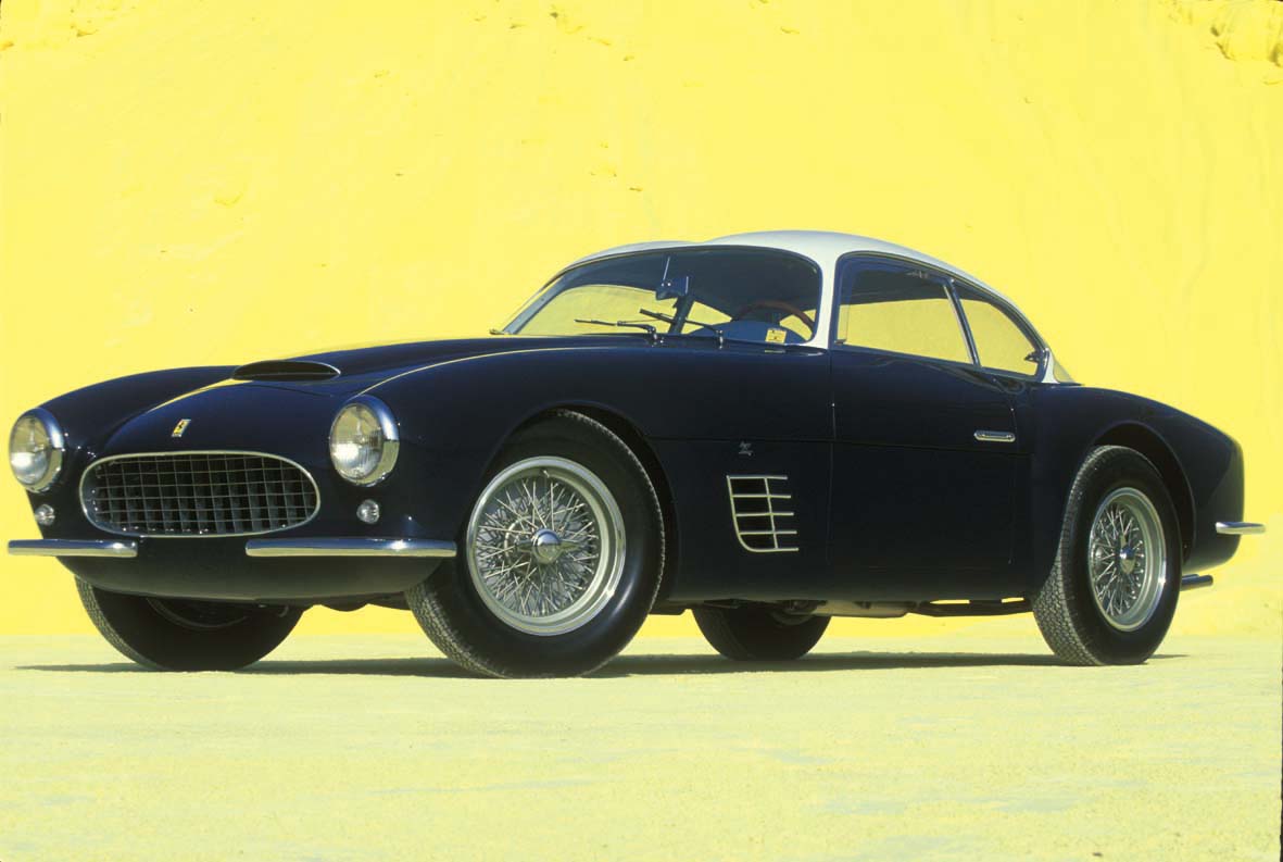
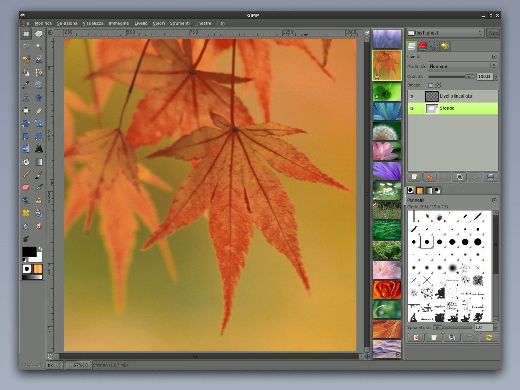
To demonstrate it, let’s say one is still working on that lovely orange sports car and in a second tab we have loaded this image of a cool Ferrari Berlina:
Now we want to compare our orange creation to the Ferrari. All we have to do is to tear off the Ferrari tab and presto: a polaroid of it appears:
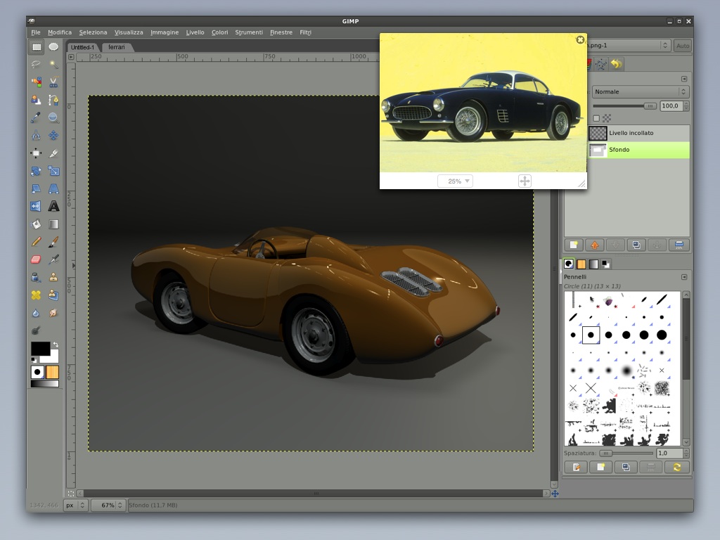
This is not a GIMP image window. It is not even a window, the window manager will know nothing about it. We avoid making it look like a window, down to ignoring the theme colors and executing the control strip at the bottom in paper white. You can move and resize the polaroid to your heart’s content, as long as it fits inside the GIMP window. You can zoom, pan and look at it, and that’s all.
voluntary confinement
That last point will be very hard to do, because everybody will be thinking of one little feature they would like to add, for themselves. But we have to be strict here to avoid mass confusion: every toolbox tool, every menu item, every dialog (in an inspector) only operates on the front tab—the orange car in this case— and never on a polaroid.
For example, when I discussed these plans with GIMP‐usability contributor Ellen Reitmayr, she asked: ‘so can you then select and copy a bit of image from these [polaroids]?’ Good question. After realising that this would mean interacting with the layer stack and selection tools, the answer has to be no.
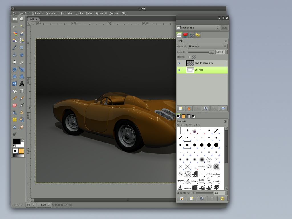
It is however possible to open multiple polaroids of the same image. And also of the image in the front tab, where one is working on:

As you can see they can overlap and they will have to have their own stacking order. Just click on a polaroid to raise it to the top. The final thing you can do with a polaroid, is to close it…
the decline and fall of tabs
This is how things were more or less when I returned home from LGM. At that point there were still three things that were bugging me about using tabs in single‐window mode:
- too easy, too fast: the tabs got adopted from web browsers, without much thought;
- it would be rather logical to use a thumbnail on the tab itself to identify the image;
- sign of the times: the web browser folks themselves are looking at solutions beyond tabbed browsing.
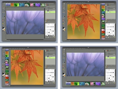
And pretty soon I was looking at the image parade you see these days in many a photo app and viewer, mainly triggered by a visual association with a row of tabs with thumbnails on them:
There are some really interesting possibilities, when we replace tabs with that. Let’s try it out:
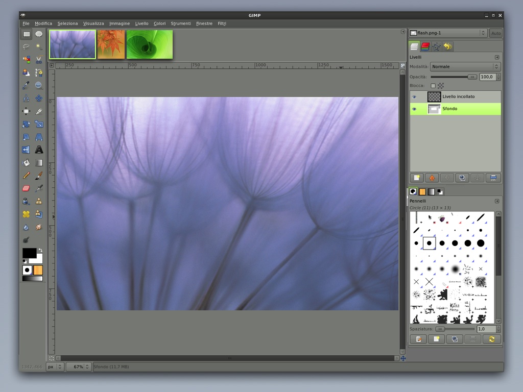
We see three open images and like you would expect, clicking on an image makes it the active image (the ‘front tab’) and dragging any of them up or down enough ‘tears’ it off to become a polaroid. A mouse‐over tooltip will display more info for each thumbnail, for starters: the filename.
history repeating
Now let us go a step further and not only show open images in the parade but also recent files that have been opened or worked on, the history:

Everything is in strict chronological order: open a file and it moves to the front of the parade. What I find very intriguing is that the notion of which file is open starts to blur. Having a file being loaded from disk becomes a side effect of clicking it to make it the current file. Similarly GIMP can decide to start closing files with no unsaved changes when there are too many of them open and memory gets tight.
My current thinking is that it is not necessary to mark files in the parade as being open. The concept quasi disappears for users. The white stars indicate unsaved changes.
One or more graphics files that are dropped on the parade get added—cued up if you want—right after the open files. Just as useful will be that a folder dropped on the parade cues up all the graphics files in it. Current work + history + cued up work + polaroids has a lot of potential, I think.
the Midas touch
I realised that it would be an eyesore and an absolute waste of space to introduce a scrollbar for the image parade. Still, it is going to scroll. It happens to be that in the last couple of years I have been working for two large companies on the interaction fundamental’s of iPhone competitors.
So how about using touch UI? A flick or a drag along the parade scrolls it; a push slows down, then stops the scrolling; a tap on a thumbnail makes it the current file; a flick or a drag of a thumbnail perpendicular to the parade creates a polaroid: it is perfectly doable, using mouse, trackpad or tablet.
non‐preferential customisation
All we need now, is some more flexibility. First, I think everybody will have their own idea what the right size for the image parade is. From pretty small:
to pretty big:

I think any size in between those has its purpose and why could that not depend on what one is doing next? Simply grab the dividing line between parade and canvas and adjust to fit your mood. Next, does it has to be at the top of our window? Left, right and bottom should also work:
I foresee every GIMP user having their own sweet spots, when it comes to combinations of size and orientation of the image parade for the type of projects they do.
raising the dead
It will not be necessary to introduce new items in the preferences dialog for anything I have shown you here. In that light I called during my LGM talk preferences ‘the graveyard of many a good idea.’
For configuring the image parade I have already built in a settings pop‑up in all the screens you see above. The top/left/right/bottom setting will be in there, as will be one for controlling the amount of history. Something along the lines of: 48 hours; a week; a month. And for those who never look back: a setting for no history at all.
red hot anticipation
To wrap up, for about 50% of GIMP users the good news is that single‐window mode is coming, complete with tear‑off toolbox and inspectors; multi‐column inspectors; polaroids; image parade with history and cued up work; touch UI and quick and easy customisation.
And it is coming faster than you’d think. Martin is ready to develop it for version 2.8 and this blog post was hotly anticipated to outline my complete plan.
For a different 50% of GIMP users the good news is that multi‐window mode is here to stay. It will benefit from multi‐column inspectors being introduced. But I actually expect that once single‐window mode is out there, there will be pressure from the community to have a look if multi‐window mode cannot be done a bit more, well, modern.
Labels: design stage, GIMP, GIMP redux, lecture, practical

If you like to ask Peter one burning question and talk about it for ten minutes, then check out his available officehours.
 Peter Sikking is an
experienced
Peter Sikking is an
experienced
interaction architect. He unabashedly puts
shipping great products at the centre of his design practice. He is known for
his work for Google, Nokia, the
Metapolator &
GIMP
open source projects,
and startups.
What is Peter up to? See his /now page.
- info@mmiworks.net
- +49 (0)30 345 06 197
- imprint
