GIMP redux, enter: the schmuck
20 May 2009, 09:56
‘What about schmuck?’ Katrin Alt said, when I explained to her about my work on GIMP. —Excuse me? ‘You know, what about CMYK.’ —Ah, that is a long story.
So started my talk at the libre graphics meeting this year. I will cover it in three separate blog entries, the first one being about schmuck.
hot debate
GIMP’s lack of CMYK mode is one of the hottest topics in the comments sections out there. Also fiery is the resistance by GIMP’s maintainers to introduce such a mode. In March the CMYK issue returned during a long thread on the GIMP developer mailing list. Quite a few users who seriously use and need color separations chipped in. It gave me a chance to understand the activity, both from a technological and users’ side.
The first thing to understand about the CMYK issue is that it is not about CMYK. The issue is bringing artwork to printing presses. And I mean serious printing presses, with operators, print runs and hydraulic parts. Not that very expensive, high‑spec printer that sits in the corner of the designer’s office, that one is still covered by openPrinting.
flex plate
Unlike for the printers that you and I use, with printing presses the plates that do the printing are freely configurable. Any number of plates can be used with literally any kind of ink/paint/lacquer, for cost or quality reasons. That there is a world beyond CMYK is something that Øyvind Kolås has been pressing on me, for instance, during a discussion last year at guadec.
During the mailing list discussion mentioned above, Louis Desjardins wrote to have a look at packaging for examples of how complex the plate set‑up can get. So I did, the next time I made a coffee. Turning over the milk carton, I found the marks for a seven‐plate print job, none of which was cyan, magenta, yellow or black.
mind the gap
Now, I am not saying that GIMP is the application for designing milk cartons, but the complexity of printing such a cheap commodity really shows that hardwiring a CMYK mode into GIMP would be a serious case of under‑design. Why go through all the trouble of introducing that when it cannot deal with a simple poster, printed in black + orange, or the milk carton?
2. control
The second most important thing to understand is that preparing artwork for the printing press means needing total control over the plates. This not only means a flexible plate set‑up as outlined above. It also requires that every bit of experience that a user has with the particular printing press can be used to fine‐tune each plate. I am not underestimating what this is going to take: basically the full GIMP functionality, including any plugin.
3. creative work
The third thing to understand is that creative work is on‑screen work. We must focus on the loop that exists between users, the tools they use and the image that appears as a result, again inspiring the next step of users. If I may be so bold: during creative work the image does not exist on disk, or in RAM, it only exists on the screen.
The natural medium of the screen is RGB pixels. That is why I say: creative work is RGB work.
4. what about CMYK files?
If one receives a file in CMYK format, we know by now that it was destined for the printing press—actually, one particular printing press that is is supposed to be fine‐tuned for. With that knowledge there can be two reasons we are touching it at all:
- it needs further fine‐tuning for that press, best done in CMYK;
- it is a found‐image that goes into a new creative work, for that it needs to be imported and converted to RGB.
5. workflow
The last thing that we have to understand about the activity is how eclectic real‐life workflow is. In theory it is simple: one creates artwork, separates it for the plates, then prints it on the press. That is also the clean model when it comes to color models.
Creative users live a bit more iterative: start creating; set up the separation to see what is possible in the end; fine‐tune that; create some more; fine‐tune some more; get feedback and adapt the creative work with that; get a print proof and do a wholesale overhaul of the separation and fine‐tuning; some last‐minute creation; print it on the press.
It is easy to see that the rigid theoretical workflow does not support creative real‐life. The rigid workflow is the the norm in software today and it inhibits creative users to work as freely as they can imagine.
form‑fit
Now that we fully understand the activity, we can work on squaring the circle. Read all about it next time.
Labels: GIMP, GIMP redux, lecture, practical, product phase

notes from san francisco: testing 1‑2‑3
6 May 2009, 06:39
This second blog posting about the openPrinting summit in San Francisco covers the usability testing of the printing dialog. First, a few words about usability testing.
I have worked with people who saw a usability test as a kind of final school exam: better send something into the test that will not rock the boat. This kind of fear surely stamps out any kind of interaction design innovation. Under those circumstances I say: why bother doing this project at all?
hard knocks
Experienced software developers appreciate working with a dedicated software test team. Yes, these testers aim to take everything apart, but the resulting software will be a lot better when it hits the streets. Similarly, I enjoy working with a usability team.
The usability test delivers hard‐hitting facts, but these flow straight into debugging and adding depth to my interaction designs. And when the test says it works, then my work is validated and that marks the end of doubt and discussion.
before the test is already a test
The usability test was performed by Jan Mühlig of relevantive, who also headed up the first involvement of openUsability with openPrinting in Atlanta, 2006. Although I took over the project at the Lexington summit in the same year, Jan has been closely involved at different phases of this project.
Straight away the preparation meeting was a hoot. For interaction architects, having a frank, uncomplicated discussion with professionals who have empathy and usability experience is both a pleasure and highly valuable. Jan’ feedback triggered a redesign that Kate, my associate at m+mi works, and I performed during our preparation of the test material.
agile like paper
The test was performed using a paper prototype. I played ‘computer’ in most of the test sessions, driving the dialog response to users’ input. Working this way allowed us to do three rounds of testing—with in between two further rounds of redesign—in exactly six days.
Being a usability researcher, Jan was not going to take for granted that any of our big, innovative concepts—no matter how sound they looked—was simply going to work. ‘Just print’; two levels of detail in the dialog; always a preview; quick presets; parameter tagging: he gave all of them a real workout during the tests. They had to prove to be a real improvement over the current state of printing dialogs.
the results are in
Walking you through the results, I will illustrate them with the latest iteration of the design, the one that went into the third test.
‘just print’
Printing still does not exist. At the start of test the participants were interviewed about what printing means to them and how they experience it. Again and again the answer is that the act of printing is not interesting, only the result counts. Here are some quotes:
‘What I think about is hard‐copies, really; a piece of paper I can look at.’
‘…but most often, I’ll just press print.’
‘I just click on print and… —[Jan:] the print appears by magic? —Yes.’
Although ‘printing does not exist’ is our number one guiding principle, it is striking to experience in the test how strong this force is. Our solution for supporting this is ‘just print,’ bypassing the print dialog altogether. Below you see the jury‐rigged file menu we used in the test:
I had put ‘Print one copy’ as a label in there for ‘Just print’ in the first test, but that did not work out. So, if you want to learn something, take some risk and use the test results. From the second test on the menu was as above. It fared better, but more testing is needed here before setting this label in stone.
preview
If ‘printing does not exist’ is a strong force, the print preview is huge. We are not talking here about participants getting along nicely with the preview and they knowing how to flip trough it. We are talking about seeing that for 100% of the participants the preview addresses a fundamental need.
Although it was my vision right from the beginning to design the print dialog around the preview, it is still amazing for me to see in the tests how deep it has an effect on users. So deep, that participants of the ‘just print’ persuasion started going through the print dialog more after seeing it—and the preview—only once. It is a huge effect to have the voodoo taken out of printing.
Now as an interaction architect I expect that long‐term—after the printing dialog has built a new level of trust in the print process through the preview and other factors—users will start taking up the offer to ‘just print’ for boring, predictable print jobs. But at any moment: if there is a hint of doubt, then the preview rules. Below we see the preview in the compact, level 2 dialog:
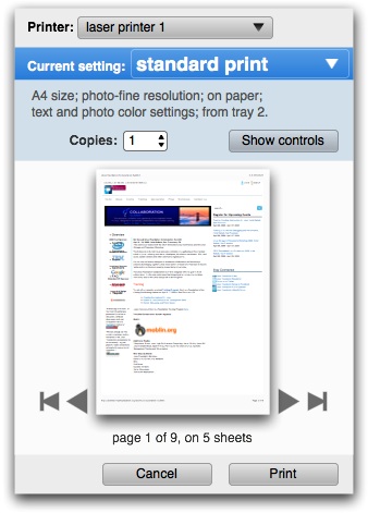
We added to this level the only universal printing parameter in the world: number of copies. If there is one thing we learned from this whole test cycle is that the way to the print is through the preview. The preview is the last thing to check and the Print button is logically located just below it.
tagging
Because of a lucky labelling flaw in our test set‑up, all the test participants went through the situation where the first tag they chose did not deliver the printing parameter they were looking for. After selecting a second tag they did not get the familiar situation of seeing different parameters, they got more of them (all parameters referenced by both tags). Then in 100% of the tests the conversation was the following:
Jan: Is this surprising?
Participant: Yes.
J: is it negative or positive?
P: I think it is positive, it is good that these are shown together because […].
Every participant formulated the last answer in a different way, citing a different reason why it was an improvement. But it was striking how the pattern returned in every test. Based on that Jan declared that he does not have to see dozens of tests more to know whether it works, it simply does. Below we see the full‐fledged level 3 dialog:
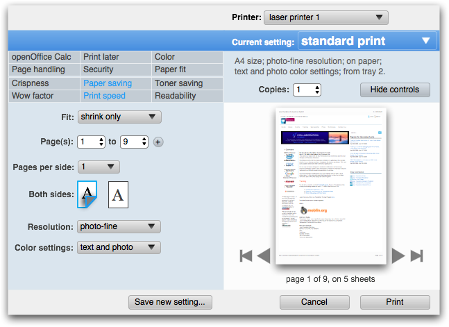
The whole tags + parameter section functions as an extension of the level 2 dialog. What is new is that the tags are now sectioned, along the lines of old‐fashioned functional vs. new user needs. Twelve of them in a single grid was simply too much. Next up for us is a parameters on the left vs. on the right design exercise and further work on the individual controls.
trouble
Not everything went that smooth from the beginning. I will illustrate that with this level 2 dialog that went into the first test (thus, now an obsolete design):

The test showed the following problems:
- participants had trouble identifying what the quick presets (on the left in the dialog) really were: a preset controlling all parameters or a single parameter settings?
- participants had trouble getting to level 3 in the dialog (via the More control button);
- participants were looking to ‘open up’ a quick preset to show what the actual implications (parameter settings) of it were;
- participants were looking to ‘open up’ a quick preset to show the printing parameters.
To find out what was going on we did a full‐risk redesign for the second test. That fared even worse. But now we knew what was going on:
- we were relying on the actual labelling of the quick presets to communicate what they actually were;
- our labelling was not good enough and since in production the real labels will be supplied by the printer manufacturer, they will never be perfect;
- the preview does not contain enough information to show what a quick preset completely entails;
- the information structure in the dialog was not clear: we were not showing that a quick preset encapsulates a full set of parameter values and thus the whole print.
into the light
To see how we solved this puzzle, let’s have a look again at the level 2 dialog that went into the third test:
The quick preset—now called ‘Current setting’ for users—now serves as a banner for everything but the printer. Under it, what is an essential print setting and not ascertainable from the preview is listed in short‐hand for a more complete overview what a quick preset will accomplish.
Furthermore, a change that meant the end of a principle that I had long cherished for the dialog: visibility and 1‑click selection of quick presets. With the limited reliability of quick preset labelling, the visible listing of them has limited value. Making the choice of quick preset a pop‑up enables to run it as a banner, closing the circle.
This design tested well in the third test. This means the big concept bugs have been debugged and fixed. For the actual quick preset pop‑up I have some innovative ideas in mind that I want to see explored. If they ever make it into the design, they sure will need usability testing, of course.
encore: labelling insights
While preparing for the first test, we spend some time straightening out the tagging used in the dialog. There we discovered some subtle factors in the labelling. Some of the tags had labels that looked like an end‑goal (‘fit to paper’), instead of a range where users can find their own optimum (‘paper fit’). The former gives the impression of a quick preset and is thus incorrect.
Similarly we have seen that quick presets can give the impression to be a single parameter setting. Although users have every right to store such ‘single issue’ presets, factory‐shipped presets should target broader goals and be labelled as such. ‘duplex: on’ is a very bad preset label, ‘good enough for jazz’ is a good label.
That’s it for dialog usability testing. Next up: the trouble with infrastructure.
Labels: design stage, openPrinting, practical
If you like to ask Peter one burning question and talk about it for ten minutes, then check out his available officehours.
 Peter Sikking is an
experienced
Peter Sikking is an
experienced
interaction architect. He unabashedly puts
shipping great products at the centre of his design practice. He is known for
his work for Google, Nokia, the
Metapolator &
GIMP
open source projects,
and startups.
What is Peter up to? See his /now page.
- info@mmiworks.net
- +49 (0)30 345 06 197
- imprint
