 our blog
next‑generation printing dialogs /4
23 October 2007, 15:12
At the end of September the openPrinting summit was held in Montreal, Canada. I presented there an overview of eleven months of work on printing dialogs. A number of the summaries I made really drove the message home, so let’s have a look at them.
voodoo child
Everybody loved the motto ‘printing does not exist.’ As we found out during early usability testing, between the moment users think they want to see it on paper and the moment it rolls out of the printer, there is just one big blank. From users’ point of view, nothing worthwhile or productive happens in between.
My favourite equivalent is streetlights: infrastructure that no one notices, until one stops working. One implication of this is that we spend the most time working on dialogs with dozens of parameters that almost nobody uses.
Another is that it is not seen as a glamourous job to work on printing, by interaction folks or developers. Practically speaking, no developer is working to improve the rather dreadful linux printing interaction at the moment. And no one is queuing up to get started.
gold, silver, bronze
I also summarised the three levels of printing we support:
- level one
- An awful lot of printing is done where users know from the start that the print will be OK. All those emails that get printed. The second, third or umpteenth time that office document gets printed. An estimated 80–90% of printing is like this.
- level two
- Users need to check that the print will be OK. Or quickly check/set which printer is used. Or that this photo should be printed either swiftly or at super quality.
- level three
- Fine‐tuning of individual printing parameters. We are talking here about the last 1–2% of printing…
We will support level one printing with just print: an optional bypass of the print dialog. In the file menu—right after the normal ‘Print…’ item—there will be the option to ‘Just print’ (working title): it will skip the dialog, showing subtle feedback that the print is formatting–queuing–printing.
just in time assembly
When you get to level three, what does a good printing dialog look like? As I explained in my presentation: here we see the revenge of the five million use cases. Printing is a generic infrastructure service and I can only say: it depends.
It depends on the actual goals of that user. It depends on the context of the actual application where that user prints from. It depends on the actual printer. And only at the moment where the actual user + application + printer meet, I can answer that question.
That particular moment is when the printing dialog is opened. And that is why we are enabling users to effortlessly configure the printing dialog that is just right, for their goals, that application and that printer. And we will persist this configuration for exactly that user + application + printer combination.
version 0.4
Inspired by the discussions following my presentation at the Montreal summit and knowing the nagging problems that still needed to be solved, I did another round of redesign of the printing dialog. So again first our…
- disclaimer
- this is a pre‐release version of the design; there are for sure some things missing and small issues to solve; enjoy nonetheless…
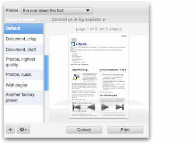
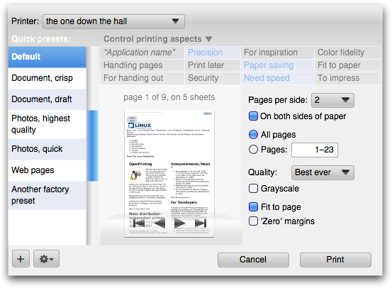
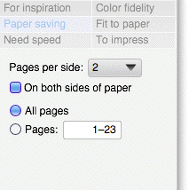
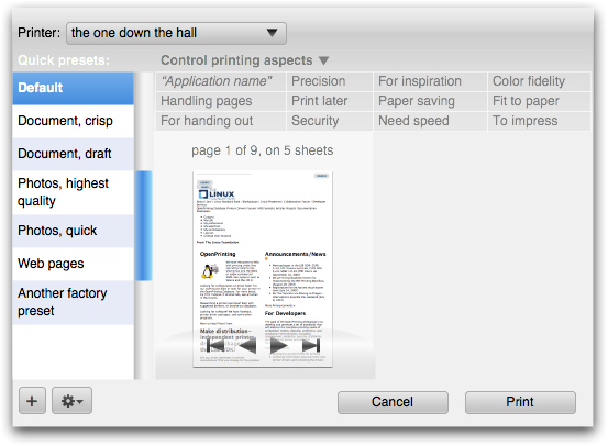
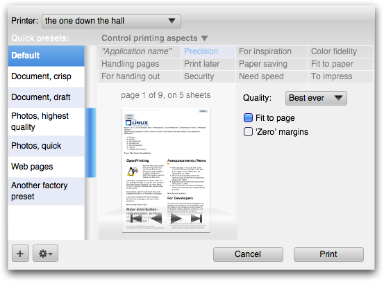
First of all, I optimised the default appearance of the dialog for level two printing, concentrating on printer, preset & preview:
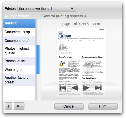
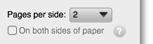
Gone are the tags at this level. Also gone are the orientation controls, because the checking of orientation is handled via the preview. A year ago I had identified ‘number of copies’ as the only universal printing parameter that makes sense for all types of printers.
Somewhere along the line I must have confused that with must be universally available. But it is useful only in particular situations, like making handouts. So it was also removed from this level. After all that pruning, it was logical to enlarge the preview area, to harmonise the design.
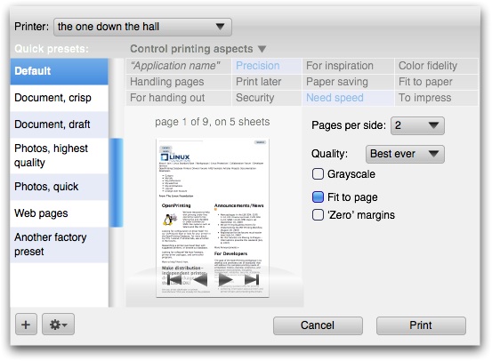
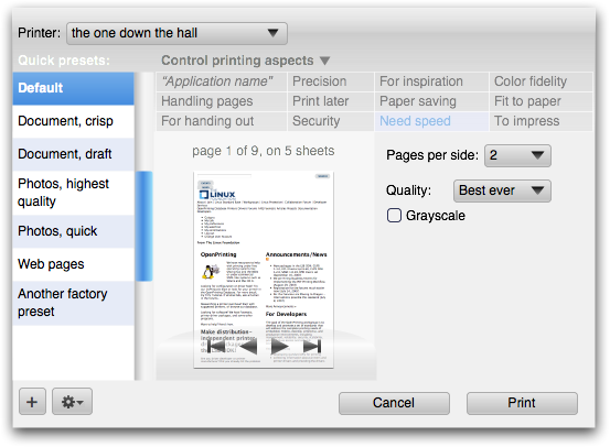
Let’s open up ‘Control printing aspects’ (animated gif)…
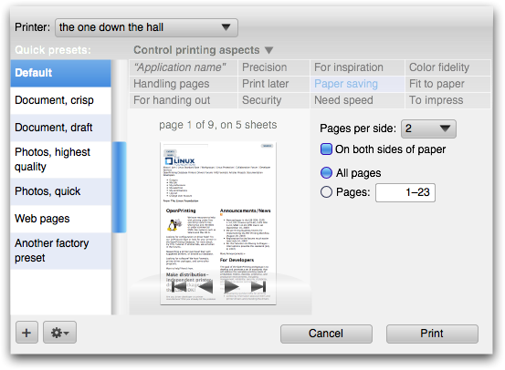
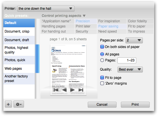
…and then we are at level three.
tags enter the matrix
A nagging problem that was still lingering was the appearance of the tags that configure the dialog. I just knew there are current‐generation UI controls that could serve as a model for this. I found them in Apple’s Garageband:
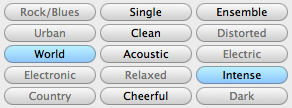
These have the function of checkboxes—used to build up a list of selection criteria—but are more compact and neat, with less visual noise. Taking that as a starting point, it turned out that for us something even more compact, neat, with way less visual noise was required:
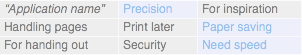
Call it a configuration matrix. It can be implemented with a table widget, but forget about just taking the default table widget. An exercise in toning down is needed to ensure that it stays in the background compared to more important elements in the dialog:
Note that the columns in the matrix have a variable width to optimise the space for the tag labels. The shortest sit next to the longest inside a 200‑pixel column. The mid‑sized tags sit together in their own 200‑pixel column.
To show the configuration matrix in action, here are all the combinations of three of the tags (animated gif):
More full‐size dialogs: first, second, third, fourth, fifth, sixth, seventh, last
more solutions
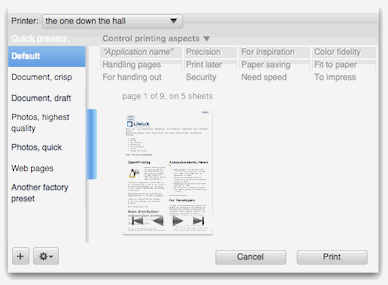
Eleven of the tags in the configuration matrix are reserved to be set up by the printer. The twelfth is reserved for the application name, top‐left in the widest column. This is the place where the application integrates if it has got a few printing parameters of its own.
Remember, if there are more than just a few, then an application is better off showing the whole transformation–to–paper process in its own main window, preferably with hands‑on UI to control it.
the gray zone
In praxis, some combinations of printer settings do not mix and match, so when one is set the other one should not be available. Example: folding and hole punching is not possible. Although better interactive UI should communicate that, the best we can do in praxis is to disable hole punching when folding is on.
To not leave users completely in the dark why a certain parameter cannot be set, I introduce a subtle icon next to it:
Clicking on the icon will bring up a dialog not only explaining why the parameter is disabled, but also what to do to make it active again. Hyperlinks in that dialog could show and highlight the necessary UI for that in the dialog.
blink revisited
Speaking about highlighting, we have combined tag–parameter highlighting (when clicked) to make a connection between a tag and its associated parameters and this is what looks like in this version (animated gif):
summit sumarum
The Montreal openPrinting summit got everybody in the printing community connected again. There is a sense of urgency that this is the chance in the next five years to get printing on linux sorted out.
Folks from both gtk and KDE were there and that gave them a jolt of inspiration to get ready to work on implementing these dialogs. I look forward to working with them.
Labels: design stage, openPrinting, practical

cross‑platform is bunk
11 October 2007, 17:49
Picture this: m+mi works opens two more offices, in addition to our Berlin ‘headquarters.’ One for functionalist architects (sense and simplicity) in Amsterdam and a cool Mediterranean design studio in Barcelona.
Our company is then operating in three countries. All have a lot of EU law in common and quite similar culture, traditions and mores. It should be relatively straightforward to come up with a common management policy and house rules for all three offices.
holiday cramp
Let’s start with holidays, when our offices are closed. For all the common Christian holidays between the three countries, there are plenty of days where only one or two countries have a day off.
Of course I do not like the overhead of implementing and documenting different holiday schedules for the three offices. And I fear that co‑workers and customers in Holland will be confused when trying to reach our Barcelona office on a Catalan holiday.
not the only fruit
So let’s look at ways to arrive at a single, consistent holiday policy for all three countries:
- preferred native solution
- It is my company and I am Dutch, so I tend to see the holidays in Holland as natural. So we take those: my co‑workers and customers in Germany and Spain suffer.
- grand compromise
- also known as roll your own, if there are holidays on the eighth, eleventh and seventeenth, then we will have one on the twelfth: mass confusion among co‑workers and customers.
- lowest common denominator
- Only the holidays all three countries have in common are company holidays: too sparse a set of holidays, will really upset my co‑workers everywhere.
- union of all
- If it is a holiday somewhere, it is a company holiday in all three countries: now we got holiday bloat, co‑workers can’t get any work done, customers think we are always chatting in the café.
The lesson from all this is that there is no other choice then to grit our teeth, comply with the law, traditions and mores in each country and focus on doing the right thing for co‑workers and customers within the context of each country.
back at the ranch…
So what has this got to do with user interaction? Well, just like m+mi works operating in three countries, a lot of applications operate in up to four ‘countries.’ They are the macintosh, windows, KDE and gnome desktop platforms.
All four have a lot of UI guidelines in common and quite similar look + feel, traditions and mores, thanks to the Xerox PARC–macintosh bloodline. It should be relatively straightforward to come up with a common UI design for all four platforms.
cross‑platform cramp
But for all the commonality between the four platforms, there are plenty of interface guidelines where one or two or all are different.
In the fourteen years that I have worked on cross‑platform projects, the engineers have never liked the overhead of implementing and documenting different UI for the different platforms. And they fear that windows users will be confused when trying to use the same application on linux.
weasel out
So they look at ways to arrive at a single, consistent UI for all desktop platforms. And so in my career I have seen all variations of the bunker‑thinking above:
- forcing the original UI design upon all platforms; especially applications that started out on windows have this tendency: preferred native solution;
- roll your own look + feel, the Java route: grand compromise;
- use only UI elements that are available on all platforms; makes it impossible to create usable UI on any of the platforms: lowest common denominator;
- making everything available on all platforms; means re‑implementing something specific for one platform on all others: union of all.
All of these are as dissatisfying, confusing, infuriating, and user productivity wasting as the m+mi works holiday solutions. It takes a lot of convincing from my side to get the engineers out of their bunker and look at the matter from the users’ point of view.
The lesson from all this is that there is no other choice then to grit your teeth, comply with the law (UI guidelines), traditions and mores of each desktop platform and focus on doing the right thing for users within the context of each platform.
Labels: fundamental
If you like to ask Peter one burning question and talk about it for ten minutes, then check out his available officehours.
 Peter Sikking is an
experienced
Peter Sikking is an
experienced
interaction architect. He unabashedly puts
shipping great products at the centre of his design practice. He is known for
his work for Google, Nokia, the
Metapolator &
GIMP
open source projects,
and startups.
What is Peter up to? See his /now page.
- info@mmiworks.net
- +49 (0)30 345 06 197
- imprint
