 our blog
lgm 07, top‑5 GIMP user requests
25 May 2007, 01:55
After my project overview at the lgm conference, Kamila Giedrojć joined me on stage to present the top‑10 user requests, and our solutions models for them. Here are the remaining top‑5:
5. avoid pop‑up dialogs
for tools, file plug‑ins, et cetera
During the expert evaluation we found unnecessary dialogs, whose default settings are fine, 99% of the time. The dialog simply creates more work and breaks the flow in these cases. Our conclusion: take them out.
Other examples of unnecessary dialogs include the rotate, perspective and scaling dialogs.
no vacancies
We also observed that the inspectors—the toolbox that by default appears on the left, and the dialogs‐column with layers, etc. that appears on the right—are already pretty much filled up with essential dialogs, and with the introduction of GEGL will be even more so in the future.
This means we cannot pursue a solution where most dialogs would stop popping up in the middle of the screen, and would instead appear in an inspector.
sneak preview
We found during the expert evaluation that a majority of dialogs offer either a limited preview of the effect they would deliver or no preview at all.
Our solution is to make the whole main window the preview. It is big, but still limited in the number of pixels that actually need to be calculated. And the image has the right size and the right zoom level, because users set it that way.
Here is the current situation in GIMP, working on an image, doing a Gaussian blur:
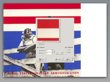
For this moment we have actually stopped working on the image itself. The work is done within the dialog, where the preview still has to be zoomed and panned to help us.
Below is our new solutions model. The heads‑up display with full‐window preview offers a continuous workflow on the image itself.
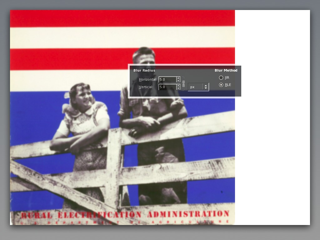
The partial transparency of the heads‑up display creates the user experience that one can work on the whole image, although technically speaking it still obscures part of the image.
- disclaimer
- this is a quick‐and‐dirty lash‑up to show you what we mean; there are for sure some things missing and lots of small issues to solve; enjoy nonetheless…
4. better painting tools
We presented some of the concepts we are working on at the moment.
In the expert evaluation we found the four brush models only available for color painting. Taking image content into account, we see that these brush models can be useful for any kind of brush based tool, like dodge/burn or sharpen.
Our solution is to make the brush models part of all brush tools, taking their icons out of the toolbox and into the tool options.
warped saturation
During our expert evaluation it became clear from all interaction aspects that the iWarp plug‑in should be a brush tool. Our workplace observation showed that if GIMP would implement that, then it would be the number one tool for photographers.
We found that there is a tool to paint with brightness (dodge/burn) but not with saturation. There are whole photography art movements based on reducing saturation, commercial photography depends on turning it up. A saturation tool completes the palette of basic painting tools.
power modes
We evaluated the paint modes and appreciated how powerful they are. However, we observed that there are ‘natural’ modes (e.g. dodge, saturation)—where one can actually predict what they will do—and mathematical modes, like multiply or color erase.
Because the natural modes can be easier matched to actual artistic goals, our conclusion is that these modes should be removed, and their functionality merged into existing and new painting tools. The mathematical modes can stay where they are, being powerful, oblique and fundamental.
dipping + smearing
During our expert evaluation of ‘wild brushwork’ we noticed that there is no equivalent of physical painting: having a palette in your hand; smearing this and that color on the canvas; even mixing in other materials, like sand.
So we created a solutions model for a file palette, which sits at the edge of the image window:
Nicknamed ‘blobs of paint,’ the blobs are dragged in from color selector swatches or project palettes, or eyedropper‑ed from the image. Furthermore the treatment from any filter or plug‑in could be dragged into a blob, which would mean one could paint with noise, for instance.
Just dip your brush in a blob and smear away on the canvas. Mixing between different blobs? We are thinking about it. Finally, even more important than creating blobs is deleting them: just drag it out of the palette. This is an easy‐come easy‑go palette.
Oh, and again our disclaimer…
3. layer trees or layer groups
During the workplace observation we saw users group layers, not only reducing clutter in their layer stack, but also for logically, when bits on the layers are part of the same concept.
Surprisingly, we saw users use layer groups to maintain versions of their file, labelling a group of all layers and then duplicating it to continue working on the next steps.
groups + sets
Groups are a physical organisation of consecutive layers, primarily used to reduce clutter. Here we see four layers organised in two groups:
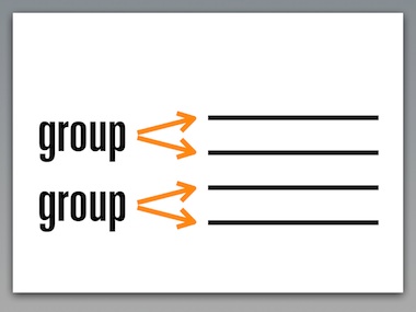
The logical way to display this in the layer dialog is like above: vertical, to the side of the actual layers.
Sets are a logical organisation of layers. A set ties layers together to a single concept. A layer can be part of multiple sets. We see that here:
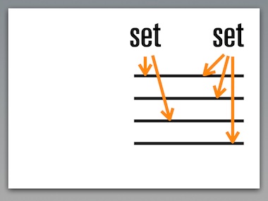
Sets, being distinctly different than groups, can be connected to any layer. Therefore it is logical to display sets different than groups in the layer dialog, horizontal, above the layer list, as shown above.
We conclude that both layer groups and sets should be implemented in GIMP, with distinctly different UI, as outlined above.
versions + approaches
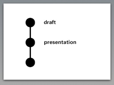
Layer groups or sets are not the most elegant solution for maintaining versions of a file. A more straightforward solution is to build simple versioning in to the file itself.
When we allow during the lifetime of a file a certain state to be labelled, and allow users to return to that state later on, then we have versioning:
The user scenarios speak of ‘compare different approaches.’ This can be different artistic approaches, or different technical approaches towards the same result.
This is elegantly supported by allowing branch versions. Different approaches can be developed and compared directly within the file:
The introduction of GEGL will make it very natural to drag and drop ‘good ideas’ from one version to another.
Our conclusion is that versioning should be supported by GIMP, but not by abusing the layer stack. The key to success is to keep the versioning system as simple as outlined above, much simpler than the source control systems that developers use every day.
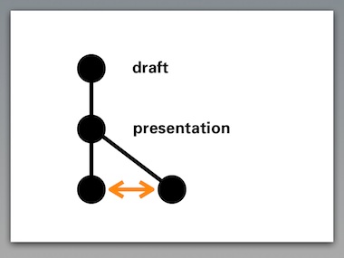
2. adjustment layers
This feature is perceived as powerful and we appreciate the immense value of being able to change your mind and readjust a graphics operation throughout the lifetime of the file.
The introduction of GEGL allows readjustment in a very natural way. Let’s say that we have applied levels–curves–noise–blur to a layer:
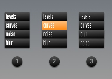
GIMP will show the performed operations in a list, similar to •1 above. When the image at this point is not punchy enough, there is nothing more natural than to select the curves operation again like in •2, and to readjust to taste.
Experimenting with the order of operations is as simple as dragging blur above the noise item in the list, as shown in •3.
as easy as 1‑2‑3
Architecturally speaking, the beauty of the layer system in GIMP is that the whole concept can be explained in a single sentence: ‘Layers are transparent foils with graphics, their stack forming the image.’
Introducing adjustment layers blows up this sentence into a full tutorial chapter. Architecturally speaking adjustment layers are a 90s highjack of an unrelated concept to achieve a certain goal: readjust operations later on.
Our conclusion is that adjustment layers are actually less powerful than taking full advantage of what GEGL can offer. We rather spend our effort on creating powerful control of graphic operations based on GEGL, than to introduce adjustment layers.
1. single window interface
During our expert evaluation we found that the inspectors have the status of real windows, which means they show up in the task bar. And they occupy 440 pixels of screen width, as demonstrated here on a 1024 screen:
Cramped is the word. At this year’s lgm the GIMP team decided that a 1280 wide screen is the minimum supported. 34% of that screen width is lost to the inspectors. Even a whopping 30 inch, 2560 pixel wide screen loses 17%.
Then there is the very disturbing situation of two menu bars. We first have to solve these issues:
Oh, better throw in our disclaimer…
Removed the extra menu bar, the inspectors have been made real floating windows. This means that the items in the task bar now match the goals of users: images. A crude scaling represents our goal to slim down the inspectors. They shall be lean and mean.
Finally, the semitransparent inspectors make that in user experience terms, we can claim those 440 pixels back to work on images. A majority of tasks can be performed under the inspectors. Yes, selected parts of the inspectors, like the color selector, will become opaque when users focus on it.
#1 trend
Only when having solved these issues, are we in a state to discuss a single window interface.
Interaction architecture—like traditional architecture—undergoes changing solution trends. And there is no denying that the latest big photo applications, apple aperture + adobe lightroom, come with single window interfaces.
And there is no denying that single window interface is by far…
So it is disclaimer time again. Starting from the improved situation above, the view can be switched with a menu item to this:
The inspectors have been docked to the side of the window, not overlapping the image, they are opaque again. Multiple open images appear in tabs. Inspectors can be torn off to become floating, and additional inspectors can be docked in columns for people with seriously big screens.
drawbacks
As shown, there is no overlapping of the inspectors and the image pane, and we are working under cramped circumstances again. And having two different UI modes means double the documentation and double the support effort.
We have not reached a conclusion yet on the introduction of a single window interface. We are positive that the current situation needs to be improved.
wrapping up
And that concluded our presentation. I want to thank Kamila for working so hard on the project, and for presenting with me at the lgm.
Labels: design stage, GIMP, lecture, practical

lgm 07, top‑10 GIMP user requests
22 May 2007, 01:12
After my project overview at the lgm conference, Kamila Giedrojć entered the stage to present with me the top‑10 user requests, and our solutions models for them.
Now let me say first here, that a solutions model shows the way forward, based on analysis of the user interaction aspects. It is not a finished solution. It takes quite a bit of work to solve and design all the details, and we are not in that phase yet.
It is both the direction of the solutions models and ensuring that the details do not undermine the concept behind a solution, that are the greatest contributions of an interaction architect to a project. Now without further ado:
10. better printing support
Starting with the product vision we see that it mentions high-end photo + original art. It is a matter of course that part of this work will end up on paper, for sale or exhibition.
It is important to realise that printing is fully part of the workflow, not an afterthought. Placing the image on the page is a creative step towards the final result.
Compare bog standard printing…
…to creative placement:
Our conclusion is that printing should be integral to GIMP, not an extra plug‑in. Furthermore we conclude that the placement of an image on paper is a creative, hands‑on affair.
This is done best by preparing the print in the main window, placing the image there on a virtual piece of paper with a tool similar to the new selection/crop tools. This should be supported by a handful of interrelated number fields for margins, image size and printing resolution.
9. painting with ‘natural brushes’
Returning to the discussion of the product vision, we see that GIMP is an application for working with existing images, not for painting from scratch.
Furthermore, nowhere during the whole expert evaluation did painting with ‘natural brushes’ rise as a secondary requirement for performing an essential task.
Our conclusion is that natural brushes should not be part of core GIMP, nor of the standard distribution. The beauty of the plug‑in system is that when somebody out there still feels the need for painting with ‘natural brushes’ they can write and distribute the plug‑in themselves.
8. improve the text tool
typography, along paths, geometric distortion
During the expert evaluation we observed:
- text being used in both original art + web graphics, both creatively and functional;
- no requirements for page layout functionality;
- at some point users have to make a choice: is this text pixel or vector based;
- requirements for text styling + typographical control, e.g. kerning and baseline shift, to be able to produce the professional results mandated by the product vision;
- the current ‘one text per layer’ doctrine is not practical. Producing ten buttons on a single canvas for a website, ten layers are needed to label them.
Our solution is to allow multiple text blocks within one text layer. Because they can overlap, they will have their own stacking order.
With the introduction of GEGL, users need no longer be concerned with the ‘pixel or vector’ question. And that can only be a good thing. Text will be editable until the end of time. It will be very natural to apply geometric distortion or pixel effects to texts.
7. save for web
Production of web graphics is part of the product vision. The user scenarios reflect this and the scenario for web images speaks of ‘export parts in optimised web format.’
kilobytes
It is important that web images are as small as possible. The ‘customer’ who commissioned the graphics is also picking up the bill for the network traffic they generate.
Combine all of the above with the fact that there are only a handful of web formats compared to more than a hundred in general. We conclude that save for web is a separate workflow where one compares the few web formats to solve the size versus quality question.
before + after
Does the quality of a jpeg compressed image needs to be compared side by side with the original? On the final website there is only the jpeg, and it either looks ‘professional’ or not. It is up to the GIMP user’s internal value system to judge what is good enough in each case.
Our solution is to reuse the main window for the save for web workflow, plenty of room to inspect the image quality. Standard zoom tools can be used to work at a level of detail where one is comfortable. GIMP can help with checking feasibility (gif) and doing the size calculations to recommend the optimal file format and ‘best’ default settings.
6. organise brushes, palettes, gradients in categories
Resources accumulate, and users ask for categories to break down their collections. The problem is that a resource (here a palette) can only be associated with one category:
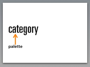
This means that there is only a single way to find back the palette: via this one category. This is similar to files and folders: there are a lot of unfindable files hiding on your hard disk.
Tagging allows to attach multiple concepts to a resource:
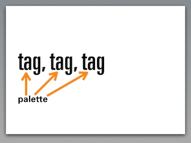
For instance customer name; project name; that it is a warm palette; a retro palette. This means that the palette can be found back via any of these concepts.
For this to be successful, we need to create UI that makes it incredibly easy to tag resources with existing and new tags, whenever users feel like it, in an incremental fashion.
next…
That was to bottom‑5 of the top‑10. Read all about the top‑5 next time…
Labels: design stage, GIMP, lecture, practical, product vision
lgm 07, GIMP project overview
16 May 2007, 19:53
A week or so ago, I delivered a presentation at the lgm conference together with Kamila Giedrojć, my associate on the GIMP redesign project. Instead of dumping the keynote slides in a pdf and making you guess what we said, I will recount the presentation here in three episodes.
I started the presentation with a project overview:
in the beginning…
It all started at the lgm 06. Or actually, two weeks before it. We were discussing at the openUsability meeting, when I asked GIMP maintainer Sven Neumann: ‘so, what is GIMP actually?’ Sven replied: ‘good question.’
Sven invited me on the spot to the lgm 06 and to work with the GIMP team to develop a product vision. That took two hours, the first hour consisting of me explaining the team why we actually needed one. During the second hour we created the product vision.
Here is what it looks like on paper:
Nice and short, it contains only the essential. And by being so concise, we are able to use it as a tool.
definitely not
At the same time we also discussed what GIMP is not:
- not photoshop
- this means that there is no obligation for GIMP to do things the photoshop way; there is not point to work on a project just to provide a free and open version of some commercial software;
- also not painter
- the focus for GIMP is to work with ‘found’ images;
- not the only linux‐pixel‐oriented‐application on earth
- in the old days, GIMP had to save the day for everyone who wanted to change some pixels on linux; today, GIMP has been released of that obligation, and its team can focus on high‑end use.
- not a web page mock‑up application
- I brought up web mock‑ups, but we realised that seriously supporting this would mean introducing a ton of functionality; it is better done in a specialised application.
real‑life balance
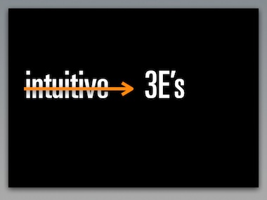
For interaction architects there is no such thing as intuitive interaction. However, we can talk about the 3E’s:
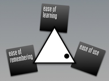
The triangle shows the relationship between them; the dot represents the real‐life situation that you cannot have it all. The trade‐off for GIMP is shown here: user efficiency (ease of use) is everything, with a nod towards ease of learning.
This can be derived directly from the product vision, which speaks about high‐end use and production of graphics.
This explains for GIMP users why it took considerable effort to learn to use the software. We cannot increase ease of learning, or we would lose out on ease of use. All we can do is make it a more gradual, incremental learning experience.
out of tune or auto‑tune
I like to compare this to learning to play the violin. For quite a while the results will be not pretty. But if you put in enough hours, the results can be beautiful, for both amateurs and professionals.
For developers this shows that hard choices have to be made in the UI design, in order to nail the right balance for the 3E’s.
getting involved
I would not have gotten more involved with GIMP if the team would not have managed to agree on a product vision. Without it any interaction architecture or usability effort is doomed.
Also the commitment of Sven to really change things for the better in the UI and the planned introduction of GEGL convinced me to get on board. We started with some ad hoc work on the selection/crop tools that will come out in version 2.4.
blastoff
Fast forward to August last year. In berlin openUsabilty, GIMP and m+mi works bundle forces to create the ‘season of usability’ pilot project. The news spread like wildfire around the world, and I selected Kamila to work with me on the GIMP project.
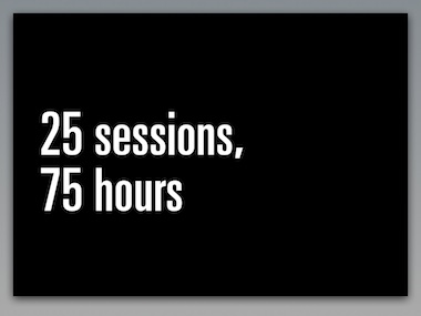
With Kamila working 20+ hours, and us having two–five meetings a week for the project, we really picked up some speed. To start with, my team needed an overview of all GIMP functionality. We need to know what we are talking about and I had set the target that it was going to fit on twelve pages.
Again I aimed to be as brief as possible, in order to create a tool instead of sprawling documentation. Two and a half months later we had it on eleven pages. And we knew GIMP.
plotting success
Meanwhile we held our scenario weekend, on which I reported here in detail. The result looks like this on paper:
Again, concise and essential enough to be used as a tool.
this year
At the start of 2007, we commenced with the expert evaluation. Taking the user scenarios as the guide to essential use, we took an architectural look at the current interaction of GIMP.
By the end of February we were through…
Notice the contrast between the user scenarios—short and essential—and the expert evaluation: deep, structural and architectural.
the road ahead
At the moment of writing we are working on the analysis. And with all the work done up to now the solutions models are coming easy. These show us the way forward for GIMP UI.
next…
At this point in the presentation Kamila entered the stage to present with me the top‑10 user requests that are UI‑related, and our solution models for those. Read all about it next time…
Labels: GIMP, lecture, practical, product phase, product vision
more printing in siena
1 May 2007, 12:35
After the printing in siena blog entry, a healthy amount of discussion ensued in the printing community. Here are a couple of concerns that I need to address.
‘are you sure this is going to work?’
We are going to user‐test these three new solutions to validate them. If they do not work, we will improve them. If any of them still doesn’t work, we will trash them and go for plan B. This is usability at its best, validating before committing to write code. It is called verified innovation.
‘“just print” without a dialog? cannot work…’
An awful lot of printing today looks like this:
- user invokes Print…;
- dialog is shown;
- user presses Print button straightaway.
My analysis is that the printing dialog in these cases is actually obstructing getting the print done, because the user ‘knew’ that the print was going to be fine anyway, before invoking Print…
We have corroborated this already with user testing. ‘Just print’ has been conceived exactly for this ‘awful lot of’ printing. Nobody is forcing users to forgo the printing dialog, they can and will use Print… in case of doubt about the happy outcome of a print job.
‘but things can go really wrong without a dialog’
This is the reality of today’s printing dialogs: people who just want to print, don’t read them. In these situations they simply do not function as the point of final check and confirmation. You could write in the dialog ‘These print settings will get you fired…’ and without a hitch, the Print button will get pushed.
Thus showing a dialog with printer settings does not prevent in any way ink, paper and energy being wasted on a doomed print. So my priority is to offer those 95% of users 95% of the time the option they need: forget about the dialog.
‘is this like that print toolbar icon in word?’
The developer at microsoft did the following: He took the icon that for years and in thousands of applications has the meaning of Print… (show the dialog) and attached a different function to it (default print without a dialog).
Brilliant.
Attach a different meaning to a ubiquitous symbol. No interaction professional would do that. No wonder users are confused. We will do two things differently:
- two, clearly labelled, different UI paths for the old Print… and the new ‘just print’; two menu items, two key shortcuts, and if you must have toolbar icons, two clearly different ones;
- a smarter behaviour for ‘just print’ than the print‐with‐defaults that word offers today.
‘too smart by half’
I should have put in a couple of examples of the applications smartening up about the transformation. In siena we discussed spreadsheets avoiding to put the last column on a separate piece of paper; web browsers that instead of formatting for 2.03 pages, subtly get it on exactly two.
Or a photo application not printing on the laser printer but on the color inkjet. This all is applying domain knowledge within the application to get it done. And involves no heavy‐handed meddling in the printing parameters.
‘machines take control over humans’
We want the applications and printer drivers to learn from user’s preferences. I want the printing driver to figure out that I tend to print multiple pages 2‑up, and duplex where available.
siena leftovers
no clue
We discussed the error‐case when either the application or the printer driver really cannot figure out how to ‘just print.’ For instance, this can happen when an application is asked to print for the first time, or when a file is printed for the first time.
If this is the case the print dialog will be shown anyway. And from thereon the precedent is set for this situation.
subtle clues
Part of the ‘just print’ solution is that we subtly communicate that the print is preparing–queuing–printing–ready. So that when users want to, they can get confirmation about the status of the job.
For instance by putting an icon in the taskbar that reflects what is going on. When clicked it could show more details, but else it stays outside of the users’ workflow.
application integration
We also agreed that we prefer that applications integrate their UI for the transformation into the print dialog. This ties the transformation parameters to the preview in the dialog.
We realise however that there are applications where the transformation is a big deal, or a complicated job. An example of the former is GIMP where placing the image on paper is part of the artistic workflow, of the latter is placing a spreadsheet over multiple pages.
Then the UI for this has to be displayed before the print dialog. I think Apple is right‑on in this regard with their drive to get this to take place inside the application main window. And to supply users with hands‑on UI to take control of this transformation.
Finally, it would really not hurt if in this ‘on virtual paper’ view, a ‘just print’ button was offered to bypass the print dialog.
the future is bright
As I am writing this, we are sketching print dialogs. We are discussing usability surveys to get the most out of the tags concept. Stay tuned for more news on that.
Labels: GIMP, openPrinting, practical
If you like to ask Peter one burning question and talk about it for ten minutes, then check out his available officehours.
 Peter Sikking is an
experienced
Peter Sikking is an
experienced
interaction architect. He unabashedly puts
shipping great products at the centre of his design practice. He is known for
his work for Google, Nokia, the
Metapolator &
GIMP
open source projects,
and startups.
What is Peter up to? See his /now page.
- info@mmiworks.net
- +49 (0)30 345 06 197
- imprint